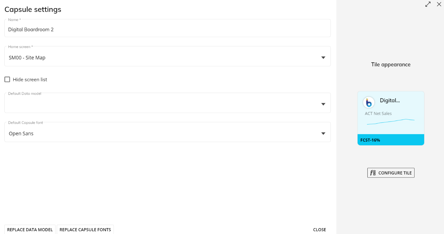
The Capsule Properties page allows you to define the following Capsule data and settings:
Capsule name. Read Create a new Capsule for more information on Capsule name guidelines.
Home Screen. Select which existing Screen you want as the opening Screen of your Capsule.
Hide Screen list. If enabled, this option will disable the Screen list option that appears in the Sliding menu when the burger icon is clicked from the Top Menu. When this option is active, you will no longer be able to use a link to open a Screen other than the Home Screen. This option should be enabled when you wish to have a user only follow the navigation links and buttons placed on the Screen.
For Presentations in Edit Mode only: when this option is enabled and the user clicks on "Go to source screen" (from the left panel of the Presentation), they will be redirected to the source Screen, not the Home Screen. Read more about Presentations.
Default Data Model. Choose the default Data Model you want to associate with the Capsule from the dropdown menu. Read Change the Data Model associated with a Capsule for more information.
Default Capsule font. Choose a custom font styles in the Capsule as the default style. This applies to all Screen Objects in all Screens.
REPLACE DATA MODEL. Replace all associations with a specific Data Model in existing Screens and Objects with another Data Model. This change will only affect the Screens and Objects associated with the target Data Model. Read Change the Data Model associated with a Capsule for more information.
REPLACE CAPSULE FONTS. Replace all font families in the existing Screens of the Capsule with a specific font family.
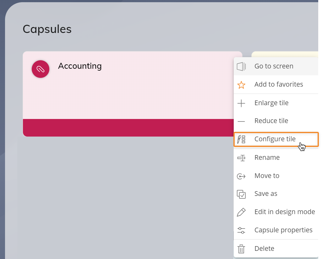
CONFIGURE TILE. Allows you to change the following graphic elements of the tile:
RANDOMIZE STYLE. Click this button to have a random style chosen for you. You can click this button as many times as you need.
Color. Choose a color from the options available or click on the "+" symbol to choose more colors, type in a Hex color code and an Alpha code, or choose a color with the dropper icon.
Icon. Select an icon from the available choices, click the three dots for more icon choices, or add a custom image by uploading it to the Capsule's embedded images area or by selecting it from the Capsule's embedded images area.
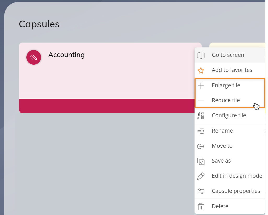
Tile size and layout. Choose the tile size appearance: XS, S, M, L, or XL.
It is also possible to change the size by accessing the Capsule menu and clicking "Enlarge tile" or "Reduce tile".
Sparkline. This option lets you set a Sparkline right on the tile by defining a Layout and a Select (optional) on the available Entities.
Footer. This option lets you show a value on the footer of the tile, by defining a Layout. If a Select is set for the Sparkline, it will also affect the footer value. Only a single value can be shown on this area.
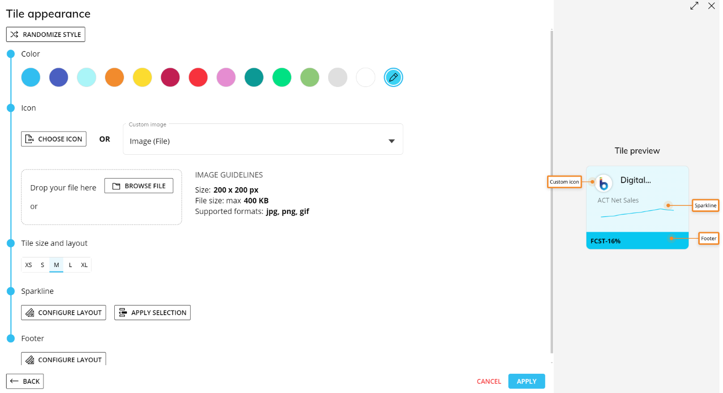
Every graphic change will be displayed immediately in the right-hand side Tile preview area.
The tile configuration editor is also available from the Capsule menu by clicking "Configure tile".