This article is all about Capsules in Design Mode. Only users with a Developer or Power User license can access the Design Mode. See more in the Licenses section.
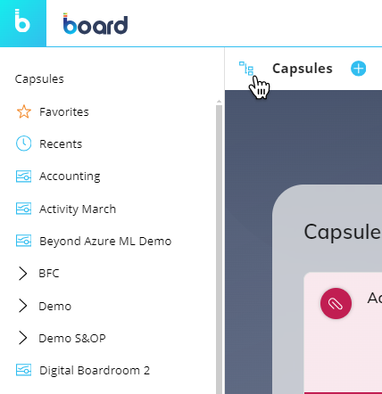
Once you've logged into Board, you will land in the Capsules home page (or Capsule browser).
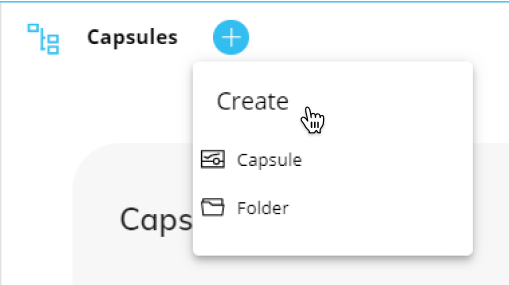
With a supported license, you can design, edit, and create Capsules. Create a new Capsule just below the Top menu in the Capsule browser by clicking on the new Capsule  button. Learn how to create a new Capsule.
You can also perform various actions on Capsules by right-clicking over their tiles. Learn how to copy, delete, rename, and move a Capsule .
From the navigation left panel in Design Mode you can also create, rename, or delete Capsule folders by right-clicking over the Capsule name.
Learn how to create, delete, and rename a folder.
The navigation left panel allows you to browse through Capsule folders. You can open and collapse the left panel that lists the Capsule folders and Capsules by clicking the Toggle-Side-Navigation  icon.
icon.
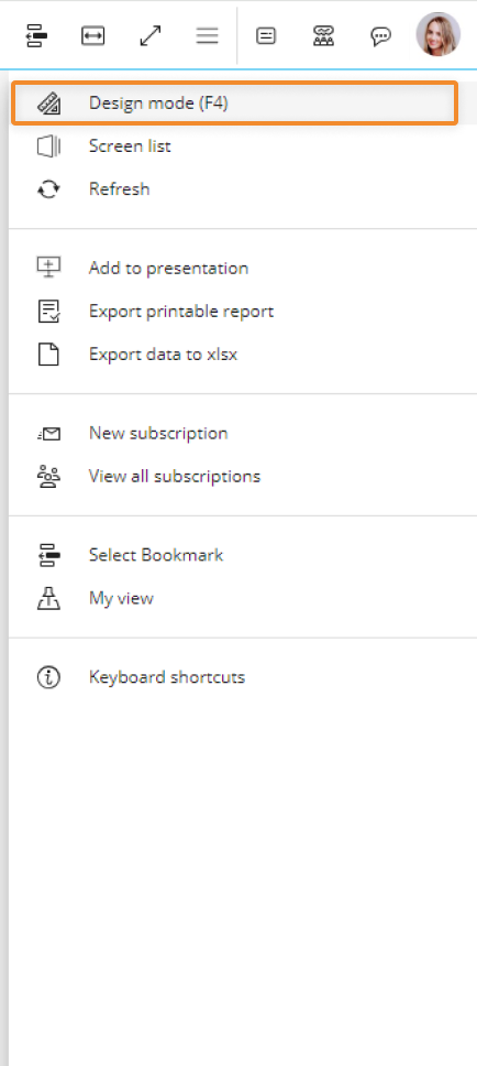
Enter Design Mode
Enter a Capsule in Design Mode from the right-click menu in the Capsule browser and click on "Edit in Design mode". You directly enter the Capsule's Home Screen with all functions for configuring it and adding Screen Objects, provided the user has the appropriate Board license and privileges in place.
The last saved configuration will be the default one applied to the Screen when the Planner opens it in Play Mode.
Top Menu in Design Mode

From the Top Menu, you can:
 SAVE. Save your Screen current configuration.
 DISCARD ALL. Discard all recent changes.
 Switch to Play mode. Exit Design Mode and display the Screen in Play Mode.
 Refresh all Screen Objects. Re-execute the Layout on all Screen Objects.
 Apply a Select to the entire Screen. Open the Select window.
 Extend to fullscreen. Extend the Capsule Screen into fullscreen. To exit fullscreen, press the "Esc" button.
 Feed. Access the feed, if permissions allow.
 Discussion. Access the discussions, if permissions allow.
 Chat. Access the chat feature, if permissions allow.
The Screen Properties panel under the Top Menu on the right side of the Screen is opened by default. You can collapse and expand it by clicking the Properties toolbar icon  . Hovering the mouse over the icon shows an arrow in the direction of collapse or expand.
Properties toolbar
The Properties toolbar, alongside the left of the Properties panel, consists of a column of icons that consists of the Layout editor access, Object alignment, and more. These Property toolbar options are as follows:
 Property panel collapse/expand. Collapse or expand the Property panel to the right. When you hover over the icon, an arrow will appear to indicate the direction of the collapse.
 Undo.
Undo. Redo.
Redo. Configure Layout. Open the Layout editor for the selected Object.
 Copy and paste. Copy/paste Screen Objects or Screen Object formats or the Object's Layout.
You can copy/paste formats even between different Objects. Only properties and formats common to all Screen Objects will be copied/pasted.
 Align left. Align the selected Object(s) to the left.
 Align right. Align the selected Object(s) to the right.
 Align top. Align the selected Object(s) to the top.
 Align bottom. Align the selected Object(s) to the bottom.
 Align vertically. Align the selected Object(s) vertically.
 Align horizontally. Align the selected Object(s) horizontally.
 Distribute vertically. Evenly distribute 3 or more selected Objects vertically across the Screen.
 Distribute horizontally. Evenly distribute 3 or more selected Objects horizontally across the Screen.
 Bring to front. Bring the selected Object(s) to the front.
 Bring to back. Send the selected Object(s) to the back.
 Delete. Delete the selected Object(s).
Left panel
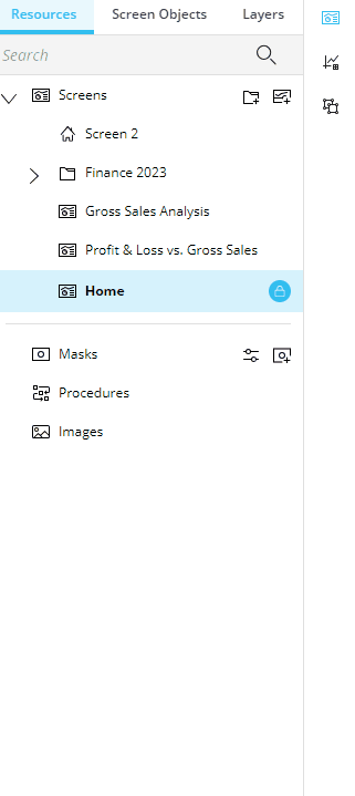
In Design Mode, the Left panel allows you to build your Capsule Screens.
The Left panel consists of three tabs horizontally displayed on the top and three corresponding icons vertically displayed on the right-hand side. Instead of only icons at the top, the three tabs are labeled at the top as follows:
Resources. The structural elements you can use within the Capsule (Screens, Masks, Procedures, Images).
Screen Objects (Toolbox).
Layers. Arrange Screen Objects in the active Screen, presented in the defined order. Screen Objects are placed in the Screen in the order you insert them, with the most recently added Object being on top of the stack. The first on the list is the bottom layer of the stack, while the last one is the top layer of the stack.
When one of these sections is selected, the tab is highlighted in blue and the corresponding icon on the right-hand side of the panel is also the color blue. You can switch between the three sections either by selecting the tab or the icon. To hide or show the panel, click on the icon that is already selected and highlighted in blue. When you hover over it, the icon will change to an arrow indicating the direction the panel will collapse or expand.
From the Left panel, the following options and features are available:
 Resources . Previously known as the "Structural elements of a Capsule", the Resources tab displays the structural elements you can use within the Capsule. The different options available in the Resources tab are the following:
 Screens. Display the list of Screens created. The capabilities found under "Screens" are as follows:
 Search existing Screens. Using the search bar, search for a Screen within the opened Capsule.
Navigate through Screens in Design mode.
 Create a folder. Next to "Screens", this icon adds a new folder. When you add a folder, it will appear at the bottom of the list. Drag and drop it into the correct order.
Organize your Screens in folders. To move a folder, simply drag the folder and drop it where you want it to move in the tree structure. By dropping a folder on another folder, you will make the former a subfolder of the latter. Read more about Screens.
 Folder options. A three dot menu icon ( ) offers the options "Add Screen", "Add Folder", "Rename", and "Delete". These options are also available via right-click.
 Create a Screen. Next to the "Add a folder" icon, the "Add a Screen" icon adds a Screen to the bottom of the list. Drag and drop it unto the correct order or into a folder.
- Screen options. A three dot menu icon ( ) offers the options to "Save as", "Delete", and "Set as Home Screen" if not already set as Home. These options are also available via right-click.
 Set a Home Screen. Click on "Set as Home Screen" from the Screen options list if the Screen is not already set as Home. There can only be one Home Screen.
 Lock Screen. The lock icon indicates that the Screen is locked to others from editing it while you are editing it.
 Masks. From the Masks option, you can now directly configure, create, or edit a Mask within the Capsule in which you need it. The configure icon
  lets you configure a Mask and the add a Mask icon
  lets you add one.
 Procedures. Open the Procedure page as before.
 Images. Open the Images section. Board supports .jpg, .png, and .gif file types.
 Screen Objects. List all the Screen Objects available to use in a Screen and allows for redesign by dragging and dropping Screen Objects in the Screen design area. Read more about Adding Objects to a Screen.
 Layers. The Layers section allows an easier way to select multiple Objects and rearrange them all together or change the order in which stacked Objects appear on a Screen by moving each one up or down the list. You can also edit shared properties of multiple selected Objects. Select all the ones you would like to move or edit properties for at the same time from the list available under Layers.
If a Container is added to the Screen, it will look like a folder in a tree structure; by moving the Container or the Objects it contains, you can rearrange their position.
Properties panel
In Design Mode, the side panel on the right of the page allows you to access a Screen's and Object's additional properties. The Properties panel is categorized by 3 sections: Data, Design, and More.
Search properties. Next to "More" is a search function where you can search for a property and find it instantly.
Screen Properties panel
If no Screen Object is selected in the Screen design area, the panel will show the following general Screen options:
The Screen Properties panel is organized into 3 categories: Data, Design, and More. The options it provides are as follows:
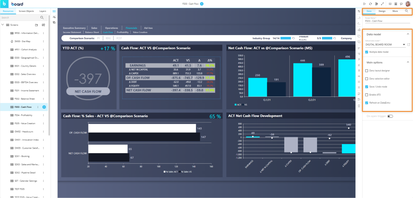
Data. Under "Data", the data Screen properties available are as follows:
Screen name. Change the Screen name.
Data model. Configure details about the Data Model(s) used in the Screen.
Default Data model. Show the default Data Model linked to the Screen. Choose another default Data Model from the dropdown menu. The open window icon directs you to the chosen Data Model page for configuration.
Multiple Data model. If selected, you can choose which Data Model to link to each Screen Object in the Layout editor. This option is disabled by default and all Objects are linked to a single Board Data Model: the one set as default when creating the Capsule or the one selected when creating the Screen.
Main options.
Deny Layout designer. Prevent entering the layout editor for all Screen Objects.
Deny selection editor. Prevent applying a Select to the Screen.
Save/Undo mode. (Enabled by default) Allow you to make multiple Data entry actions, save values in bulk or undo them. If disabled, after each data entry the new value is stored and you can't go back.
Enable ATO. Enable Advanced Transaction Object (ATO) management for the Screen. This option is activated automatically as soon as the Object Entity Editor is added to the Screen: the ATO allows users to execute CRUD (Create, Read, Update, Delete) actions on Entities, Entity members, and Relationships.
Refresh on Data entry. (Enabled by default) Refresh all Screen Objects' Layouts when you save/apply a Data entry action on a single Screen Object. If disabled, only the Layout of the Screen Object you've saved/applied a Data entry action on will refresh.
Design. Under "Design", the design Screen properties available are as follows:
Screen size. Adjust the Screen size (4:3, 16:9 or Custom).
Fit mode. Define how the Screen should fit your viewing area.
Colors. Select the colors you want for your Screen's appearance.
Background. Display the Screen's background color. Click on the color tile to configure the following options:
Type. Choose the type of background for your Screen:
Solid. Display a solid color of your choice.
Background. Choose the color for the solid background.
Gradient. Display a gradient color of your choice.
From color/To color. Choose the 2 colors that you want the gradient background to reflect.
Gradient direction. Choose the direction that the gradient color is displayed: from left to right, from top to bottom, or from the center to the outer edges.
Image. Display an image of your choice.
Capsule image/ External link. Select the corresponding radio button and either choose a Capsule image from the dropdown or type in the external link that contains the image you want to display on the Screen background.
Fill. Choose how the image should fill the background.
None. The image appears as the Screen background according to its dimensions. If its dimensions are smaller than the Screen's, white space appears surrounding the image.
Fill. Fill the Screen with the image. The image is stretched to fit the Screen's dimensions regardless of its dimensions.
Uniform. Expand the images size accordingly with its dimensions until one side fits to the Screen's dimensions. For example, if the Screen size is 16:9 and the image is 2x3, Uniform will expand the image to 6x9.
Uniform to fill. Expand the image to fill the Screen without stretching the image. This means that the image could appear cropped. If we use the above example dimensions, the image would expand to 16x18 within a 16:9 Screen size.
Repeat. Repeat the image in the Screen.
Repeat. Repeat the image in all the empty spaces of the Screen.
Repeat horizontally. Repeat the image horizontally.
Repeat vertically. Repeat the image vertically.
No repeat. Does not repeat the image.
Alignment. Align the image accordingly.
Vertical/Horizontal. Align the image vertically from the top, the middle, or the bottom. Align the image horizontally from the left, the middle, or the right.
Screen Mask. Add Masks right from the Capsule. To create or edit Masks, you can do so under Resources in the Left panel.
Mask. Choose a Mask to apply to the Screen from the dropdown menu. This feature will disable Screen size and Colors options.
Environment background toggle. When enabled, shows the space outside of the Screen's design area when zoomed out. You can customize the following options:
Show background grid. When enabled, displays the space outside of the Screen's design area in a grid pattern.
Cover background. Display the space outside of the Screen's design area in the color and style or image configured.
More. Under "More", you will find the settings for the mouse-over Tooltip. This is helpful for directing the end user or communicating with others who will access the Screen. Access the options by enabling "On-Screen tips".
Anchor point. Choose the position of where the anchor will be displayed: Top/Left or Center/Center.
On-Screen tips. Upon enabling, the following Tooltip options become available:
Tip type. Choose the format of the Tooltip that displays to the user, either "Dialog" or "Balloon".
Dialog. Show messages in a popup window.
Balloon. Show messages in a text bubble over the Object.
Content. Write the message of the Tooltip which will display when the end user hovers over the icon.
On-Screen element. Choose the Format of the element: "Icon" or "Text or Number".
Icon. Customize the displayed icon.
Choose icon. Choose the icon you want to display for the mouse-over Tooltip.
Text or Number. Customize the Text or Number.
Text or Number. Write in what you would like the element to say.
Position. Choose the position of the element.
Background. Choose the background color of the Tooltip.
Icon. Choose the icon, text, or number color.
Enable animation. Enable, and the element will pulse to draw the user's attention.
Object Properties Panel
If a Screen Object is selected in the Screen design area, the contextual right panel will show specific options for that Object, which includes the Object Properties panel, as described below.
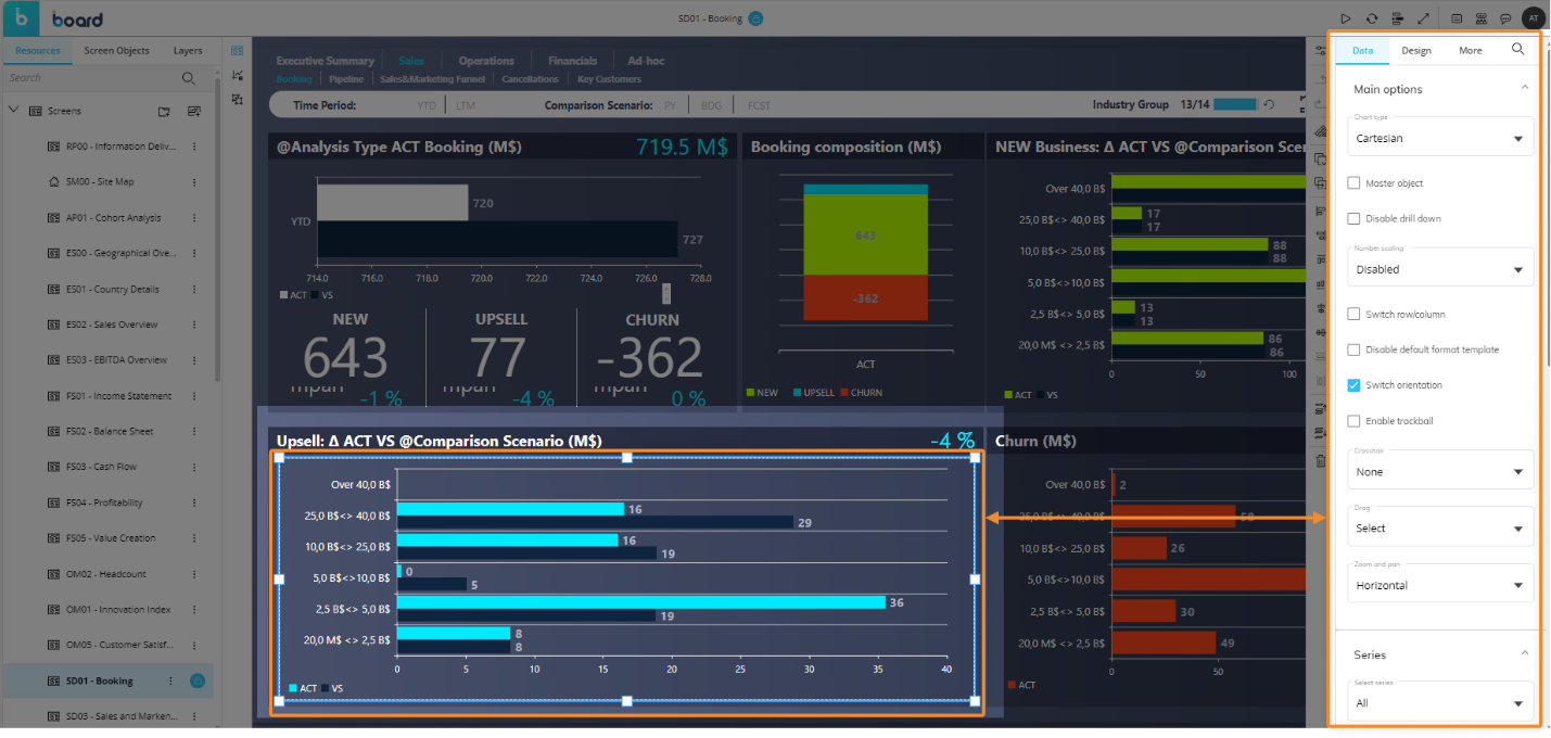
The Object Properties panel is organized into 3 categories: Data, Design, and More. The options it provides are as follows:
The "Properties Search" feature, identifiable by the search icon ( ) to the right of the menu categories, allows you to easily find properties, even in more complex Objects.
Data. The Data tab displays all of the settings pertaining to the data display of the specific type of Object. Series is found under "Data", including "Series color" and "Label color" settings.
Design. Under the Design tab, you find all the Object property options offered that pertains to the design of the Object. Scrollbars style and Columns are only available for Data View, and Main options, Elements, and Templates are available for Charts, while the following are available for all Objects:
Position and size. Configure the size of the Object by defining the height and width in pixels. Align the position by defining its alignment to the left and top of the screen in pixels. Define the Object's rotation by entering a number of degrees, where 0 has no rotation and 180 is completely rotated upside down.
Colors. Choose the background color of the Object with the same options and features as Screen background, as described above.
Border. Choose the border color, thickness, and radius for each Object.
Effects. Select the Object opacity using the scrollbar or typing in a percentage to the right.
More. Under "More", you will find the settings for the mouse-over Tooltip. This is helpful for directing the end user or communicating with others who will access the Screen. Access the options by enabling "On-Screen tips".
On-Screen tips. Upon enabling, the following Tooltip options become available:
Tip type. Choose the format of the Tooltip that displays to the user, either "Dialog" or "Balloon".
Dialog. Show messages in a popup window.
Balloon. Show messages in a text bubble over the Object.
Content. Write the message of the Tooltip which will display when the end user hovers over the icon.
On-Screen element. Choose the Format of the element: "Icon" or "Text or Number".
Icon. Customize the displayed icon.
Choose icon. Choose the icon you want to display for the mouse-over Tooltip.
Text or Number. Customize the Text or Number.
Text or Number. Write in what you would like the element to say.
Position. Choose the position of the element.
Background. Choose the background color of the Tooltip.
Icon. Choose the icon, text, or number color.
Enable animation. Enable, and the element will pulse to draw the user's attention.
Hover tooltip. Write a message that will appear to the end user when the mouse hovers over the Object.
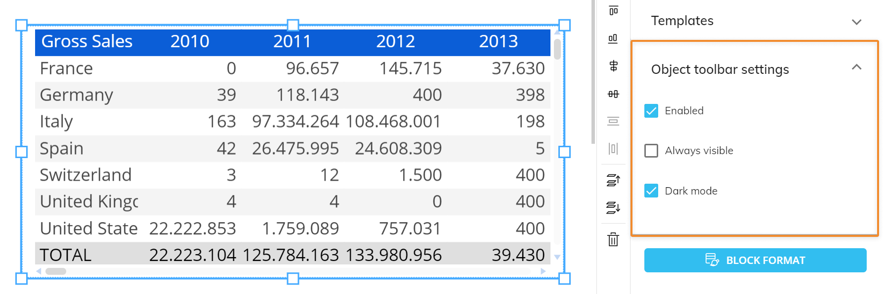
The following properties are available in the "Object toolbar settings" menu located at the bottom of the Object Properties panel of the Screen editing page when an Object of the first group of Objects (Data View to Tree Object) is selected:
Enabled. Select it to enable the toolbar in Play Mode.
Always visible. If enabled, pins the toolbar on top of the Object.
Dark mode. Select it to apply the dark theme to the toolbar. Deselect it to apply the light theme to the toolbar.
If multiple Screen Objects are selected in the Screen design area, the Properties panel to the right will only show options that are common to all of those Objects.