This topic describes how to add a new Label Object to a Screen or a Container and its specific properties.
To create a new Label Object, you need to access a Screen in Design Mode.
Once you're in the Screen editing page, locate the Label Object from the Screen Objects list in the left panel, then drag and drop it onto your Screen or Container.
The Label Object, just like every other Object, can be moved, resized, duplicated via copy/paste, and easily aligned with other Objects on the Screen.
See Configure Screen Objects for more details.
Label Object: use cases
When you create a Label Object, it is set to display the "Label" caption by default. The next step is to configure the Label as desired, for example:
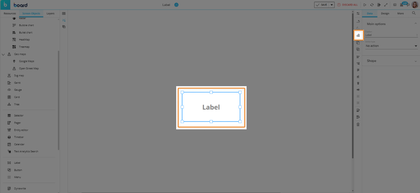
You can associate it with a Layout that will define a value to be displayed. click on the Object or select the Object and click the "Configure Layout" button (
 ) in the Properties Toolbar located vertically alongside the Properties panel to the right of the Screen.
See The Layout Object, Configure a Layout, and About Data Blocks of a Layout for more details on the Layout Object.
Using the available Label properties and settings, you can use the Object to display a custom text string, a selection, or an image.
Using the appropriate options, you can use the Label as a clickable element that triggers various actions. See Label properties and settings for more details.
How to use a Label for displaying data
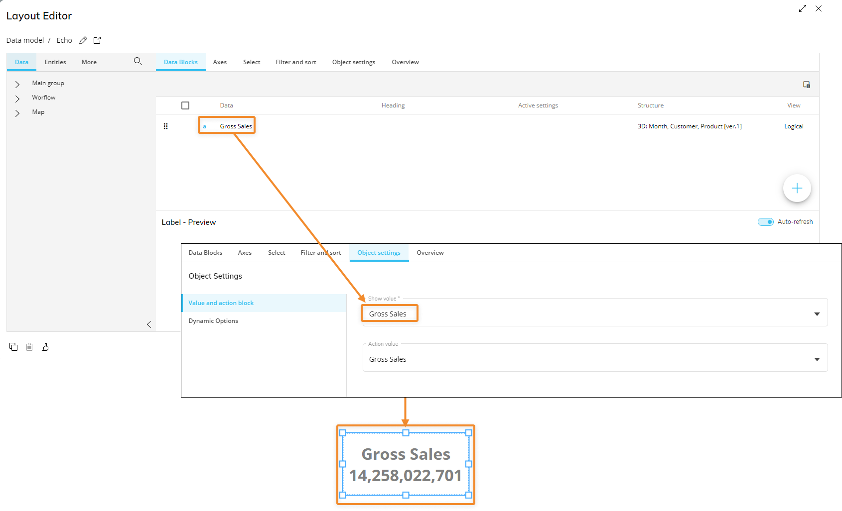
In addition to static elements such as text or numbers, a label can also display values taken from a Block of a Layout.
The Label can only display one value at a time.
To do so, proceed as follows:
Configure at least one Block in the Layout editor.
In the Object Properties panel, select the desired Block in the "Show value" field. The first Block you create will be automatically selected.
Save the Layout.
You may define an Entity in the Axes area and set the same Entity in parallel to a Pager to cycle through all members of that Entity and have the Label display the corresponding value.
You can also set a Color alert on the displayed Block to change the appearance of values in the selected Screen Object based on the alert configuration. See Color alert for more details.
Label properties and settings
Label properties are available from the Object Properties panel on the right of the Screen editing page once the Object is selected.
The Object supports all options common to all Screen Objects.
Properties specific to the Label Object are highlighted in the following image and explained below:
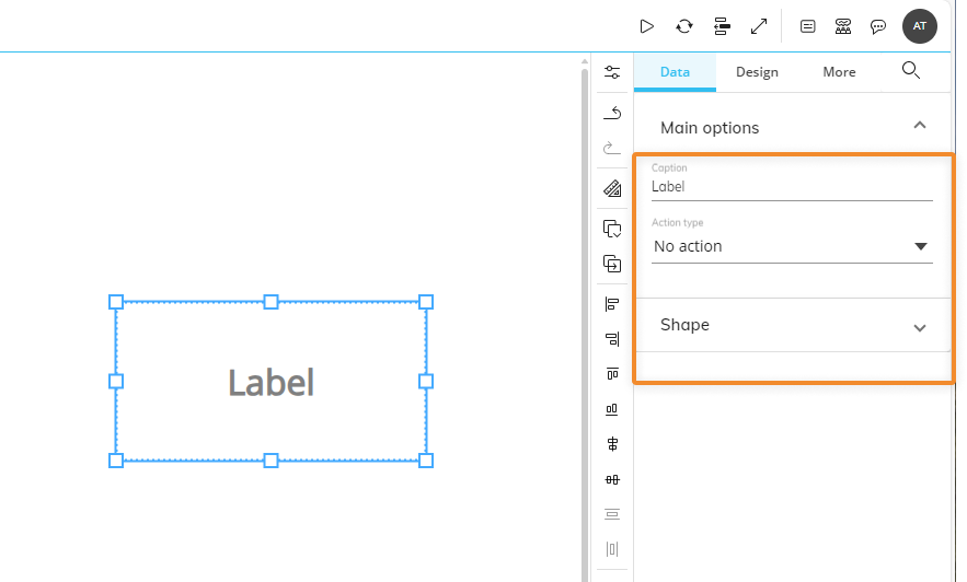
Main options of Data Object properties
Under the Data tab of the Object Properties, the following Main options are available:
Caption. This field allows you to configure a custom text to be displayed in the Label. Enter a substitution formula to display the desired data in the Label. See Substitution formulas for more details.
If the Label is associated with a Layout, the custom caption is displayed before the value from the Layout.
If a Color alert is defined on the selected Block of the Layout associated with the Label, the custom caption text color or background is colored accordingly.Action Type. Choose an action to perform when the Label is clicked. The following options are available:
Go to Screen. Opens a Screen of the current Capsule. When this option is selected, the following additional options become available:
Screen. Choose the destination Screen from this dropdown menu.
Same tab. Opens the destination Screen in the same browser tab (as opposed to a new tab).
Apply data selection. Applies the current Screen Selection to the destination Screen. Selections from Pagers are transferred as fixed selections (Screen selection) where those Pagers do not exist on the Screen to be opened.
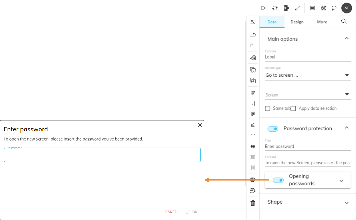
Password protection. Toggles a password prompt before executing the action. If the option is active, you can fill out the "Title" and "Content" fields to show the end user a custom message in the password request popup window. Toggle the "Opening passwords" option to define one or multiple passwords: to add a new password, enter it in the text field and click on the plus icon.
Go to URL. When the Label is clicked, a custom URL is opened in a new browser tab. The field also supports MAILTO links, which open the default mail client on the computer for sending an email. The execution of this action can be password protected, as explained in the "Go to Screen" bullet point.
Run Procedure. Runs a Procedure when the Label is clicked. When this option is selected, the following additional options become available:
Procedure location. Select the Procedure location, Capsule, or Data Model. If the Data Model location has been selected, pick a Data Model from the list.
Procedure dropdown. Select the desired Procedure from the dropdown menu. You can easily review the Procedure structure by clicking the Edit Procedure button (
 ) on the right.
Password protection. The execution of this action can be password protected, as explained in the "Go to Screen" bullet point.
Refresh Screen. Refreshes all Layouts associated with the Objects on the Screen when the Label is clicked. The execution of this action can be password protected, as explained in the "Go to Screen" bullet point.
Save Data entry. Saves all data entries made on all Screen Objects at once. The execution of this action can be password protected, as explained in the "Go to Screen" bullet point.
If Save/Undo mode is disabled on the Screen, after each data entry action the new value is automatically saved. Be sure to enable the Save/Undo mode on the Screen, before configuring the Save Data entry option on a Label.
Undo Data entry. Removes all unsaved data entry actions made on all Screen Objects at once.
If Save/Undo mode is disabled on the Screen, after each data entry action the new value is automatically saved. Be sure to enable the Save/Undo mode on the Screen, before configuring the Save Data entry option on a Label.
Go to previous Screen. Opens the previously opened Screen, the one before the Screen with the Label. This option works only if the current Screen was opened in the same tab as the previous one. The execution of this action can be password protected, as explained in the "Go to Screen" bullet point.
Shape. Applies a custom shape to the Label. This menu is not available for the Button Object.
Main options of Design Object properties
Under the Design tab of the Object Properties, the following Main options are available:
Vertical alignment. Sets the vertical text alignment for the caption.
Horizontal alignment. Sets the horizontal text alignment for the caption.
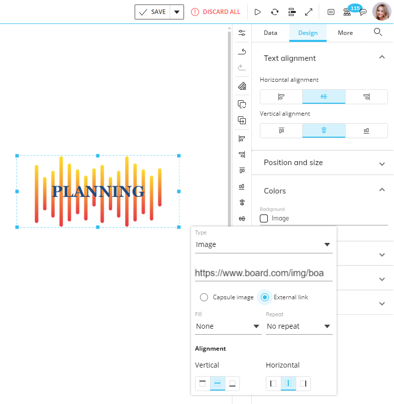
How to use a Label to display a custom image
You can configure a Label in order to display a custom image.
To do so, proceed as follows:
Select the Label Object.
Click on the Colors menu in the Design area of the Object Properties panel to the right of the Screen editing page to open it.
Click on the square under the "Background" field to open a popup menu. From the "Type" dropdown menu, select "Image".
Select the image location (Link or Capsule). Write in the link in the text field or choose a Capsule from the dropdown menu.
(Optional) Configure the image properties as desired.
Save the Screen.
Dynamic actions
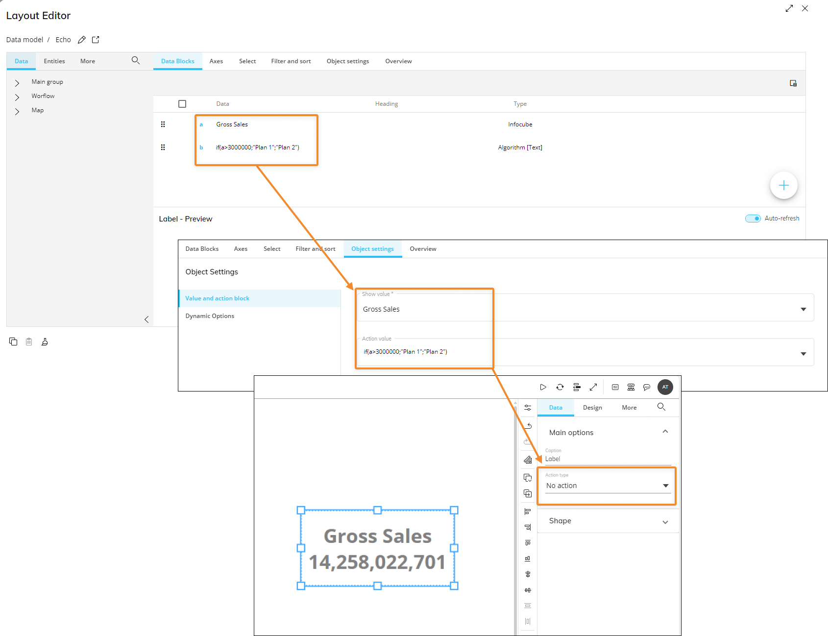
In addition to displaying values, a Label can be configured to run the actions below based on a value in a Cube or an Algorithm:
Go to Screen
Run Procedure
Go to URL
To do so, proceed as follows:
Create a new conditional Block in the Layout editor.
The Block must be configured as a Text Algorithm and its output must be a Screen name, a Procedure name, or a URL address.
In the Object settings of the Layout editor, select a Block (other than the conditional one you just created) in the "Show value" field.
In the "Action value" field, select the conditional Block and save the Layout.
In the Label properties panel, select one of the three supported actions mentioned above.
Save the Screen.
In the example below, if the Net Sales value is greater than 3 million, clicking the Label in Play Mode will open the "Plan 1" Screen, otherwise it will open the "Plan 2" Screen.
Interacting with the Label Object in Design Mode
In Design Mode, the Label Object doesn't support any interactive feature other than those available for its configuration. If you need to test the behavior of the Label, you must switch to Play Mode.