This topic describes all settings that can be applied to a Data View Object to customize its appearance and refine how data is displayed.
The Data View Object can be formatted through specific features and options available from the Object Properties panel of the Screen editing page.
The following groups of settings are available:
Formatting a Data View is possible from the Object Properties Panel, accessible from a Screen in Design Mode when a Data View is selected. There are three sections in this panel, two of which concern formatting: Data and Design. The following formatting options are organized by these two tabs and listed in the order that they are seen from top to bottom.
Object Data Properties to format a Data View
While selecting a Data View Object, access the Object Properties panel from the sliding panel on the right side of the Screen. Access the "Data" tab (which is the default panel displayed) to access data formatting options specific to a Data View.
Multiple Entities by row options
The Multiple Entities by row menu includes all options that can be applied when the Data View is associated with a Layout having two or more Entities set by row.
The following options are available:
Collapse groups. Enabling this option will collapse all row groups.
View totals on expanded groups. Displays group totals in row headers also when row groups are expanded.
If this option is enabled and the "Summary" property of Data Blocks is set to an option other than "Total" and "No total" in the Layout editor, group totals will be displayed only at the most nested level. This is a known limitation.
Disable group alerts. Disables color alerts on group headers.
Display Entity name in group headers. Displays the Entity name in group headers, right before the Entity member.
Show groups as an unbalanced hierarchy. Displays Entity members in row groups as an unbalanced hierarchy, i.e. the grouping visualization is ignored for any parent-child (one to one) relationship.
Flatten groups level. This option can be applied when the Data View is associated with a Layout having three or more Entities set by row and allows you to combine flattened and grouped views: select the Entity from which the flattening view should start from the dropdown menu to automatically apply the combined view.
Table Style
Under the Table style menu, the following options are available:
Disable alternate row highlighting. Disables highlighting on alternate rows (white and grey, by default).
Horizontal border lines. Draws a line before and after each row, except headers.
Vertical border lines. Draws a line before and after each column, except headers.
Multi-level column headers. Enables the organization of headers in a multi-level structure. This option is applicable only if two or more Entities are set by row.
If enabled on a Data View with two or more Entities by row, all subtotals are removed and only the grand totals are left.
If disabled on a Data View with two or more Entities by row, data is displayed in columns representing every possible combination between those Entities and the Data Blocks of the Layout, without groupings.
Wrap column headers. Enables text wrapping on column headers. When text wrapping is enabled, the columns width remains fixed and the row height is automatically readjusted to fit the entire text.
Wrap row headers. Enables text wrapping on row headers. When text wrapping is enabled, the row headers column width remains fixed and the row height is automatically readjusted to fit the entire text.
Hide column headers. Hides all column headers.
Disable default format template. Disables the automatic application of row templates set as default for specific Entities. See Templates below.
Propagate cell template on Drill-down. If enabled, when the user drills down on a formatted cell, the format settings are applied to the Data View in the drill-down window.
Frozen rows and columns fields. Keeps an area of the Data View visible while you scroll to another area of the Object. The feature is available both in Play Mode and in Design Mode. The Freeze Panes feature always locks rows and columns starting from the top left corner of the Data View.
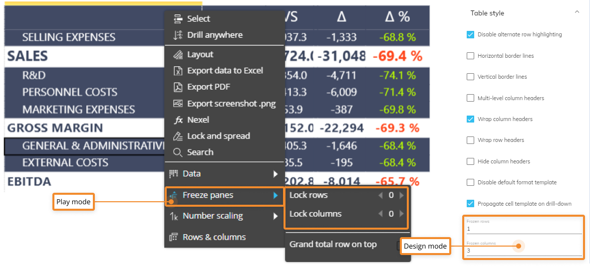
The configuration shown above locks the first two rows on top and the three leftmost columns of the Data View, resulting in a locked area made of six cells.
Columns
Under the Columns menu from the Data tab of the Object Properties panel, the following options are available:
Wrap text. Enables text wrapping on cells (useful for text Cubes or other text columns).
Disable sorting on columns. Disables clicking on column headers to automatically sort cells values in Play Mode (in descending or ascending order).
Allow user to resize. Enables users to resize columns by placing the mouse pointer on the boundary line between column headers and dragging the double-headed arrow to widen or to make the column narrower.
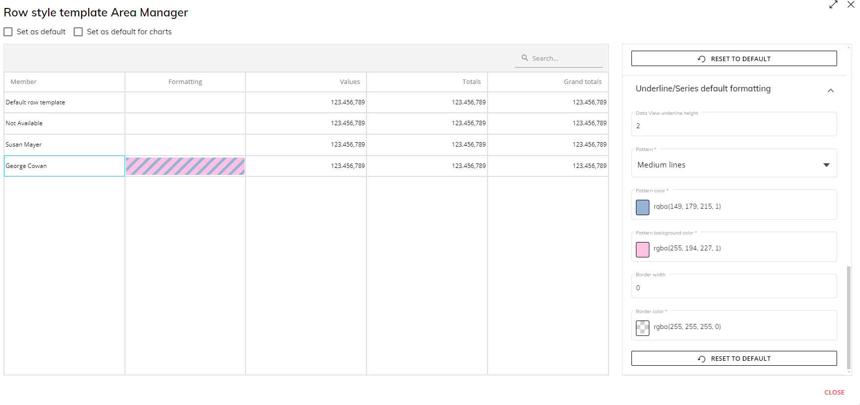
Templates
Under the Templates menu, you can apply a previously saved row style templates to the Data View by choosing a template from the dropdown menu.
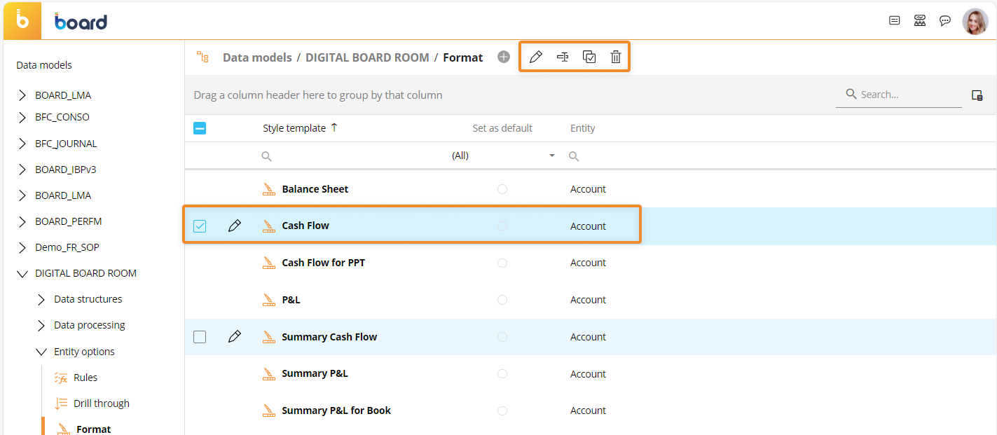
Click the Templates button to open the Templates page. A table lists all available templates that can be renamed, edited, duplicated or deleted: select at least one template to reveal these options.
Click on the orange plus icon (
 ) and a popup window will appear: give your template a name, associate it with an Entity, decide whether to set it as default for all members of that Entity and click "OK".
You can create as many templates as needed, but there can be only one default template for each Entity of the Data Model.
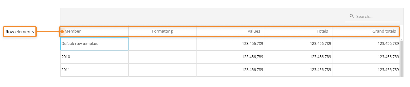
To edit a template, select it from the list and click "EDIT" to open the template configuration window. From it, you can customize the cell background color, cell borders, font settings, and number format for the following elements of each row:
Members (Members of Entities set by row or by column)
Values (the actual cells of the row)
Totals (all cells displaying calculated subtotals, if any)
Grand Totals
Templates can be customized for individual Entities or members of Entities.
The "Template" widget is located in the Object Properties panel in Design Mode where you can choose a Template from the dropdown menu.
In the "Row template" dropdown menu, Developers will find all templates defined in the Data Model, regardless of the Entities used in the Layout. This approach has been also applied to the same menu in the Data view properties panel.
Templates can be reused in other Data Views and, if configured as default for specific Entity members, they are automatically applied when that Entity is set by row in a Layout. This is particularly useful for Entities such as a chart of accounts, from which financial statements are created.
Since a template is configuration set to a specific Entity, it is saved in the Data Model where that Entity resides, under the "Format" section. In this case, nothing is saved in the Capsule except for one or more links to the templates in use. If you need to share a template between different Board Platforms (for example, a template created in a Development environment that needs to be available also in a Production environment), you must use the Transporter tool or recreate it manually in the desired Platform.
Using the Select to apply a template
To apply an already configured template to a single member of a specified Entity using the Select:
Perform a Select on a member of an Entity and click "Save".
Under the Templates options, select a Row Template.
In order for this process to work, the following requirements must be met:
The template is not set as default and has been chosen manually from the "TEMPLATES" widget in Design Mode.
The Entity associated with the template is not used in a "Refer To" or a "Detail By" option and it's not in the Layout axes (By Row or By Column).
The Select on the Entity associated with the template includes only one Entity member.
The configured template can be applied with selections made using the following features/Objects:
Screen selection
Layout selection
Selectors
Pagers
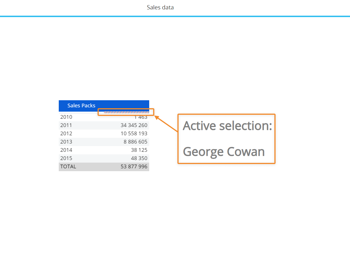
Example
In the following Screen, a template on the "Area Manager" Entity is applied to the Data View:
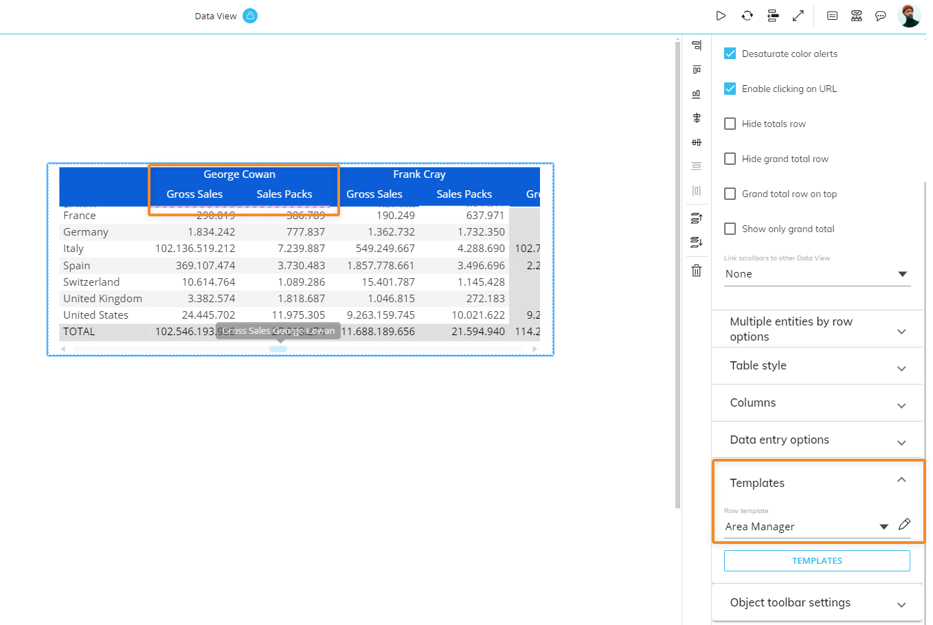
The Template affects only the member "George Cowan":
If a selection on the same member is applied in Play Mode, the template is correctly applied to the Data view, even if the "Area manager" Entity is not used in the Layout.
Object toolbar settings
The following properties of the Object toolbar settings are:
Enabled. Select it to enable the toolbar in Play Mode.
Always visible. If enabled, pins the toolbar on top of the Object.
Dark mode. Select it to apply the dark theme to the toolbar. Deselect it to apply the light theme to the toolbar.
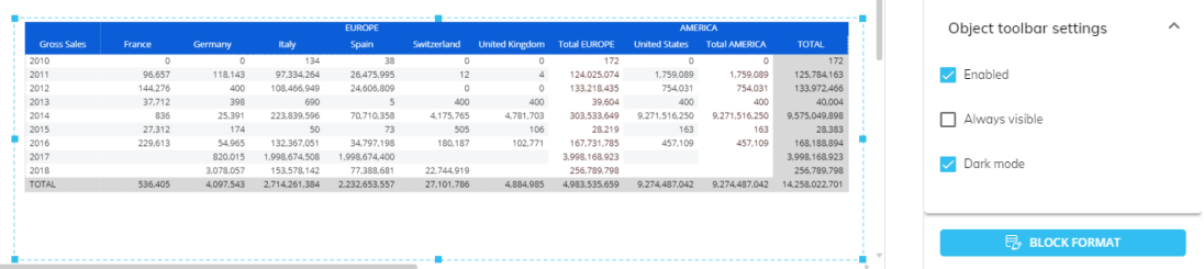
If multiple Screen Objects are selected in the Screen design area, the object properties right panel will show options common to those Objects.
Block Format (Button)
The Block Format button allows you to format each column of the Data View by applying formatting options to each Block of the Layout.
Click the Block Format button to open the Block format configuration window.
From the Block format configuration window, you can customize the cell background color, cell borders, font settings, and number format for the following elements of each column:
Label (the column header)
Value (the actual cells of the column)
Total (all cells displaying calculated subtotals, if any)
Grand Total
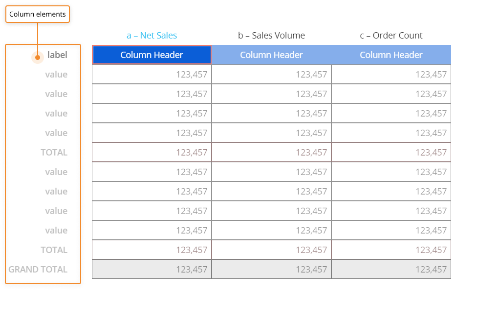
To format a cell, click on it and apply the desired settings from the right panel. Click the "SAVE" button to apply changes and close the configuration window.
The option "Format negative numbers with parentheses" displays negative numbers in parentheses instead of using the minus sign when enabled. This option shouldn't be used on cells where Data Entry is enabled, because it doesn't allow you to save manually entered values.
It's important to understand the order in which Board applies formatting styles to the Data View, as this sequence determines how it will appear to the end user. First, the default Data View style is applied, then the style defined via the Block Format button (if any). Finally, the row style defined in the Template section is applied (if any). If one of those properties is not defined, the previous one in the sequence is applied.
Object Design Properties for formatting a Data View
While selecting a Data View Object, access the Object Properties panel from the sliding panel on the right side of the Screen. Select the "Design" tab to access design formatting options specific to a Data View.
Columns
Under the Columns menu from the Data tab of the Object Properties panel, the following options are available:
Columns. Choose which columns you would like to add formatting to: all columns, the By Row column, or a Cube column.
Column width. Allows the configuration of the pixel width of all columns at once.
Underline. Enable this toggle in order to add an underline to column headers of the Data View. The underline can be completely customized in terms of height, fill pattern, color, and border from the options below it as well as which columns to underline (chosen from the "Columns" dropdown menu above).
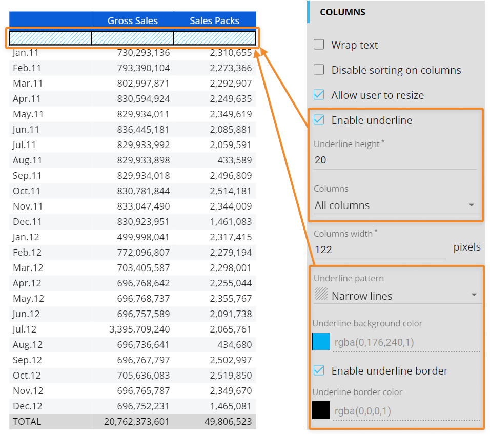
Underline height. Customize the height of the underline by changing the pixel number in this field. The default is 14 px.
Underline pattern. Choose the pattern you would like the underline to have. You can choose from:
None (default)
Narrow lines
Wide lines
Narrow waves
Wide waves
Small dots
Medium dots
Large dots
Underline color. Choose the color you would like your underline to be. If you choose "None" as the pattern, the underline color will fill the whole space. If you choose a pattern, this color choice will apply to the pattern.
Underline pattern background color. Choose the background color of the underline pattern. This is only applicable when a pattern is chosen and will not apply when "None" is chosen.
Enable underline border. This option creates a border around the underline cell. If you enable this option, you can choose what color you want the border to be.
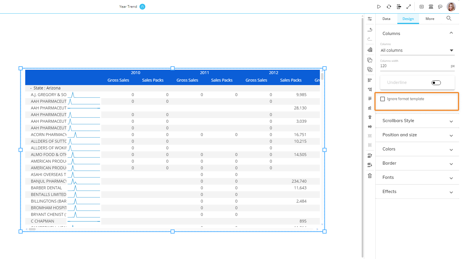
Ignore template for underline. Allows the Developer to ignore the underline options in the applied row style template for specific Blocks (columns) of the Layout. The property is disabled by default.
Ignore format template. Allows the Developer to ignore the applied row style template for specific Entities in the axes and Blocks (columns) of the Layout. This property is disabled by default.
Formatting priority sequence for a Data View
Given the potential impact of these new formatting options, it's important to understand the order in which Board applies formatting styles to Data Views and charts, as this sequence determines how it will appear to the Planners:
The default Data View style defined at the Object level is applied.
The style defined via the Block Format button is applied (if any).
The row style defined in the Template section is applied (if any).
If a "Refer To" or "Detail By" option is configured on an Entity which has a default template, this template will be applied with the highest priority above all other formatting properties.
If one of those properties is not defined, the previous one in the sequence is applied.
Templates are always applied during the Layout execution.
Existing formatting properties applied at the Object level are always kept, even if a template is applied: if you unlink a template from the Object, the Object will automatically revert to the previously saved formatting properties. This also applies to default templates.
If a template applies custom formatting properties only to specific members of an Entity, other members of that Entity will inherit the existing formatting properties applied at the Object level.
Scrollbars Style
Under the Scrollbars Style menu, you can customize the scrollbars of a Data View.
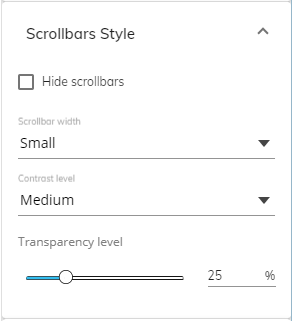
The options for this Object setting are the following:
Hide scrollbars. Enable this option to hide the scrollbars. The option is disabled by default.
Scrollbar width. You can choose the width of the scrollbars from the dedicated drop-down list. You can choose one of the following options: Small, Medium, Large.
Contrast level. You can choose the color contrast of the scrollbars from the dedicated drop-down list. You can choose one of the following options: Small, Medium, Large.
Transparency level. You can choose the transparency level of the scrollbars by sliding the transparency level slider or manually entering a transparency level percentage number in the dedicated field.
These settings are also included in the properties that can be copied and pasted between Objects using the "Copy and Paste" feature in the Properties toolbar of the right sliding panel in the Capsule workspace.
Colors
The color options for a Data View are specific to it as an Object and offer the following customization options:
Background. Customizes the background colors of the Data View, including the extra space that borders around the Object when the sizing allows it and excluding every other row in the grid when data is present which remain white.
Background. Colors the background of the Data View. When data appears in the Data View, every other row is colored white to differentiate between rows.
Highlighted. Colors every other row, where the other rows remain white. If the Background color was configured, the rows that were once that color are replaced with the highlighted color while the other rows remain white and the extra space around the Data View remain the customized "Background" color from above.
Grid. Customizes the colors of the whole grid without every second row remaining white.
Background. Colors the whole grid one color. Overrides the Highlighted color chosen above.
Foreground. Colors the text of the whole Grid.
Cell. Customizes the colors of only the cell areas of a Data View, which excludes the headers and totals areas.
Background. Colors every other row another color. This is in addition to the Grid color. Whereas the customizations from "Background" only highlight every other row with one custom color and the other color is always white, using Grid and Cell background color settings can customize both colors highlight each row.
Foreground. Colors the text within all the cells. This excludes headers and totals.
Border. Colors the borders of each individual cell.
Data entry. Customizes the colors of the cells related to Data Entry.
Cell foreground. Colors the text within the Data Entry cells.
Cell background. Colors the background of the Data Entry cells.
Total foreground. Colors the text of the Data Entry total cells, which display under each Row group when multiple Entities are grouped by Row.
Total background. Colors the cell background of the Data Entry total cells, which display under each Row group when multiple Entities are grouped by Row.
Grand total foreground. Colors the text of the Data Entry grand total cells, which display at the bottom of each column and at the end of each row.
Grand total background. Colors the cell background of the Data Entry grand total cells, which display at the bottom of each column and at the end of each row.
Header. Customizes the colors of the header cells.
Foreground. Colors the text of all the header cells.
Background. Colors the background of all the header cells.
Border. Colors the border of all the header cells.
Total. Customizes the colors of the cells that display the totals of each Row group, which can only display if two or more Entities are set By Row.
Foreground. Colors the text of the total cells.
Background. Colors the cell background of the total cells.
Grand total. Customizes the colors of the grand total cells, which display at the bottom of each column and at the end of each row.
Foreground. Colors the text of the grand total cells.
Background. Colors the cell background of the grand total cells.
Group by. Customize the cells that display each Row group, which is only available when more than one Entity is set By Row. For example, if you dimension a Data View row by Year and Quarter, in the by Row column, each year will display on a row cell with the corresponding quarters underneath it and the row cell that displays the year will receive the "Group by" color customization.
Foreground. Colors the text of the cells that display the name of each Row group.
Background. Colors the background of the cells of the row that displays the name of each Row group.
Learn more about: