After creating a Flex Grid and configuring the Layout, the formatting can be done directly from the Flex Grid on a Screen while in Design mode. Formatting options, like grouping, sorting, and filtering, can be exactly the same for an end user in Play mode if the configuration allows for it, the difference being that the Developer in Design mode can save a default view for Play mode.
The topics covered on formatting a Flex Grid are as follows:
Object Data properties & display options for pivot capabilities
While selecting a Flex Grid Object, access the Object Properties panel from the sliding panel on the right side of the Screen. Access the "Data" tab (which is the default panel displayed) to access data formatting options specific to a Flex Grid.
Main options
The Object Data properties specific to a Flex Grid are display options for both flat mode and Pivot mode which allow or restrict end users to use all, none, or certain pivot capabilities. The check boxes, Expansion level, Group display type, Sorting modification, and Filtering modification are explained below: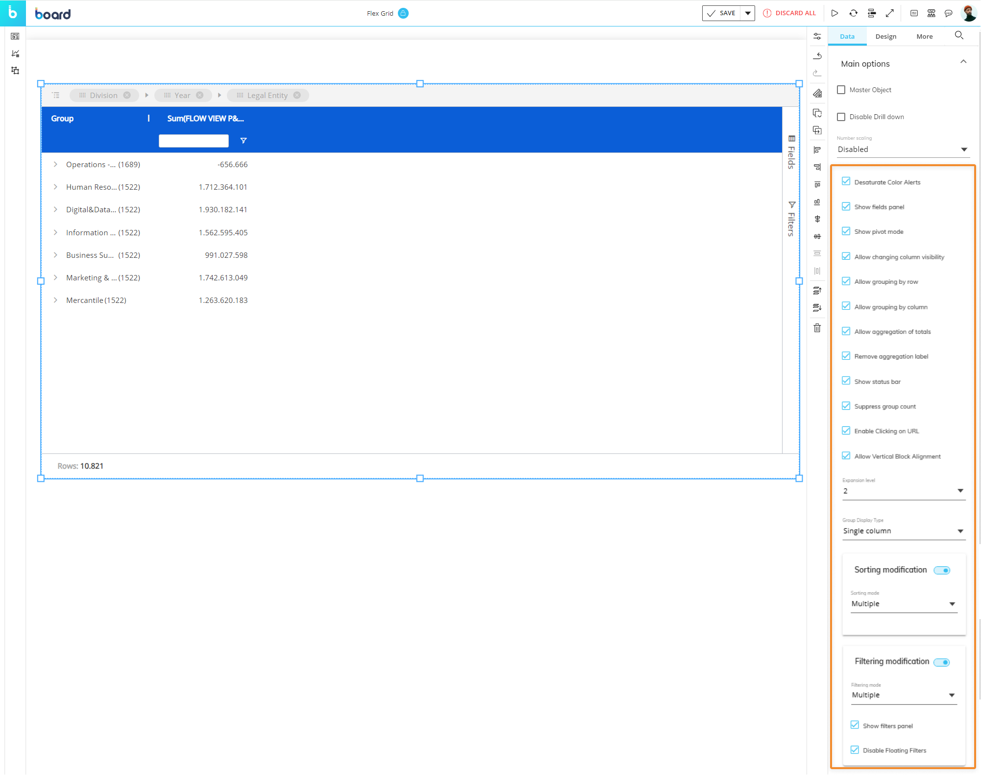
Desaturate Color Alerts (enabled by default). Enabled by default. Displays different shades of colors configured in the Color alert option of the Layout based on actual cell values. If disabled, only the colors configured in the Color alert option are displayed. This option applies to Figures, Blocks, and Blocks only alert formats.
Show Fields panel. Enabled by default. Enables or disables the display of the "Fields" panel in Play mode.
Show Pivot mode. Enabled by default. Enables or disables the possibility for end users to use Pivot Mode in Play mode.
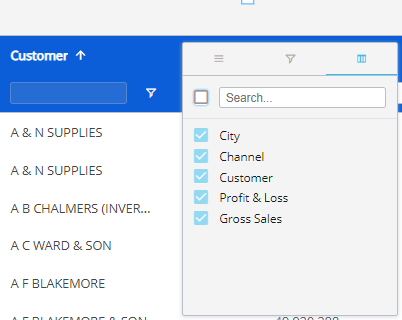
Allow changing column visibility. Enabled by default. Allows or disallows end users to change the visibility of columns shown in flat mode from the Column menu in the Quick pivoting tab
 . In the image below, the checkboxes are disabled and cannot be unselected to hide a column.
Allow grouping by row. Enabled by default. Allows or disallows end users to group fields By Row in Play mode.
Allow grouping by column. Enabled by default. Allows or disallows end users to group fields By Row in Play mode.
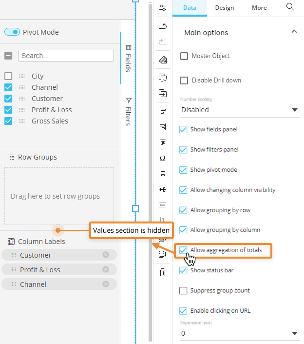
Allow aggregation of totals. Enabled by default. Allows or removes the "Values" area of the Fields panel in both flat view and Pivot Mode. The image below shows the the Fields panel without the "Values" section because this setting disabled.
Remove aggregation label. Enabled by default. Removes the aggregation label of Column headers when fields are added to the “Values” area. E.g. “Count (Year)” and “Sum (Gross Sales)” become “Year” and “Gross Sales”, respectively.
Show status bar. Enabled by default. Enables or disables the status bar at the bottom of the Flex Grid.
Suppress group count. When enabled, removes the number that is displayed in parenthesis next to each row group.
Disabled by default. This number counts the dataset rows which have been grouped by row, both in flat and Pivot mode.
Enable clicking URL. Enabled by default. Once enabled, activates the hyperlinks in Play mode within a Flex Grid.
Allow Vertical Block Alignment. Enabled by default. Allows the possibility to view data in a vertical format.
Allow Docked Charts in Drill Down. Enabled by default. Allows Planners to used Docked Charts in a Drill Down.
Expansion level
The Expansion level customizes the view of the expanded/collapsed Row groups for the end user.
For example, if a Flex Grid was dimensioned by 3 Row groups, the default view shows all the rows collapsed under the most-aggregated group. If this setting is set to 1, the default view would expand the most-aggregated Row group to show the next Row group within the tree. If this setting is set to 2, the default view would show the most-aggregated Row group and the next Row group expanded so that the third Row group would be exposed. Set to 3 in order to expand all 3 Row groups.
This setting is only for the default view, and the end user can still use the expand/collapse options manually.
Group display type
The Group display type section displays the row groups either in a single column (default), multiple columns (for 2 or more), or only as row groups without any headers or columns. The options chosen here also have implications on the printable report when exporting to Excel. Read more about Group display type settings when exporting a Flex Grid to Excel. Choose one of the following 3 options from the dropdown menu:
Single column (default). A single group column is added to the grid which displays all row groups.
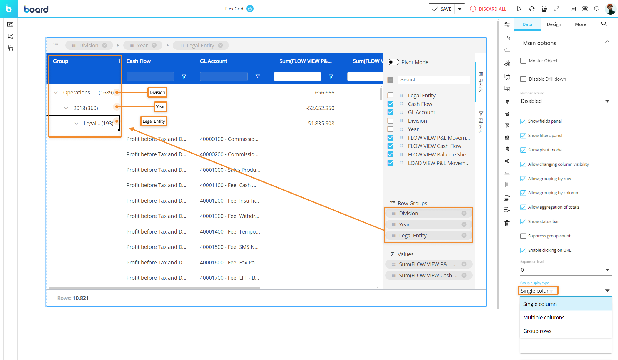
Multiple. Separate group columns will be added to the grid for each column used to group the rows by.
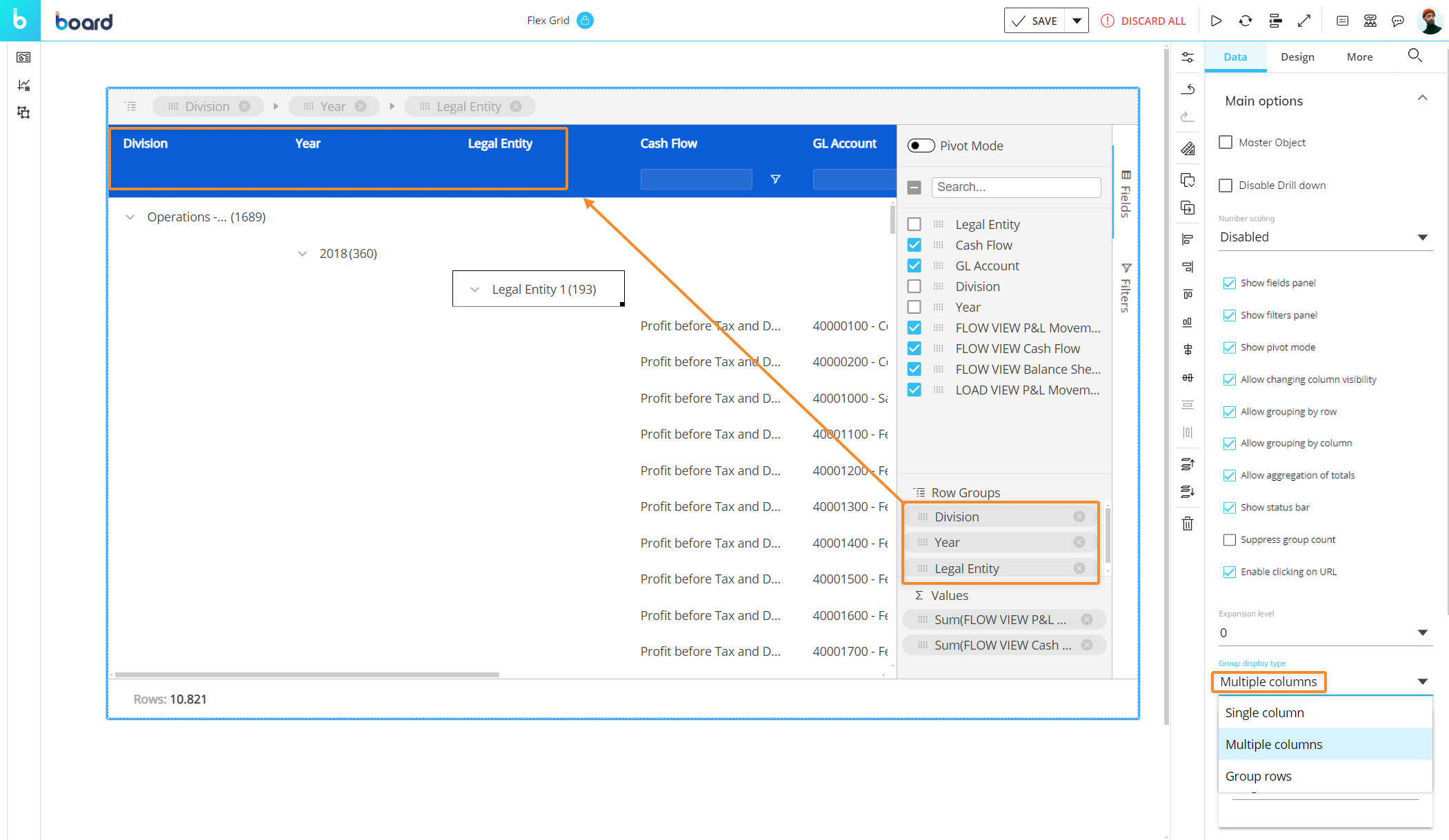
Groups row. Removes Group headers and displays the grouping fields only in rows, similar to a Data View (only available in flat mode).

Sorting modification
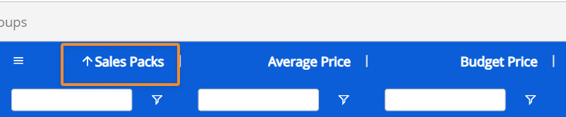
The Sorting modification section enables or disables the end user's ability to sort. If enabled, choose "Single" or "Multiple":
Single. Restricts the end user to only one field sort at a time. Sorting another field will automatically remove the last one.
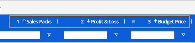
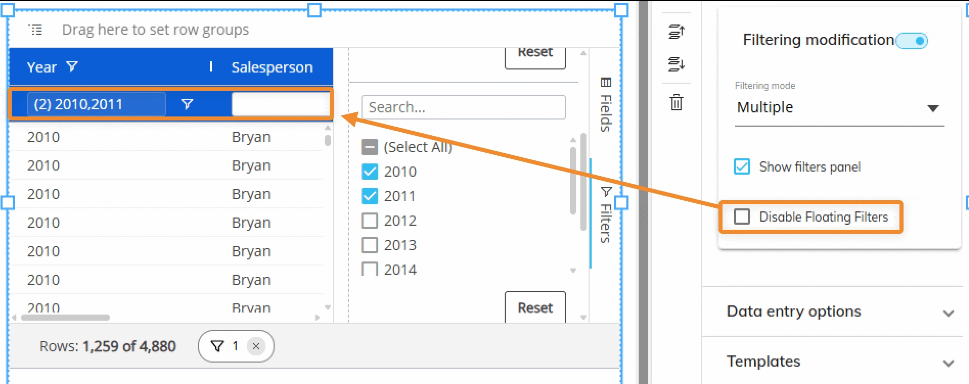
Multiple. Allows the end user to sort multiple columns at a time. The numbers indicating which is the first (1), second (2), third (3), and so on
Filtering modification
The Filtering modification section enables or disables the end user's ability to filter. If enabled, you can choose between "Single" or "Multiple", where "Single" offers 1 filter per column and "Multiple" offers multiple types of filters per column.
Single. Restricts the user's ability to apply only 1 filter per column.
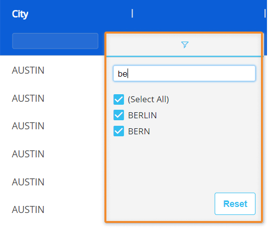
Text field or Time Entity. A single filter on a text field or Time Entity offers a text field search box (as shown below) from the filter menu.
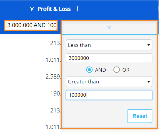
Numeric field. A single filter on a field with numeric data offers dropdown filter options combined with numeric field boxes with the possibility to use AND/OR conditions. The search box in the column header is also available for filtering directly from it.
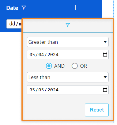
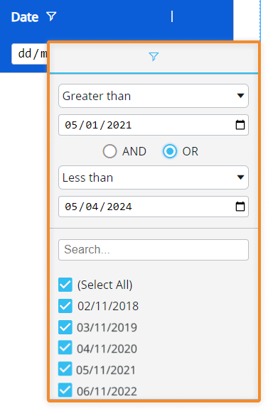
Date field. A single filter on a date field allows you to filter by dates with dropdown menus of filter options combined with a calendar with the possibility to use AND/OR conditions.
Multiple. Allows the end user to apply multiple separate filters per column at a time. You can use multiple filters for each column, which unlocks a more advanced way to filter.
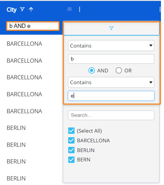
Text field or Time Entity. When multiple filtering is configured, a text field or Time Entity column allows for an additional filter option to what is offered in a single filtering configuration: dropdown filter options combined with text field boxes with the possibility to use AND/OR conditions. The checkbox filters, which are the only option for a single filter on a text field, now will show results of the additional filter above them. In addition, the search box in the column header becomes available for direct filtering from it.
In the example below, the user can search for words that contain both the letters "b" and "e" resulting in BARCELONA, BERLIN, and BERN instead of only BERLIN and BERN like in the single filter example.
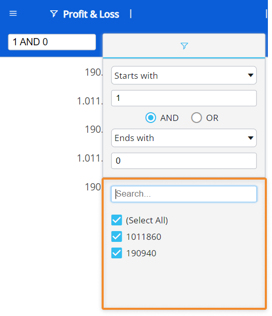
Numeric field. When multiple filtering is allowed, a field that contains numeric data allows for an additional filtering option to what is offered in a single filtering configuration: checkbox fields that reflect the of the results from the above filter. In addition, you can also search through the results using the search box above the checkboxes.
Date field. When multiple filtering is allowed, a Date field allows for an additional filtering option to what is offered in a single filtering configuration: checkbox fields that reflect the of the results from the above filter. In addition, you can also search through the results using the search box above the checkboxes.
Show filters panel. Enabled by default. Shows the filters panel on the right side bar of the Flex Grid. Disable to remove.
Disable Floating Filters. Disables the floating filters feature.
Data entry options
To enable Data Entry for end users, enable the toggle in this section.
Set trigger. Enable this trigger to allow Data Entry options.
Customize color Formatting
Customizing the color format of a Flex Grid is similar to a Data View. Select the Object in Design mode and access the Object properties panel on the right.
Formatting in the Data panel: Templates and Block Format
From the Data submenu of the Object properties panel, you can customize Templates and Block format similar to a Data View. Click on the TEMPLATES or BLOCK FORMAT button to open a popup window where you can configure the Row style template or Block format. Configuring a new template will bring you to the Templates page.

Row format templates are
To ignore any default formatting configured, check the "Disable default format template" checkbox.

When configuring a Block format for a Flex Grid, the Block format is applied across all of the block columns that may appear when using the pivot tool. For example, if a Gross Sales Block is formatted to have a green background, and the Flex Grid is configured to have an Entity grouped by column like Country, the Gross Sales block will appear under each country column group, and those columns will all display with the same formatting, which in the example is a green background.
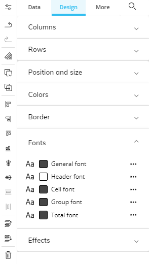
Formatting in the Design panel
From the Design submenu of the Object properties panel, you can customize the colors, border, fonts, and transparency similar to a Data View.
Columns
The Columns section allows you to customize the table style.
Columns. Choose the column or “All columns” to customize.
Column Width. Adjust the width of all or some columns of Flex Grid.
Rows
Height. This setting changes the height of the heading and row cells.
Extra Narrow. Rows take up the least amount of space.
Narrow. Rows take up less space than Compact.
Compact (Default). Rows take up moderate space.
Large. Rows take up more space than the the Compact setting and less than the Extra Large setting.
Extra Large. Rows take up the most space.
Custom. You can customize the height with the below settings:
Row Height
Header Height
“Custom” gives you the freedom to adjust the size of the density within the range of 14-100px for both rows and headers. All other sizes are predefined.
The density setting of the row spacing does not adjust when you change the font size. If you make the cell or heading font size smaller, more space between rows and around the heading text will appear. If you make the cell or heading font size bigger, less space between rows and surrounding the heading text will appear.
If the font size is too big for the density setting, you will have to adjust the density setting or font size accordingly.
Exports of a Flex Grid to a Microsoft Excel Workbook for Board M365 print the current row height from the Flex Grid as a manual row height in Excel. This applies when the Flex Grid is formatted with a row density (other than the default), such as "Extra Narrow", "Narrow", "Large", "Extra Large", or "Custom".
Because of this, actions that change a Table configuration do not reapply the configured Flex Grid row height to new or changed rows.
Rows that were exported from the original Flex Grid keep their custom height. Rows that appear later, for example after expanding row groups, use the standard Excel row height.
You can manually change row heights in Excel after the export. This behavior only affects how row heights are displayed in Excel.
.png)
Position and size
Customize the configuration of the Flex Grid’s position on the Screen, its height, width, left and top margin, and rotation angle.
Read more about common Object properties.
Colors
The different customizations available for Flex Grid colors are:
Grid. Customization of the whole Grid at once instead of every separate part so that value cells and headers are all uniform.
Background. Customizes every cell in the Flex Grid to one color. Headers, cells, and group background colors can be customized afterward.
Foreground. Customizes every value in every cell of the Flex Grid to one color, even Headers. If you want to customize headers to have a different color text, customize them under "Fonts".
Borders. Add a color to the all Flex Grid borders. This will add a border to every cell in the Grid, even headers. Headers and cells border colors can be customized afterward.
Header. Customizes header background and border color.
Header background. Customizes the column header background color. If done after customizing Flex Grid, the cells other than the column headers stay the same.
Header drop area background. Customizes the top bar of the Flex Grid where you drop fields to group by row or column.
Header drop area border. Customizes the border of the top bar where you drop fields to group by row or column.
Header border color. Customizes the header border color. If done after customizing Flex Grid, the borders other than the column headers stay the same.
Side bar. Customizes the right-side bar where “Fields” and “Filters” appear.
Background. Customizes the side bar background.
Border. Customizes the side bar border.
Status bar. Customizes the status bar at the bottom of the Flex Grid.
Background. Customizes the status bar background.
Border. Customizes the status bar border.
Cell. Customizes cell background and border colors, horizontally and vertically.
Cell background. Customizes the cell background.
Highlighted cell background. Customizes the highlighted cell background.
Horizontal border color. Customizes only the cell horizontal border color.
Vertical border color. Customizes only the cell vertical border color.
Group. Customize the cell background for groups and totals.
Group background. Customizes the color of cells for groups.
Total background. Customizes the color of cells with total values.
Data Entry. Customize the colors shown when conducting Data Entry.
Cell foreground. Customizes the font of the saved data entry.
Cell background. Customizes the cell background of the saved data entry.
Total foreground. Customizes the font of the saved data entry’s total.
Total background. Customizes the cell background of the saved data entry’s total.
Border
The different customizations available for Flex Grid borders are:
Color. Customizes the Flex Grid border.
Thickness. Customizes the thickness of the border.
Radius. Customizes the roundness of the border.
Text
The different customizations available for Flex Grid fonts are:
Header font. Customize the font size, style, and color of the header value or text.
Cell font. Customize the font size, style, and color of the cell value or text.
Group font. Customize the font size, style, and color of the group value or text.
Total font. Customize the font size, style, and color of the total value or text.
Wrap Header Text. Enable to wrap header text.
Wrap Text. Enable to wrap cell text.
Effects
Object opacity. Customizes the opacity of the Object. Default is at 100% so no opacity appears.
Design priority hierarchy
The color customization from the Object properties panel has the lowest priority.
The "Grid" section is the lowest priority of the color customization within the Object properties panel, and the formatting can be overridden by customizing "Header", "Cell", and/or "Group".
The Block format is the next priority, which will override the color customizations made from the Object properties panel.
The Row style Template is the highest priority and will override any Object formatting.
When a parent Entity is customized with the Row style template formatting, all its children will also have the same formatting. When there are two default formats, the highest hierarchical Entity will override the other format. For example, if year and quarter are formatted, the year format will override the quarter format.