The Data View Object provides the following interactive features:
Any changes made to the Data View using the functions listed above will be lost if you leave the Screen or update it, except for Data Entry actions.
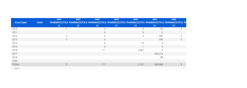
Interactive Selection on rows and columns
The Data View Object allows the user to make a selection on an Entity by selecting rows and/or columns.
For example, on a Data View displaying Countries in rows, it is possible to click on one or more rows (i.e. Countries) and then use them as selection criteria so that other Objects on the Screen are refreshed accordingly.
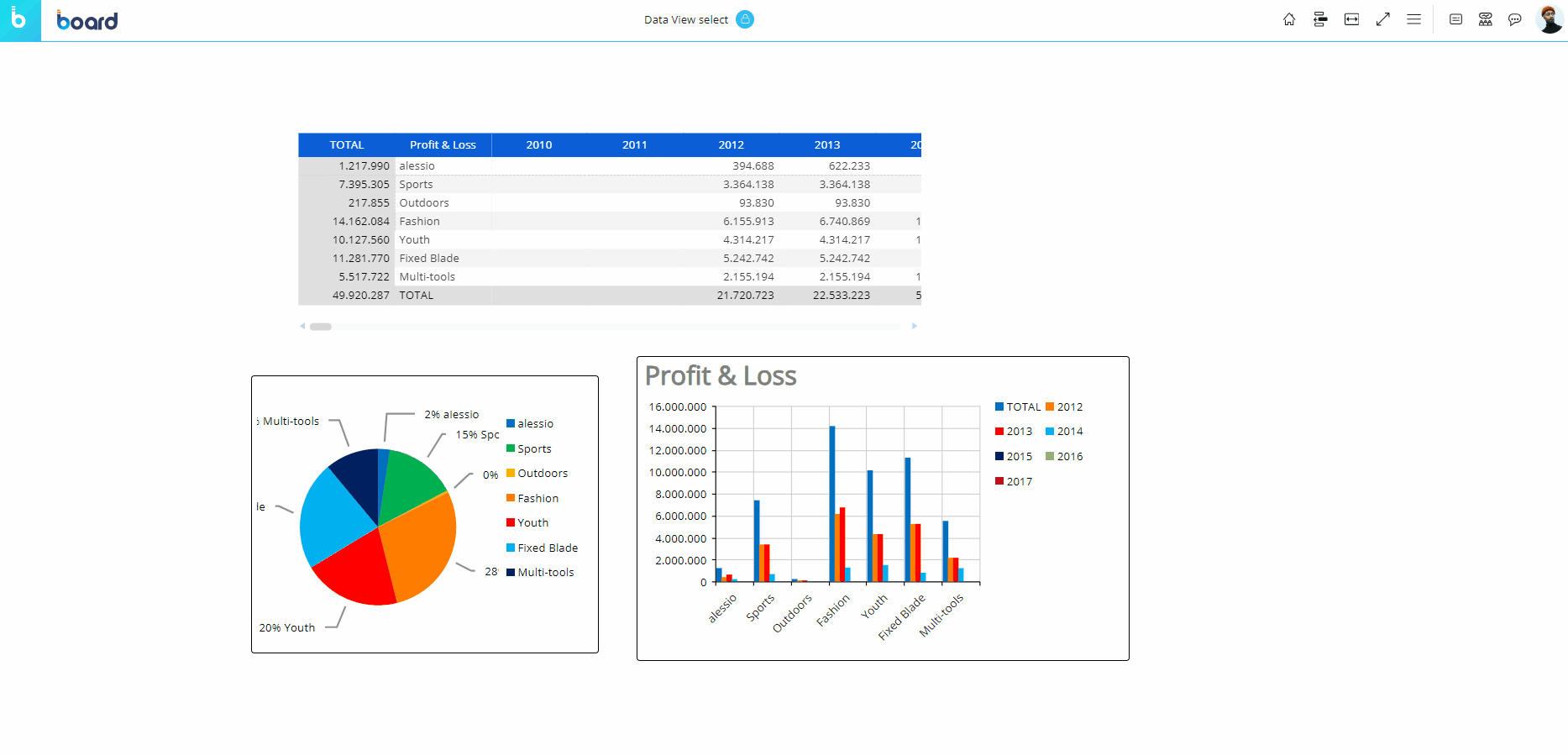
As you can see in the example above, once a selection is applied the other Objects on the Screen are refreshed to show data for the selected items only.
To reset the selection made on a Data View Object, click the reset icon (  ) in the top left corner of the Data View.
The selection can be made on the Entities set "By Row" and "By Column".
Sorting on columns
Click on column headers to automatically sort cells values (in descending or ascending order). Click three times to restore the default view.
Master
If the Data View has been configured as a Master Object, clicking on a row header (i.e. the Entity members set by row) will update the data displayed by all other Objects on the Screen in order to show only the data relating to the clicked header. The Master Object result is similar to applying a Screen Selection.
By clicking on the "Disable master" icon (  ) in the sliding toolbar, you can disable this option. Click on the "Enable master" icon (
  ) to re-enable it.
Drill Anywhere
If the configuration allows it, the Drill Anywhere button allows Planners to configure a default drill that will be available for all cells of the Data View, except column headers.
Clicking on the Drill Anywhere icon (  ) (if it is available to end users from the configuration) in the sliding toolbar will open a window where you can choose, depending on the configuration, which kind of drill you want to deploy: Entity, Screen, Procedure, or Drill Through. Select a type from the available tabs and then choose an Entity, Screen, Procedure, or Drill Through from the list available to drill down on. Then click "APPLY" or double-click on the Entity, Screen, Procedure, or Drill Through to save the default drill, close the window, and perform it.
Once the drill is saved, it can be easily performed by clicking on the Drill Down icon (  ).
).
The Drill Anywhere function is available also in the drill-down windows where you can create your own drill-down paths at different levels of granularity.
Drill Down
Once you have configured a drill using the Drill Anywhere function, click the Drill Down icon (  ) to perform it on the selected cell of the Data View.
Drill-to-Screen
If a Drill-to-Screen has been configured on the Data View, select a cell and click the Drill Down icon (  ) , double-click on a row header (Entity member) or a cell to follow the drill path configured by a Developer from the Data View to another Screen of the current Capsule.
To facilitate a different Drill-to-Screen, if the configuration allows it, select a cell and click on the Drill Anywhere icon (  ) to open a configuration window where you can choose from a list of available Screens to deploy as a drill and set as the default.
Depending on the Drill-to-Screen configuration, the destination Screen will open with:
A selection based on the Entity member selected or double-clicked in the Data View.
A selection based on the row and column item corresponding to the cell selected or double-clicked in the Data View.
No inherited selection.
Drill-Procedure
If a Drill-Procedure has been configured on the Data View, select a cell and click the Drill Down icon (  ), double-click on a row header (Entity member) or a cell to follow the drill path configured by a Developer from the Data View to another Procedure of the current Capsule.
To facilitate a different Drill-Procedure, if the configuration allows it, select a cell and click on the Drill Anywhere icon (  ) to open a configuration window where you can choose from a list of available Procedures to deploy as a drill and set as a default.
Depending on the Drill-Procedure configuration, the Procedure will run with:
A selection based on the Entity member selected or double-clicked in the Data View.
A selection based on the row and column item corresponding to the cell selected or double-clicked in the Data View.
No inherited selection.
Data Entry
The Data View allows the entry of numeric data, dates, text, and even files into Cubes. See Data Entry on Cubes and Data Block settings for more details.
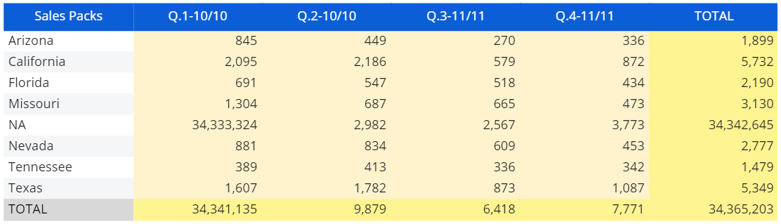
When Data Entry is enabled on a Cube, the background of the total cells become yellow, while the background of the value cells become beige (unless otherwise formatted), as in the following example:
To perform a Data Entry action, double click on a cell to enter data (either by typing a value, by picking a date from a date picker, and so on). To upload files or pictures, single click the corresponding cell to bring up a tooltip with the download, upload, and delete buttons.
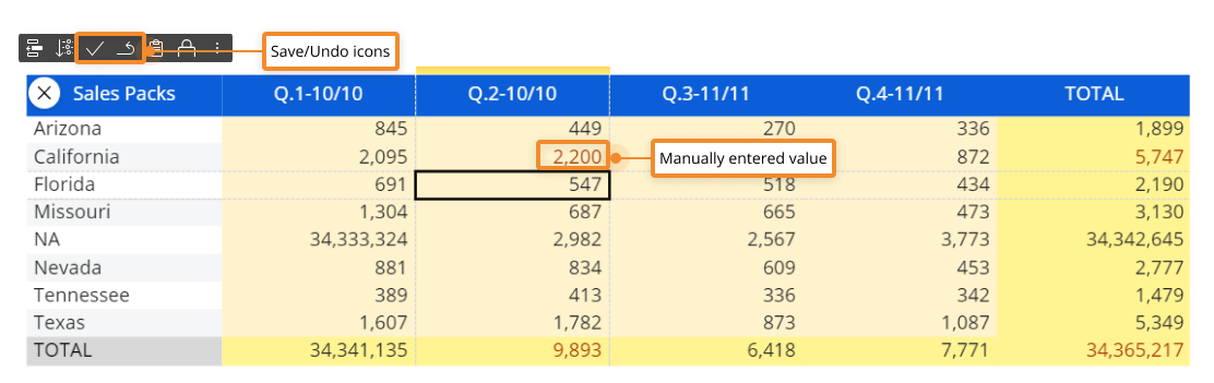
If Save/Undo mode is enabled on the Screen, after you have entered a value, press the save icon at the top left of the Data View to actually save the value in the Cube. You can also save by pressing the F9 key on your keyboard.
The undo arrow icon allows you to restore the last saved values (i.e. it discards all unsaved changes).
Unsaved values and totals that depend on those values are shown in red (unless otherwise formatted). When you click the save icon, their text color will change to match the text color of previously saved values, indicating that all changes have been saved in the target Cube. In case of suggested values taken from an Entity or a Custom list, the user will be presented with multiple suggested values for a single Data Entry action. The list supports vertical scrolling and its elements are filtered as the user writes in the cell. The list displays a maximum of 200 items: if the desired item is not displayed in the list, start typing in the cell to search on the entire set of suggested values.
When the Data Entry option is enabled in the Layout, after you have manually entered data in a cell, the Object toolbar in the top left corner of the Data View will automatically show the Save/Undo icons (if Save/Undo mode is enabled on the Screen) and the Lock/Unlock icons (see Lock and Spread for more details).
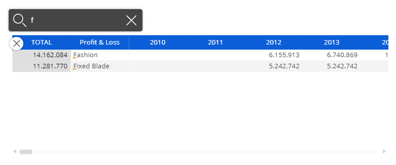
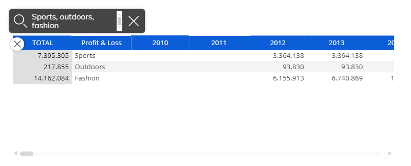
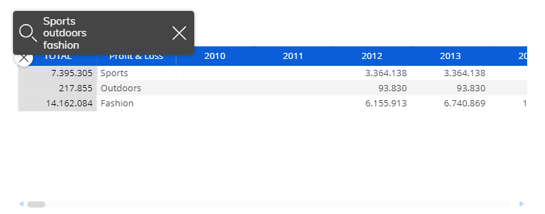
Fast Search
The Fast Search feature is available in the Object toolbar and allows you to easily locate information within the Data View via the built-in search field. The feature is particularly useful when searching through multiple columns or rows.
To use it, click the Magnifying glass icon in the Object toolbar and type the string you want to search for in the Data View. The Items matching your search will be highlighted as shown below:
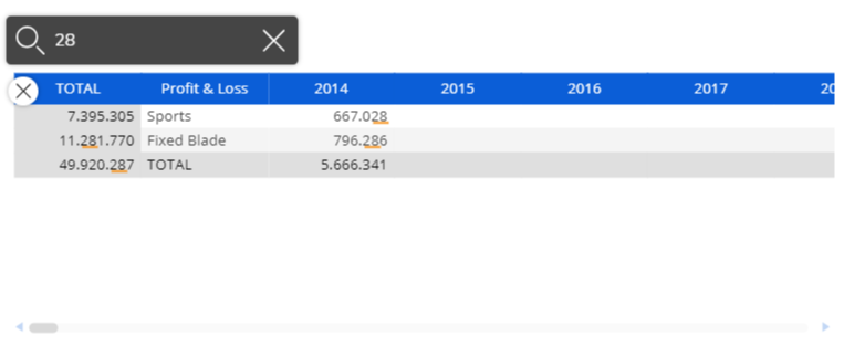
You can also search for multiple strings at once by typing each one separated by a comma or by typing each string on a new line in the search field.
To reset the search field, delete the string you typed or click the paint brush icon that will now display in the Object toolbar.
Important notes on the Fast Search
The search string is underlined in yellow on all the Data View items that match the string, even if it's a partial match. Highlighted results in a Data View are reset if the dataset displayed changes, for example using a Selector or a Pager. The Data View is automatically filtered to show rows where at least one element matches the string. The Fast Search feature is a broad match search that also selects items that partially match the string. You can enter multiple strings to restrict search results: strings will be searched using the logical operator AND. A search string can even match numbers or dates, but always as a text string search (separators must be typed). The search is performed on Data View elements only. If you search for an Entity member by code, but the Entity members are displayed by their Description in the Data View, you won't get any results.
The Fast Search feature is also available in the Drill Down windows.
The Object toolbar
When you hover over the Data View, the Object toolbar icon ( ) appears in the top left corner. Click on it to reveal the Object toolbar which you can disable or pin to the top of Objects. You can fully expand it by clicking on the 3 vertical dots to the right.
The Object toolbar includes the following icons by default (unless otherwise configured):
 The Layout. Opens the Layout editor.
 Export data to Excel. Exports data in a standard MS Excel Worksheet or for Board Excel Add-in.
 Export PDF. Exports the Data View as a PDF file.
 Export screenshot to .png. Takes a screenshot of the Object and saves it as a .png file.
 Expand all. Expands all row groups.
 Collapse all. Collapses all row groups.
 Fx icon. Opens the Nexel formulas editor.
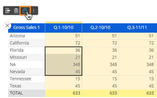
 Lock and spread.
 Search. Opens the Fast Search feature. See Fast Search above for more details.
 Data. Allows you to select all or select individual columns (Data Blocks) of the Layout associated with the Data View (deselected Blocks will be hidden from view).
 Freeze panes. Allows you to configure an area of the Data View that is always visible while you scroll to another area of the Object. The Freeze Panes feature always locks rows and columns starting from the top left corner of the Data View.
 Number scaling. Displays large numbers in a shortened format with one decimal place, adding a "K" for thousands, "M" for millions or "B" for billions. If enabled in Design Mode, when the user hovers over the property, a side menu opens with the following options: Disabled, Automatic (in which automatically the numbers are displayed with only one decimal digit), Thousands (K), Millions (M), or Billions (B).
The number of decimal digits displayed for Thousands (K), Millions (M), or Billions (B) reflects the configuration made in Block settings of the Layout Editor, in the "Digits" area under the "Main options" submenu. Any change applied to the number scaling or Column visibility is kept if the Screen is saved as a Slide in a Presentation or using the My Screen View feature.
 Rows & Columns. Allows you to add/remove Entities set by row or by column, configured in the Quick Layout of the Layout Editor.
 Paste data. Allows you to paste data from the clipboard into the Data View, starting from the selected cell. Data Entry must be enabled on the target cell range.
 Comment. Displays any comment attached to the Data View (if any). Depending on the comment configuration, the icon displayed can be a balloon icon, a question mark icon or an alert icon.
The options mentioned above are also available in the drill-down windows.
The Block format icon (  ) is only available for drill-down windows and allows you to format each column of the Data View. See Formatting a Data View for more details.
Data View keyboard shortcuts
In addition to the interactive features, a few keyboard shortcuts are supported by the Data View Object: these shortcuts allow you to work more efficiently, especially with Data Views consisting of a large amount of rows. They are the following:
Home (or Ctrl+left). Go to the first cell of the current row.
End (or Ctrl+right). Go to the last cell of the current row.
Ctrl+home. Go to the beginning of the Data View (the first cell in the top left corner).
Ctrl+end. Go to the end of the Data View (the last cell in the lower right corner).
Ctrl+up. Go to the first cell of the current column.
Ctrl+down. Go to the last cell of the current column.
Learn more about: