💡This article contains version changes.
Spot the light bulb icon? That means you’ll find helpful details about what’s changed across versions. Read more about version changes here.
The Flex Grid Object provides sophisticated data interactions for financial planners. Planners can effortlessly pivot, sort, filter, incorporate embedded charts, group rows and/or columns, and more with extensive datasets to examine data from various perspectives without requiring developers to set up multiple Data Views.
The Flex Grid Object includes specific options and characteristics that differentiate it from a Data View Object. Some of these features are detailed below. The subjects discussed regarding interaction with a Flex Grid are as follows:
Interactive Selection on rows and columns
The Flex Grid Object enables users to select an Entity by choosing specific rows and/or columns.
For example, in a Flex Grid that lists Countries in rows, users can click on one or multiple rows (i.e., Countries) and utilize them as selection criteria, prompting other Objects on the Screen to update accordingly.
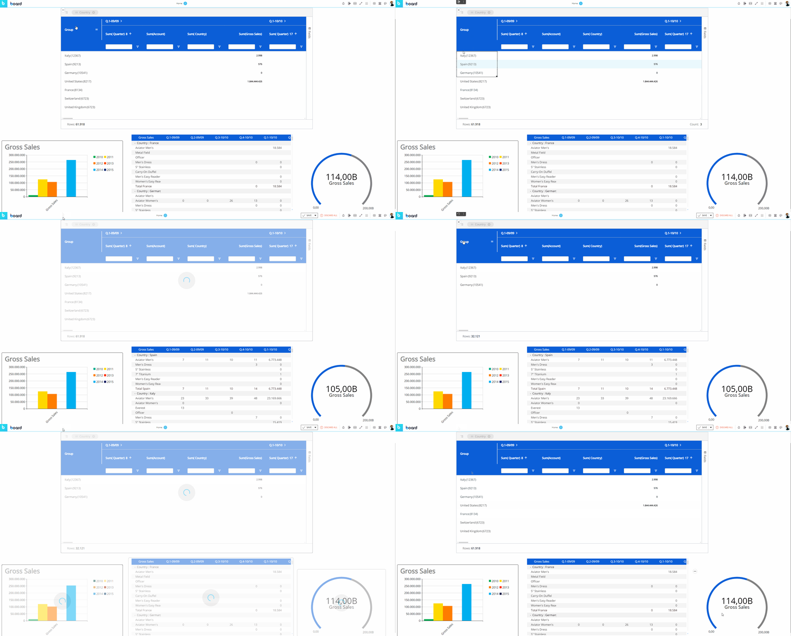
As you can see in the example above, once a selection is applied the other Objects on the Screen are refreshed to show data for the selected items only.
To reset the selection made on a Flex Grid Object, click the reset button (  ) in the top left corner of the Flex Grid.
The selection can be made on the Entities set By Row and By Column. Read more about how the Select works.
The "Fields" panel in Play Mode
The "Fields" panel, displayed vertically on the right side of the Flex Grid, is a powerful tool specific to the Flex Grid. This panel gives the end user the ability to pivot and display data in different ways, depending on the configuration of the developer. Beyond the capabilities of grouping and setting fields by Row within the Flex Grid as described above, the "Fields" panel allows you to group fields by Column using the "Pivot Mode" feature, giving you even more flexibility and freedom to configure your dataset.
You can interact with the Flex Grid in 2 ways:
Flat view. In flat view, you see all the fields selected which can be grouped by Row. Click on the "Fields" panel to open it. Then drag and drop fields into Row Groups, Values, or hide Blocks from the panel. All rows of the dataset are always part of flat view. Even if row groups are defined, you can expand all row groups to display the distinct rows of the dataset, configured by the Developer.
Click on the Fields panel to open it. Then drag and drop fields into Row Groups or Values areas or hide Blocks from the panel. You can also drag column headers to the top bar of the Flex Grid that says "Drag here to set row groups".Pivot Mode. In Pivot Mode, you only see aggregated data by Rows that are based on the group configuration in the Columns panel, and you also have the possibility to group By Column, which becomes available only when "Pivot Mode" is enabled.
Enable the Pivot Mode toggle and then drag and drop fields as before, but now you can add Column groups under the "Column Labels" section that appears at the bottom of the panel.
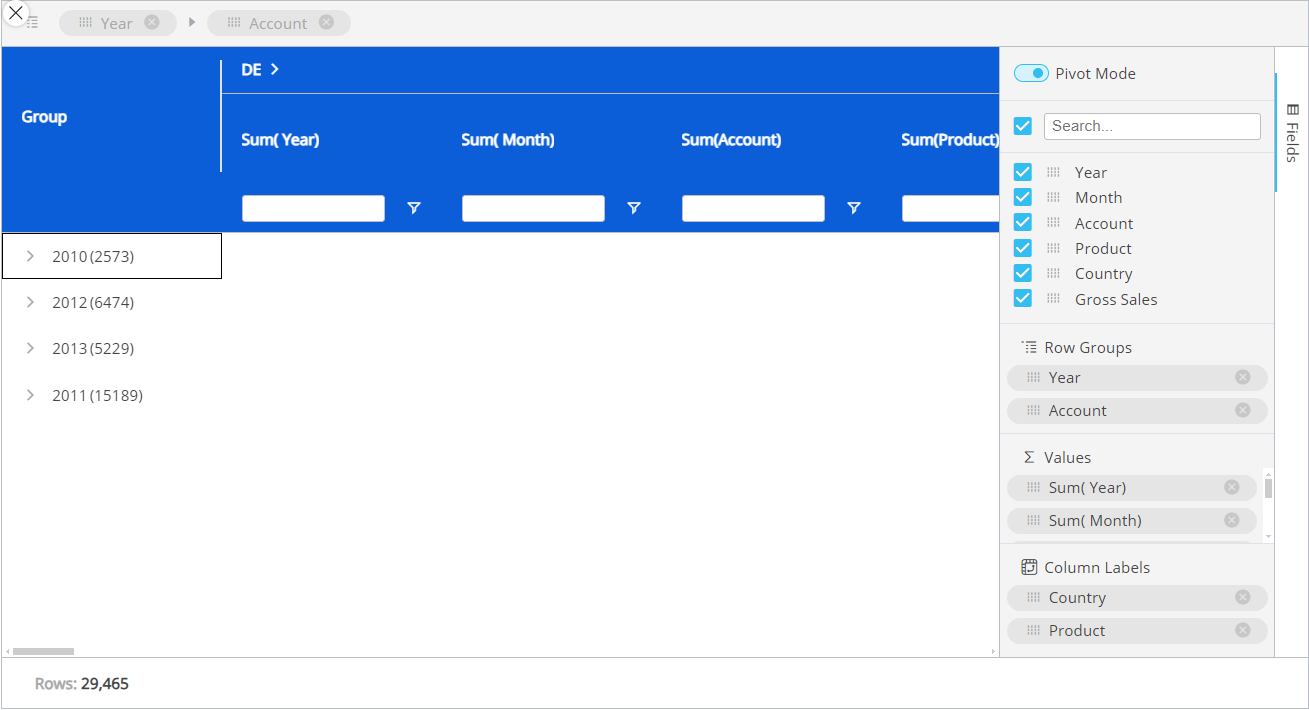
The Fields panel options are:
Pivot Mode. Enabling Pivot mode allows you to customize the display of the Flex Grid in more detail. Upon enabling for the first time, you will see the default view configured by the Developer, and the feature "Column Labels" appears at the bottom.
Column Labels. Enabling Pivot Mode will unlock the "Column Labels" feature at the bottom of the panel. Drag and drop fields that you would like to group the other fields by.
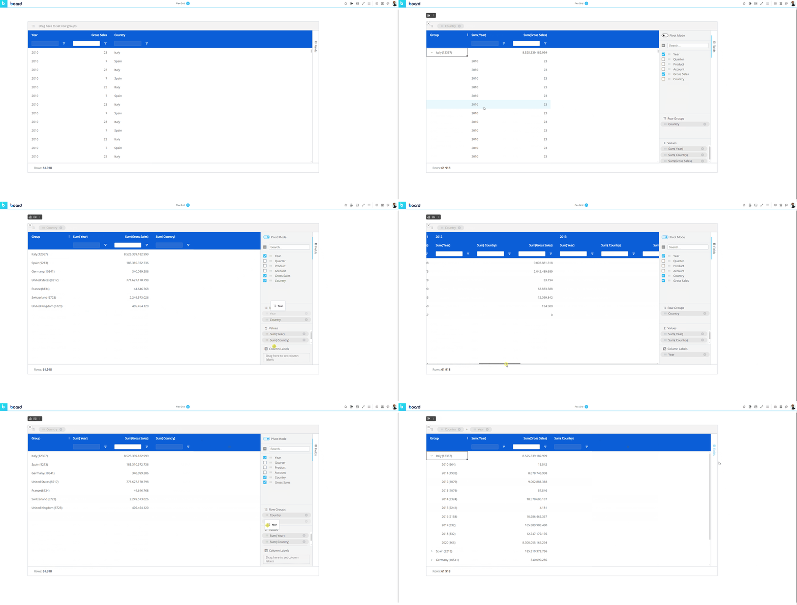
For example, if you have a Flex Grid with the Entities "Year" and "Country" and a "Gross Sales" Block, and you set "Country" by "Row Groups", then, "Year" and "Gross Sales" show separate value fields.
Instead, if you set "Country" in the "Column Labels" sections, the Columns will now be organized by the group "Country" and Gross Sales will be broken down into multiple columns that display the value by country rather than a lump sum of Gross Sales in the Country value cell.
Next, if you add "Year" to the "Row Groups" underneath "Country", years are grouped within each country, and you can expand and collapse those row groups to see the data broken down by group.
Search. Use this search bar to find a field within the list below it (of only the fields configured in the Layout).
The checkbox that appears to the left of the search bar is used exclusively for the search results. The checkbox will select or deselect all the fields that are displayed under the search bar.
For example, if you search for "Sales" from a list of 10 fields, and 2 fields show up called "Gross Sales" and "Total Sales", you can select or deselect only these fields that displayed via the search function by selecting or deselecting the checkbox to the left of the search bar.Checkbox behavior. The checkbox is selected only when all the fields below the search bar are selected. If some are not, the checkbox will appear with a minus sign. If the checkbox is enabled with a checkmark, all field results via the search will be selected. If deselected when all fields are selected, all fields will become deselected.
If nothing is entered into the search bar, then all the fields are listed. The same behaviors as above apply when nothing has been searched.
Fields. All fields configured in the Flex Grid will display under the search bar. You can rearrange the position of the fields in the Flex Grid by dragging and dropping a field in a different order. The first field in the list will display on the leftmost side of the Flex Grid columns, while the last will display on the rightmost side. You can also drag and drop these fields into the areas below: Row Groups, Values and Column Labels.
Row Groups. Drag and drop one or more fields you would like to configure the Flex Grid by row. By adding more than one, the row fields become grouped. The grouping behavior is determined by the position of the field in the "Row Groups" list. The first field in the list is the root group, the second is the first sub-group, the third is the next sub-group, and so on.
Values. Drag and drop fields here in order to aggregate the data on field groups. A new column appears in which it will display the aggregated value. The default aggregation is sum, but the aggregation can be changed via the "Value aggregation" menu access by the header options menu or directly in the Columns panel. From the Columns panel, click on the field under the Values section to display a dropdown menu where you can choose between average, count, first, last, max, min, and sum. Read more about aggregation values.
Sorting and Filtering a Flex Grid in Play Mode
Sorting and filtering is not done in the Layout editor configuration as with a Data View, but within the Flex Grid itself, if the Developer's configuration allows it.
Sorting a Flex Grid
To sort directly from the Flex Grid Object, if the configuration allows it, click on a column header or drag and drop a field into the "Row Groups" section from the "Columns" panel that you would like to sort from. Arrows will indicate the order: up arrow for ascending, down arrow for descending, or no arrow for the default order.
Filtering a Flex Grid
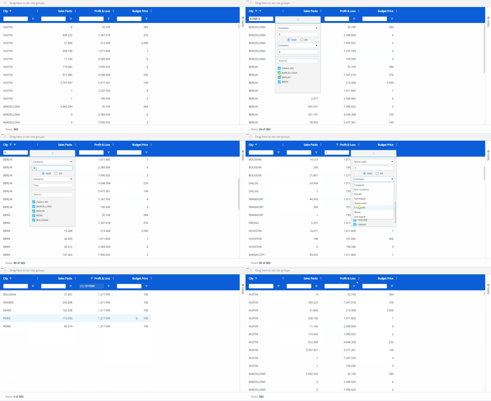
There are 3 ways to filter a Flex Grid: from the filter icon under each column header, the column option menu within the filter subpage, and the textbox underneath a column header (if available), each described below:
Filter icon
To filter from the Flex Grid Object with the filter icon for a field, click on the filter icon and select all the member items you would like to filter or type to search for a text/value.
To filter from the Flex Grid Object with the filter icon for a field, click on the filter icon. Then choose how you want to filter the field with the dropdown menu and add a value (if prompted) to combine with the filter command. By default, it filters using "Equals". If you want to, you can add a second filter in combination with "AND" or "OR" below.
Filter from the column options menu
Another way to filter is from accessing the same filter menu as with the filter icon from within the column options menu. Click on the hamburger menu icon and click on the filter icon from the dialog box. If the text box is colored the same as the header background (or grayed out if the header background is white), then a small dialog window opens with the filter options to choose from and a search box. If the text box is white, you can type directly into the box in order to filter it according to what you type.
Filter using textbox
It is possible to filter from the textbox below each column header when the textbox is available (when it is white-filled or not grayed out).
To filter within the textbox below the column header, like "FLOW VIEW P&L" in the example below, simply type into the textbox and hit "Enter" on your keyboard or click outside of the textbox to run the search.
The column will filter according to the default setting, which is "Equal to" for integer Blocks when single filtering is configured and "Contains" for all other Blocks as well as all columns when multiple filtering is configured. To change the filter option from its default, click on the filter icon (  ) and choose your parameters from the dropdown menus and using the AND/OR functions.
To filter without a textbox, like "Year" in the example below, click on the filter icon (  ) and make a selection from the following options. You can also use the search bar to find what you are looking for.
To filter the columns that appear in the Flex Grid, you can deselect them from the Fields panel or access the menu from any one of the columns using the hamburger icon that appears in the top right corner. From the third tab with the Flex Grid icon (  ), a list of the columns appears where you can select or deselect the ones you want to view or hide.
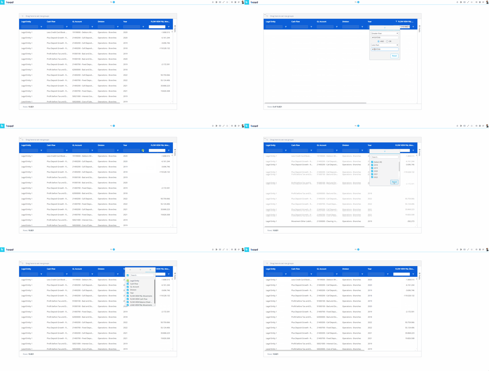
The textbox is only available to value fields when the filter configuration is set to "Single", or available to all fields when the filter configuration is set to "Multiple", allowing multiple filters at once.
💡"Filters" Tab
In version 14.2.2 and earlier, the Filters tab is not available.
Along the right side of the Flex Grid with the "Fields" tab is the "Filters" tab where you can create filters for a Flex Grid. In addition to the filter icon in every column, the Filters tab contains every element name which you can open by clicking on the element, and the applicable filter options appear in the dropdown where you can reset filters or configure them.
Multi-filtering & multi-sorting
It is possible to sort and filter by multiple fields, if the configuration allows it. When multiple sorting and/or filtering is allowed, the first sort or filter applied is the first priority in the hierarchy, while the second and third sort or filter becomes the second and third priority, respectively.
Multiple sorting allows multiple columns to apply a sort, whereas a single sort only allows one column to apply a sort to the Flex Grid Object.
Multiple filtering allows multiple filtering per column, whereas a single filter only allows one filter per column.
When sorting multiple fields, a number will appear next to the field header to indicate the priority order of the sort.
When filtering multiple fields, the textbox option under every field is available.
Grouping a Flex Grid in Play Mode
You can group fields directly from the Flex Grid Object in both flat view or in Pivot Mode. The difference being that, in Pivot Mode, you can dimension the whole grid by rows and group columns, whereas in the flat view with Pivot Mode disabled, you can only group fields by Row.
Grouping in flat view
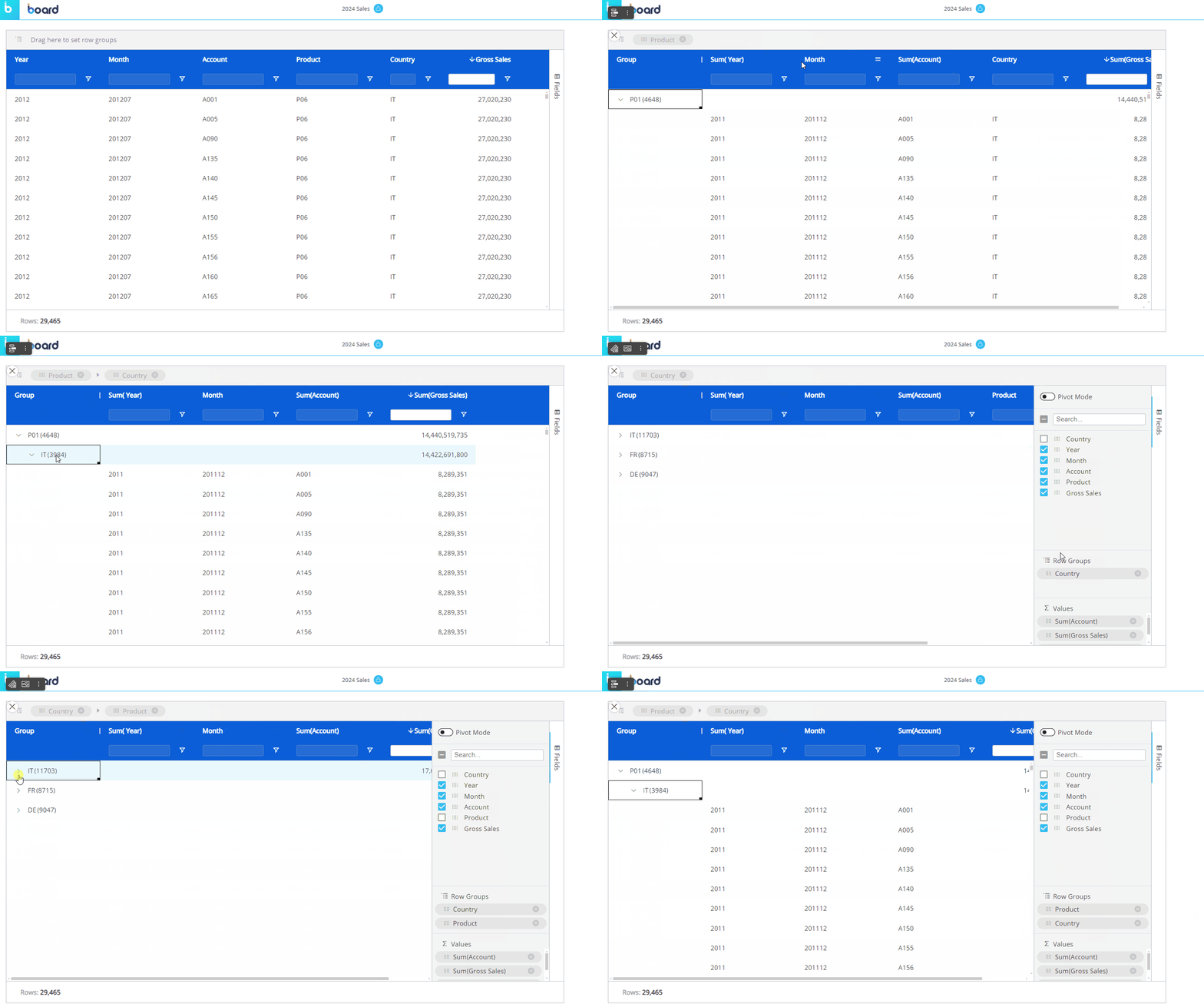
To group the full dataset by Row in flat view, drag and drop a column header of a field into the top grey bar that says "Drag here to set row groups". You can also group the flat dataset in a similar way by utilizing the "Fields" panel without enabling "Pivot mode". To do so, do the following:
Open the "Fields" panel.
Drag and drop fields into the "Row Groups" section. This will automatically set that field by row, grouping the others under it, as in the example below. You can change the hierarchy of the groups by dragging and dropping the elements in the order you want, the leftmost position being the most-nested.
Grouping in Pivot Mode
To group a dataset using Pivot Mode, access the "Fields" panel from the right side of the Flex Grid, and do as follows:
Open the "Fields" panel.
Enable the Pivot Mode toggle.
Dimension fields by Row by dragging and dropping fields into the "Row Groups" section. You can change the hierarchy of the groups by dragging and dropping the elements in the order you want, the top position of the "Row Groups" section being the most-nested. You can also drag fields into the top grey bar for Row Groups
You must have at least one field set by Row Groups.
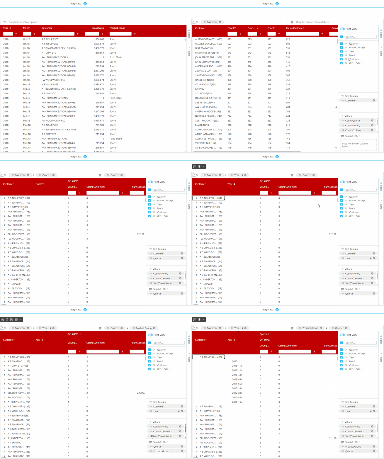
Group fields by Column by dragging and dropping the fields into the "Column Labels" section (which only appears once Pivot Mode is enabled). You can change the hierarchy of the groups by dragging and dropping the Entities in the order you want, the top position of the "Column Labels" section being the most-nested. Or drag and drop the field into the top grey bar to the Right for Column Labels. On the grid, you can expand and collapse the Column groups as you want.
The different ways of grouping is shown in the example below.
💡Flex Grid Collapse and Expand on Column Headers (only with 3 or more column labels)
In version 14.2.2 and earlier, this functionality is not available.
Users can collapse and expand Column headers when configured with at least 3 Entities. Use the arrow that appears next to column headers to expand or collapse.
In Pivot Mode, expanding/collapsing column labels requires at least 3 column labels and a dataset under 100,000 rows.
This limitation does not apply to the “By Column” configuration, which supports expand/collapse without major restrictions.
Master
If the Flex Grid has been configured as a Master Object, clicking on a row header (i.e. the field members set by Row Groups) will update the data displayed by all other Objects on the Screen in order to show only the data relating to the clicked header. The Master Object result is similar to applying a Screen Selection.
By clicking on the "Disable master" icon (  ) in the sliding toolbar, you can disable this option. Click on the "Enable master" icon (
  ) to re-enable it.
Tree view for Unbalanced Entities
You can dimension a Flex Grid by an Unbalanced Entity and view it in tree view. Tree view enables the display of an Unbalanced Entity's hierarchy in a tree form, allowing the users to interact with it by expanding and collapsing different nodes, as opposed to viewing the Entity in flat view.
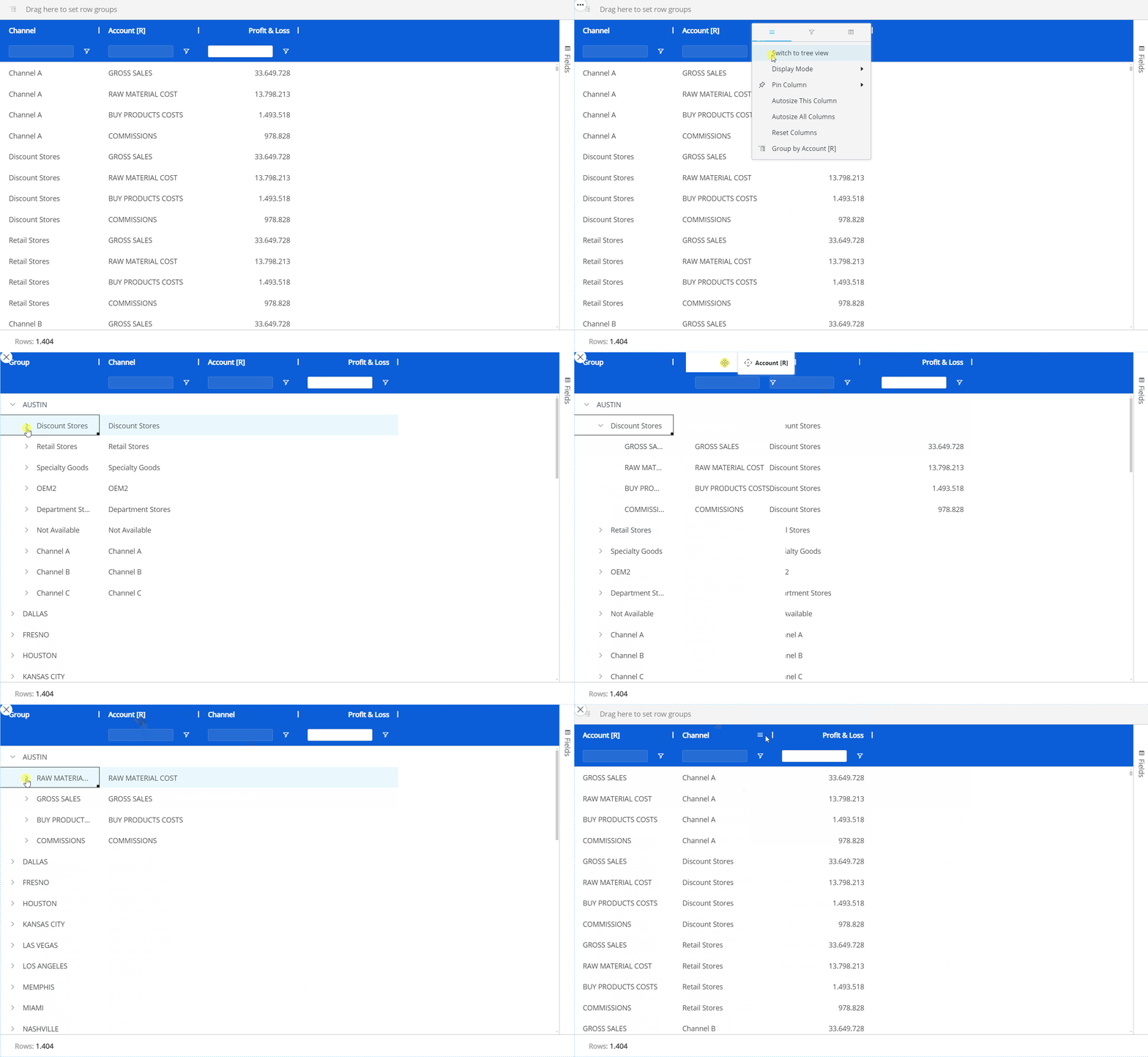
To see an Unbalanced Entity in tree view, you must be in flat view (not available in Pivot Mode). Click on the hamburger icon in the top right corner of the Unbalanced Entity's column (the Column menu) and select "Switch to tree view". To exit the tree view, click on the hamburger icon in the top right corner and then select "Switch to flat view".
The tree view of the Unbalanced Entity will not retain any grouping.
In Play Mode, the Tree view is only available when the Flex Grid is in flat view and Pivot Mode is not enabled. When Pivot Mode is enabled, the Tree view is automatically disabled.
When using the Tree view functionality, locking the total cell of a high-level row group will automatically lock its lower-level row groups.
Embedded Charts
Charts are viewed directly within the Flex Grid itself and configured on-the-fly. Embedded charts can help you visualize selected data from within the Flex Grid, however, can not be saved.
It is possible to select from various functions, such as SUM, AVERAGE, MIN, and MAX to summarize data in a chart
To view embedded charts, right click a value cell and click "Range Chart":
Range Chart. Based on the range selected within the Flex Grid and always available whether in Pivot mode or not. A chart popup window will appear where you can define the data settings in more detail under "Data" in the right panel, like "Categories", which are your fields, and the "Series", your Data Blocks, to configure the chart. You can also change the chart type and color palette under "Edit Chart" from the more options icon.
Then, click on the type of chart you'd like to display which are as follows:
Column. Displays a vertical bar graph with the options of "Grouped", "Stacked", and "100% stacked", shown below respectively.
.png)
Bar. Displays a horizontal bar graph with the options of "Grouped", "Stacked", and "100% stacked", shown below respectively.
.png)
Pie. Displays a pie chart with the options of "Pie" or "Doughnut", shown below respectively.
.png)
Line. Displays a line chart as shown below.
.png)
X Y (Scatter). Displays a scatter plot where data between 2 variables is displayed with a point or dot with the options of "Scatter" and "Bubble", shown below respectively.
.png)
Area. Displays a line graph where the area below the line is filled in with color with the options of "Area", "Stacked", and "100% stacked", shown below respectively.
.png)
Statistical. Displays the frequency of numerical data with rectangles.
.png)
Combination. Displays the combination of two types of charts, either "Column & Line" or "Area & Column", shown below respectively.
.png)
To change the color palette, the type of the chart, or to change the category of data, find the more options icon and click “Edit Charts”. Under “Design” (“Settings” for version 14.2 and earlier), you can edit the pattern or color palette.
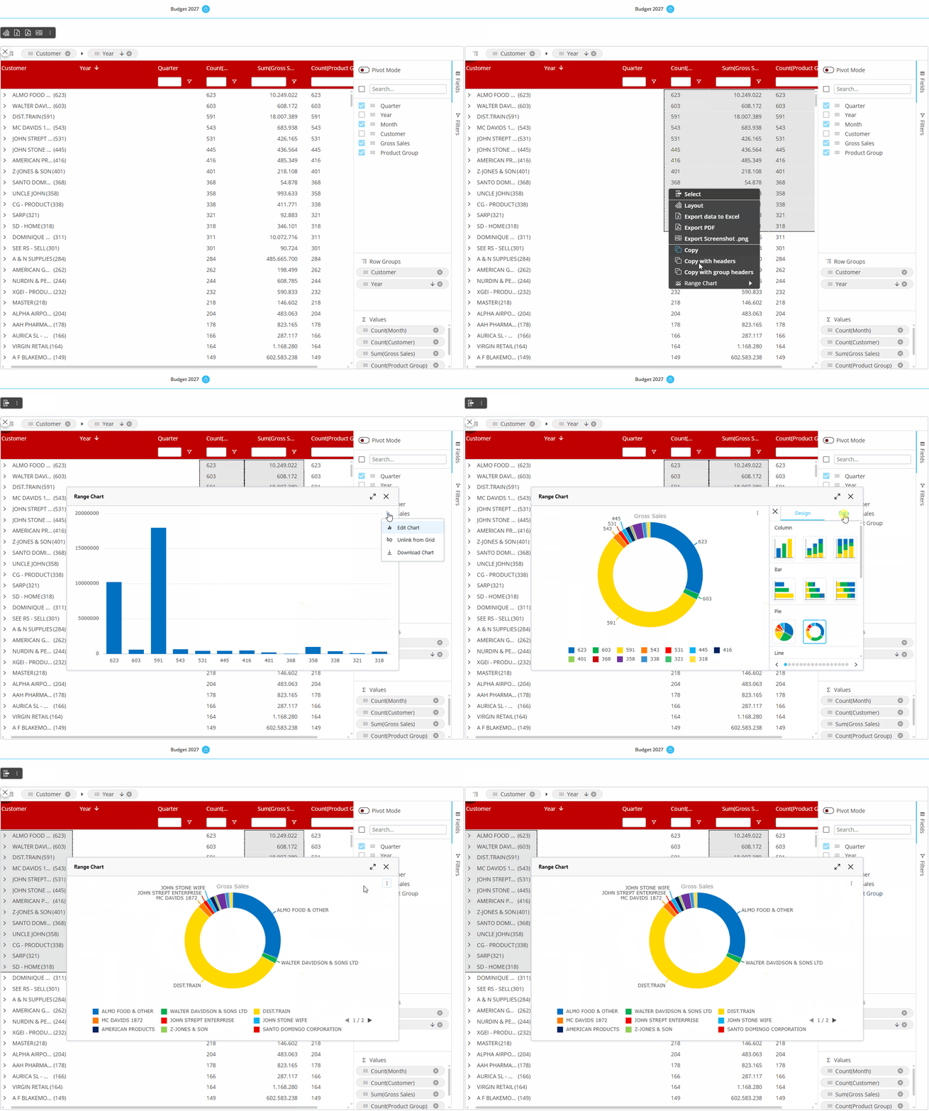
When you are happy with the chart you have created, you can do a few things with it:
Download the chart as a .png by clicking on the download icon in the upper right corner of the chart area, as shown below.
Link or unlink the chart by clicking on the link icon, as shown below. This means, if data is updated upon a refresh, the data will also change and update the linked chart, whereas the data will not change in an unlinked chart.
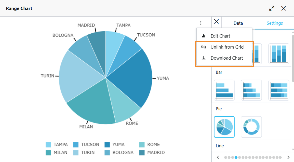
version 14.2 and earlier
💡Advanced settings. From 14.3 onwards, Range Charts have “Advanced Settings” where you can enable “Animation” and configure the duration.
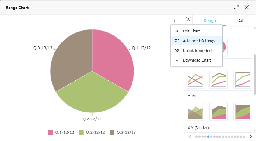
version 14.3 and onward
Flex Grid options
The Flex Grid has many unique options and settings unlike other Objects, found directly in the Flex Grid.
Flex Grid Object toolbar
You can access the Object toolbar in the top left corner of the Flex Grid by hovering over the Object and clicking on the Object toolbar icon (  ) which gives you the following options:
Layout
 . Access the Layout.
Export data to Excel
 . Exports the Flex Grid as an Excel file, as described in the next paragraph.
Export PDF
 . Exports the Flex Grid as a PDF file.
Export Screenshot .png
 . Takes a screenshot of the Flex Grid and saves it in .png format.
When a cell is selected, the following options are available in the Flex Grid Object toolbar:
Copy. Copy the selection of one or many cells.
Copy with headers. Copy the selection of one or many cells with the headers included.
Copy with group headers. Copy the selection of one or many cells with the group headers included.
Range Chart. View embedded charts directly from the Object. Choose which type of chart you want to display alongside the value: Column, Bar, Pie, Line, X Y (Scatter), Area, Histogram, Combination. Read more about Flex Grid embedded charts.

💡 Export data to Excel
From 14.3 onward, you can export data to Excel with “Export flatten” and “Remove empty Sheets” options. In version 14.2.2 and earlier, you can export the exact Layout of your Flex Grid configuration to an Excel worksheet directly from the Object, but you do not have “Export flatten” and “Remove empty Sheets” options.
Color, border, font, template, and block formatting is not exported.
You can export the exact Layout of your Flex Grid configuration to an Excel worksheet directly from the Object.
Export to Excel in Flatten and Non-Flatten modes
The Excel export options in the Flex Grid offer two distinct modes for tailored data exports: Flatten and Non-flatten.
Flatten
Export flatten. When enabled, exports raw datasets without grouping, ensuring a clean data structure for further analysis. Includes raw data while ignoring grouping and hidden columns.
When using Flat Mode:
Exports the dataset without applying grouping or hierarchy structures.
Hidden columns are ignored in the output.
When using Pivot Mode:
Groups are exported into separate columns, preserving the hierarchical structure.
Items in Column Labels are preserved.
Totals are not included in the export, maintaining a clean dataset for external analysis.
Hidden columns are ignored in the output.
Non-flatten
When “Export flatten” is disabled, exports in a non-flatten format: retains grouping and hierarchy structures while reflecting the active selections.
Exports the dataset while maintaining the grouping structure displayed on screen also in the Excel sheet.
Retains all hierarchy and grouping details based on the current Flex Grid configuration.
Users can collapse and expand row groups also in the Excel sheet.
Flex Grid export to Excel options
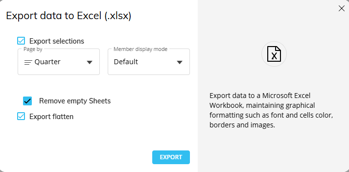
When exporting a Flex Grid to Excel, the following options are available on the “Export data to Excel (.xlsx)” popup window:
Export selections. When "Export Selection" is checked in the configuration settings, the exported Excel sheet includes a Reference Tab which captures the active selections applied on the Screen at the time of export.
Page by. When "Page By" is configured by an Entity from the dropdown display, the exported Excel file includes separate tabs for each Page By Entity member and display based on the display mode chosen in the Member display mode dropdown.
Member display mode. Choose the member display mode of the Entity chosen in the “Page by” dropdown.
Export flatten. When "Export flatten" is checked in the configuration settings, the exported Excel sheet will include all data included in the Flex Grid, even if not shown on the Screen due to Row groups. Selections performed on Flex Grid are always respected when exporting.
Remove empty Sheets. When enabled, any empty sheets that would normally display in the report is removed to reduce excess pages.
This flag is enabled by default and can only be disabled when the “Page by” field is configured.
Group display type settings when exporting a Flex Grid to Excel
Furthermore, the "Group display type" setting found in the Flex Grid Object’s Property Panel offers different ways to improve the functionality of the extracted report as follows:
Single column (default):
In flatten mode: Exports raw data sets without grouping.
In non-flatten mode: Retains the grouping structure displayed on screen, with collapsible/expandable groups in the Excel sheet.
Multiple columns:
In flatten Mode: Exports flat, ungrouped datasets, excluding hidden columns and totals.
In non-flatten mode: Exports data with multi-column grouping preserved, matching the browser structure.
Group rows:
In flatten Mode: Ignores grouping and exports raw data without totals.
In non-flatten mode: Retains the row grouping hierarchy, matching the browser view in the Excel sheet.
The Flex Grid exported to Excel must not exceed 1 million rows. If it does, the following message will appear:
Grouping configured by row in a Flex Grid is converted to Excel groups functionality when exported to Excel. Tree view groups on Unbalanced Entities are converted to Excel groups functionality when exported to Excel.
Flex Grid Column menu
Every column displayed in a Flex Grid has a menu for further options and capabilities.
Hover over the column header and click on the hamburger menu icon (  ) to access the Column menu. There may be up to 3 subpages of menu options available: main options, filtering, and quick pivoting.
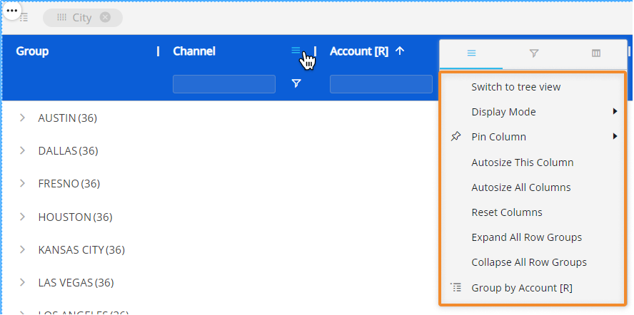
Main options. Customize Axes settings directly from the Flex Grid.
Switch to tree view/ Switch to flat mode. View an unbalanced Entity in tree view (only available for unbalanced Entities).
Display Mode. Choose or change the display mode of the Entities by Column. The following are available: Code, Desc (description), and Code and description.
Pin Column. Pin the Entity column to the left or right of the Flex Grid so that it is frozen in the viewing area and always in view while scrolling through other columns.
Autosize This Column. The column width size is automatically changed to a size suitable to view the data within the Flex Grid Object.
Autosize All Columns. Every column width size is automatically changed to a size suitable to view the data within the Flex Grid Object.
Reset Columns. Resets columns to their default width.
Expand All Row Groups (flat view only). Expand all the row groups listed to the left side (if any) with one click. Each one can individually be expanded manual by clicking on each arrow next to the Group Entity's member.
This option is only available in flat view and when a row group exists.
Collapse All Row Groups (flat view only). Close all the row groups listed to the left side (if any) with one click. Each one can individually be collapsed manual by clicking on each arrow next to the Group Entity's member.
This option is only available in flat view and when a row group exists.
Group/Un-Group by/ Un-Group all. Group or ungroup the Flex Grid by the selected field or all fields. Also available by dragging and dropping the field into the top bar that says "Drag here to set row groups" and ungrouping by clicking the X next to the field's name placed in the top bar.
This option is only available when no column group exists.
Filtering. Gives you the same filtering options as in the field header. Select all the members you would like to filter this Entity by or type in a value you would like to filter the field by.
Quick pivoting. Shows the Entities set by Row with select boxes next to them. Select or deselect them to customize the display of the Flex Grid, however, for more customization, access the pivot tool located in the Fields panel on the right side of the Flex Grid.
Right click options within the Flex Grid
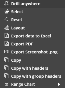
The Flex Grid right click options are the different in Design Mode from Play Mode. Right-click on any value cell or a selection of cells to reveal the following options:
💡Drill down. If a Drill Down is configured, you can drill down via right click options.
This feature was introduced in version 14.3.
In version 14.2.2 and earlier, Drill Down on a Flex Grid Object is not available.💡Drill anywhere. Configure a Drill Down.
This feature was introduced in version 14.3.
In version 14.2.2 and earlier, Drill Anywhere on a Flex Grid Object is not available.Select. Quickly add a selection to the Flex Grid of selected cells. This is separate from a Layout or Screen Select. The Flex Grid Select considers Layout and Screen Selects first.
Reset. Reset any selections made on the Flex Grid.
Layout. Access the Flex Grid Layout.
Export data to Excel. Export to Excel.
Export PDF. Export to PDF.
Export Screenshot .png. Export screenshot.
Copy. Copy the selection of one or many cells.
Copy with headers. Copy the selection of one or many cells with the headers included.
Copy with group headers. Copy the selection of one or many cells with the group headers included.
Range Chart. View embedded charts directly from the Object. Choose which type of chart you want to display alongside the value: Column, Bar, Pie, Line, X Y (Scatter), Area, Histogram, Combination. Read more about Flex Grid embedded charts.
Excel-like status bar component
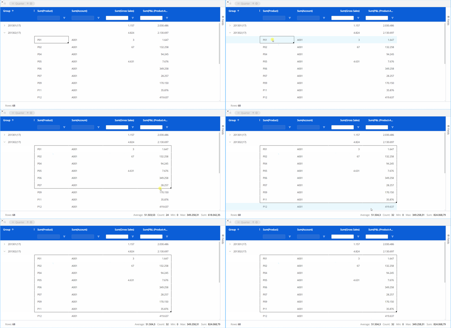
At the bottom of the Flex Grid, a status bar gives you information about the selected cell or cells. If one or no cell is selected, it will display the number of Rows in the Flex Grid. If a group of cells are selected, it will display:
Rows. The number of Rows displayed in the Flex Grid.
Average. The average value of the selected cells.
Count. The number of cells selected.
Min. The minimum value within the cells.
Max. The maximum value within the cells.
Sum. The sum of the selected cells in total.
💡Drill Down and Drill Anywhere
In version 14.2.2 and earlier, Drill Down and Drill Anywhere on a Flex Grid Object is not available.
The Drill Down and Drill Anywhere features allow users to explore data in greater detail - users can interactively drill into specific entities and gain actionable insights directly from the grid, much like the functionality available in the Data View Object.
How to use the Drill Down and Drill Anywhere features in Flex Grid
Much like in the Data View Object, the Drill Down and Drill Anywhere features allow you to see data that is in a different aggregation level than what is exposed in the Flex Grid table.
Drill Anywhere
When a drill is performed, by right-clicking a cell and then clicking “Drill anywhere” from the menu or by clicking on a cell and then on the Drill Anywhere icon from the Object toolbar , a popup window displays.
From this window, you can select the level of granularity you wish to see.
Drill Down
When a Drill Anywhere is configured, it is possible to access the Drill Down icon from the Object toolbar or from the right click menu which lets you access the same level of granularity as configured in the Drill Anywhere functionality.
The drill Entity is displayed on rows and filters automatically applied based on the drilled number’s coordinates.
The resulting Layout retains the same structure and the pivoted fields by row/column, maintaining the same point of view of the original Flex Grid but focused on the drilled entity in axes with all configured blocks, just applying a selection on the drilled member.
In Unbalanced Hierarchies, Drill by level is implemented, ensuring consistency when exploring hierarchical data, regardless of its structure.
Drill Procedures and other Drills are also available for the Flex Grid.
