This topic describes the Format section of the Data Model.
In this section, you can create, edit, and manage row templates, also called style templates, for each Entity in the Data Model: you can configure different formatting elements (i.e. backgrounds, borders, fonts etc.) for each Member, for values related to Members, for totals, and grand totals.
You can then apply the template to a Data View, Flex Grid, or Charts Object, which must have the Entity the template is associated with set By Row in the Axes area of the Layout definition.
How to access the Format page
You can access this section in one of the following ways:
Access the designer space of the desired Data Model and click on the Format tile.
Select the desired Object in a Screen in Design Mode and then click on the "TEMPLATES" button under the "Templates" menu in the Object Properties panel on the right of the Screen.

Since a template is a configuration set to a specific Entity, it is saved in the Data Model where that Entity resides, under the "Format" section. In this case, nothing is saved in the Capsule except for one or more links to the templates in use. If you need to share a template between different Board Platforms (for example, a template created in a Development environment that needs to be available also in a Production environment), you must use the Transporter tool or recreate it manually in the desired Platform.
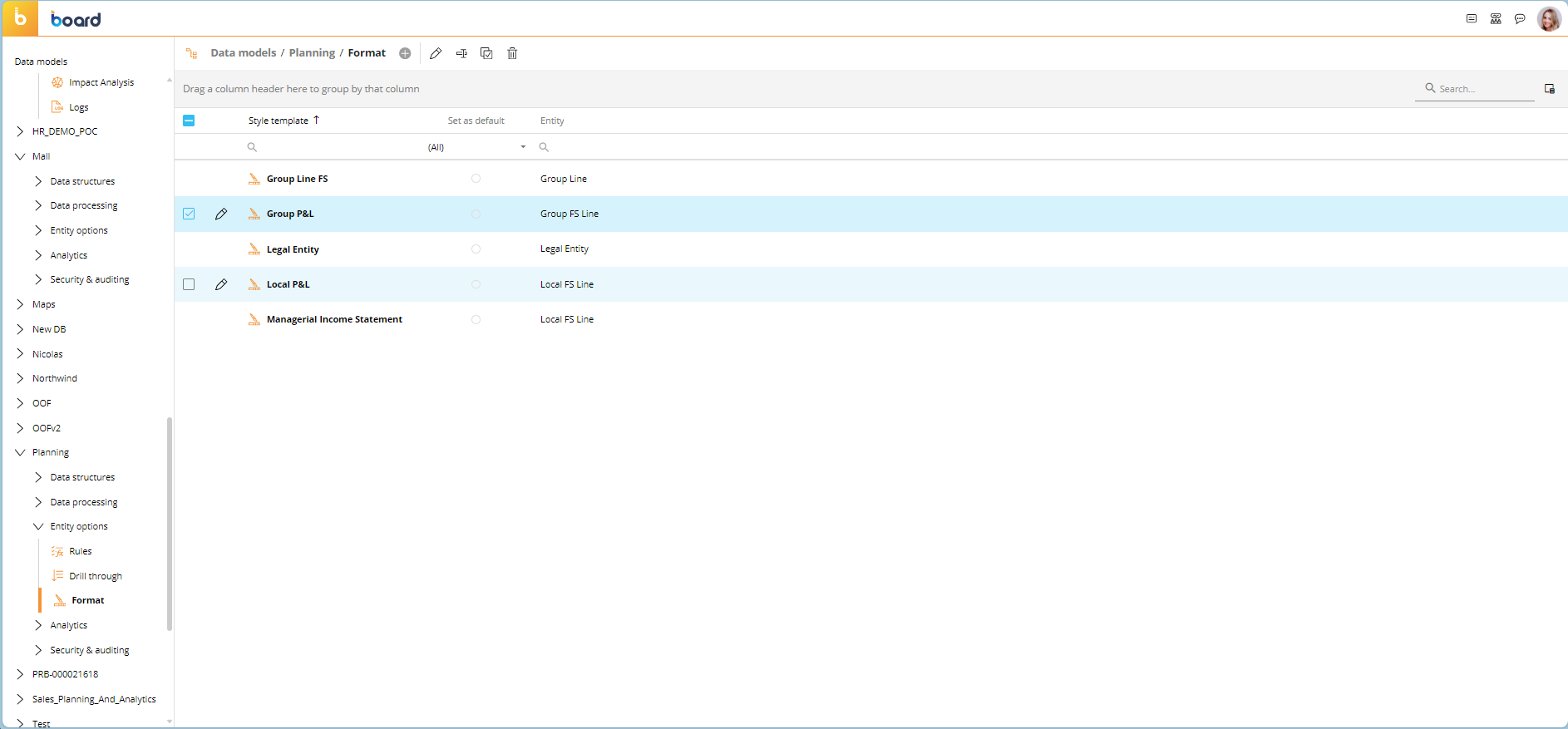
The Format page displays a table with all existing templates that contains the following information:
Style template. This column displays the title of each template. This is what you will use to associate the template with an Object.
Set as default. Choosing this radio button sets the selected template as the default template for the designated Entity of the selected Data Model. Only one default template for each Entity of the Data Model can be set.
Entity. This column displays the name of the Entity that each corresponding row template is associated with.
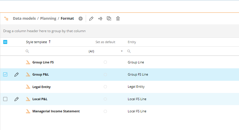
The table is sortable and searchable using the interactive header fields.
Creating a row template
To create a new row template, proceed as follows:
Click on the orange plus icon
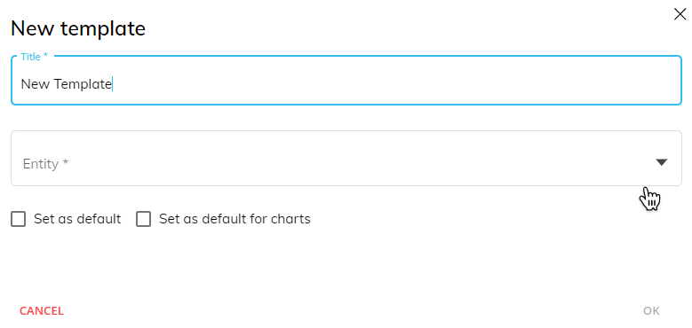
 in the top left corner next to "Format" in the upper left corner to bring up the "New template" popup window. You can also create a new template from within a Capsule Screen: select the Object and, from the Object Properties Panel, select the Template menu and click on the "TEMPLATES" button.
Enter the name of the new template in the "Title" field.
Choose the Entity to which you want to associate the template from the "Entity" dropdown list.
(Optional). Enable or disable the "Set as default" and "Set as default for charts" checkboxes. If "Set as default" is enabled, the current template will be automatically applied to Data View & Flex Grid Objects when said Entity is set "By Row" in the associated Layout. The "Set as default for charts" works similarly but applied to Chart Objects instead.
You can create as many templates as needed, but there can only be one default template for each Entity of the Data Model: setting a template as the default on the same Entity where a default template was already configured will make the most recent template created the default one.
That being said, you can enable both "Set as default" and "Set as default for charts" for the same Entity, as it is one default for two different types of Objects set only once.
Click "OK" to save the template.
Managing and applying row templates
You can perform different actions on one or more existing row templates by selecting them and clicking on the different buttons that appear above the template list.
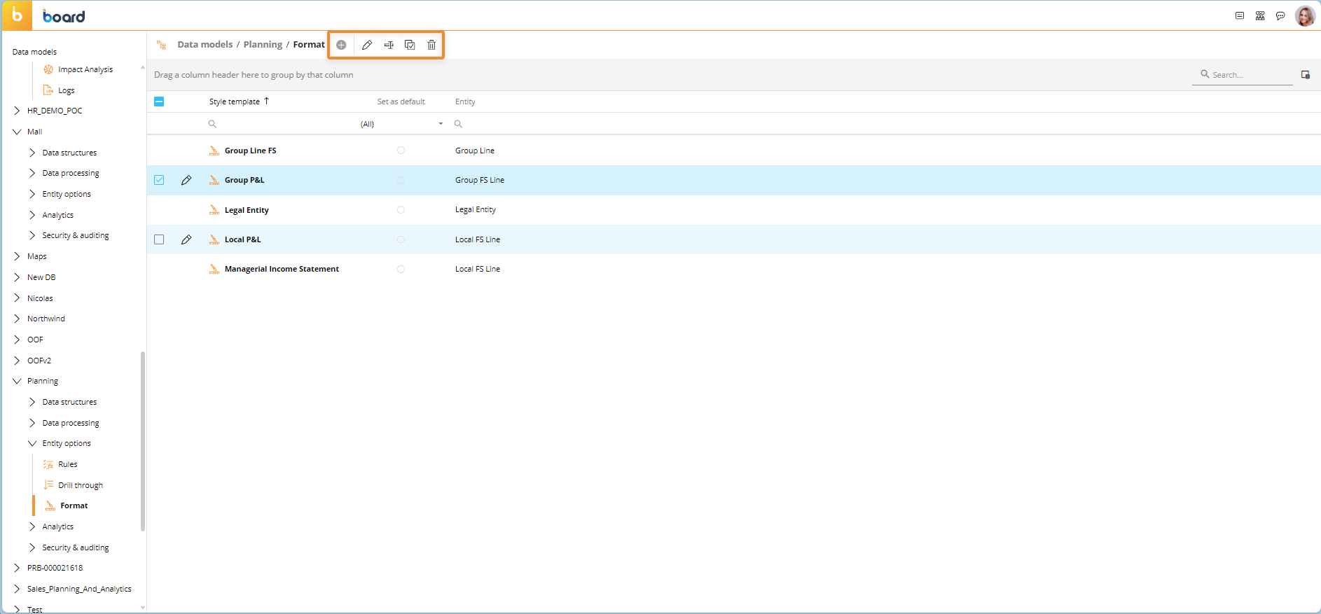
The available actions on the Format page are described below:
To edit a template, select it and click on the pencil icon. See the Editing a row template below for more detailed information.
To rename a template, select it and click on the "Rename" icon. A popup window will appear for you to enter the new name and click "OK" to save it.
To create a copy of an existing template, select it and click on the "Duplicate" icon. A popup window will appear for you to enter the name of the copy of the template and click "OK" to save it.
To delete one or more templates, select one or more and click on the trash icon.
You cannot change the Entity an existing row template is associated with. This applies when you copy a template: the copy of the template will be associated with the same Entity as the original template.
To apply an already configured Format template to an Object, proceed as follows:
Select the desired Object in a Screen in Design mode. The Layout associated with the Data View must contain at least one Entity that has templates associated with it set "By Row".
Open the "TEMPLATES" menu in the Object Properties panel to the right of the Screen.
Select the desired template from the "Row template" dropdown list. The list is presented with the name of the template on the left and the Entity it is associated with to the right. You can also access the template configuration window to edit the chosen template by clicking the pencil icon next to the dropdown list or click the "TEMPLATES" button to open the Template page and create a new one.
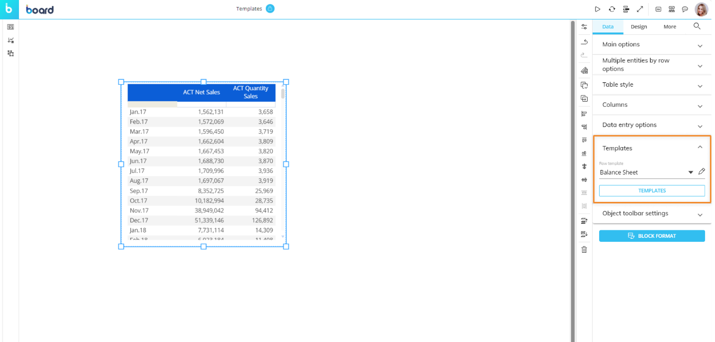
Read more about the Templates option in Formatting a Data View.
In the case where an Entity with a default template is used in the Layout associated with the Object, the "Row template" dropdown list will automatically select that default template.
It's important to understand the order in which Board applies formatting styles to the Object, as this sequence determines how it will appear to the end user. First, the default Object style is applied, then the style defined via the Block Format button (if any). Finally, the row style defined in the Template section is applied (if any). If one of those properties is not defined, the previous one in the sequence is applied.
Editing a row template
To edit any template, select it from the dropdown list from the Templates menu of the Object's Properties panel or from the table on the Format page which can be opened by clicking on the "TEMPLATES" button and click the pencil icon to open the template configuration window. From it, you can customize the cell background color, cell borders, font settings, and number format for the following elements of each row:
Members (Members of the Entity set By Row). Select a member from the "Members" column that corresponds with a specified member to apply formatting to only that member's column heading (Data View) or Series (Charts) or with "Default row template" to apply to all members' column headings/Series.
Values (the cells of the row). Select the cell under the "Values" column that corresponds with a specified member to apply formatting to only that member's value cells or with "Default row template" to apply to all members' value cells.
Totals (all cells displaying calculated subtotals, if any). Select the cell under the "Totals" column that corresponds with a specified member to apply formatting to only that member's total cells or with "Default row template" to apply to all members' total cells.
Grand Totals. Select the cell under the "Grand Totals" column that corresponds with a specified member to apply formatting to only that member's grand total cells or with "Default row template" to apply to all members' grand total cells.

How to customize elements of the Template
To customize the style of the desired elements in the template configuration window, proceed as follows:
Select the items that you want to customize by clicking on the cell under one of the 4 headings, Member, Values, Totals, or Grand totals, that corresponds with a specific member or all members using "Default row templates".
You can select one or multiple items at once by holding the Ctrl or Shift key on your keyboard and clicking on the desired cells. The selected items are highlighted by a blue border. In addition, you can select the first cell of the first row ("Default Row Template") to automatically apply the formatting to all other rows below.
You can choose whether this template should be "Set as default" for all Data Views or "Set as default for charts" for all chart Objects. Leave these options blank to manually add them when you want to.Edit the following format settings as needed:
Choose a background color under the "Background" menu.
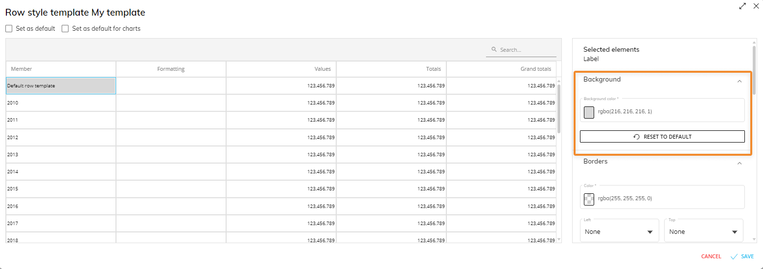
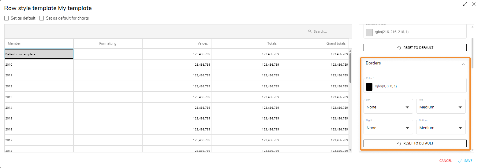
Choose a border color under the "Borders" menu and then choose the thickness of each border in their corresponding dropdown list.
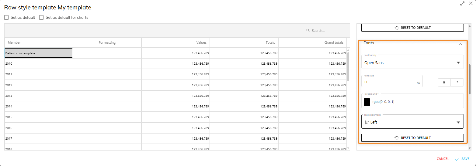
Configure the font under the "Fonts" menu. Here you can choose the font family, font size, text style, foreground color, and text alignment.
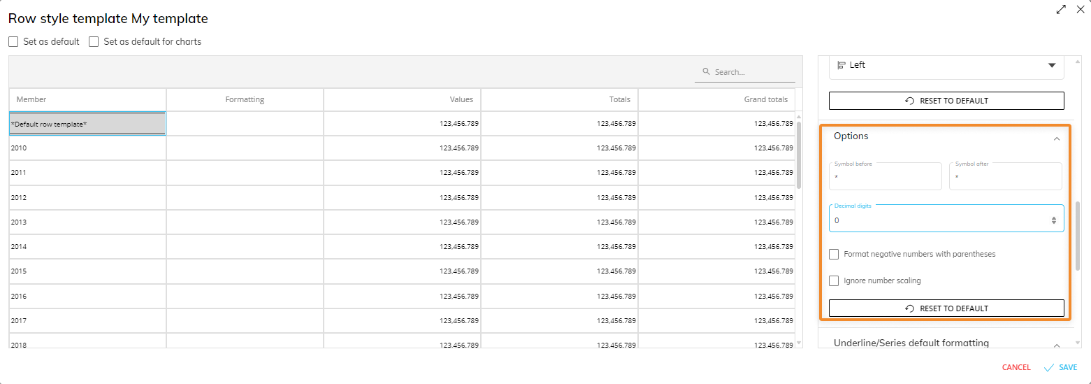
Configure the following additional settings under the "Options" menu:
Symbol before. Enter a symbol, word, or phrase which will be added as a prefix to the values displayed in the selected cells.
Symbol after. Enter a symbol, word, or phrase which will be added as a suffix to the values displayed in the selected cells.
Decimal digits. Enter the number of decimal digits that are displayed after the comma in the values in the selected cells.
Format negative numbers with parentheses. If enabled, negative numbers in the cells are displayed in parentheses and are not preceded by the minus sign.
Ignore numbers scaling. If enabled, the format will ignore the setting for numbers scaling, which displays a shortened number format with a "K" for thousands, "M" for millions or "B" for billions.
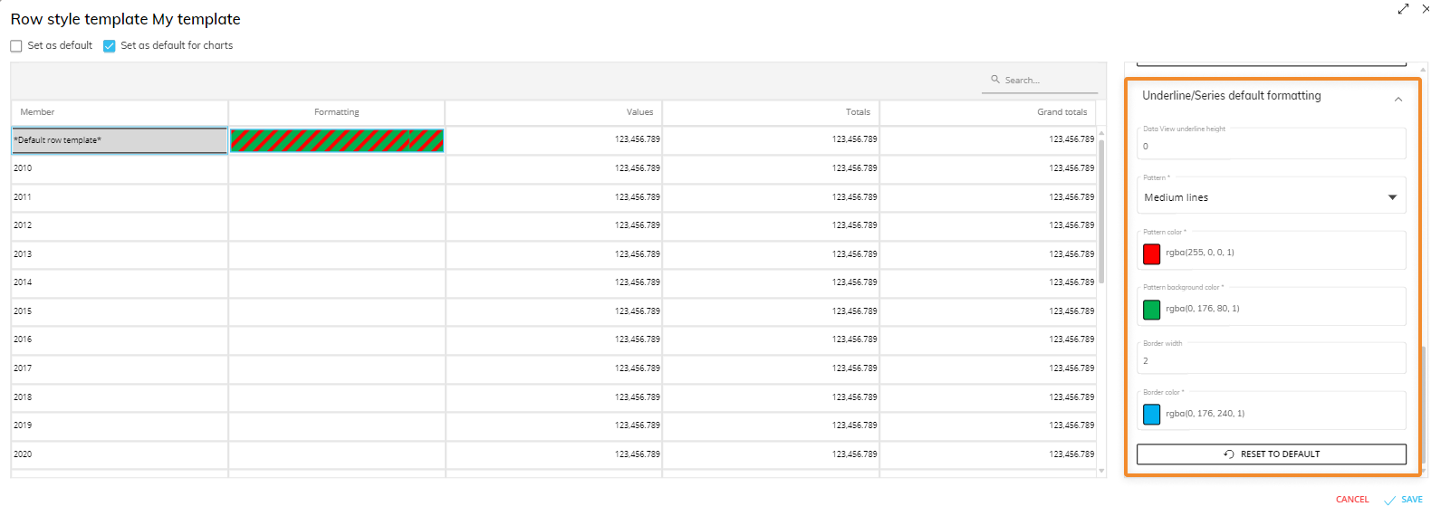
Configure default formatting for single Entities or single members of an Entity in the "Underline/Series default formatting" menu. You must select the cell under the "Members" column you wish to apply formatting to, and the customized formatting will appear under the "Formatting" column of the corresponding row of the selected cell (as shown in an example below):
Data View underline height (property only for Data Views). It sets the height of the underline for the Entity/member. If the value is greater than zero, it enables the underline on the Data View (0 = disabled). If different values are entered, the higher value is applied to all columns.
Pattern. If a pattern is selected, the following two related properties appear below:
Pattern color. Sets a fill pattern for the underline.
Pattern background color. Sets a color for the underline background.
Color. This property is only available if no pattern is selected. It defines a solid color for the underline of a Data View and for series/categories of any chart that has the corresponding Entity in the Layout associated with it.
Border width. This option determines the border width for the series/categories of the chart. If the entered value is greater than zero, it also enables the border on the Data View underline, but in this case the width is fixed and won't change regardless of the configured value.
Border color. Sets a color for the border of series/categories/underline.
In the Data View, the properties you set in a template work also if the associated Entity is set by Column or is used in a "Refer To" or a "Detail By" option. In charts, these properties also work if the associated Entity is set in the Series/Categories fields (and Categories, in the Pie chart) of the Layout, in a "Refer To" or in a "Detail By" option.
Underline/Series Formatting for Data Views vs Charts
When formatting an Object with the "Underline/Series default formatting" option, the appearance differs for a Data View and a Chart. The following example shows the difference.
The example below is a Row template for the Entity "Country" where all members have an Underline/Series format next to "Default row template" and a specific member format, in this case next to "Italy".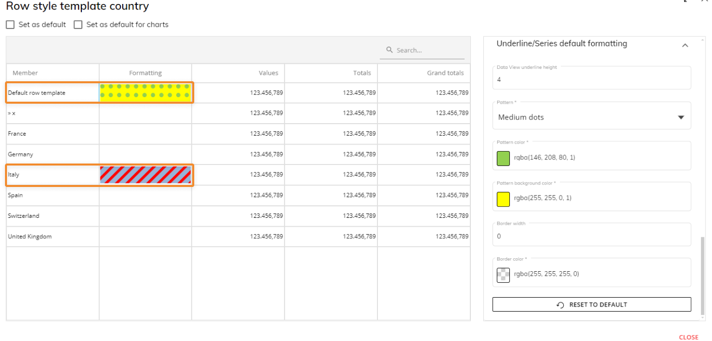
For a Data View, the customized pattern or colors will appear as an underline under the member name of a column. "Default row template" applies to all members and individual members can be customized by selecting them in the first column of the Row style template window.For a Chart, the customized pattern or colors will appear filled in for the Series member. In the example below, a bar chart shows the different patterns for the Series members.
In the example below, all members have a custom pattern created for the "Default row template" cell and the "Italy" member has an individual customized pattern: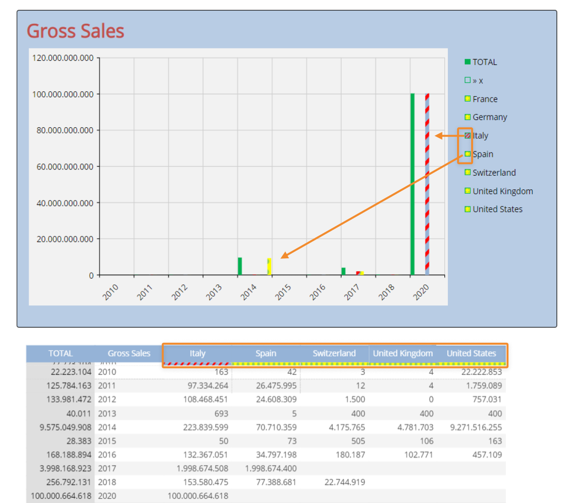
This is an example of that template format above applying to both a Chart and a Data View.When a template is applied to categories of a Bar chart, border settings are ignored (no border is displayed). This is a known limitation.
In case of a "Refer To" option in place, only the template set as default for charts for the chosen Entity is applied and it cannot be changed at the Object level, as the template has the highest priority over any other formatting option.
In case of a "Refer To" option in place and no default template configured for charts on the chosen Entity, no template is automatically applied: to apply one, the user must select it manually from the "Row Template" dropdown menu under the "Templates" menu on the right.MULTIPLE TEMPLATES
There can be only one template applied to a single Object: the template set manually in the "Template" widget has always the highest priority.
If one or more "Refer To" options are set in the Layout and none of the configured Entities is linked to a default template, the template set in the "Template" widget is always applied.MULTIPLE DEFAULT TEMPLATES
If no template has been set in the "Template" widget, the template is applied following the rules below.
Layouts with multiple "Refer To" options OR multiple "Detail By" optionsIf multiple "Refer To" options are set in the Layout and the corresponding Entities have a default template, the only template applied is the one defined by the first "Refer To" option encountered in the Block list. This also applies to Layouts with multiple "Detail By" options (and no "Refer To" options).
Layouts with multiple "Refer To" options AND multiple "Detail By" options
If one or more "Refer To" options are set in the Layout along with one or more "Detail By" options and the corresponding Entities have a default template, the only template applied is the one defined by the first "Refer To" option encountered in the Block list, as the "Refer To" option in this case has the highest priority.
To ensure backward compatibility, a "Set as default for charts" is at the top of the "Row style template" configuration page (disabled by default) as well as available in the window when creating a new template.
A "Formatting" column in the preview table shows the visual effect of the new settings.
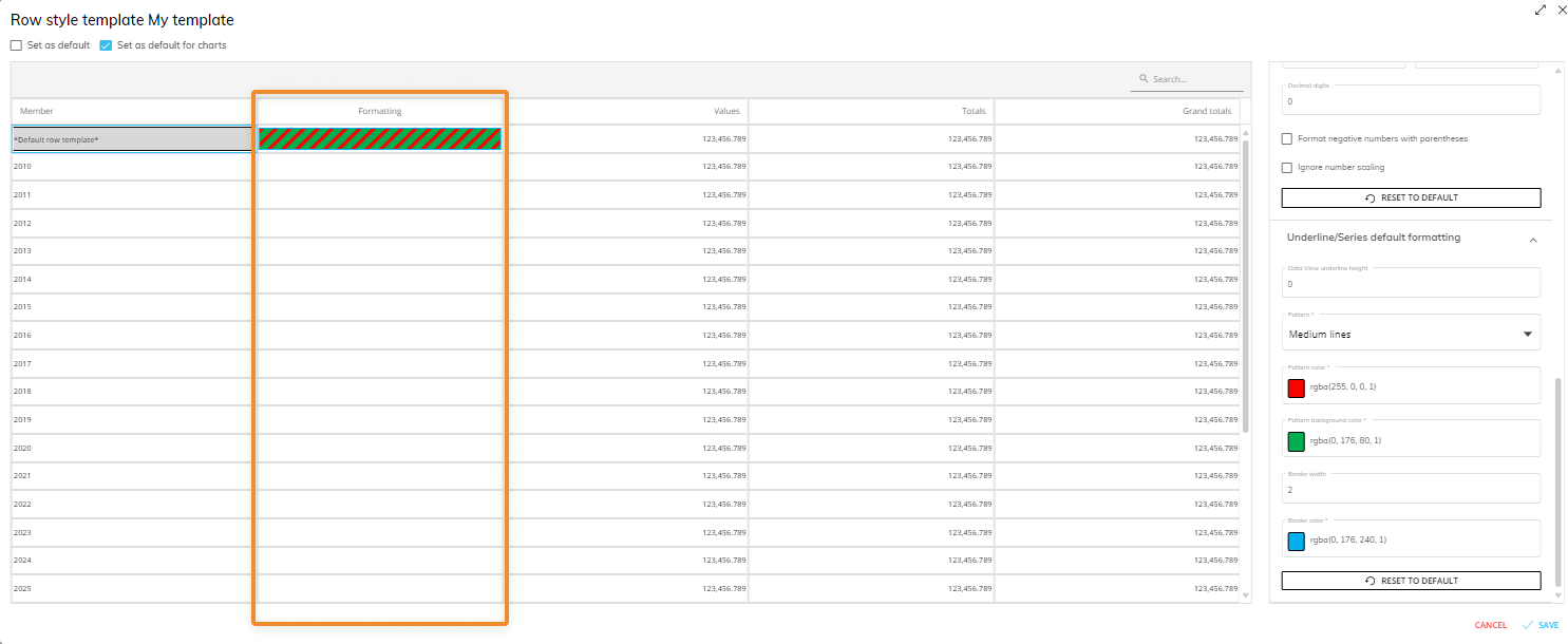 The properties are not available for columns other than the “Member” one.
Click on "SAVE" in the bottom right corner to save the template settings.
The "Format negative numbers with parentheses" option shouldn't be used on cells where Data entry is enabled because it doesn't allow you to save manually entered values.
Enable the "Set as default" option next to the template name to set it as the default one for the Entity it is associated with.
Format Behavior
The "Disable default format template" property (checkbox) allows the Developer to override the formatting options applied by a template: when this happens, the formatting options become active again and can be changed freely.
When the user overrides the last formatting options applied (via the Row style template, Block format, "Refer To" or "Detail By", etc.), those options are kept as a starting point for the user, who can customize them as he sees fit.
If you set a template as default (for charts or for Data Views), the template is only automatically applied to all existing eligible Objects if they have not been manually associated with other templates. You cannot manually remove a template that is set as default for an Entity unless you enable the "Disable default format template". You can create as many templates as needed, but there can only be one default template for each Entity of the Data Model: setting a template as the default on the same Entity where a default template was already configured will make the most recent template created the default one.
If a template applies some custom formatting properties only to specific members of an Entity, other members of that Entity will inherit the existing formatting properties applied at the Object level.