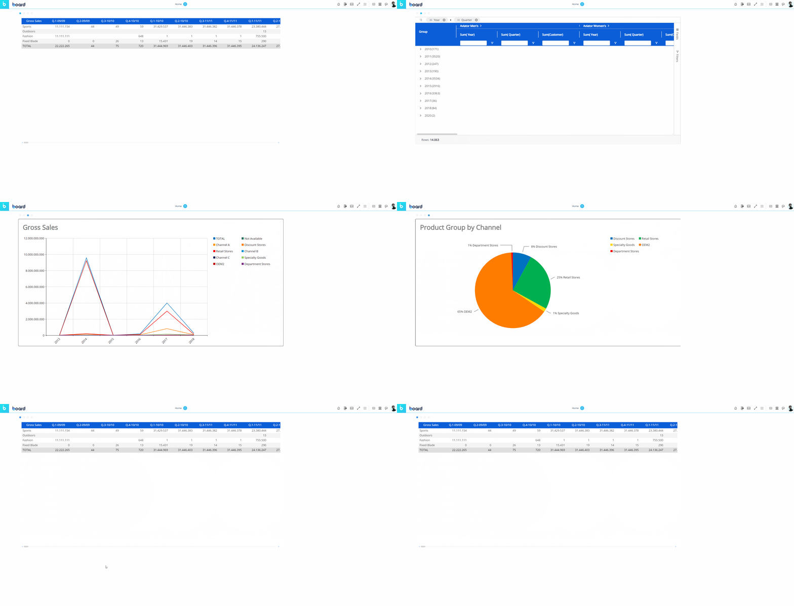
Screen Objects are widgets that display data or other types of information within a Screen; they are the primary components which populate a Screen.
Users with a Developer license or a Power User license can create and maintain Screens, and configure Objects on those Screens in order to display relevant information for user analysis.
The Planners can also interact with Objects in a number of ways, depending on their License, Role, security permissions and the configuration of the single Object and/or Screen. Some Objects, however, are or may not be interactive at all.
Objects take different forms and deliver different functions:
they can visually represent data (such as the Data View, Flex Grid, Charts, Gauges),
they can act as navigational elements within a Capsule (such as a Menu, Label or Button),
they can filter data on a Screen/Container (such as the Pager, the Selector, the Calendar), and
they can allow the users to manipulate data (such as the Entity Editor, the Data View with Data Entry enabled or Buttons that trigger Procedures).
Other Objects allow you to embed external web pages on a Screen (Web Viewer), show custom annotations (Dynawrite) or expand the Screen design area in order to add more Objects to a single Screen (Containers).
Objects and Object formats can be copied across Screens, even if they are not in the same Capsule. Once added to a Screen, Objects can be resized and moved anywhere within the Screen design area.

Options common to all Screen Objects
Each Object has its own specific settings and configuration options. However, all Objects share the following set of common features and properties, located in the Object Properties panel to the right of the Capsule workspace in Design Mode when an Object is selected:
"Data" section
Master. If enabled, click on an Entity member, a series, a category or a marker (if available) to update the data displayed by all other Objects on the Screen in order to show only the data relating to the clicked item. The Master Object result is similar to applying a Screen Selection.
The Master Object is only available for data visualization Objects located in the first group of the Screen Object list (Objects Data View to Tree).
Disable Drill down. Disables the drill-down functionality on the selected Object, both in Design Mode and Play Mode.
Disable Drill down is only available for data visualization Objects.
Object toolbar settings. Allows you to enable the toolbar in Play Mode, pin it so that it is always available, and choose a dark color theme.
"Design" section
Position and size. The configuration of the Object's position on the Screen, its size, and a rotation angle.
Colors. The Object's elements' colors or background image configuration.
Border. The Object's border style configuration.
Font. Font configuration: text font family, font size, and color.
Effects. The Object's transparency configuration. In Play Mode, the Object will appear opaque until you hover over it.
"More" section
On Screen tips. Enable to create a custom mouse-over tooltip. An icon will appear over the Object in Play Mode, and when the user hovers over the icon a message will appear.
This is helpful for directing the user or communicating with others who will access the Screen. Access the options by enabling "On-Screen tips".
Tip type. Choose the format of the tooltip that displays to the user, either "Dialog" or "Balloon".
Dialog. Shows message in a popup window.
Balloon. Shows message in a text bubble over the Object.
Content. Write the message of the tooltip which will display when the user hovers over the icon.
On-Screen element. Choose the Format of the element: "Icon" or "Text or Number".
Icon. Customize the displayed icon.
Choose icon. Choose the icon you want to display for the mouse-over tooltip.
Text or Number. Customize the Text or Number.
Text or Number. Write in what you would like the element to say.
Position. Choose the position of the element.
Background. Choose the background color of the tooltip.
Icon. Choose the icon, text, or number color.
Enable animation. Enable, and the element will pulse to draw the user's attention.
Hover tooltip. Write a message that will appear to the user when the mouse hovers over the Object.
Configure Multiple Objects
You can also select multiple Objects to configure them at once. In this case, only properties common to all of those selected Objects will be available.
See Add and remove Objects and Configure Screen Objects for more details.
Available Screen Objects
In a Capsule, Developers can add the following Screen Objects to a Screen:
Data Objects:
Geo Maps
Interaction Objects:
Navigation Objects:
Content Objects:
Container Objects: