This topic describes how to configure each type of Container and its specific properties.
Each type of Container has its own specific settings and configuration options, as detailed in the following paragraphs. However, all of them share options common to all Screen Objects and the "Enable ATO" property.
Tab Container
The Tab Container creates folders to contain other Objects, including other Containers. It shows one Object at a time with the option of selectively moving through tabs.
To add an Object to the Container, simply drag and drop it on the Container area where it says "Drop Objects here". A new tab will automatically be created.
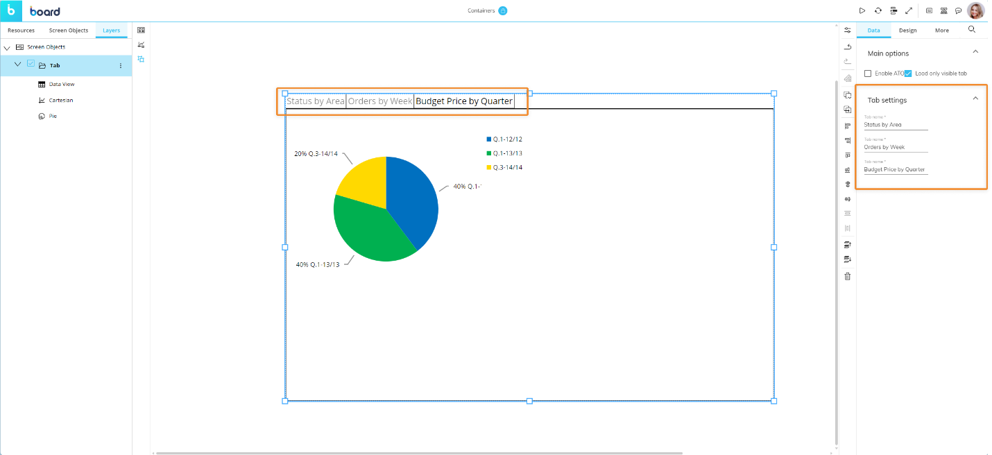
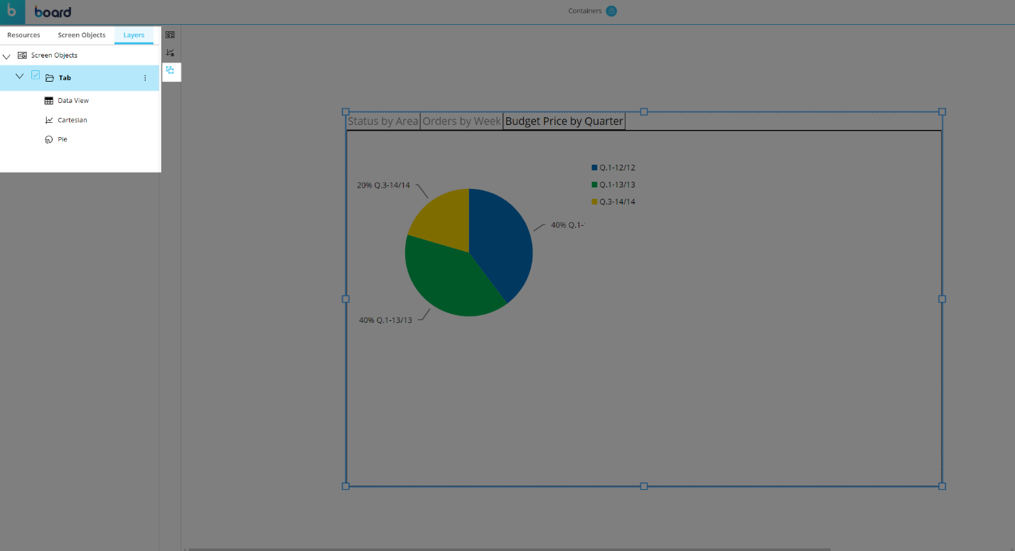
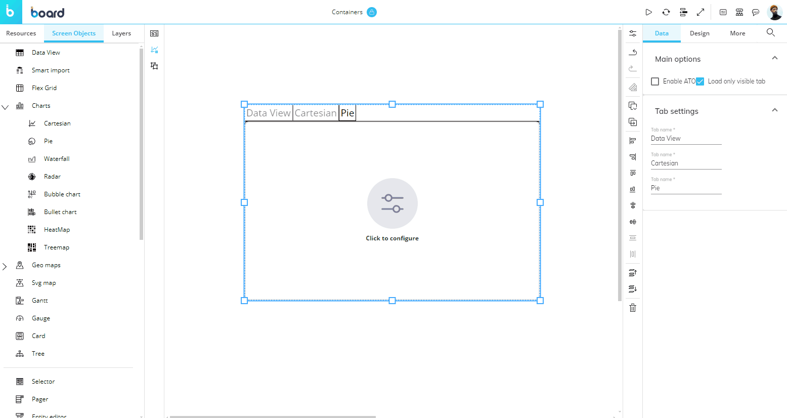
Tab labels can be renamed from the Properties panel on the right side of the Screen editing page once the Container is selected.
To delete a tab, delete the Object that it contains. You can do this by selecting the Object and clicking the trash icon in the vertical Properties toolbar. Otherwise, you can navigate to the "Layers" tab in the left panel of the Screen editing area, select the Container and click the trash icon in the vertical Properties toolbar.
The Tab Container can also be used to create ATO management environments: to do so, check the "Activate ATO" option under "Data" in the Properties panel once the container is selected.
The following properties specific to the Tab Container are available in the Object Properties panel on the right side of the Screen editing page:
Data properties
Load only visible tab. This option will only load visible tabs.
Tab settings. Rename each tab you make.
Design properties
Font. Font configuration: text font family, font size and color, if applicable.
Transition Container
The Transition Container displays Objects in sliding panels that can be browsed manually or as an automatic slideshow. It can contain any Object as well as other Containers.
Example of a Transition container with four sliding panels and auto play enabled
To add an Object to the Container, simply drag and drop it on the Container area. A new panel is automatically created.
You can change the panel order by dragging and dropping the corresponding Object up or down the list in the Layers subpage.
The following properties specific to the Transition Container are available in the Object Properties panel on the right side of the Screen editing page:
Enable slide show. Enables auto play for the slideshow effect. If enabled, the slides succession enters a loop and does not stop, even if all slides have already been shown.
Slide show interval. Defines the time span the container must wait before moving to the next panel. The values are expressed in seconds. The higher the values, the longer a panel is displayed.
Vertical alignment. Defines the vertical position of the navigation elements. When the "Center" option is selected, previous/next buttons (arrows) appear on the sides of the container.
Horizontal alignment. Defines the horizontal position of the navigation elements.
The Transition container can also be used to create ATO management environments: to do so, check the "Activate ATO" option under "Data" in the Properties panel once the Container is selected.
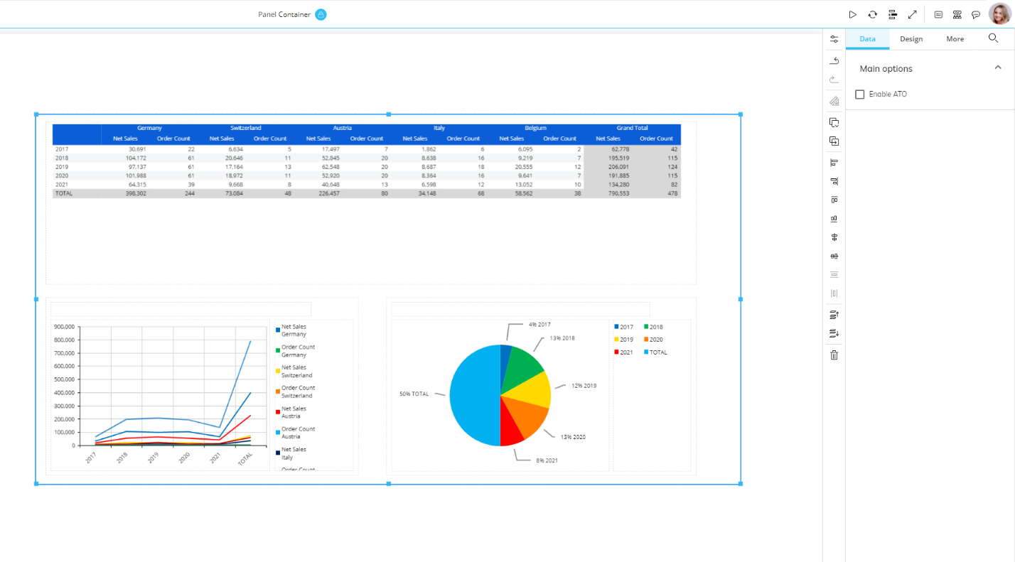
Panel Container
The Panel Container is a rectangular frame which can be used to group Objects. It can contain any Object as well as other Containers.
The Panel Container is particularly useful when you want to move multiple Objects together because the size and position of the Objects it contains remains fixed.
In the following picture, a transparent Panel container consists of three other Objects.
The Panel Container can also be used to place multiple Objects within the same tab of a Tab Container, as shown below.
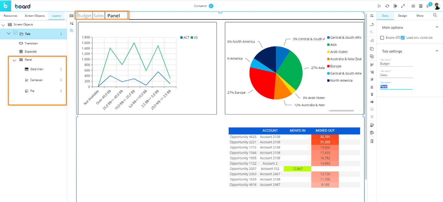
As you can see from the Screen Objects order in the left panel, the Panel Containers have been added to a Tab Container, creating a flexible configuration capable of showing multiple Objects in a single tab.
If an Object contained in a Panel does not fit within its area, then scrollbars will appear to assist with navigation of the content.
The Panel Container can also be used to create ATO management environments: to do so, check the "Activate ATO" option under "Data" in the Properties panel once the Container is selected.
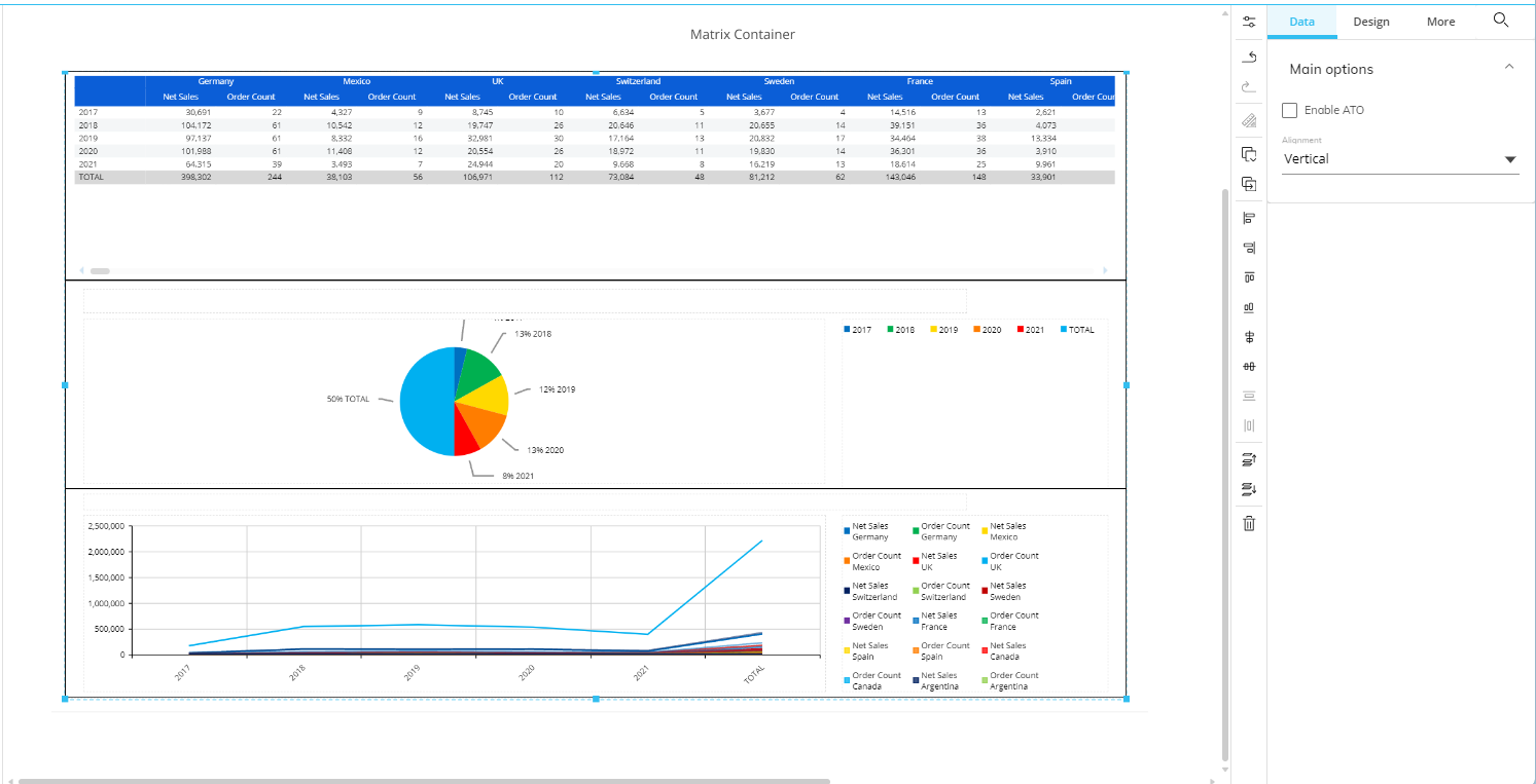
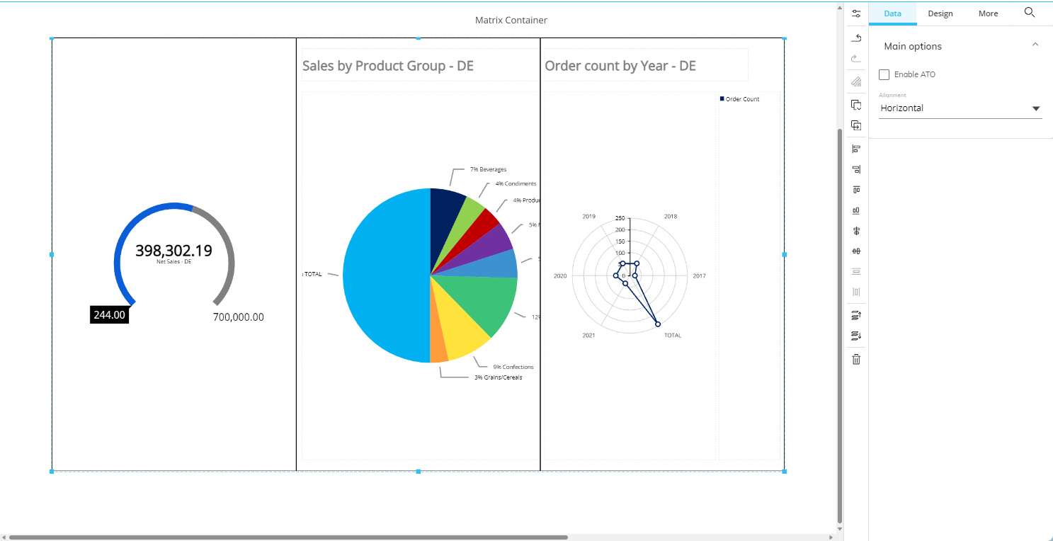
Matrix Container
The Matrix Container shows embedded Objects in a grid of rows and columns of equal size. It can contain any Object as well as other Containers.
Example of a Matrix container with four charts
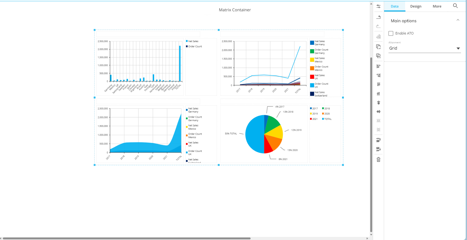
The Matrix Container automatically readjusts the number and size of rows and columns dynamically as new Objects are added.
You can change the Objects order by dragging and dropping the corresponding Object up or down the list in the Layers subpage.
Three alignment options specific to the Matrix Container are available in the Object Properties panel under "Data" on the right-hand side of the Screen editing page:
Grid (default setting). Objects are arranged in a responsive grid that adjusts according to the number of objects added.
Horizontal. All Objects are arranged in a single row.
Vertical. All Objects are arranged in a single column.
Choose your alignment option immediately after having dropped your Objects on the Container area, before configuring Layouts. If you switch to another alignment option after configuring Layouts, the size of the Objects won't automatically fit and you will need to manually adjust it using the options in the "Position and size" menu.
Example of 3 Objects embedded in a vertically aligned Matrix Container
Example of three Objects embedded in a horizontally-aligned Matrix Container
The Matrix Container can also be used to create ATO management environments: to do so, check the "Activate ATO" option under "Data" in the Properties panel once the Container is selected.
Book Container
The Book Container displays embedded Objects with a page-flip effect. It can contain any Object as well as other Containers.
To add an Object to the Container, simply drag and drop it on the Container area. A new "page" is automatically created.
You can change the "page" order by dragging and dropping the corresponding Object up or down the list in the Layers sub-page.
To turn pages, click the previous/next arrows on the sides of the Container.
The Book Container can also be used to create ATO management environments: to do so, check the "Activate ATO" option in the Properties panel under "Data" once the Container is selected.
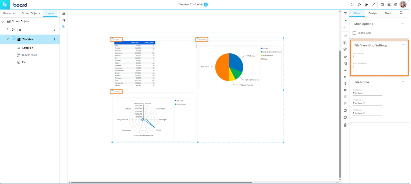
Tile View Container
The Tile View Container displays embedded Objects in tiles minimized in a grid, providing an overview on the included Objects.
Tile labels can be renamed from the Properties panel on the right side of the Screen editing page once the Container is selected.
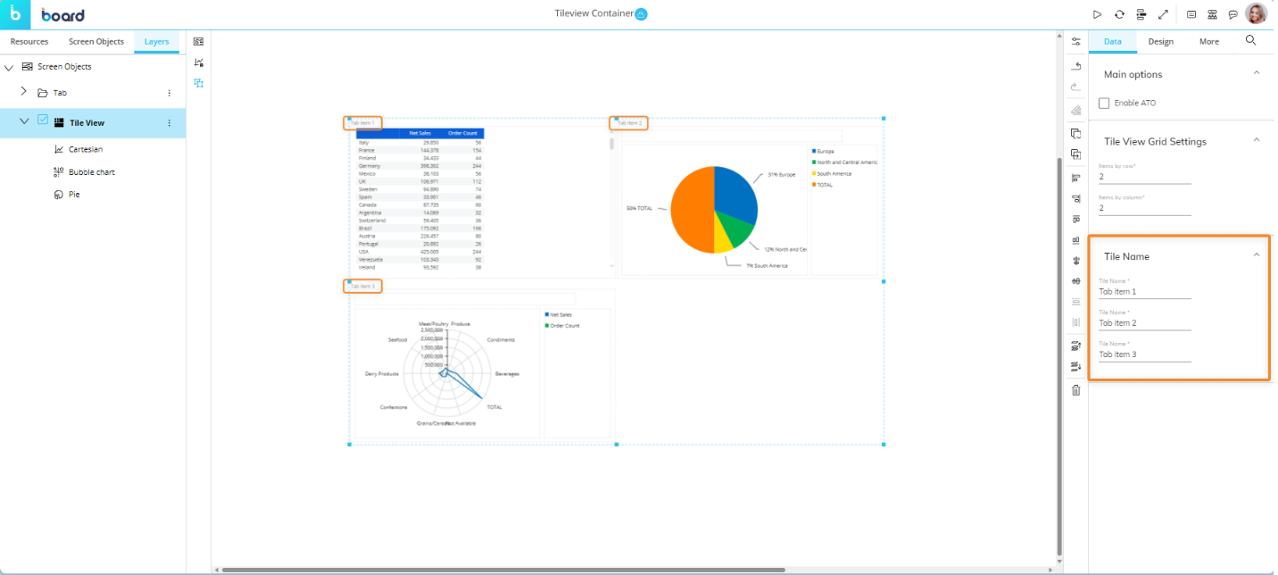
You can also configure how many Objects should be displayed in each row and column of the Container. To do so, go to the "Tile View Grid Settings" menu under "Data" in the Properties panel and enter the desired settings.
To add an Object to the Container, simply drag and drop it on the Container area. A new tile is automatically created.
We recommend to limit the number of Objects in a Tile View container to 12, also considering other Objects included on the Screen. When designing a Screen, you should always consider the total time required to open it, which depends on the number of Objects added.
You can change the Objects order in the Container by dragging and dropping the corresponding Object up or down the list in the Layers sub-page.
The following properties specific to the Tile View Container are available in the Properties panel on the right side of the Screen editing page:
Design properties
Font. Font configuration: text font family, font size and color, if applicable.
The Tile View Container can also be used to create ATO management environments: to do so, check the "Activate ATO" option under "Data" in the Properties panel once the Container is selected.
Expander Container
The Expander Container displays embedded Objects in columns. It can contain any Object as well as other Containers.
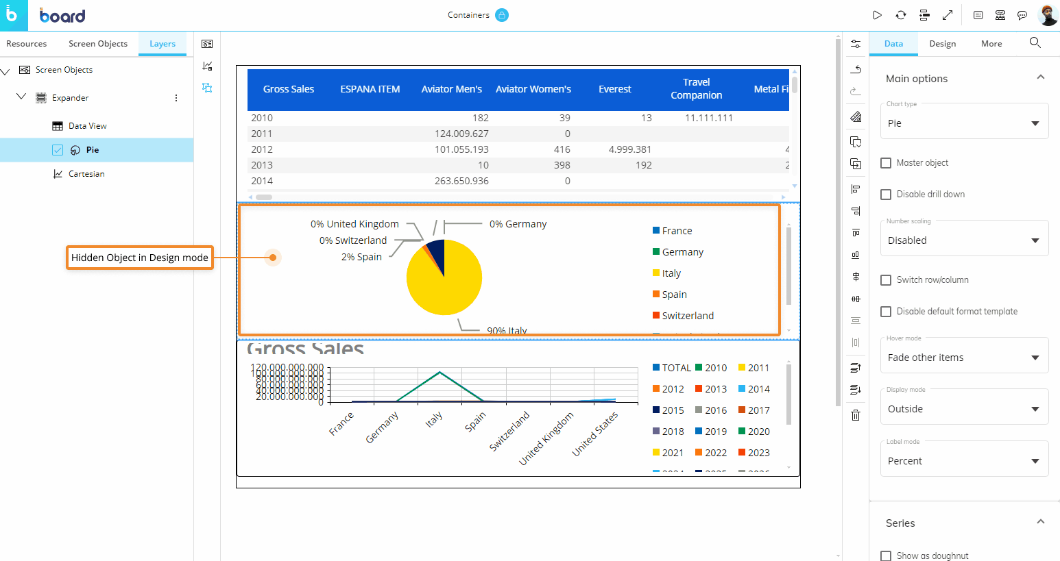
You can manage the visibility of embedded Objects in order to show or hide some of them in Play Mode: their position in the Container when the Screen is opened in Play Mode depends on the configuration of the visibility properties.
For example, if an Expander contains one Data View in the first position, a Pie chart in the second, and a Line chart in the third position, but the Pie chart is hidden due to its visibility settings, the Line chart is automatically displayed in the second position of the Container after the Data View.
To set an Object as hidden, open the Layout editor and go under "Dynamic Options" under the "Object Settings" tab. Then, under the "Dynamic Options" menu, select a Block from the "Visibility" dropdown menu and tick the Inverse checkbox beside it.
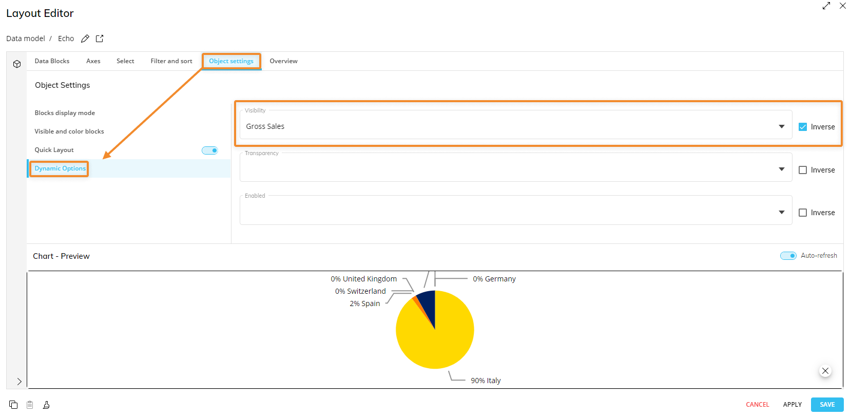
In the image above, the Pie chart is set to hidden, but it will still be visible in Design Mode. In Play Mode, the Object following it will move up one place in the Expander Container, hiding it from the Planners, like in the example below.
To add an Object to the Container, simply drag and drop it on the Container area. A new column element is automatically created.
You can change the Objects order in the Container by dragging and dropping the corresponding Object up or down the list in the Layers sub-page.
The Expander Container can also be used to create ATO management environments: to do so, check the "Activate ATO" option under "Data" in the Properties panel once the Container is selected.
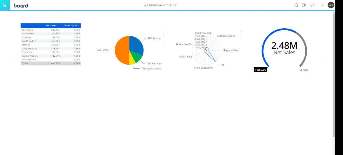
Responsive Container
The Responsive Container shows embedded Objects in a customizable grid of rows. The grid is responsive (i.e. it adjusts smoothly to various screen sizes) and it can contain any Object as well as other Containers.
Example of a Responsive container behavior with different screen sizes
To add an Object to the Container, simply drag and drop it on the Container area. A new element (child) is automatically created.
You can change the Objects order in the Container by dragging and dropping the corresponding Object up or down the list in the Layers sub-page.
To configure how Objects should be displayed in the Container, open the "Grid Settings" menu under "Data" in the Properties panel, and enter the desired settings.
The "Children width" type dropdown offers two options:
Fixed. The element’s height and width will not adjust to the available screen space.
Dynamic. The element’s height and width will adjust to the available screen space, based on the minimum and maximum values configured in the fields below.
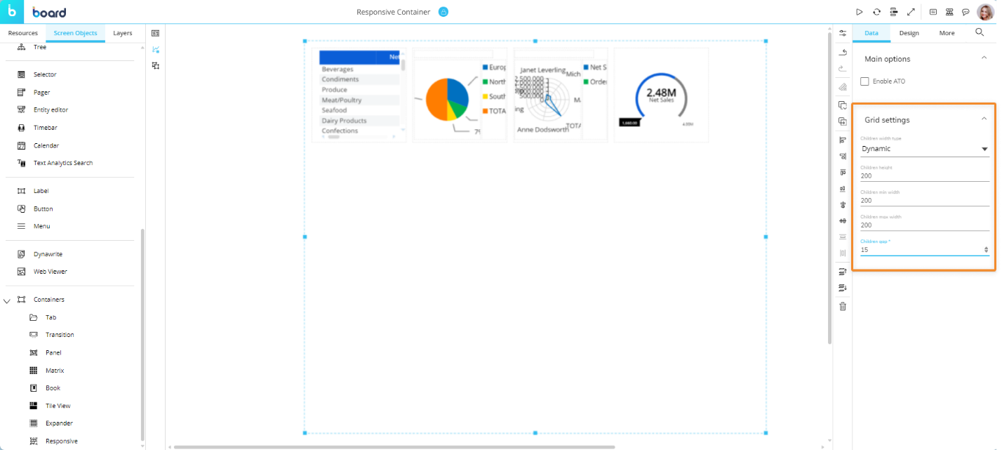
The "Children height " field lets you configure the vertical distance between grid elements.
The "Children width" field lets you configure the horizontal distance between grid elements.
The "Children gap" field lets you configure the margin distance from between the top of the Container and the grid elements.
The Responsive container can also be used to create ATO management environments: to do so, check the "Activate ATO" option under "Data" in the Properties panel once the Container is selected.