Flex Grid is a unique Object in that most of its configuration is done by interacting within the Flex Grid itself. Customizing a Flex Grid in Design Mode to have a specific saved configuration for an end user in Play Mode is covered in the following paragraphs:
Formatting the Object settings, options, and colors are covered in Formatting a Flex Grid article.
The "Fields" panel & Pivot Mode in Design Mode
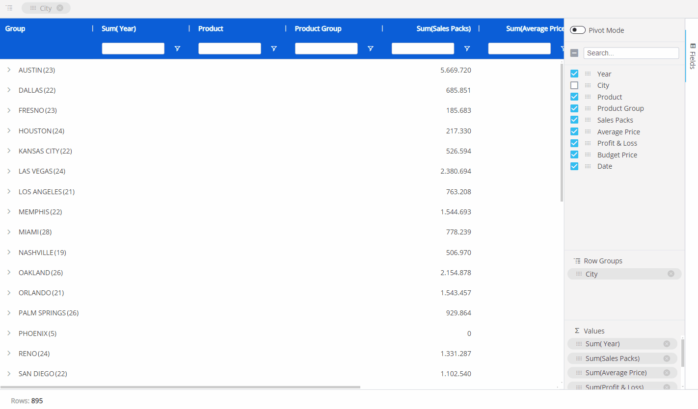
The panel labeled "Fields", displayed vertically on the right side of the Flex Grid, is a powerful tool specific to the Flex Grid that gives the Planners the ability to pivot and display data in different ways, depending on the configuration made by the Developer.
Beyond the capabilities of grouping and setting fields by Row within the Flex Grid, the Fields panel allows you to group fields by Column using the "Pivot Mode" feature, giving you even more flexibility and freedom to configure your dataset.
You can configure the Flex Grid in 2 ways:
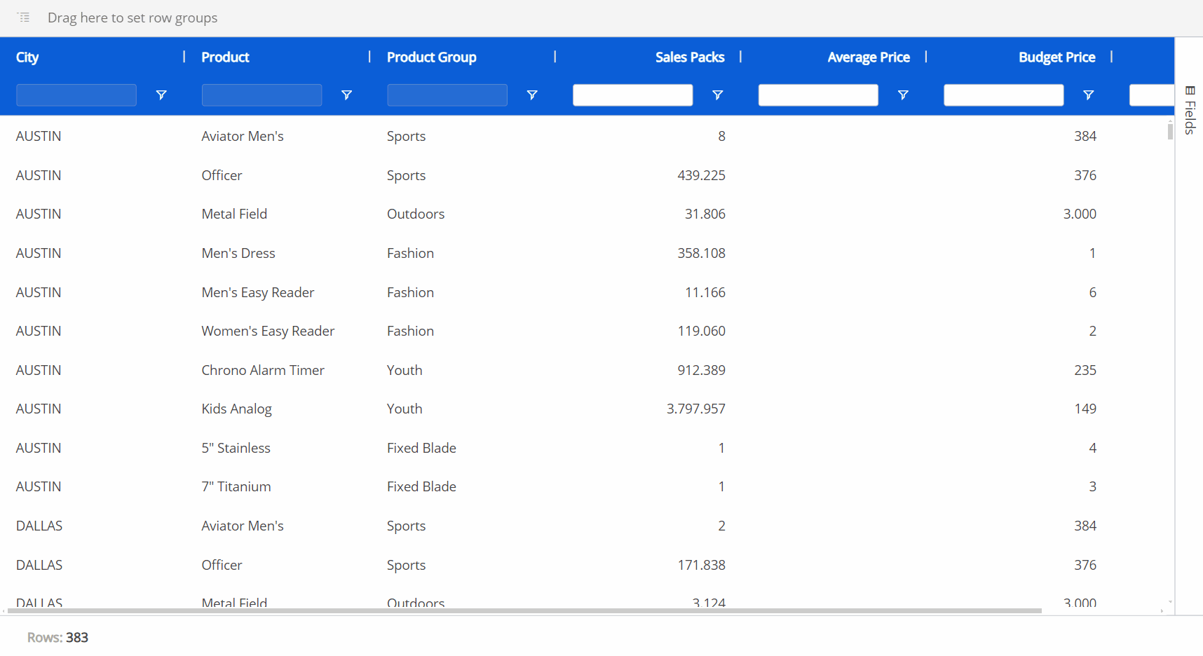
Flat view. In flat view, you see all the fields selected which can be grouped by Row. All rows of the dataset are always part of flat view. Even if row groups are defined, you can expand all row groups to display the distinct rows of the dataset, chosen in the Axes area of the Layout Editor.
Click on the Fields panel to open it. Then drag and drop fields into Row Groups or Values areas or hide Blocks from the panel. You can also drag column headers to the top bar of the Flex Grid that says "Drag here to set row groups".The maximum number of columns allowed on a Flex Grid is 1 million.
Pivot Mode. In Pivot Mode, you only see aggregated data by rows that are based on the group configuration in the Fields panel, and you also have the possibility to group By Column, which becomes available only when "Pivot Mode" is enabled. Enable the Pivot Mode toggle to configure the default Pivot Mode view.
Drag and drop fields as before, but now you can add Column groups under the "Column Labels" section that appears at the bottom of the panel.
The configuration made in the Flex Grid from Design Mode can be saved as a default view for Planners in Play Mode by clicking "SAVE" in the Top menu.
Configuring a Default view
To configure a default view:
For flat view, click on the "Fields" panel to open it. Then drag and drop elements into Row Groups, Values, or hide Blocks from the panel. Press "SAVE" to save the flat view configuration as the default view for the Planners.
For Pivot Mode, click on the "Fields" panel to open it. Enable the Pivot Mode toggle to configure the default Pivot Mode view. Drag and drop fields by Row Groups, as in flat view, and Column groups under the "Column Labels" section that appears at the bottom of the panel. Press "SAVE" to save the Pivot Mode configuration as the default view for the Planners.
Fields panel options
In the "Fields" panel, the options available are the following:
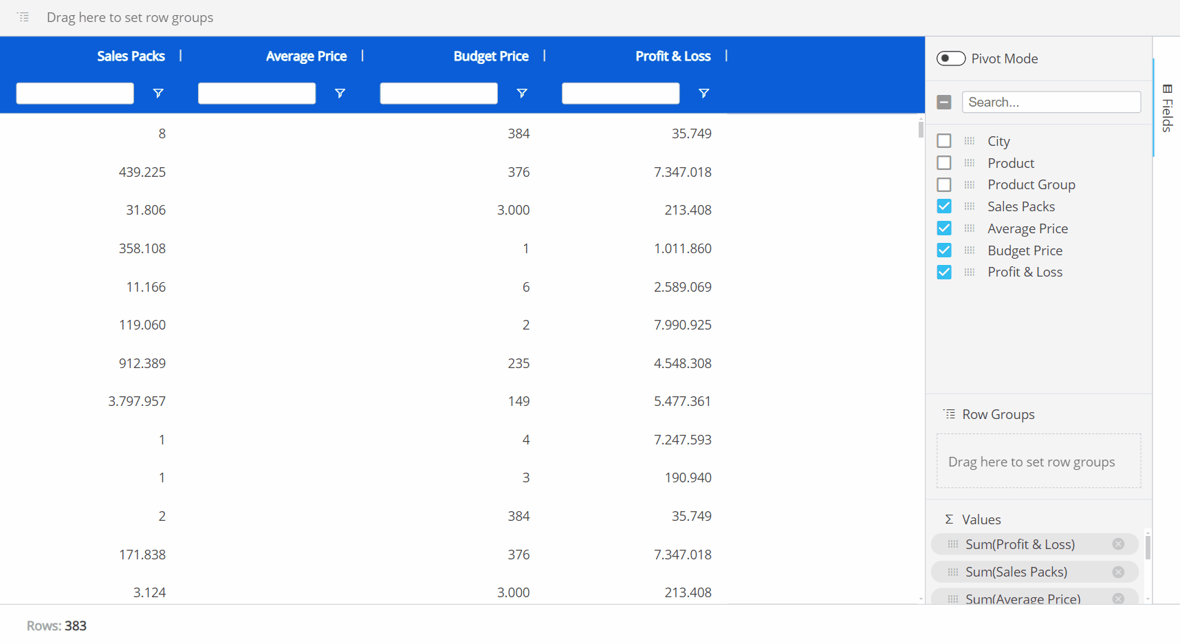
Pivot Mode. Enabling Pivot Mode allows you to customize the display of the Flex Grid in more detail. Upon enabling for the first time, all the default settings are cleared and the feature "Column Labels" appears. After configuring the Flex Grid in Pivot Mode, you can alternate between the default flat view configuration and the Pivot Mode selections made by enabling or disabling the Pivot Mode toggle.
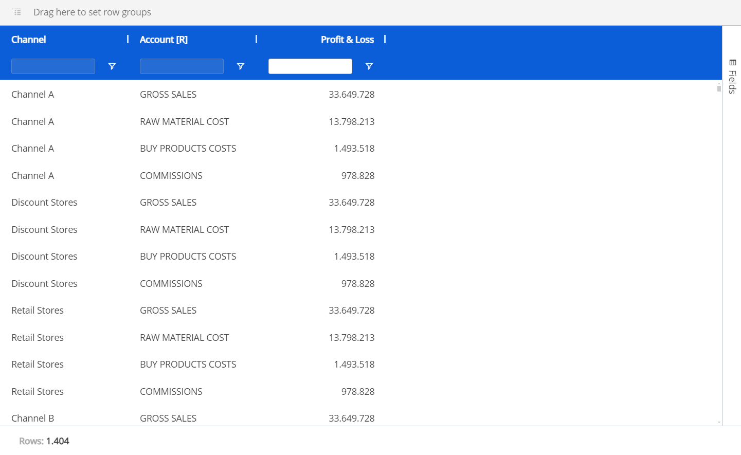
Column Labels. Enabling Pivot Mode will unlock the "Column Labels" feature. Drag and drop fields into the Column Labels area that you would like to group by column. For example, in the Flex Grid below, we break down the P&L data by Product group and Product, while by Row we have the City field. When you have multiple fields in the Column Labels area, you will also be able to expand and collapse column groups.
When a group of columns is collapsed, it will show the total value for that group.
Search. Use this searchbar to find a field within the list below it (of only the fields configured in the Layout).
The checkbox that appears to the left of the searchbar is used exclusively for the search results. The checkbox will select or deselect all the fields that are displayed under the searchbar.
For example, if you search for "Sales" from a list of 10 fields, and 2 fields show up called "Gross Sales" and "Total Sales", you can select or deselect only these fields that displayed via the search function by selecting or deselecting the checkbox to the left of the searchbar.Checkbox behavior. The checkbox is selected only when all the fields below the searchbar are selected. If some are not, the checkbox will appear with a minus sign. If the checkbox is enabled with a checkmark, all field results via the search will be selected. If deselected when all fields are selected, all fields will become deselected.
If nothing is entered into the searchbar, then all the fields are listed. The same behaviors as above apply when nothing has been searched.
Fields. All fields configured in the Flex Grid will display under the searchbar. You can rearrange the position of the fields in the Flex Grid by dragging and dropping a field in a different order. The first field in the list will display on the leftmost side of the Flex Grid columns, while the last will display on the rightmost side. You can also drag and drop these fields into the areas below: Row Groups, Values and Column Labels.
Row Groups. Drag and drop one or more fields you would like to configure the Flex Grid by row. By adding more than one, the row fields become grouped. The grouping behavior is determined by the position of the field in the "Row Groups" list. The first field in the list is the root group, the second is the first sub-group, the third is the next sub-group, and so on.
Values. Drag and drop fields here in order to aggregate the data on field groups. A new column appears in which it will display the aggregated value. The default aggregation is sum, but the aggregation can be changed via the "Value aggregation" menu access by the header options menu or directly in the Columns panel. From the Columns panel, click on the field under the Values section to display a dropdown menu where you can choose between average, count, first, last, max, min, and sum.
Read more about interacting with the "Fields" panel in Play Mode.
Interactions with a Flex Grid using the "Fields" panel can be exactly the same for an end user in Play Mode, if the configuration allows it.
Grouping in Design Mode
You can group fields of a Flex Grid via flat view or Pivot Mode directly from the Flex Grid Object.
The difference being that, in Pivot Mode, you can dimension the whole grid by rows and group columns, whereas in the flat view (with Pivot Mode disabled), you can only group the field by Row.
Any field can be used to create a row group in a Flex Grid. Differently from a Data View, where only Entities can be set By Row, in Flex Grid, users can use any type of data, referred to as a "field", to create groups (text, values, dates, algorithms, etc.). A Flex Grid simply creates row groups based on the data available in that field.
When grouping by Row, regardless of the view, you can configure how much, if at all, the group should expand by default for the Planners in Play Mode by using the Expression level setting in the Object Properties panel.
The grouping configuration made in the Flex Grid from Design Mode can be saved by clicking "SAVE" as a default view for the Planners in Play Mode.
Grouping in flat view
To group the full dataset by row in flat view:
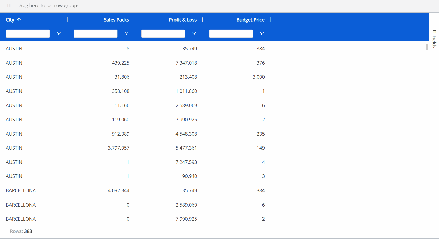
Drag and drop a column header of a field into the top grey bar that says "Drag here to set row groups". You can also group the flat dataset in a similar way by utilizing the Fields panel without enabling "Pivot Mode" and dragging and dropping fields into the "Row Groups" section. This will automatically set that field by row, grouping the others under it, as in the example below. You can change the hierarchy of the groups by dragging and dropping the elements in the order you want, the leftmost position being the most-nested.
Press "SAVE" to save the grouping for the Flex Grid in flat view as the default view for the end user in Play Mode.
The field to the leftmost position in the grid or in the Row Groups area at the top of the Flex Grid as well as the top position within the Fields panel under "Row Groups" and "Column Labels" is the most-nested Entity.
Grouping in Pivot Mode
To group a dataset using Pivot Mode, access the "Fields" panel from the right side of the Flex Grid, and proceed as follows:
Enable the Pivot Mode toggle.
Dimension fields by Row by dragging and dropping fields into the "Row Groups" section. You must have at least one field dimensioned by Row Groups. You can change the hierarchy of the groups by dragging and dropping the elements in the order you want, the top position of the "Row Groups" section being the most-nested.
Group fields by Column by dragging and dropping the fields into the "Column Labels" section (which only appears once Pivot mode is enabled). You can change the hierarchy of the groups by dragging and dropping the Entities in the order you want, the top position of the "Column Labels" section being the most-nested. On the grid, you can expand and collapse the Column groups as you want.
Press "SAVE" to save the grouping configuration for the Flex Grid in Pivot Mode as the default view for the end user in Play Mode.
The different ways of grouping is shown below:
Grouping a Flex Grid can be exactly the same for an end user in Play Mode, if the configuration allows it.
Sorting and filtering in Design Mode
There are 2 areas that contribute to sorting and filtering a Flex Grid in Design Mode:
In the Object Properties described above. The "Sorting modification" and "Filtering modification" settings which will allow the Developer as well as the Planners to use the sort or filter features. Enabling "Sorting modification" and/or "Filtering modification" will also give you the option to allow single or multiple filtering and/or sorting, as described in the following paragraph: Multiple sorting & filtering.
Directly from the Flex Grid Object in which you can save the display configuration after sorting and filtering as a default view for the Planners in Play Mode. Simply press "SAVE" in the Top menu once configured.
To sort directly from the Flex Grid Object:
Enable "Sorting modification" from the Object Properties panel.
Click on the field header you would like to sort from or click on the field under the "Row Groups" section in the Columns panel.
Arrows will indicate the order: up arrow for ascending, down arrow for descending, or no arrow for the default order.Click "SAVE". This will save the sorting for the Planners to encounter in Play Mode when first entering the Screen.
To filter directly from the Flex Grid Object:
Enable "Filtering modification" from the Object Properties panel.
From the Flex Grid Object, there are 3 ways to filter: click on the filter icon, search in the textbox under a column header, or go to the column options menu and click on the filter icon from the window.
Read in more detail about the 3 ways to filter in the Interacting with a Flex Grid article, as it is the same for the end user in Play Mode if the configuration allows it.Click "SAVE". This will save the filtering for the end user to encounter in Play mode when first entering the Screen.
You can also configure whether the Planners can filter and/or sort the Flex Grid in Play Mode, and if so, only a single filter/sort or multiple filters/sorts from the Object Properties panel.
Sorting and filtering a Flex Grid can be exactly the same for Planners using Play Mode if the configuration allows it.
Multiple sorting & multiple filtering
It is possible to sort and filter by multiple fields, if the configuration allows it. When multiple sorting and/or filtering is allowed, the first sort or filter applied is the first priority in the hierarchy, while the second and third sort or filter becomes the second and third priority, respectively.
Multiple sorting allows multiple columns to apply a sort, whereas a single sort only allows one column to apply a sort to the Flex Grid Object.
Multiple filtering allows multiple filtering per column, whereas a single filter only allows one filter per column.
Read more about how to configure multiple sorting and filtering and what the differences are to single sorting and filtering in the Formatting a Flex Grid article.
When sorting multiple fields, a number will appear next to the field header to indicate the priority order of the sort.
When filtering multiple fields, the textbox option under every field is available.
Tree view for Unbalanced Entities
Multiple Unbalanced Entities by row are supported by the Flex Grid Layout. You can dimension a Flex Grid by one or more Unbalanced Entities and save the Flex Grid in tree view for the Planners in Play Mode. Tree view enables the display of an Unbalanced Entity's hierarchy in a tree form, allowing users to interact with it by expanding and collapsing different nodes, as opposed to viewing the Entity in flat view.
The following information in regards to Unbalanced Entities in the Flex Grid should be noted:
You can add multiple Unbalanced Entities by row in a Flex Grid Layout, and the Object will calculate the aggregation of data required by each Unbalanced Entity.
The Unbalanced Entities do not need to be in the most-nested position.
Disabling an Unbalanced Hierarchy has been improved and is managed for each Block individually (even if the Unbalanced Entity is not set By Row). This allows you to cover more use cases where, before, it was only possible to disable the Unbalanced Entity aggregation on all the Blocks of the configuration.
To see an Unbalanced Entity in tree view, you must be in flat view. Click on the hamburger icon in the top right corner of the Unbalanced Entity's column (the Column menu) and select "Switch to tree view". To exit the tree view, click on the hamburger icon in the top right corner and then select "Switch to flat view". Press "SAVE" in the top menu to save the tree view for Planners in Play Mode.
The tree view of the Unbalanced Entity will not retain any grouping.
In Play Mode, tree view is only available when the Flex Grid is in flat view and Pivot Mode is not enabled. When Pivot Mode is enabled, tree view is automatically disabled.
The Object toolbar
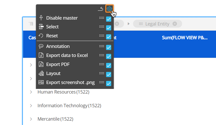
You can configure which options will be available in the Object toolbar to the Planners in Play Mode. To do so, double-click or Ctrl + click the Object and click the Object toolbar icon ( ) in the top left corner, then expand it by clicking on the 3 vertical dots ( : ) the configuration panel is accessible from the cog icon in the top right corner. Then select or deselect the options. You can also reorder the options by dragging and dropping the option by its corresponding moveable icon (
  ).
).
Options can only be moved within their sections, determined by the line separating each section.
Flex Grid column menu
Every column displayed in a Flex Grid has a menu for further options and capabilities.
Hover over the column header and click on the hamburger menu icon. There may be up to 3 subpages of menu options available: main options, filtering, and quick pivoting.
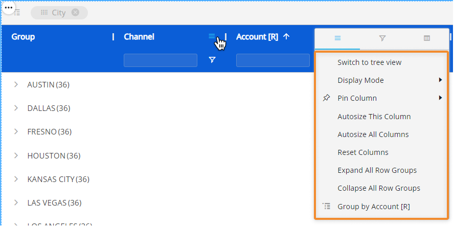
Main options . Customize Axes settings directly from the Flex Grid and save them as a default view for the Planners in Play Mode.
Switch to tree view/ Switch to flat mode. View an unbalanced Entity in tree view (only available for unbalanced Entities).
Display Mode. Choose or change the display mode of the Entities by Column. The following are available: Default, Code, Desc (description), and Code and description.
Pin Column. Pin the Entity column to the left or right of the Flex Grid so that it is frozen in the viewing area and always in view while scrolling through other columns.
Autosize This Column. The column width size is automatically changed to a size suitable to view the data within the Flex Grid Object.
Autosize All Columns. Every column width size is automatically changed to a size suitable to view the data within the Flex Grid Object.
Reset Columns. Resets columns to their default width.
Expand All Row Groups (flat view only). Expand all the row groups listed to the left side (if any) with one click. Each one can individually be expanded manual by clicking on each arrow next to the Group Entity's member.
This option is only available in flat view and when a row group exists.
Collapse All Row Groups (flat view only). Close all the row groups listed to the left side (if any) with one click. Each one can individually be collapsed manual by clicking on each arrow next to the Group Entity's member.
This option is only available in flat view and when a row group exists.
Group/Un-Group by/ Un-Group all. Group or ungroup the Flex Grid by the selected field or all fields. Also available by dragging and dropping the field into the top bar that says "Drag here to set row groups" and ungrouping by clicking the "X" next to the field's name placed in the top bar.
This option is only available when no column group exists.
Filtering. Gives you the same filtering options as in the field header. Select all the members you would like to filter this Entity by or type in a value you would like to filter the field by. Read more about filtering in formatting a Flex Grid.
Quick pivoting. Shows the Entities set by Row with select boxes next to them. Select or deselect them to customize the display of the Flex Grid, however, for more customization, access the pivot tool located in the Fields panel on the right side of the Flex Grid.
Right click options within the Flex Grid in Design Mode
The Flex Grid right click options are the different in Design Mode from Play Mode. Right-click on any value cell or a selection of cells to reveal the following options:
💡Drill down. If a Drill Down is configured, you can drill down via right click options.
In version 14.2.2 and earlier, Drill Down on a Flex Grid Object is not available.
💡Drill anywhere. Configure a Drill Down.
In version 14.2.2 and earlier. Drill Anywhere on a Flex Grid Object is not available.
Select. Quickly add a selection to the Flex Grid of selected cells. This is separate from a Layout or Screen Select. The Flex Grid Select considers Layout and Screen Selects first.
Reset. Reset any selections made on the Flex Grid.
Layout. Access the Flex Grid Layout.
Copy. Copy the selection of one or many cells.
Copy with headers. Copy the selection of one or many cells with the headers included.
Copy with group headers. Copy the selection of one or many cells with the group headers included.
Range Chart. View embedded charts directly from the Object. Choose which type of chart you want to display alongside the value: Column, Bar, Pie, Line, X Y (Scatter), Area, Histogram, Combination. Read more about Flex Grid embedded charts.