This section defines all the Chart Object properties specifically for a Cartesian chart.
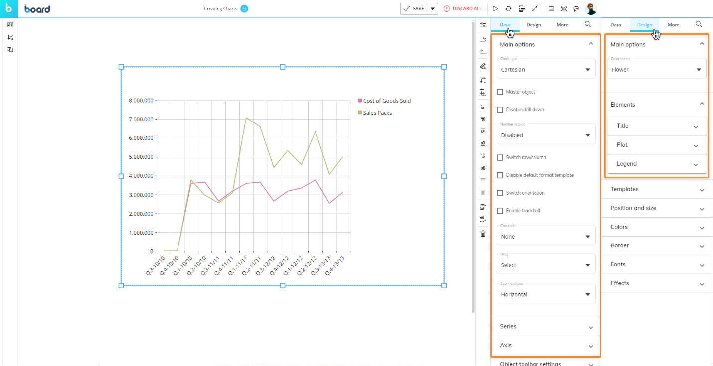
Data Object Properties
The following properties under the Data tab of the Properties panel are available for the Cartesian chart:
Main options
The Main options accordion offers the following properties:
Chart type. Easily switch between Cartesian, Pie, Radar, and Waterfall chart types without the need to create new Screen Objects.
Numbers Scaling. Displays whether to view large numbers in a shortened format with one decimal place, adding a "K" for thousands, "M" for millions or "B" for billions. The Developer can choose to enable it so that Planners can choose between Disabled, Automatic, Thousands (K), Millions (M), or Billions (B) in Play Mode, or the Developer can choose a fixed option. For example, 12,543,000 is automatically displayed as 12.5 M.
The number of decimal digits displayed for Thousands (K), Millions (M), or Billions (B) is configured in the Block settings of the Layout Editor, as the "Digits" property under the "Main options" submenu.
Switch Row/Column. If enabled, Blocks will be displayed in the X-axis and Entities set in the "Categories" field of the Layout will be displayed as series. The option does not change the associated Layout.
Disable default format template. If enabled, it allows the Developer to override the default template applied to all series/categories. This option is disabled by default.
Switch orientation. Switches the chart orientation. When changing the orientation, the numerical axis and the row axis are switched.
Enable trackball. Enables the visualization of a Label containing data of all Blocks set in the Layout when you hover over different areas of the chart. (Not available for the Waterfall series type).
Crosshair. Crosshairs are thin vertical and horizontal lines centered on a data point in a chart. Choose between vertical, horizontal or both to allow your users to be able to target a single element in the chart using the line and see the value of the selected data point.
Drag. Lets you configure the default action when a user drags the mouse over the chart. The available options are:
Pan. Allow users to navigate through a zoomed chart by dragging the mouse.
Zoom. Allow users to zoom in the chart by dragging the mouse. Zooming is also possible using the mouse wheel.
Select (default). Allow users to select a set of categories in the chart by dragging the mouse. When the mouse button is released, the selection is applied as a Screen selection and all other Objects on the Screen are updated accordingly.
Zoom and pan. Configure the default zoom direction when zooming using the mouse wheel, vertical, horizontal or both.
Series options
The Series accordion offers the following properties:
Select series. Select the series for which you wish to edit the settings. Select "All" to edit all series at once.
Series type. Select the chart type to use for the selected series (line, area, point, bar, funnel etc.).
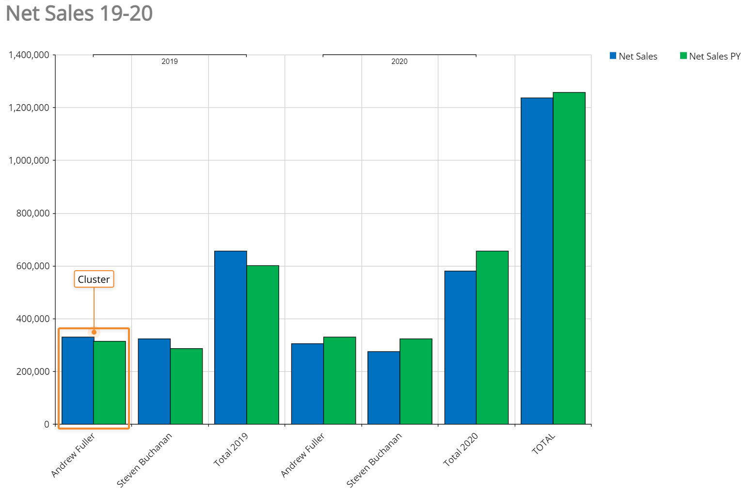
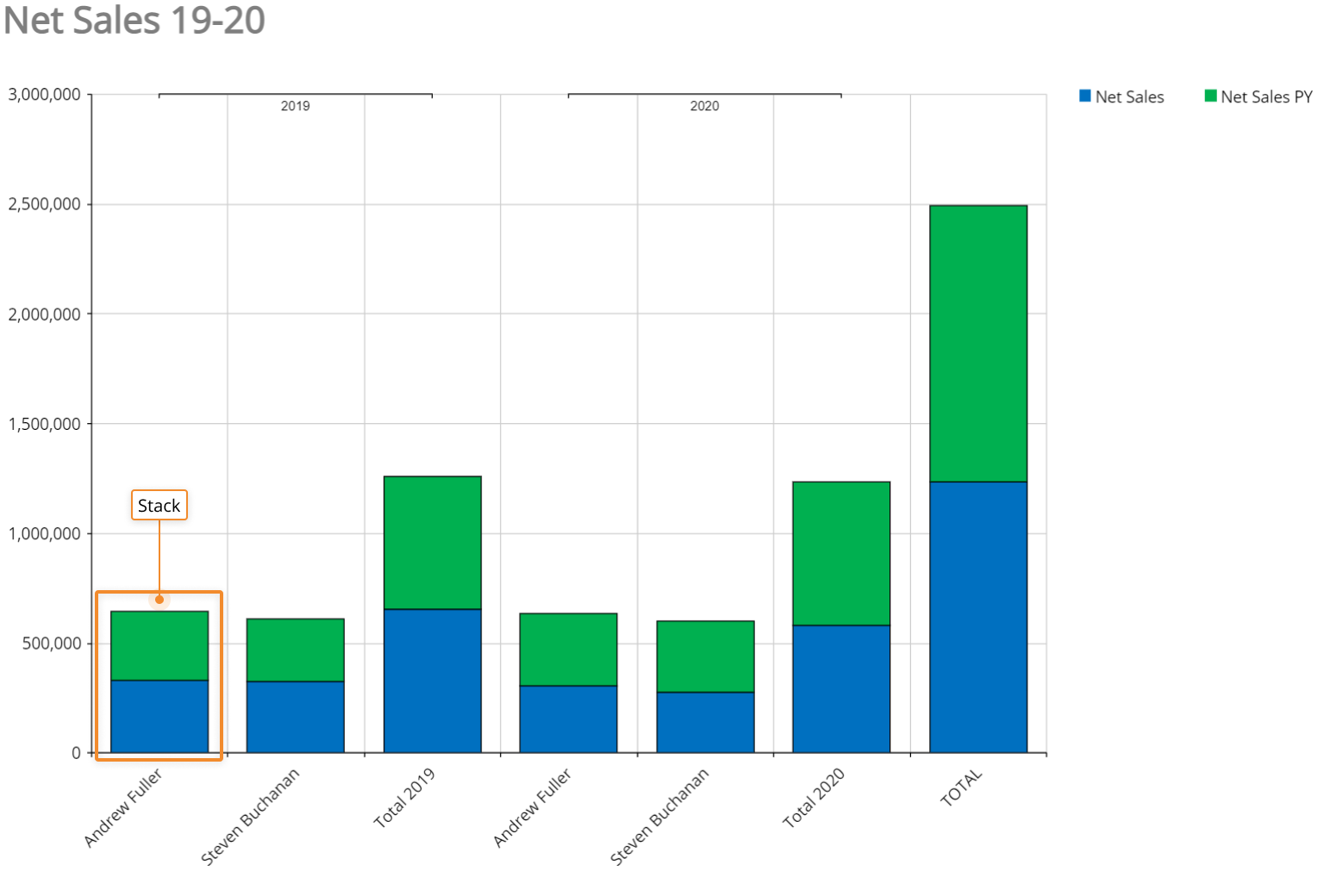
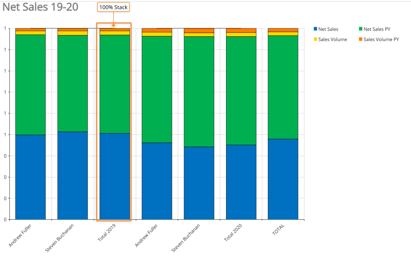
Combine mode. Choose how to display the associated Layout definition containing more than one Block. The available options are:
Cluster(only available for Bar series types). Combines Bar series into clusters for every element in the category axis.
Stack. Each bar displays a total amount, broken down into sub-amounts. Equivalent subsections are the same color in each bar.
Stack 100. Each bar is the same height or length, and the sections are shown as percentages of the bar rather than as absolute values.
Series color. Select the main color of the Series type, for example, the line or the bar.
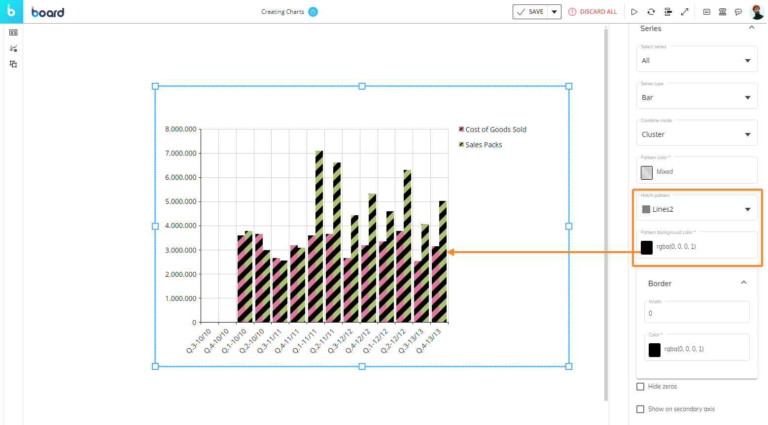
Hatch pattern. Select from various fill-patterns to customize series of a Bar chart. This option is only available when the Series type is a Bar chart.
Pattern background color. Defines a pattern background color when (and only when) a Hatch pattern (above) is applied to a series.
Border width and color. Defines the border width and color only for a Bar chart chosen from the Series type.
Line width. Defines the line width for line-based series types.
Hide zeroes. When enabled, series that have zero values won't be plotted in the chart.
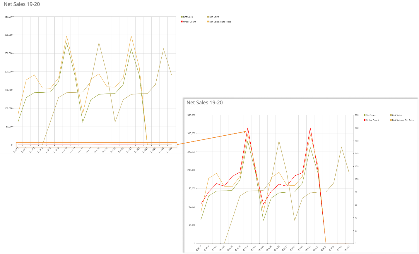
Show on secondary axis. If enabled, displays selected series on a secondary axis. This is particularly useful when you have Blocks with values that differ significantly from each other.
For example, the option has been enabled on the Order Count series in the following chart. As you can see, the series is barely noticeable in the first chart, while it is much more visible with the "Show on secondary" axis option turned on.
Marker type. Select a marker type to identify data points of each category for selected series (square, triangle, circle). This option is only available for line-based series types.
Show labels. Enable this option to display data labels on top of data points of each category for selected series. Data labels display the data point's value.
Rotation angle. Defines a rotation angle for data labels.
Label color. Applies the selected color to the background of data labels.
Axis settings
The Axis accordion offers the following properties:
In the Category axis submenu:
Visible. Uncheck this option to hide the Category axis.
Reverse. Reverses the order of the Categories in the axis.
Label interval. Defines the interval between visible X-axis labels.
Label fit mode. Defines how X-axis labels are displayed: on multiple lines or tilted.
Rotation angle. Defines the rotation angle of X-axis labels when the Label fit mode is set to "Rotate".
Show grid line. Shows/hides vertical lines of the grid in the chart background.
Dash style. Applies a preconfigured style to vertical lines of the grid in the chart background.
Axis label. Defines the X-axis title.
In the Primary axis submenu:
Visible. Uncheck this option to hide the Y-axis.
Reverse. Reverses the values order in the Y-axis.
Logarithmic scale. Switches values in the Y-axis to a base-10 logarithmic scale.
Autorange. When enabled, the system automatically defines the axis values range.
Minimum/Maximum. If the "Autorange" option is disabled, you can manually define the minimum and maximum value displayed on the axis.
Step. If the "Autorange" option is disabled, you can manually define the step of the values displayed on the axis.
Label fit mode. Choose "Rotate" to display Y-axis labels as tilted.
Rotation angle. Defines the rotation angle of Y-axis labels when the Label fit mode is set to "Rotate".
Show grid line. Shows/hides horizontal lines of the grid in the chart background.
Dash style. Applies a pre-configured style to horizontal lines of the grid in the chart background.
Separator. Enable this option to display numeric and decimal separators for values on the axis.
Decimal. If the "Separator" option is enabled, you can manually define how many numbers should be displayed after the decimal separator.
Percentage. Enable this option to display a percent sign (%) after values on the axis.
Prefix/Postfix. You can manually enter characters that will be displayed before and/or after values on the axis.
Axis title. Defines the Y-axis title.
For the Secondary axis submenu, please refer to the previous list of options.
Design Object Properties
Main options
The following properties under the Design submenu are available for the Cartesian chart:
Under the Main options menu, these options are available:
Color theme. Applies a preconfigured color style to series.
Elements settings
The Elements accordion is used to customize the title, plot area, and legend of your chart. The following options are available:
In the Title submenu:
Height/Width/Left/Top. Define the position and size of the title area.
Horizontal alignment. Sets the horizontal text alignment.
Vertical alignment. Sets the vertical text alignment.
Visible. Uncheck this option to hide the title area.
In the Plot submenu:
Height/Width/Left/Top. Define the position and size of the plot area.
In the Legend submenu:
Height/Width/Left/Top. Define the position and size of the Legend area.
Visible. Uncheck this option to hide the title area.
Large icons. Check this option to enlarge all elements of the legend.
Templates menu
The Templates accordion is available only for bar and pie charts, so that you can choose a custom template for individual Entities or members of Entities.
From the "Template" widget, you can select a Row template, edit one, or create a new one by clicking the "TEMPLATES" button:
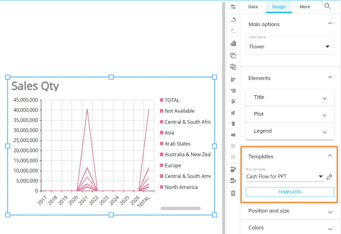
In the "Row template" dropdown, Developers will find all templates defined in the Data Model, regardless of the Entities used in the Layout. This approach has been also applied to the same menu in the Data view properties panel.
Under the Object toolbar settings, available for all objects, you can customize the following properties:
The following properties of the Object toolbar settings are:
Enabled. Enables the toolbar in Play Mode.
Always visible. Pins the toolbar on top of the Object.
Dark mode. Applies the dark theme to the toolbar. Deselect it to apply the light theme to the toolbar.
If multiple Screen Objects are selected in the Screen design area, then the Object properties right panel will only provide the options that are common to all of those Objects.