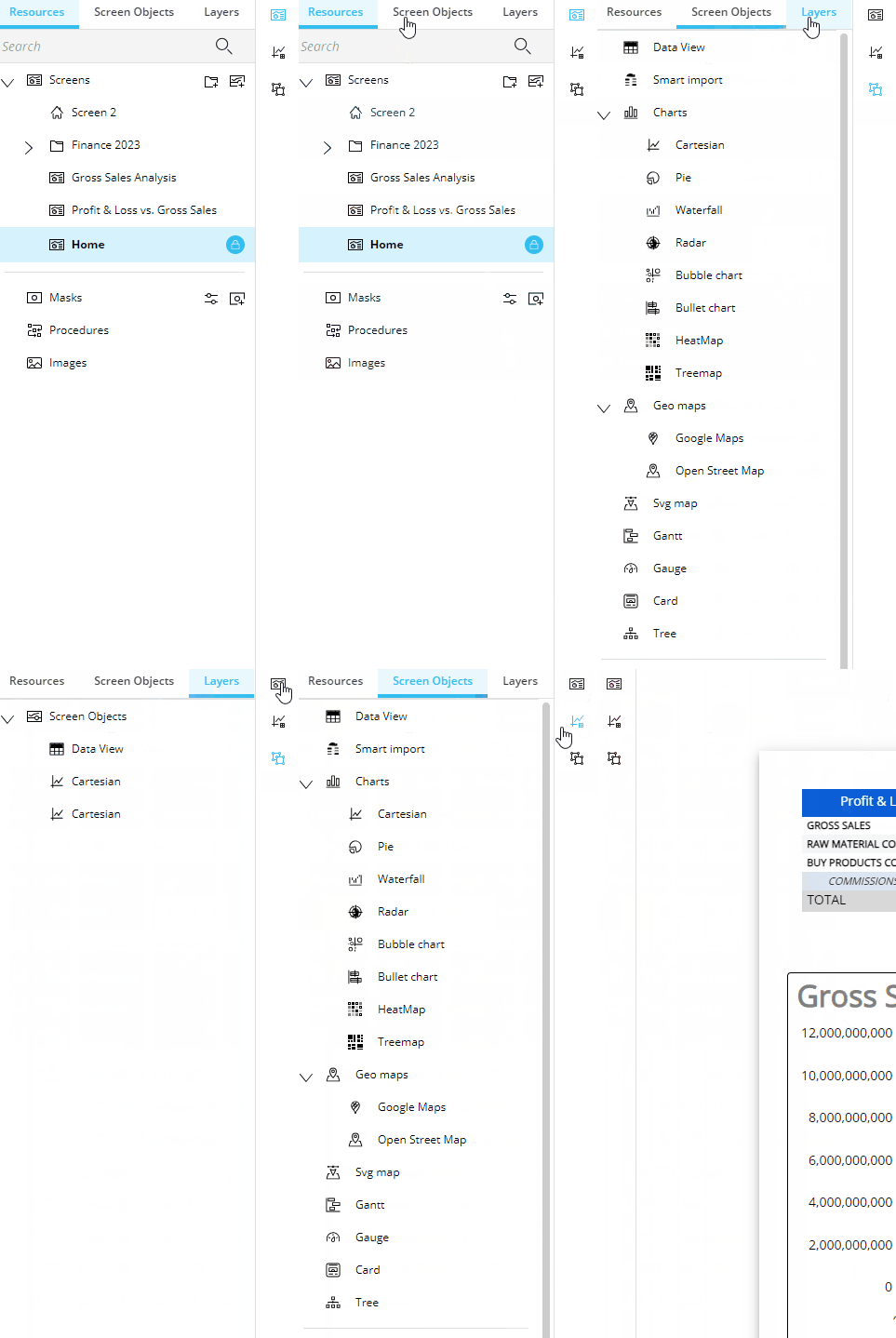
In the new Board 14 release, sliding panels and toolbars have been added and improved. The sliding panels and toolbars display all the options and settings available for a Capsule, Screen, Object, or cell.
The types of sliding panels and toolbars available are:
Properties Panel (formerly the Contextual right panel)
Object toolbar(offering the same menu as the Sliding panel) in Play mode
Left panel
The new Left panel offers the same options as before, but with a whole new look and design. The Left panel consists of three tabs horizontally displayed on the top and three corresponding icons vertically displayed on the right-hand side. Instead of only icons at the top, the three tabs are labeled at the top as follows:
Resources
 . Previously known as the “Structural elements of a Capsule”, the Resources tab displays the structural elements you can use within the Capsule
Screens
 . Under “Screens”, the list of Screens made are displayed. The other new icons and capabilities are:
Add a folder
 . Next to “Screens”, this icon adds a new folder. When you add a folder, it will appear at the bottom of the list. Drag and drop it into the correct order
Add a Screen
 . Next to the "Add a folder" icon, the "Add a Screen" icon adds a Screen to the bottom of the list. Drag and drop it unto the correct order or into a folder
Screen options
 . Next to each Screen listed is a three dot icon that displays the options to "Save as", "Delete", and "Set as Home Screen" if not already set as Home
Folder options
 . Next to each folder listed is a three dot icon that displays the options "Add Screen", "Add Folder", "Rename", and "Delete"
Lock Screen
 . The lock icon indicates that the Screen is locked to others from editing it while you are editing it
Masks
 . From the Masks option, you can now directly configure, create, or edit a Mask within the Capsule in which you need it. The configure icon
  let’s you configure a Mask and the add a Mask icon
  let's you add one
Procedures
 . Directs you to the Procedure page as before
Images
 . Directs you to the Images page as before
Screen Objects
 . This section lists all the Screen Objects available to use in a Screen as before. A new Object called the Flex Grid has been added
Layers
 . The Layers section allows an easier way to select multiple Objects and re-arrange them all together. You can also edit shared properties of multiple selected Objects. Select all the ones you would like to move or edit properties for at the same time from the list available under Layers

New navigation behavior of the Left panel
When one of these sections is selected, the tab is highlighted in blue and the corresponding icon on the right hand side of the panel is also the color blue. You can switch between the three section either by selecting the tab or the icon. To hide or show the panel, click on the icon that is already selected and highlighted in blue. When you hover over it, the icon will change to an arrow indicating the direction the panel will collapse or expand.
Properties panel
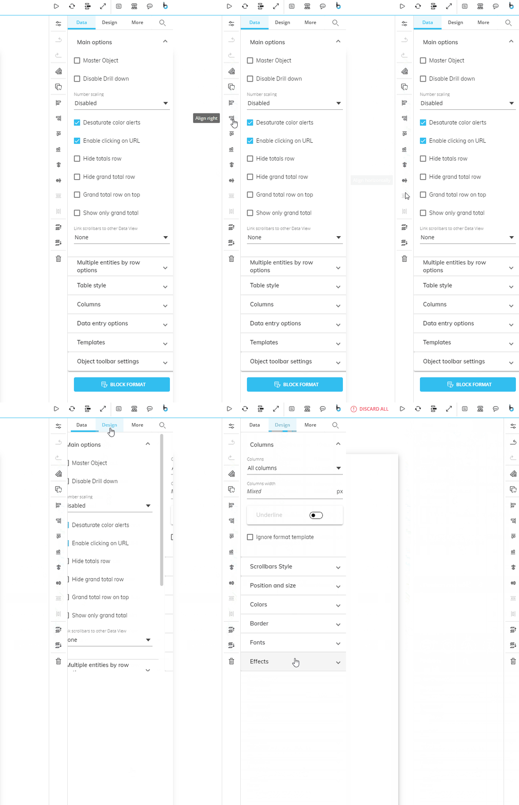
The Properties panel, previously known as the Contextual right panel or sliding toolbar, offers many of the same features as well as additional ones designed for easier navigation and visibility.
Specifically, the new areas of the Properties panel to observe are:
Properties panel menu. The menu at the top of the Properties panel is categorized by three sections: Data, Design, and More
Search properties. Next to “More” is a search function where you can search for a property and find it instantly
Properties toolbar. To the left of the Properties panel is a column of icons known as the Properties toolbar
To collapse or expand the Properties panel, click on the configure icon at the top of the Properties toolbar.
Properties toolbar
The new Properties toolbar to the left of the Properties panel consists of a column of icons, most of which were previously found in the Top menu. The Properties toolbar display icons for quick access of the Layout and easy Object alignment icons. These Property toolbar options are as follows:
Property panel collapse/expand
 . This new icon collapses or expands the Property panel to the right. When you hover over the icon, an arrow will appear to indicate the direction of the collapse
Undo

Redo

Configure Layout

Copy and paste

Align left

Align right

Align top

Align bottom

Align vertically

Align horizontally

Distribute vertically
 . This distributes 3 or more selected Objects vertically across the Screen
Distribute horizontally
 . This distributes 3 or more selected Objects horizontally across the Screen
Bring to front

Bring to back

Delete


Object Properties panel
The new Object Properties panel is reorganized by category: Data, Design, and More. All of the options and settings are the same as before but organized in three different categories. For example, whereas before you would find everything related to columns under only one "Columns" section, now you will find a "Columns" section under "Data" and under "Design" in which their corresponding properties, whether they pertain to data or to design, are found.
The new “Properties Search” feature to the right of the menu allows you to easily find properties, even in more complex Objects.
Data. The Data tab displays all of the settings pertaining to the data display of the specific type of Object. Series is found under "Data" including "Series color" and "Label color" settings.
Design. Under the Design tab, you find all the Object property options offered that pertains to the design of the Object. Position and size, Colors, Border, Fonts, and Effects are available for all Objects, while Scrollbars style and Columns are only available for Data View, and Main options, Elements, and Templates are available for Charts
More. Under "More", you will find the settings for the mouse-over Tooltip. This is helpful for directing the end user or communicating with others who will access the Screen. Access the options by enabling "On-Screen tips"
Tip type. Choose the format of the Tooltip that displays to the user, either "Dialog" or "Balloon"
Dialog. Shows message in a popup window
Balloon. Shows message in a text bubble over the Object
Content. Write the message of the Tooltip which will display when the end user hovers over the icon
On-Screen element. Choose the Format of the element: "Icon" or "Text or Number"
Icon. Customize the displayed icon
Choose icon. Choose the icon you want to display for the mouse-over Tooltip
Text or Number. Customize the Text or Number
Text or Number. Write in what you would like the element to say
Position. Choose the position of the element
Background. Choose the background color of the Tooltip
Icon. Choose the icon, text, or number color
Enable animation. Enable, and the element will pulse to draw the user's attention
Hover tooltip. Write a message that will appear to the end user when the mouse hovers over the Object
Screen Properties panel
The new Screen Properties panel is reorganized by category: Data, Design, & More.
Data
Under "Data", you will find similar properties as before which are as follows:
Screen name
Data model
Default Data model
Multiple Data models
Main options
Deny Layout designer
Deny selection editor
Save/Undo mode
Enable ATO
Refresh on Data entry
Design
Under "Design", similar properties as before are displayed, which are as follows:
Screen size
Fit mode
Colors
Background
Type
Background
Screen Mask. This property is not new, however, it is newly placed in the Screen properties section to give you the ability to add Masks right from the Capsule. To create or edit Masks, you can do so under Resources in the left panel.
Mask
Environment background toggle
More
Under "More", you will find these properties:
Anchor point. Choose where you would like to add the Anchor for the Tooltip, either Top/Left or Center/Center
On-Screen tips. Upon enabling, the following options become available:
Tip type. Choose the format of the Tooltip that displays to the user, either "Dialog" or "Balloon"
Dialog. Shows message in a popup window
Balloon. Shows message in a text bubble over the Object
Content. Write the message of the Tooltip which will display when the end user hovers over the icon
On-Screen element. Choose the Format of the element: "Icon" or "Text or Number"
Icon. Customize the displayed icon
Choose icon. Choose the icon you want to display for the mouse-over Tooltip
Text or Number. Customize the Text or Number
Text or Number. Write in what you would like the element to say
Position. Choose the position of the element
Background. Choose the background color of the Tooltip
Icon. Choose the icon, text, or number color
Enable animation. Enable, and the element will pulse to draw the user's attention
Hover tooltip. Write a message that will appear to the end user when the mouse hovers over the Object
Screen Properties panel
The new Screen Properties panel is reorganized by category: Data, Design, & More.
Data
Under "Data", you will find similar properties as before which are as follows:
Screen name
Data model
Default Data model
Multiple Data models
Main options
Deny Layout designer
Deny selection editor
Save/Undo mode
Enable ATO
Refresh on Data entry
Design
Under "Design", similar properties as before are displayed, which are as follows:
Screen size
Fit mode
Colors
Background
Type
Background
Screen Mask. This property is not new, however, it is newly placed in the Screen properties section to give you the ability to add Masks right from the Capsule. To create or edit Masks, you can do so under Resources in the left panel.
Mask
Environment background toggle
More
Under "More", you will find these properties:
Anchor point. Choose where you would like to add the Anchor for the Tooltip, either Top/Left or Center/Center
On-Screen tips. Upon enabling, the following Tooltip options become available:
Tip type. Choose the format of the Tooltip that displays to the user, either "Dialog" or "Balloon"
Dialog. Shows message in a popup window
Balloon. Shows message in a text bubble over the Object
Content. Write the message of the Tooltip which will display when the end user hovers over the icon
On-Screen element. Choose the Format of the element: "Icon" or "Text or Number"
Icon. Customize the displayed icon
Choose icon. Choose the icon you want to display for the mouse-over Tooltip
Text or Number. Customize the Text or Number
Text or Number. Write in what you would like the element to say
Position. Choose the position of the element
Background. Choose the background color of the Tooltip
Icon. Choose the icon, text, or number color
Enable animation. Enable, and the element will pulse to draw the user's attention
Sliding menu in Play mode
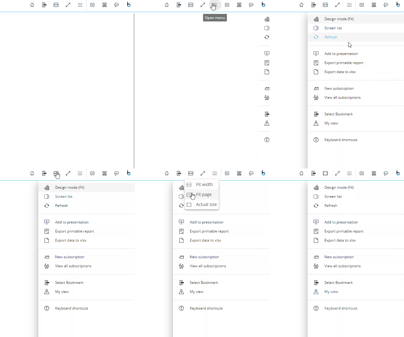
The Sliding menu in Play mode slides into view after clicking the hamburger menu icon ( ). The menu options are the same as before except that "Screen fit" is no longer in this menu and is displayed in the Top menu as an icon that changes depending on the desired view of the Objects on the Screen located at the Top menu and labeled as "Fit mode". Some of the icons and Fit mode names have changed and are as follows:
Fit width (formerly "Fit to width")
 .
.Fit page (formerly "Fit to single page"
 .
.Actual size
 .
.

Object toolbar in Play mode
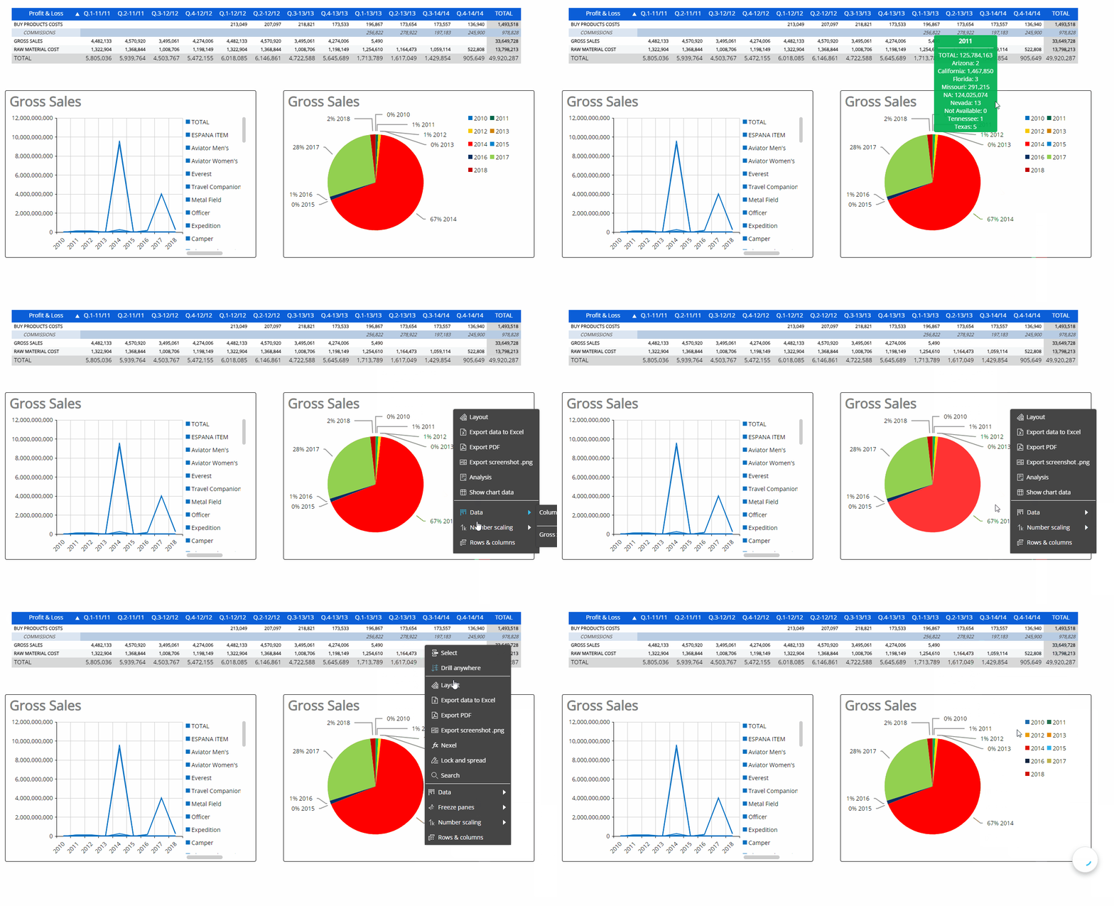
This Object toolbar in Play mode has been improved. It is accessible by right-clicking over an Object or by accessing the Contextual sliding menu like before. The options are mostly the same as before with the following enhancements:
Export screenshot .png. This new element allows you to export a screenshot of the Object, saved as a .png.
Enhanced Rows & Columns (Quick Layout). This option is not new, but enhanced. Now, when you click on "Rows & Columns", a window appears where the user can easily with visual-enhanced design change the Layout configuration of the Object to display the data how they want.
