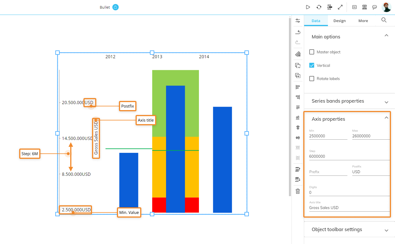
This topic describes how to navigate and customize the settings and options of a Bullet chart Object, which are the following:
The Bullet chart is very similar to a Bar chart, but it displays additional visual elements to add more context to your data. This type of chart is very useful to visualize progress against target values, so it's typically associated with performance data.
In the following example, the blue bar represents the feature measure (main data), while red lines that run perpendicular to the orientation of the chart represent the comparative measure (target marker to compare against the feature measure).
The segmented colored bars behind each blue bar are used to display ranges/thresholds. Each color shade is typically used to assign a performance range rating: darker shades are associated with low ratings, while lighter shades are associated with higher ratings.
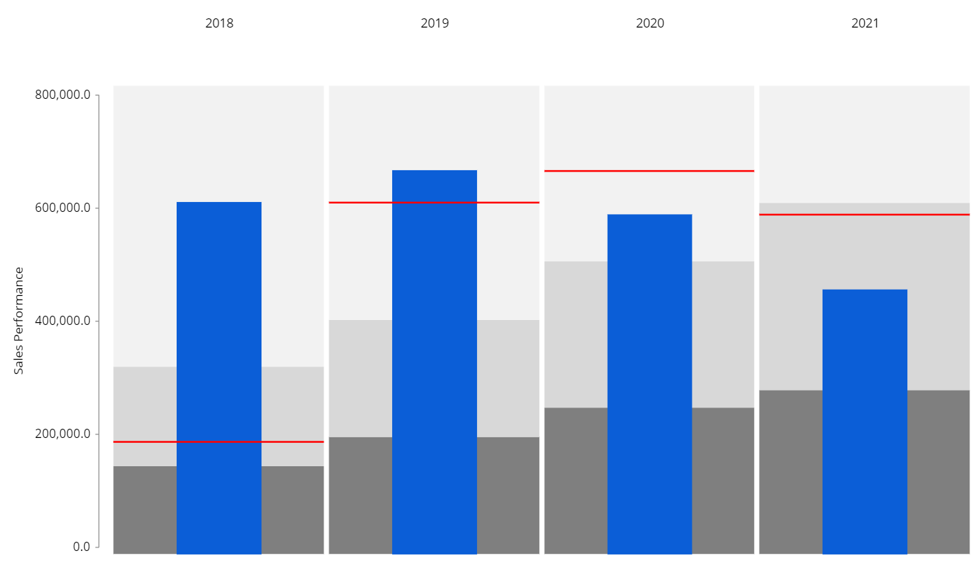
In the example above, you have hit your goal in 2018 and 2019, but fell short of your targets in 2020 and 2021.
Bullet chart: Layout properties
The Layout editor for a Bullet chart includes a specific menu for configuring the feature measure, the comparative measure and ranges, as displayed in the following image:
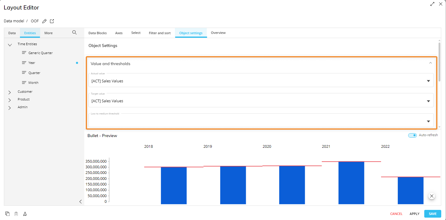
Under the Value and thresholds menu, you can define:
The actual value (required field). The Data Block whose values will be displayed as the feature measure.
The target value. The Data Block whose values will be displayed as the comparative measure.
The low to medium threshold. The Data Block whose values will be displayed as the darker bar behind the actual value bar. You can also configure ranges from the Bullet chart properties available in the Object Properties panel to the right of the Screen editing page.
The medium to high threshold. The Data Block whose values will be displayed as the lighter bar behind the actual value bar. You can also configure ranges from the Bullet chart properties available in the Object Properties panel to the right of the Screen editing page.
Blocks hidden using the dedicated option in the Block settings won't be available in the Value and thresholds and color menus.
You cannot add more than one Entity By Row in a Layout associated with a Bullet chart.
Bullet chart Object properties
Additional Bullet chart properties are available from the Object Properties panel to the right of the Screen editing page once the Chart Object is selected and associated with a Layout. They are highlighted in the following image:
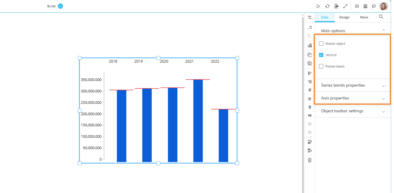
Main options of Data properties
The following properties are available for the Bullet chart:
Vertical. If disabled, switches the chart orientation so that bars will be displayed horizontally.
Rotate labels. If enabled, flips labels of the Entity set By Row by 90°.
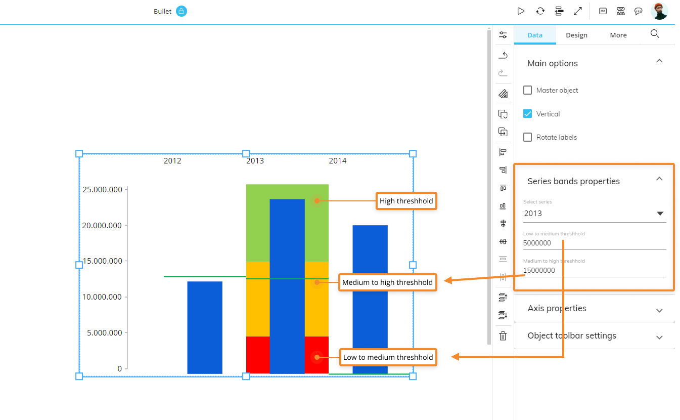
Series bands properties
Under the Series bands properties menu, select each series to manually configure the low to medium and medium to high thresholds for ranges, as displayed in the following image:
Axis properties
Under the Axis properties menu, the following options are available:
Minimum-Maximum. You can manually define the minimum and maximum value displayed on the value axis.
Step. You can manually define the step of values displayed on the axis.
Prefix/Postfix. You can manually enter characters that will be displayed before and/or after values on the axis.
Digits. You can manually define how many numbers should be displayed after the decimal separator.
Axis title. Defines the value axis title.
