The Capsules section of Board offers two operating modes: Play Mode and Design Mode.
When Play Mode is active, you can only view and navigate through existing Capsules.
When Design Mode is active, you can create new Capsules or perform specific actions on existing Capsules.
Switch between Design and Play Modes
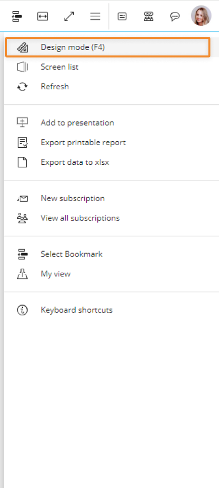
You can easily switch between Play Mode and Design Mode by pressing the F4 key. Additionally, you can switch between these modes by clicking on the Play icon (  ) located in the Top Menu of the Capsule workspace while in Design Mode and by clicking on the Design icon (
  ) located in the sliding menu while in Play Mode.
Please note that Design and Play Mode in a Capsule are analogous to, but different from, Edit and Play Mode in a Presentation.