Flex Grid offers embedded Range and Docked Charts. Range Charts offer a Planner a way to temporarily visualize data and download the chart. Range Charts are only available temporarily for the user when interacting with the Flex Grid. The Docked Charts can be configured by a Designer for the Planner to view but also made by Planner and saved.
This article is about Range Charts. Read more about Docked Charts.
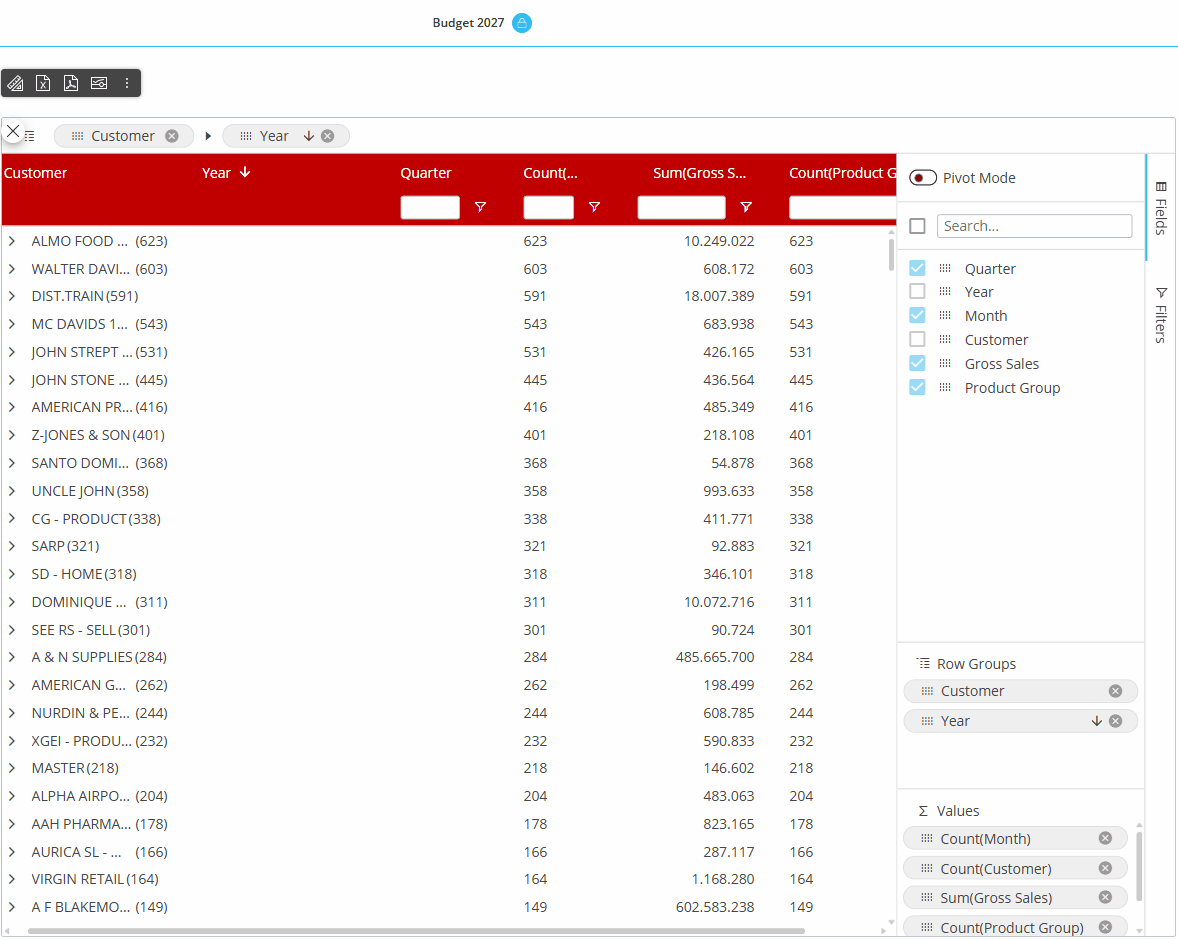
Flex Grid Range Charts
Charts are viewed directly within the Flex Grid itself and configured on-the-fly. Embedded charts can help you visualize selected data from within the Flex Grid, however, can not be saved.
It is possible to select from various functions, such as SUM, AVERAGE, MIN, and MAX to summarize data in a chart
To view embedded charts, right click a value cell and click "Range Chart":
Range Chart. Based on the range selected within the Flex Grid and always available whether in Pivot mode or not. A chart popup window will appear where you can define the data settings in more detail under "Data" in the right panel, like "Categories", which are your fields, and the "Series", your Data Blocks, to configure the chart. You can also change the chart type and color palette under "Edit Chart" from the more options icon. Read more in the Edit Charts paragraph.
Then, click on the type of chart you'd like to display which are as follows:
Column. Displays a vertical bar graph with the options of "Grouped", "Stacked", and "100% stacked", shown below respectively.
.png)
Bar. Displays a horizontal bar graph with the options of "Grouped", "Stacked", and "100% stacked", shown below respectively.
.png)
Pie. Displays a pie chart with the options of "Pie" or "Doughnut", shown below respectively.
.png)
Line. Displays a line chart as shown below.
.png)
X Y (Scatter). Displays a scatter plot where data between 2 variables is displayed with a point or dot with the options of "Scatter" and "Bubble", shown below respectively.
.png)
Area. Displays a line graph where the area below the line is filled in with color with the options of "Area", "Stacked", and "100% stacked", shown below respectively.
.png)
Statistical. Displays the frequency of numerical data with rectangles.
.png)
Combination. Displays the combination of two types of charts, either "Column & Line" or "Area & Column", shown below respectively.
.png)
Edit Charts
To change the color palette, change the type of chart, or to edit data, find the more options icon and click “Edit Charts”.
Design
Under “Design”, you can edit the pattern or color palette.
Data
When you are happy with the chart you have created, you can do a few things with it:
Download the chart as a .png by clicking on the download icon in the upper right corner of the chart area, as shown below.
Link or unlink the chart by clicking on the link icon, as shown below. This means, if data is updated upon a refresh, the data will also change and update the linked chart, whereas the data will not change in an unlinked chart.
Advanced settings. Enable “Animation” and configure the duration.