Board 15 introduces the new Docked Charts for Flex Grid, in addition to the existing Range Charts. Docked Charts display saved charts in a dedicated area below the Flex Grid and can be created in flat or Pivot Mode. End users can create, save, and reuse Docked Charts, and Developers can preconfigure and save Docked Charts for end users. By default, Docked Charts visualize the entire Flex Grid dataset or selected cells, and users can fully customize the chart type, data configuration, and design (including the chart title).
Flex Grid Docked Charts can also be configured, edited, and customized within a Drill Down.
Docked Charts in a Drill Down are supported.
To disabled Docked Charts in a Drill Down, Developers must uncheck the option “Allow Docked Charts in Drill Down” in the Flex Grid Properties Panel under the “Data” tab.
Create Docked Charts
To create Docked Charts, follow these steps:
Right-click in the Flex Grid you want to add a Docked Chart to
Click on Docked Charts and another menu will open with the following types of charts:
Column
Grouped
Stacked
100% Stacked
Bar
Grouped
Stacked
100% Stacked
Pie
Pie
Doughnut
Line
Line
Stacked
100% Stacked
X Y (Scatter)
Scatter
Bubble
Area
Area
Stacked
100% Stacked
Statistical
Histogram
Hierarchical
Treemap
Sankey
Specialized
Waterfall
Heatmap
Combination
Column & Line
Area & Column
Select the type of chart you want and Board displays the chart in the area below the Flex Grid.
Add up to 6 Docked Charts and arrange them in up to 2 rows.
Configure the chart data. Click on the “More” 3-dot icon
 from the floating menu and then on “Edit Chart Data”.
Configure the chart data using the “Data”, “Filters”, and “Advanced” tabs.
Read more about configuring a Docked Chart.Design the chart. Click on the “More” icon from the floating menu and then on “Edit Chart Design”.
Customize the chart type and color palette from the “Design” tab and fonts, text, titles, spacing and more design elements in the “Customize” tab.
Read more about designing a Docked Chart.Customize the chart: resize, reorder, remove, or open a chart in full screen view to focus on detailed analysis.
Full screen view is only available in Play Mode. It cannot be saved in Design Mode, in My View, or for Presentations.
If you minimize a chart, Board keeps the chart name visible in the bottom left corner of the Docked Chart area, similar to Excel tabs, so you can quickly identify and display saved charts.
Configure a Docked Chart
You can configure the Docked Chart to better display specific data defining more than just Categories and Series. With Docked Charts, you can now breakdown Series according to configured By Column Blocks or break a Series by an Entity.
To configure a Docked Chart, click “Edit Chart Data” from the “More” option in the floating Menu. You have three tabs to make customizations: Data, Filters, and Advanced. The options available are described below:
Data tab
In the Data tab, you have the three following configurations and additional options:
Series. A Series is a single set of values and equivalent to fields set to Values. Only numeric fields configured in the Flex Grid Fields panel under Values are available.
Series breakdown. Applies when a By Column Block is used as a Series. Users can break the Series down further by the Entities defined in the Block’s “By Column” configuration.
Series breakdown is only available when a Block in the Series is configured with a By Column.
Series breakdown is not supported for the following chart types: Waterfall, Treemap, Histogram, Scatter, Bubble, and Sankey.When a Series breakdown is added, Board automatically disables Break Series by.
Choose the aggregation type: Count, First, Last, Sum (default), Min, Max, or Average.
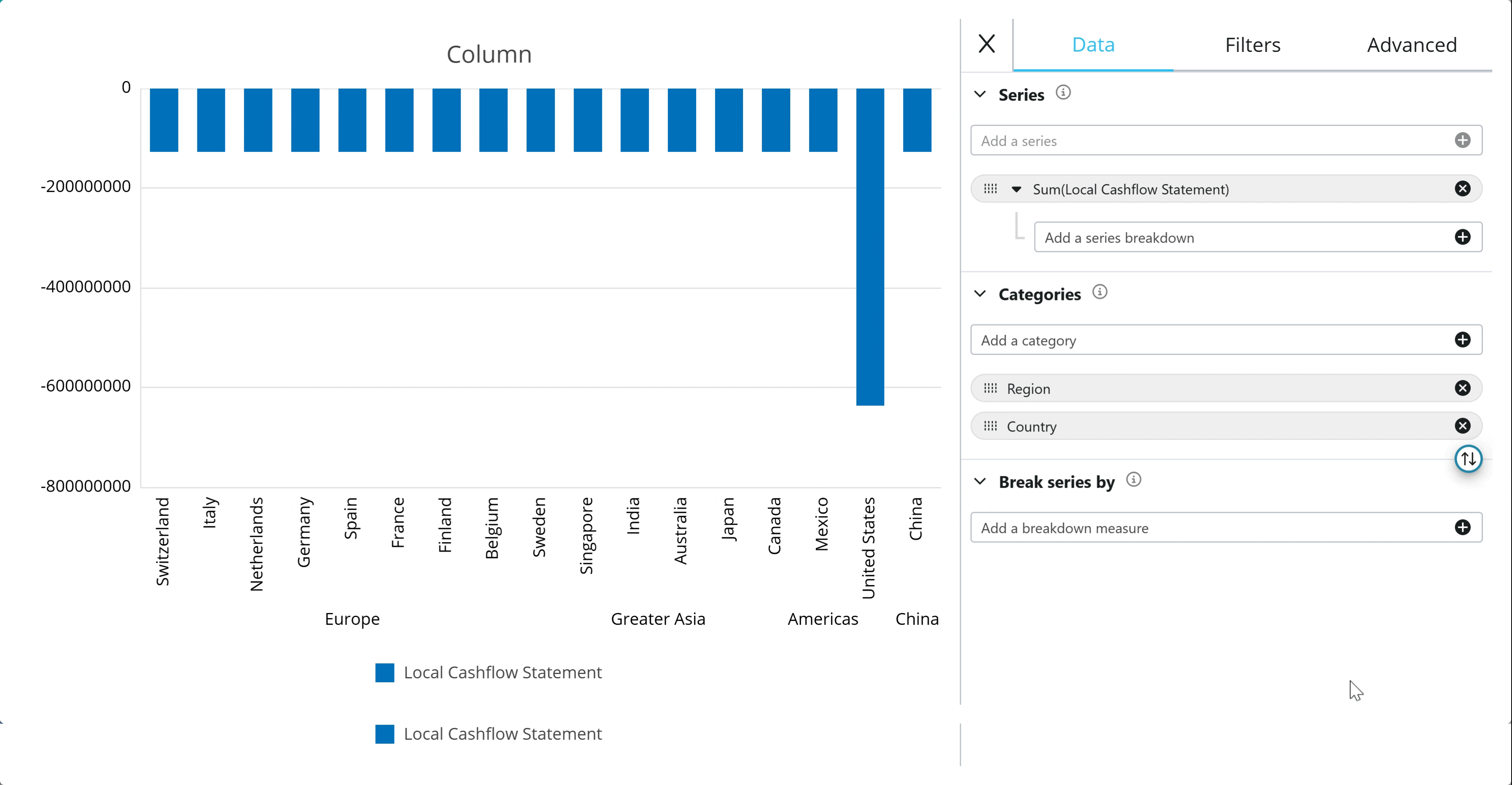
Categories. Categories represent the X-axis and equivalent to those fields set to Row Groups. Select Entities from the “Add a category” dropdown menu. If users add multiple Categories, the Entities will be ordered as they were added. Upon creating the chart, the Categories order reflect the grid configuration of nested Entities.
The Categories can be reordered by dragging and dropping them in the order you want.
Break Series by. Splits Series by an Entity, for example to add multiple bars per Category instead of adding more Categories.
Break Series by is available only when Series breakdown is not configured.
Switch fields between Categories and Break Series by
An icon  exists between Categories and Break Series by that switches the configuration: moving the fields configured in Categories to Break Series by and vice versa.
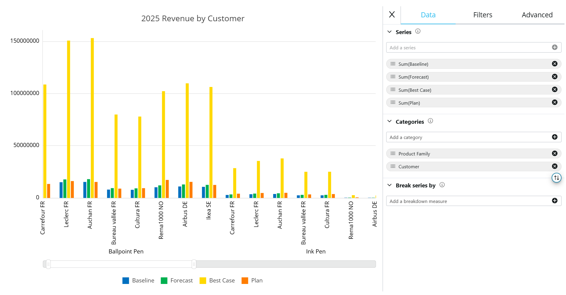
Example:
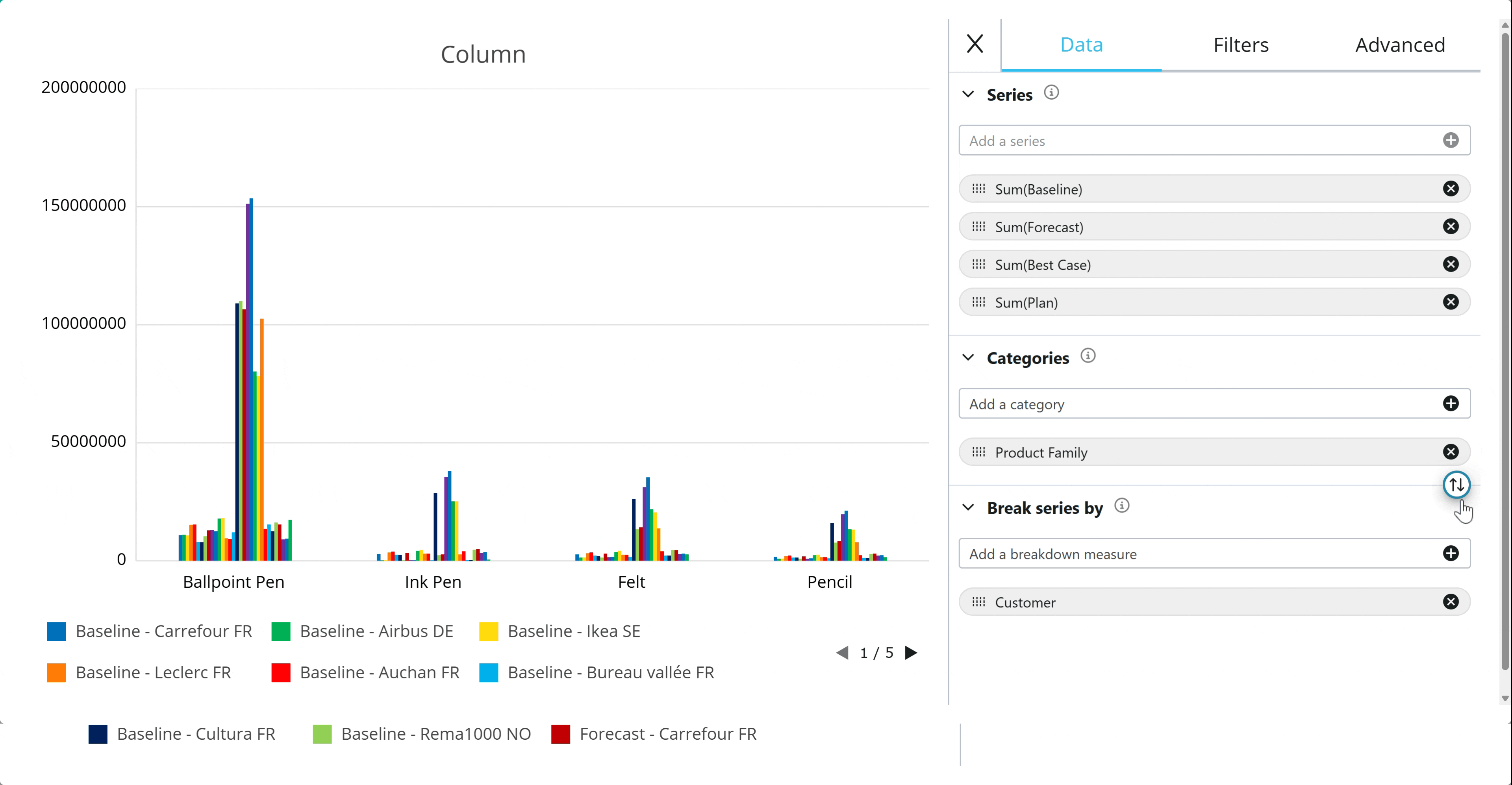
In the example below, Product Family is configured as the Category and Customer is configured as the Break Series by so that the Product Family items, like Ballpoint Pen, are broken down by customers.
After switching the configured fields, Product family configured as a Break Series by and Customer configured as a Category, the chart shifts to showing the customers, like Carrefour FR, broken down by the product families.
Filters tab
From the Filters tab, you can configure multiple filters regarding the fields that make up the specific chart. Users always have ability to filter and use multiple filters regardless of the Flex Grid filter settings set by the Developer in the Properties Panel.
The same filter rules specific to a Flex Grid apply.
To filter a Docked Chart:
Navigate to the Filters tab
View the fields available
Open a field by clicking on it to reveal the filter menu for that specific field
Configure a filter using the same logic as in the Flex Grid
Read more about filtering in a Flex Grid.
Advanced tab
The Advanced Tab offers the same customizations for all charts except for Pie, Doughnut, Treemap, and Sankey charts. Pie and Doughnut charts only offer “Animation” customization while Treemap and Sankey have no Advanced settings.
The advanced customizations for most charts are:
Navigator. A bar appears under the chart with two drag elements on either side of the bar. This feature allows you to focus in on a section of the whole chart without using filters. This is disabled by default. When enabled, the following options are available:
Height. Customize the height of the bar by using the slider.
Mini-chart. When enabled, displays the chart elements in the bar area.
Zoom. A feature that can zoom in on a section of the whole chart. This part achieves the same as the Navigator without a bar element. It is enabled by default and can be enabled at the same time as Navigator to use in addition or instead of it. When enabled, the following options are available:
Selecting. Allows the user to select an area of the chart using their mouse to zoom in on. This option is disabled by default.
Scrolling. Allows the user to use their mouse scroll function to zoom in. This option is enabled by default. When enabled, the following option is available:
Scrolling Step. Customizes how granular each scroll zooms in, 1 being the most you can zoom in and .01 the least.
Both Selecting and Scrolling can be enabled simultaneously.
Animation. Displays a default animation of the chart moving upon creating or modifying it.
Toggle it on or off and customize the length in milliseconds (ms). Animation is enabled by default with a duration of 500 milliseconds.Pie and Doughnut Charts only offer Animation in the Advanced settings
Crosshair. Displays the crosshair element on the chart which gives more granular details of the chart data displayed. This option is enabled by default. When enabled, the following options are available:
Label. Displays two labels: the x axis and y axis
Snap to Node. Snaps crosshair to nodes.
Color. Customizes the crosshair color.
Pie and Doughnut charts only offer Animation settings in the Advanced Tab.
Treemap and Sankey charts do not have any Advanced settings.
Design Docked Charts
You can edit the Docked Charts design by clicking on “Edit Chart Design” from the “More” option of the floating menu.
Design tab
The Design tab is where you can change the chart type and chart color palette.
Chart type
Upon creating a Docked Chart, you choose an initial chart type. From the Design tab, you can change it for two typical use cases:
Edit original chart: change the chart type and save it
End users can view chart data differently: Save a specific chart type with a specific data configuration and end users can change the chart type to view data differently.
Change the chart type by simply selecting one of the chart images. Charts are organized by category. When you hover over a chart image it displays the name of the chart.
Chart color palette
After creating a Docked Chart, you can change the default color palette at the bottom of the Design tab.
To change the color palette, like with a Range Chart, scroll through the different color palettes at the bottom of the pane using the left and right arrows or click the dots lined up in between the arrows.
You cannot customize colors. You can only choose from the defined palettes available.
Customize tab
The Customize tab is where you can customize more details of the chart. The following customization options are available.
Chart Style
Padding. Adjust the padding around the chart by using the slider for all sides: Top, Right, Bottom, and Left
Background. Add a Background color. This option is enabled by default. When enabled, choose a color for the background by clicking on the color square.
Titles
Titles is enabled by default. When enabled, you can customize the following Titles design options:
Chart Title. Customize the title of the chart and its font, style, color, size and spacing. Enabled by default.
Subtitle. Customize the subtitle of the chart and its font, style, color, size and spacing. Disabled by default
Horizontal Axis Title. Customize the axis title of the chart that appears horizontally and its font, style, color, size and spacing. Disabled by default
Only available for charts with horizontal axes.
Vertical Axis Title. Customize the axis title of the chart that appears vertically and its font, style, color, size and spacing. Disabled by default
Only available for charts with vertical axes.
Legend
Legend is enabled by default. When enabled, you can customize the font, style, color, and size of the legend, in addition to the following Legend design options:
Position. Choose the position of the legend: Top, Right, Bottom (default), and Left
Spacing. Define the spacing between the legend and the chart elements
Marker Size. Define the size of the legend colored markers.
Marker Stroke. Define the border thickness of the legend markers
Item Spacing. Define the spacing between legend markers and their titles
Horizontal Spacing. Define the spacing between legend markers horizontally
Vertical Spacing. Define the spacing between legend markers vertically when they appear stacked on top of each other because their isn’t enough room to accommodate them all horizontally.
Vertical Spacing only applies when legend markers are stacked vertically because not enough space is available to accommodate them only horizontally
Series
Series options depend on the type of chart.
Below, read about the full Series options for Column and Pie charts and the specific chart options for the rest of the chart types.
Column Charts Series
The following options are configurable for the Series design of Column charts:
Tooltips. Displays a tooltip giving more granular details about the chart element. Enabled by default
Stroke Width. Defines the border thickness of each chart element.
Line Dash. Breaks up the solid border into a perforated border and defines the length of the dashes.
Only definable when Stroke Width is more than 0.
Line Opacity. Defines the border opacity.
Only definable when Stroke Width is more than 0.
Fill Opacity. Defines the opacity of the color fill of the chart element.
Labels. Adds labels of each value to the chart. Disabled by default. When enabled, customize the label font, style, color, and size.
Shadow. Adds shadows to the visual chart elements. Disabled by default. When enabled, customize the shadow color, blur effect, and offsets on the X and Y axis.
Pie charts Series
The following options are configurable for the Series design of Pie charts:
Tooltips. Displays a tooltip giving more granular details about the chart element. Enabled by default
Stroke Width. Defines the border thickness of each chart element.
Line Opacity. Defines the border opacity.
Only definable when Stroke Width is more than 0.
Fill Opacity. Defines the opacity of the color fill of the chart element.
Callout Labels. Adds label for each category name to the chart. Enabled by default. When enabled, customize the label font, style, color, and size, in addition to the length, width, and offset of the line connecting the label to the chart element.
Sector Labels. Adds a label for each value to each chart element, subject to view size. When enabled, customize font, style, color, size, and position ratio.
Shadow. Adds shadows to the visual chart elements. Disabled by default. When enabled, customize the shadow color, blur effect, and offsets on the X and Y axis.
Other chart types specific options
The following options are unique configurable options for the Series design of specified charts:
Line and Area
Line Width. Defines the line thickness of each chart element.
Markers. Marks the chart data points with a marker. When enabled, customize the shape, size, and stroke width.
Scatter and Bubble
Shape. Choose the shape of the Scatter and Bubble chart icon, it’s size(s), and stroke width.
Treemap
Group. Customize the padding and spacing between the Categories groups.
Tile. Customize the padding and spacing between the tiles that exist within each group.
Sankey
Link. Configure the link lines opacity, strike width, stroke opacity, line dash and line dash offset.
Node. Configure the node spacing, width, alignment, fill opacity, stroke width, stroke opacity, line dash, and line dash offset.
Waterfall
Connector Line. Configure the following options for the connector line between data points: color, stroke width, line opacity, line dash
Series Items. Configure both the positive and the negative chart display of the series data by choosing the corresponding item in “ Item Type” and customize the following options for each: stroke width, line dash, line opacity, fill opacity.
Bar
Customize the bar chart stroke width, line dash, line opacity, and fill opacity.
Histogram
Customize the histogram chart bin count (the frequency of data points falling within specific numerical intervals), stroke width, line dash, line opacity, and fill opacity.
Heatmap
Customize the heatmap line color, line width, and line opacity.
Combination
For combination charts, choose each chart type from the “Series Type” dropdown menu and customize each set of options for each chart type.
Horizontal Axis
Horizontal Axis customization is only available for charts that have a horizontal axis.
The following options are configurable for the Horizontal Axis design:
Position. Defines location of the horizontal axis labels: Top or Bottom (default).
Color. Defines the color of the line separating horizontal axis labels and the chart: the position changes depending on the above Position configuration.
Thickness. Defines the thickness of the line separating horizontal axis labels and the chart: the position changes depending on the above Position configuration.
Grid Lines. Enable to add vertical grid lines to the graph that correspond with the information on the horizontal axis. When enabled, you can customize the color, thickness and dash line length of the horizontal axis grid lines.
Ticks. Enable to extend gridlines where the horizontal axis labels appear to better see the separation between horizontal axis labels. The position changes depending on the above Position configuration. When horizontal axis Grid Lines are enabled, these look like an extension of the grid lines.
Labels. Customize the appearance of the horizontal axis labels: font, style color, size, padding (from above when Position is configured to top and below when Position is configured to bottom)
Auto Rotate. Doesn’t apply any rotation to the horizontal axis labels on the horizontal axis when enabled. Enabled by default.
When disabled, the “ Rotation” option appears, which defines the rotation of these category names by either using the circular image to manually control the rotation or inserting the degree number in the text field.
Vertical Axis
Vertical Axis customization is only available for charts that have a vertical axis.
The following options are configurable for the Horizontal Axis design:
Position. Defines the location of the vertical axes labels: Right or Left (default).
Color. Defines the color of the line separating vertical axis labels and the chart: the position changes depending on the above Position configuration.
Thickness. Defines the thickness of the line separating vertical axis labels and the chart: the position changes depending on the above Position configuration.
Grid Lines. Adds horizontal grid lines to the graph that correspond with the information on the horizontal axis. Enabled by default. When enabled, you can customize the color, thickness and dash line length of the horizontal axis grid lines.
Ticks. Enable to extend gridlines where the vertical axis labels appear to better see the association with the vertical axis information. The position changes depending on the above Position configuration. When vertical axis Grid Lines are enabled, these look like an extension of the grid lines.
Labels. Customize the appearance of the vertical axis labels: font, style color, size, padding (from the left when Position is configured to left and the right when Position is configured to right)
Auto Rotate. Doesn’t apply any rotation to the horizontal axis labels on the horizontal axis when enabled. Enabled by default.
When disabled, the “ Rotation” option appears, which defines the rotation of these category names by either using the circular image to manually control the rotation or inserting the degree number in the text field.
Edit or manage Docked Charts
You can edit and manage the existing configuration and design of each Docked Chart within the chart area. When hovering over the chart you also see a contextual menu in the top right corner which allows you to:
— Minimize. Minimize from full screen. Only active in full screen view
 Expand/
 Collapse to/from full screen. Only active in regular view.
X Remove. Delete or close the chart.
- More. Click here to Edit data and design configuration or download the chart.
Edit Chart Data
Edit Chart Design
Download Chart
To edit or manage Docked Charts, follow these steps:
Click on the
three dots icon in the top right corner of the Docked Chart you want to edit or manage.Click “Edit Chart Data” .
Re-configure a Docked Chart using the 3 tabs: Data, Filters, and Advanced. (Explained further in below paragraphs.)
Click the “X” icon to exit the Edit Data panel.
Customize the design by following step 1 and then clicking “Edit Chart Design”. (Explained further in below paragraphs.)
Resize, reorder, remove, or open a chart in full screen view.
Full screen view is only available in Play Mode. It cannot be saved in Design Mode, in My View, or for Presentations.
If you close a chart, Board keeps the chart name visible in the bottom left corner of the Docked Chart area, similar to Excel tabs, so you can quickly identify and reuse saved charts.
Save and reuse
Docked Chart configurations can be saved in Design Mode, My View, and Presentations. End users can personalize Docked Charts by saving them in “My View” so that when they make more configurations or return to the default chart, they always have the option to recall their preferred chart configuration.
Supported Interactions
Data Entry. Docked Charts update immediately when Data Entry is applied. In simulation mode, changes can be restored when Data Entry is cleared and are saved when Data Entry is saved.
Filters. Docked Charts respond to Flex Grid filters. When filters are applied, an icon shows a filter icon and the number of active filters. Users can hover over the icon to review which filters are applied and clear filters from the tooltip.
Drill down. Docked Charts are supported in a drill down so Planners can view the drilled data in a Docked Chart the same way they view it in the grid on the Screen. Chart customizations can also be defined within a drill window, so a drilled view can show Docked Charts that differ from the Screen view.
Chart-specific behavior
Some of the charts have behaviors specific to the type of chart. These behaviors are listed below.
Waterfall Docked Charts behavior
Waterfall behaves differently depending on the number of series.
With 1 series, the first and last data points are used as starting and ending values, and the category labels represent the steps.
With 2 series, the first series is the starting value and the second series is the ending value.
With 3 or more series, each series is treated as a step.
Full configuration of subtotals and variances is not yet available in Docked Charts.
For more complex scenarios, use the Board Waterfall Screen Object.
Sankey Docked Charts behavior
Specific Sankey behavior to consider are the following:
Sankey accepts 1 series and 1 category.
By default, all elements flow into a total node. Negative elements display flowing out of the node, and positive elements display flowing in.
If an unbalanced hierarchy is used in the category, Board creates nodes based on that hierarchy.
If the default display is not as expected, users can customize it using route configuration, where each node, in-flow, or out-flow can be configured.
Treemap Docked Charts behavior
Treemap creates nodes based on an unbalanced hierarchy if an unbalanced hierarchy is used in Categories.
Column charts behavior
When a Column or Combination chart exceeds the space allowed for the chart, a navigation menu will appear when hovering over the specific chart. This differs from the “Navigation” toggle in the Advanced tab of the Data configuration area.
The following navigation elements are available:
—. Zoom out
+/. Zoom in
<. Pan left
>. Pan right
Reset zoom
Other limitations
A Docked Chart supports a maximum of 400 series and 1,000 categories.
A Flex Grid supports a maximum of 6 Docked Charts. Docked Charts can occupy up to 2/3 of the Flex Grid area.
If the Docked Charts area exceeds this limit, Board does not create additional charts.
Custom styling for a specific series, such as per-series color and style, is not yet available.
If a chart type does not support breakdown and a Series uses a Block configured By Column, Board visualizes the Block as a whole, as if By Column is not applied.
Docked Charts refresh with any applied data entries or filtering, but the chart that appears when opening the Screen remains the default configuration.