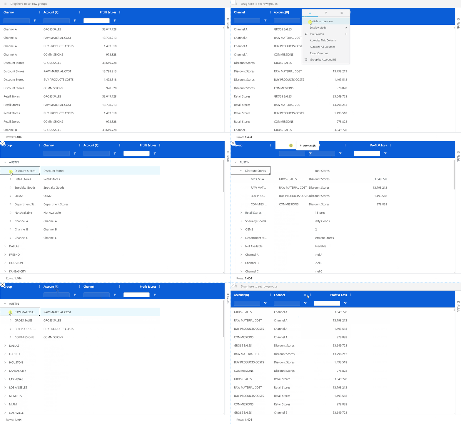
The Flex Grid Object provides sophisticated data interactions for financial planners. Planners use the "Fields" panel and other Flex Grid options to change how data is arranged in Play Mode. You can move fields, group data, use Pivot Mode, change Block alignment, and expand or collapse groups. The available interactions depend on the Flex Grid configuration set by the Developer.
The subjects discussed regarding organizing data in a Flex Grid are as follows:
Read about how to analyze data in a Flex Grid and other display options.
Read about Range Charts (interaction only) and Docked Charts (savable).
Interactive Selection on rows and columns
The Flex Grid Object enables users to select an Entity by choosing specific rows and/or columns.
For example, in a Flex Grid that lists Countries in rows, users can click on one or multiple rows (i.e., Countries) and utilize them as selection criteria, prompting other Objects on the Screen to update accordingly.
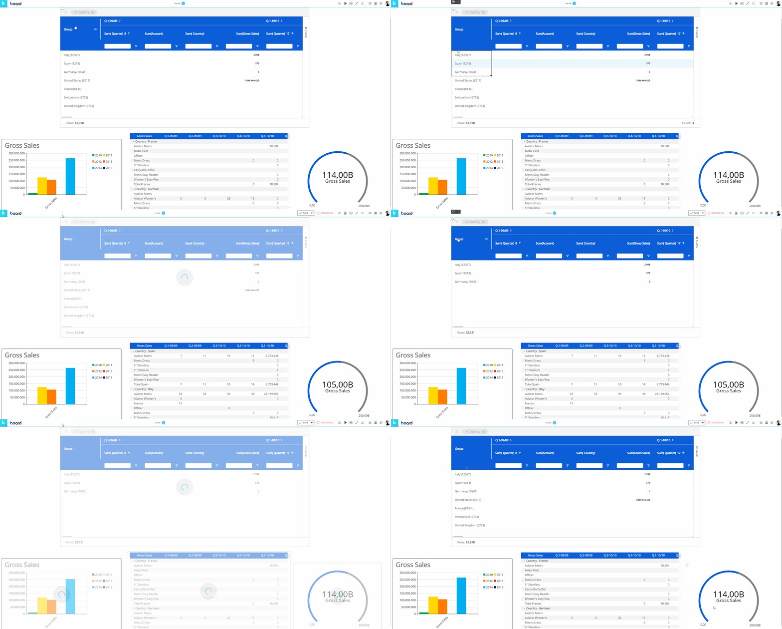
As you can see in the example above, once a selection is applied the other Objects on the Screen are refreshed to show data for the selected items only.
To reset the selection made on a Flex Grid Object, click the reset button  in the top left corner of the Flex Grid.
The selection can be made on the Entities set By Row and By Column. Read more about how the Select works.
The "Fields" panel in Play Mode
The "Fields" panel, displayed vertically on the right side of the Flex Grid, is a powerful tool specific to the Flex Grid. This panel gives the end user the ability to pivot and display data in different ways, depending on the configuration of the developer. Beyond the capabilities of grouping and setting fields by Row within the Flex Grid as described above, the "Fields" panel allows you to group fields by Column using the "Pivot Mode" feature, giving you even more flexibility and freedom to configure your dataset.
You can interact with the Flex Grid in 2 ways:
Flat view. In flat view, you see all the fields selected which can be grouped by Row. Click on the "Fields" panel to open it. Then drag and drop fields into Row Groups, Values, or hide Blocks from the panel. All rows of the dataset are always part of flat view. Even if row groups are defined, you can expand all row groups to display the distinct rows of the dataset, configured by the Developer.
Click on the Fields panel to open it. Then drag and drop fields into Row Groups or Values areas or hide Blocks from the panel. You can also drag column headers to the top bar of the Flex Grid that says "Drag here to set row groups".Pivot Mode. In Pivot Mode, you only see aggregated data by Rows that are based on the group configuration in the Columns panel, and you also have the possibility to group By Column, which becomes available only when "Pivot Mode" is enabled.
Enable the Pivot Mode toggle and then drag and drop fields as before, but now you can add Column groups under the "Column Labels" section that appears at the bottom of the panel.
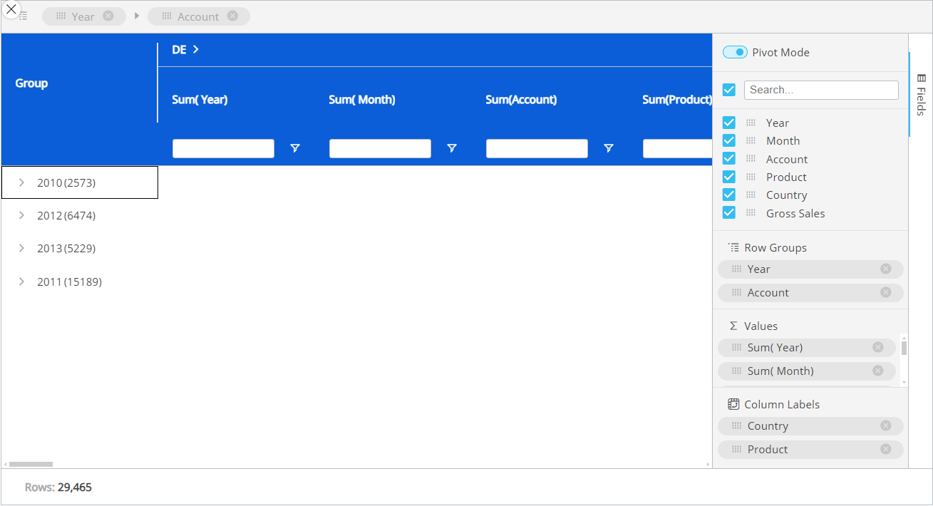
The Fields panel options are:
Pivot Mode. Enabling Pivot mode allows you to customize the display of the Flex Grid in more detail. Upon enabling for the first time, you will see the default view configured by the Developer, and the feature "Column Labels" appears at the bottom.
Column Labels. Enabling Pivot Mode will unlock the "Column Labels" feature at the bottom of the panel. Drag and drop fields that you would like to group the other fields by.
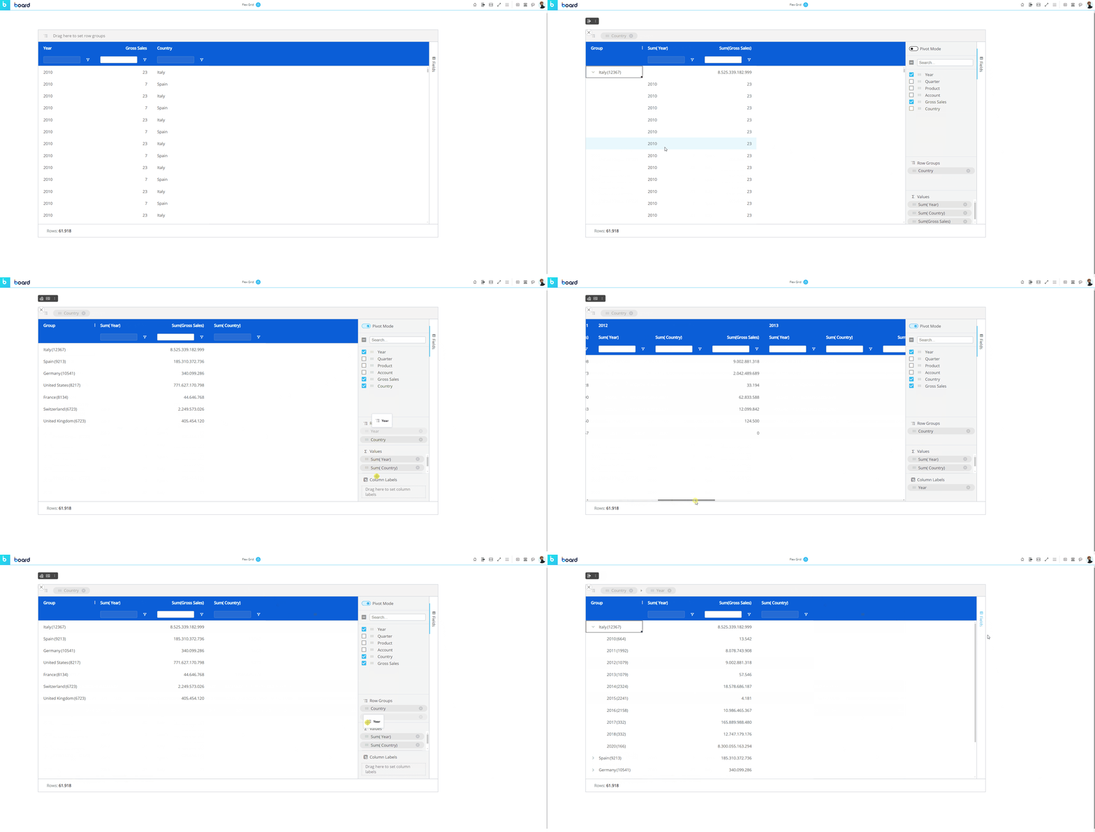
For example, if you have a Flex Grid with the Entities "Year" and "Country" and a "Gross Sales" Block, and you set "Country" by "Row Groups", then, "Year" and "Gross Sales" show separate value fields.
Instead, if you set "Country" in the "Column Labels" sections, the Columns will now be organized by the group "Country" and Gross Sales will be broken down into multiple columns that display the value by country rather than a lump sum of Gross Sales in the Country value cell.
Next, if you add "Year" to the "Row Groups" underneath "Country", years are grouped within each country, and you can expand and collapse those row groups to see the data broken down by group.
Search. Use this search bar to find a field within the list below it (of only the fields configured in the Layout).
The checkbox that appears to the left of the search bar is used exclusively for the search results. The checkbox will select or deselect all the fields that are displayed under the search bar.
For example, if you search for "Sales" from a list of 10 fields, and 2 fields show up called "Gross Sales" and "Total Sales", you can select or deselect only these fields that displayed via the search function by selecting or deselecting the checkbox to the left of the search bar.Checkbox behavior. The checkbox is selected only when all the fields below the search bar are selected. If some are not, the checkbox will appear with a minus sign. If the checkbox is enabled with a checkmark, all field results via the search will be selected. If deselected when all fields are selected, all fields will become deselected.
If nothing is entered into the search bar, then all the fields are listed. The same behaviors as above apply when nothing has been searched.
Fields. All fields configured in the Flex Grid will display under the search bar. You can rearrange the position of the fields in the Flex Grid by dragging and dropping a field in a different order. The first field in the list will display on the leftmost side of the Flex Grid columns, while the last will display on the rightmost side. You can also drag and drop these fields into the areas below: Row Groups, Values and Column Labels.
Row Groups. Drag and drop one or more fields you would like to configure the Flex Grid by row. By adding more than one, the row fields become grouped. The grouping behavior is determined by the position of the field in the "Row Groups" list. The first field in the list is the root group, the second is the first sub-group, the third is the next sub-group, and so on.
Values. Drag and drop fields here in order to aggregate the data on field groups. A new column appears in which it will display the aggregated value. The default aggregation is sum, but the aggregation can be changed via the "Value aggregation" menu access by the header options menu or directly in the Columns panel. From the Columns panel, click on the field under the Values section to display a dropdown menu where you can choose between average, count, first, last, max, min, and sum. Read more about aggregation values.
Fields right-click menu
In flat mode
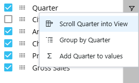
When in flat mode, a user can access a right click menu for each field available in the Fields list. The following options are available depending on the current field configuration:
Scroll [Field] into View. This option is available only when a field is not grouped by row. When a table is heavily populated with many columns, this option scrolls to the specified field when it may be difficult to locate.
Group/Ungroup by [Field]. This options allows users to group or ungroup the specified field and updates the Flex Grid accordingly.
Add/Remove [Field] from values. This option allows users to add or remove the field to the values section of the Fields panel and updates the Flex Grid accordingly.
In Pivot Mode
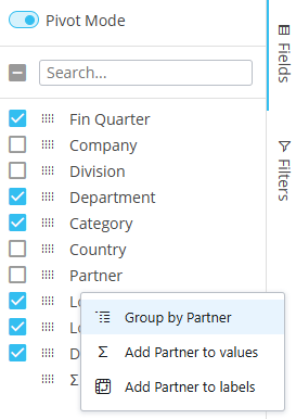
When in Pivot Mode, a user can access a right click menu for each field available in the Fields list. The following options are available depending the current field configuration:
Group/Ungroup by [Field]. This options allows users to group or ungroup the specified field and updates the Flex Grid accordingly.
Add/Remove [Field] from values. This option allows users to add or remove the field to the values section of the Fields panel and updates the Flex Grid accordingly.
Add/Remove [Field] to labels. This option allows users to add or remove the field to the labels section of the Fields panel and updates the Flex Grid accordingly.
Interact with Vertical Alignment
Planners can interact with an already configured vertical alignment or configure a Flex Grid to view data vertically themselves.
Data Entry is supported with vertical alignment. Read about data entry limitations in a Flex Grid.
Filters and sorts are supported between vertical and non vertical alignment with some exceptions, stated in the filter and sort paragraph below.
Drill down (on Entities) is supported with vertical alignment, but not other type of drills. Read more about Drill Downs in Vertical Alignment.
The Flex Grid rows limit of 2.5 million rows apply to vertical alignment. This is important to consider in the initial configuration because the number of rows increases when switching to vertical alignment.
Vertical alignment is not compatible with Blocks configured with the 'By Column' option and Entities set By Row.
Picture type Blocks are not compatible with vertical alignment.
Exporting a Flex Grid in vertical alignment is not supported. The export will execute and render a Flex Grid in non-vertical alignment.
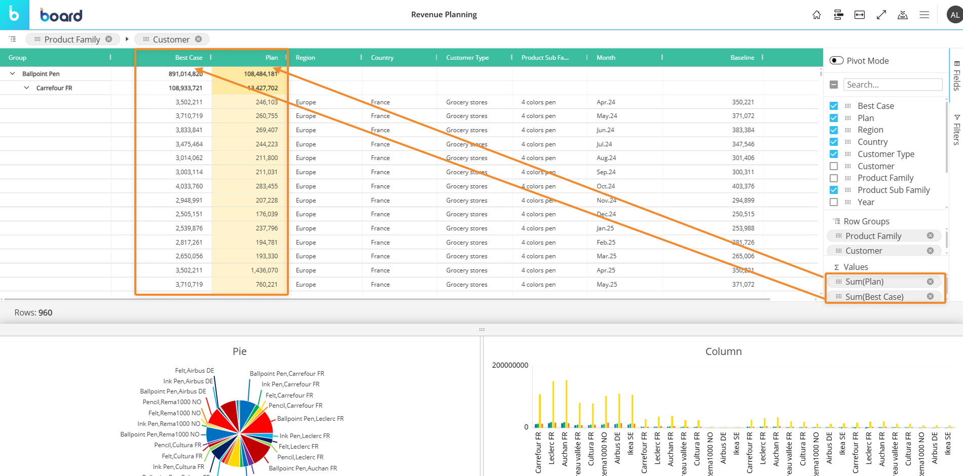
Below is a a Flex Grid without vertical alignment, showing the Values fields (“Plan” and “Best Case”) as total columns represented of the Row Groups, which are “Product Family” and “Customer”.
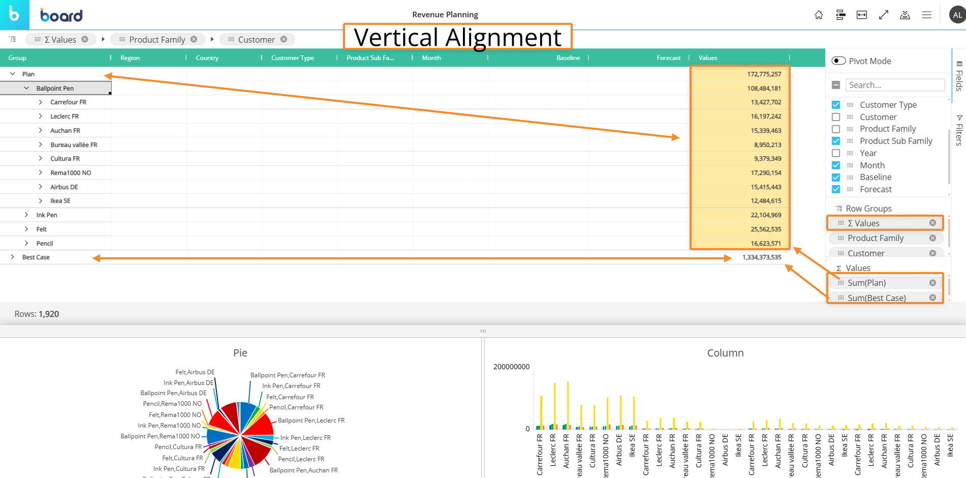
Below is a Flex Grid in Vertical Block Alignment, showing the Values fields (“Plan” and “Best Case”) organized as Row Groups along with “Product Family” and “Customer” and displaying the totals in the last column.
How to align Flex Grid vertically
Planners can create a vertical alignment of a Flex Grid by following these steps:
Click on “Fields” on the right side bar of the Flex Grid
Drag and drop fields you want to see vertically to the areas below: “Row Groups”, “Values”, and “Column Labels” and arrange the hierarchy within the “Row Groups” area
Add the “∑ Values” field to the “Row Groups” area based on the hierarchy you want to view your data
The position of fields matters
When only ∑ Values is in Row Groups, all the fields added to “Values” Area appear in the order they are configured.
Adding a field or more before “∑ Values” in Row Groups displays data in the typical Flex Grid organization: embeds the KPIs within the fields in the order they are configured in Row Groups.
If “∑ Values” is placed before a Field, the KPIs are broken down by those dimensions.
To change the aggregation formula from the Fields area, right click on a checked field to ungroup or remove from Values area or an unchecked field to group or add to Values area.
All these settings can be saved or restored using “My view” from the burger top menu and added to a Presentation
Limits are the same as Flex Grid: 2.5M rows
Group a Flex Grid in Play Mode
You can group fields directly from the Flex Grid Object in both flat view or in Pivot Mode. The difference being that, in Pivot Mode, you can dimension the whole grid by rows and group columns, whereas in the flat view with Pivot Mode disabled, you can only group fields by Row.
Group in flat view
To group the full dataset by Row in flat view, drag and drop a column header of a field into the top grey bar that says "Drag here to set row groups". You can also group the flat dataset in a similar way by utilizing the "Fields" panel without enabling "Pivot mode". To do so, do the following:
Open the "Fields" panel.
Drag and drop fields into the "Row Groups" section. This will automatically set that field by row, grouping the others under it, as in the example below. You can change the hierarchy of the groups by dragging and dropping the elements in the order you want, the leftmost position being the most-nested.
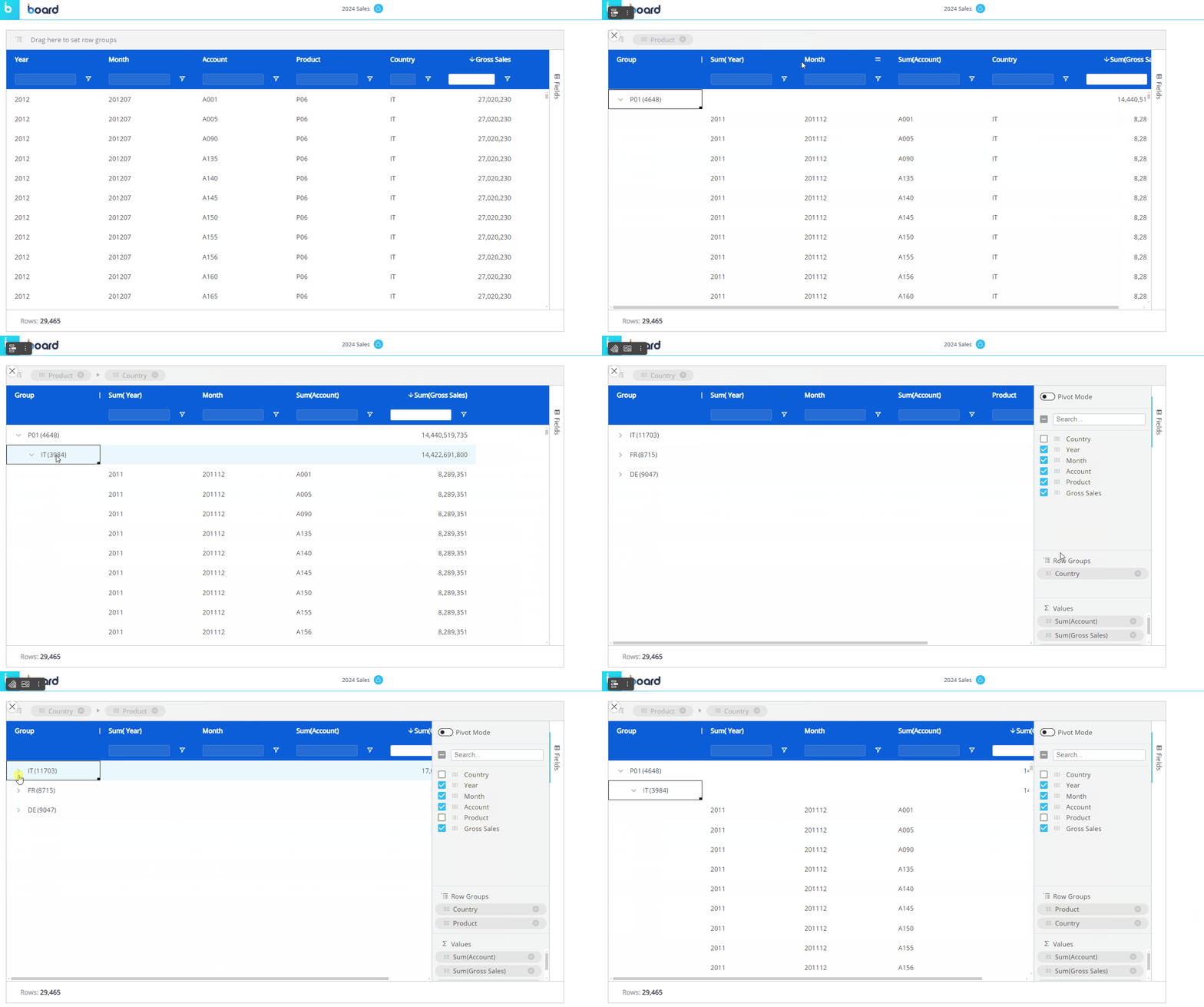
Group in Pivot Mode
To group a dataset using Pivot Mode, access the "Fields" panel from the right side of the Flex Grid, and do as follows:
Open the "Fields" panel.
Enable the Pivot Mode toggle.
Dimension fields by Row by dragging and dropping fields into the "Row Groups" section. You can change the hierarchy of the groups by dragging and dropping the elements in the order you want, the top position of the "Row Groups" section being the most-nested. You can also drag fields into the top grey bar for Row Groups
You must have at least one field set by Row Groups.
Group fields by Column by dragging and dropping the fields into the "Column Labels" section (which only appears once Pivot Mode is enabled). You can change the hierarchy of the groups by dragging and dropping the Entities in the order you want, the top position of the "Column Labels" section being the most-nested. Or drag and drop the field into the top grey bar to the Right for Column Labels. On the grid, you can expand and collapse the Column groups as you want.
The different ways of grouping is shown in the example below.
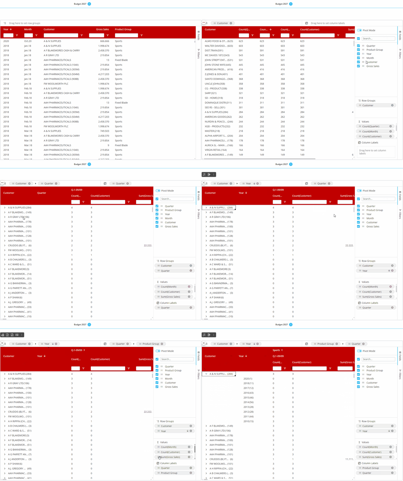
Flex Grid Collapse and Expand on Column Headers (only with 3 or more column labels)
Users can collapse and expand Column headers when configured with at least 3 Entities. Use the arrow that appears next to column headers to expand or collapse.
In Pivot Mode, expanding/collapsing column labels requires at least 3 column labels and a dataset under 100,000 rows.
This limitation does not apply to the “By Column” configuration, which supports expand/collapse without major restrictions.
Tree view for Unbalanced Entities
You can dimension a Flex Grid by an Unbalanced Entity and view it in tree view. Tree view enables the display of an Unbalanced Entity's hierarchy in a tree form, allowing the users to interact with it by expanding and collapsing different nodes, as opposed to viewing the Entity in flat view.
To see an Unbalanced Entity in tree view, you must be in flat view (not available in Pivot Mode). Click on the hamburger icon in the top right corner of the Unbalanced Entity's column (the Column menu) and select "Switch to tree view". To exit the tree view, click on the hamburger icon in the top right corner and then select "Switch to flat view".
The tree view of the Unbalanced Entity will not retain any grouping.
In Play Mode, tree view is only available when the Flex Grid is in flat view. When Pivot Mode is enabled, the Tree view is automatically disabled.
Locking the total cell of a high-level row group will automatically lock its lower-level row groups in tree view.
Tree view is not available with vertical alignment.