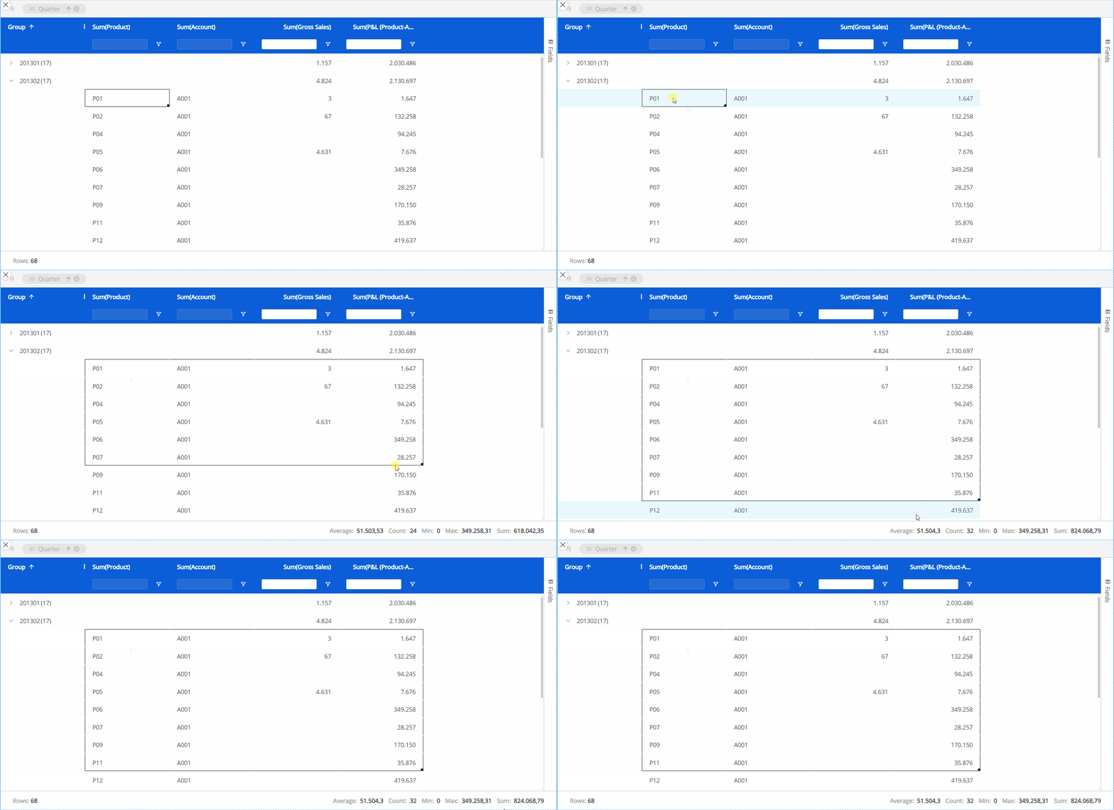
The Board 14 release introduces the new Flex Grid Object, a powerful reporting tool displayed as an Excel-like table with key features like pivoting, grouping, sorting, filtering, quick charts, and more.
The following article explains the specific features, settings, and properties of a Flex Grid for both Developers and Planners. The topics included are as follows:
How to create a Flex Grid Layout
With significantly improved performance capabilities based on an improved query, Flex Grid gives end users and developers the ability to leverage large data volumes with more Entities set by Row than ever before and dimensioned directly from the Object. In previous versions, end users could only interact with a Data View to display data in a table format, of which the end user's capabilities to display data in different ways was configured by developers and sometimes restricted. Now, end users have more autonomy to pivot data to analyze data directly from the Flex Grid Object.
In contrast to a Data View that only shows data from a top-down perspective, the Flex Grid also displays data from a bottom-up perspective, giving the end user more self-service capabilities and freedom to create a very detailed dataset where it was not as visually optimized or possible in a Data View before. For example, you might choose to use a Data View to display aggregated data like KPIs.
Data View | Flex Grid |
|---|---|
Aggregated analysis, general guidelines could be:
| Detailed analysis, general guidelines could be:
|
Top-down approaches
| Bottom-up approaches
|
Standard/prebuild reports
| Data Exploration reports
|
This new Object can report and handle large, detailed datasets, reducing performance latency and inefficient usage of resources.
Flex Grid Highlights
The new Flex Grid Object breaks data silos with unmatched performance, allowing the display of datasets for different areas of a business and unlocking unified decision making. The Flex Grid Some of the benefits include:
Supports more Entities by row and column. Supports more than 1M Entities and dozens of columns of detail with analysis capabilities which are challenging even within Excel.
Better performance. Flex Grid uses a new query method enabled by the new B14 Engine, which is more powerful and allows the retrieval of large dataset. Furthermore, the new execution logic minimizes the server requests of data, allowing a smooth user experience in all Object interactions.
Self-service pivoting with Pivot Mode. Less focus on the prebuild or standard reporting which allows end users to achieve their reporting needs autonomously directly within the Flex Grid. Pivot functionalities allow developers to create more open reports and dashboards for planners so they can freely and independently achieve the type of analysis they need.
Improved filtering and sorting. Filtering and sorting is not configured in the Layout editor configuration as with a Data View, but within the Flex Grid itself. It is also possible to save a default display configuration of sorting and filtering within the Flex Grid so as not to start from the original dataset. Manual sorting of columns and Blocks are also possible.
Multi-filtering & multi-sorting. It is possible to sort and filter by multiple Entities and Cubes. The maker can configure the restrictions to a single column or multiple.
Embedded Charts. Charts are possible directly within the Flex Grid itself. Use on-the-fly charts to visualize demand patterns and identify trends.
Export to Excel. You can export the exact Flex Grid configuration to an Excel workbook directly from the Object without formatting it.
More flexible formatting. The Flex Grid has even more formatting options than a Data View, found under the Design subpage of the Object Properties panel.
Large calculations on-the-fly. Leaf-level calculations can now be done on-the-fly directly in the Flex Grid. Now, the calculations are executed at dataset level when the dataset is retrieved from the engine. This is ideal for use cases which would previously require calculations and storing data using dataflows. For example, this new Object could be useful when making currency conversions, variance analysis calculations, P*Q , etc.
Unbalanced hierarchies. The dataset-level execution now allows the table to calculate multiple unbalanced hierarchy aggregations; this is significant because in Data Views, only the most-nested Unbalance hierarchy set By Row was executed.
Rules and Algorithms. These on-the-fly calculations are executed at dataset-level, now allowing the users to easily display/aggregate calculated values by the available dimensions (i.e. Excel Pivot-like behavior).
To read in more detail about a Flex Grid, refer to the manual documentation articles below:
How to create a Flex Grid
To create a Flex Grid, proceed as follows:
Format the Flex Grid with the options from the Object Properties panel.
Dimension the Flex Grid with the "Fields" panel and Pivot Mode and save a default view for the Planners by grouping, sorting, and filtering directly from the Object in a Screen while in Design mode. You can also view Unbalanced Hierarchies with tree view.
Create a Flex Grid Layout
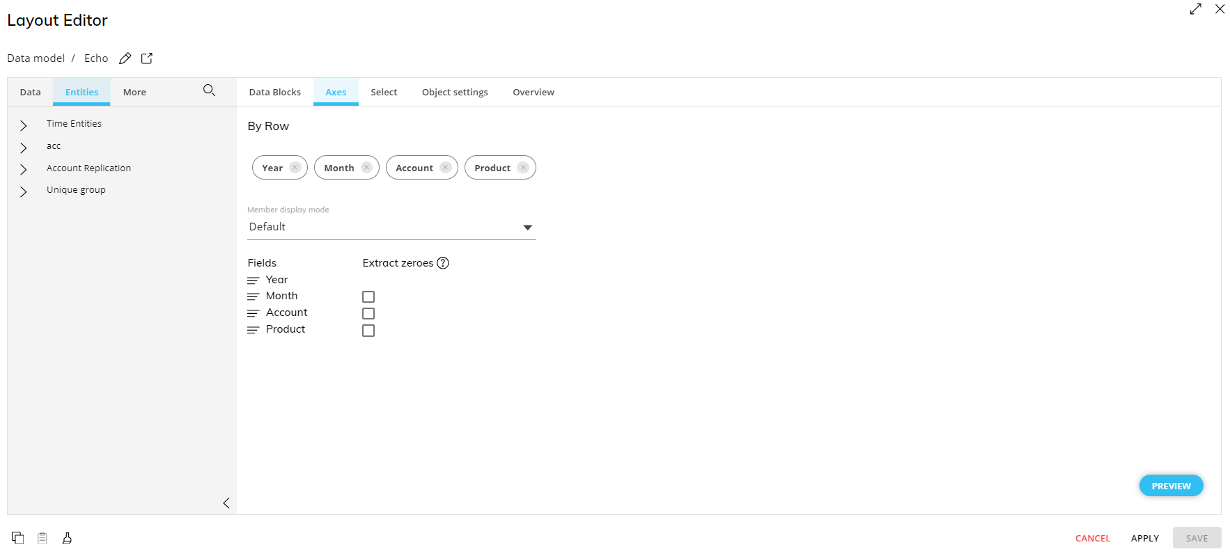
The Flex Grid Layout has some commonalities to a Data View Layout, however, there are many differences. To configure the Flex Grid Layout, Entities are dropped into only one area titled "By Row" and the "Select" and "Filter and sort" submenus are disabled, all of which are possible to configure directly in the Flex Grid Object.
Similar to a Data View, data is displayed in a table format with Entities by rows and columns, you must configure the Layout with at least one Data Block, and you must dimension the Layout with at least one Entity.
The first Data Block of a Layout must be a Cube or an Algorithm.
In the Axes area, you can add multiple Entities to the "By Row" area. In fact, you can add much more Entities by Row than in a Data View in order to display complex grids of data in different ways with the powerful Pivot Mode tool.
Unlike a Data View, rows and columns are not configured within the Layout but rather within the Flex Grid Object. Entities are only set "by Row" in the Layout and configured in more detail directly from the Flex Grid itself, for example dimensioning the grid using the Fields panel, grouping, and defining specific sorting and filtering from each Entity heading.
Underneath the "By Row" area, you can define the Member display mode and enable or disable the "Extract zeroes" feature like with other Objects.
You can add a Layout Selection solely on the Flex Grid Object, similar to a Data View. The Layout Select is configured exactly like the Select function, considers security selections, and follows the Selections application sequence (Select at runtime), however, the behavior is slightly different. Refer to the Flex Grid Select behavior documentation to understand how the Select function works with a Flex Grid.
Flex Grid Object Data properties & display options for pivot capabilities
To access the Flex Grid Properties, you must access a Capsule Screen and select the Flex Grid Object. When the Layout has been configured, you will see the Object settings in the right sliding Properties panel. Those settings are categorized into 3 tabs, Data, Design, and More. The settings specific to a Flex Grid Object are as follows:
Main options. The Object Data properties specific to a Flex Grid are display options for both Flat Mode and Pivot Mode which allow or restrict Planners to use all, none, or certain pivot capabilities.
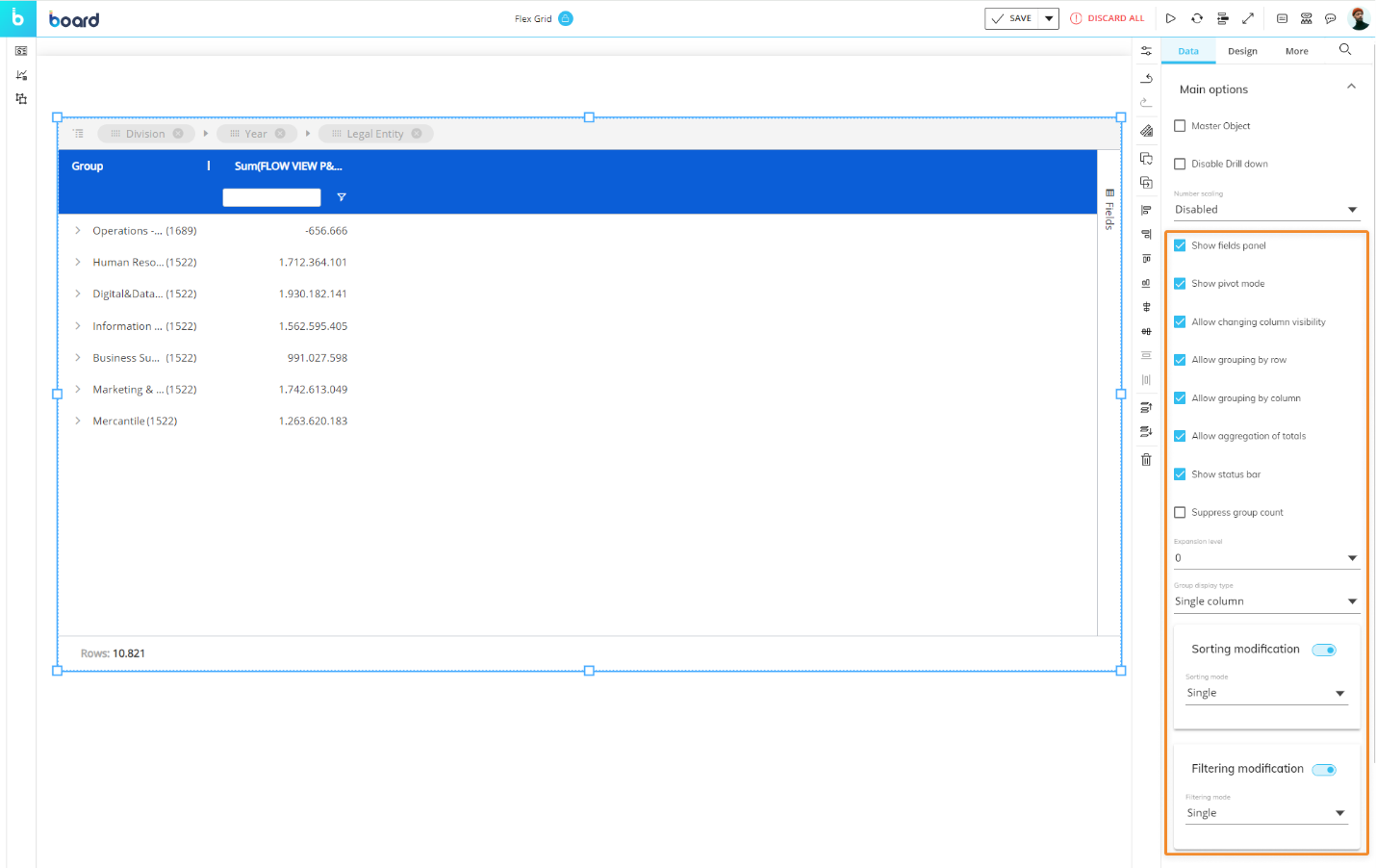
Show Fields panel. Enables or disables the display of the "Fields" panel in Play Mode.
Show Pivot mode. Enables or disables the possibility for Planners to use Pivot Mode in Play Mode.
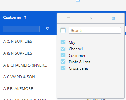
Allow changing column visibility. Allows or disallows Planners to change the visibility of columns shown in flat mode from the Column menu in the Quick pivoting tab
 . In the image below, the checkboxes are disabled and cannot be unselected to hide a column.
Allow grouping by row. Allows or disallows Planners to group fields By Row in Play Mode.
Allow grouping by column. Allows or disallows Planners to group fields By Row in Play Mode.
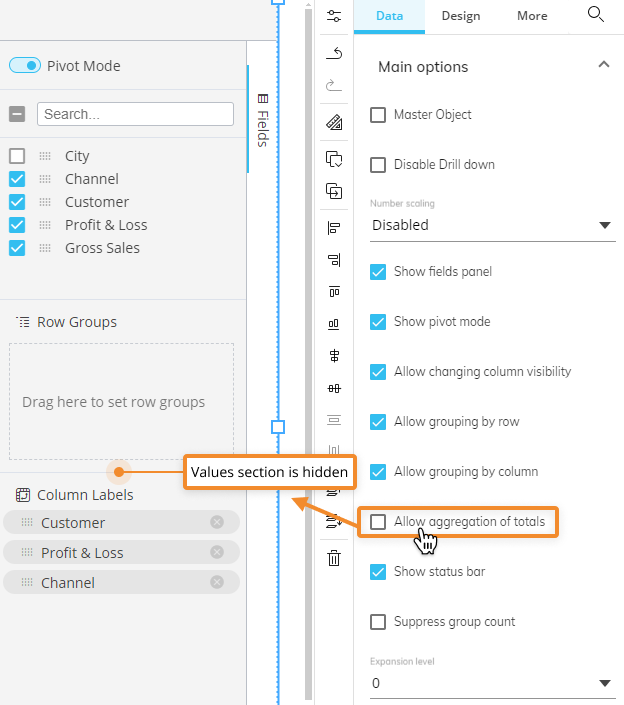
Allow aggregation of totals. Allows or removes the "Values" area of the Fields panel in both flat view and Pivot Mode. The image below shows the the Fields panel without the "Values" section because this setting disabled.
Show status bar. Enables or disables the status bar at the bottom of the Flex Grid.
Suppress group count. When enabled, removes the number that is displayed in parenthesis next to each row group. Disabled by default. This number counts the dataset rows which have been grouped by row, both in flat and pivot mode.
Expansion level. Customizes the view of the expanded/collapsed Row groups for the Planners.
For example, if a Flex Grid was dimensioned by 3 Row groups, the default view shows all the rows collapsed under the most-aggregated group. If this setting is set to 1, the default view would expand the most-aggregated Row group to show the next Row group within the tree. If this setting is set to 2, the default view would show the most-aggregated Row group and the next Row group expanded so that the third Row group would be exposed. Set to 3 in order to expand all 3 Row groups.This setting is only for the default view, and the end user can still use the expand/collapse options manually.
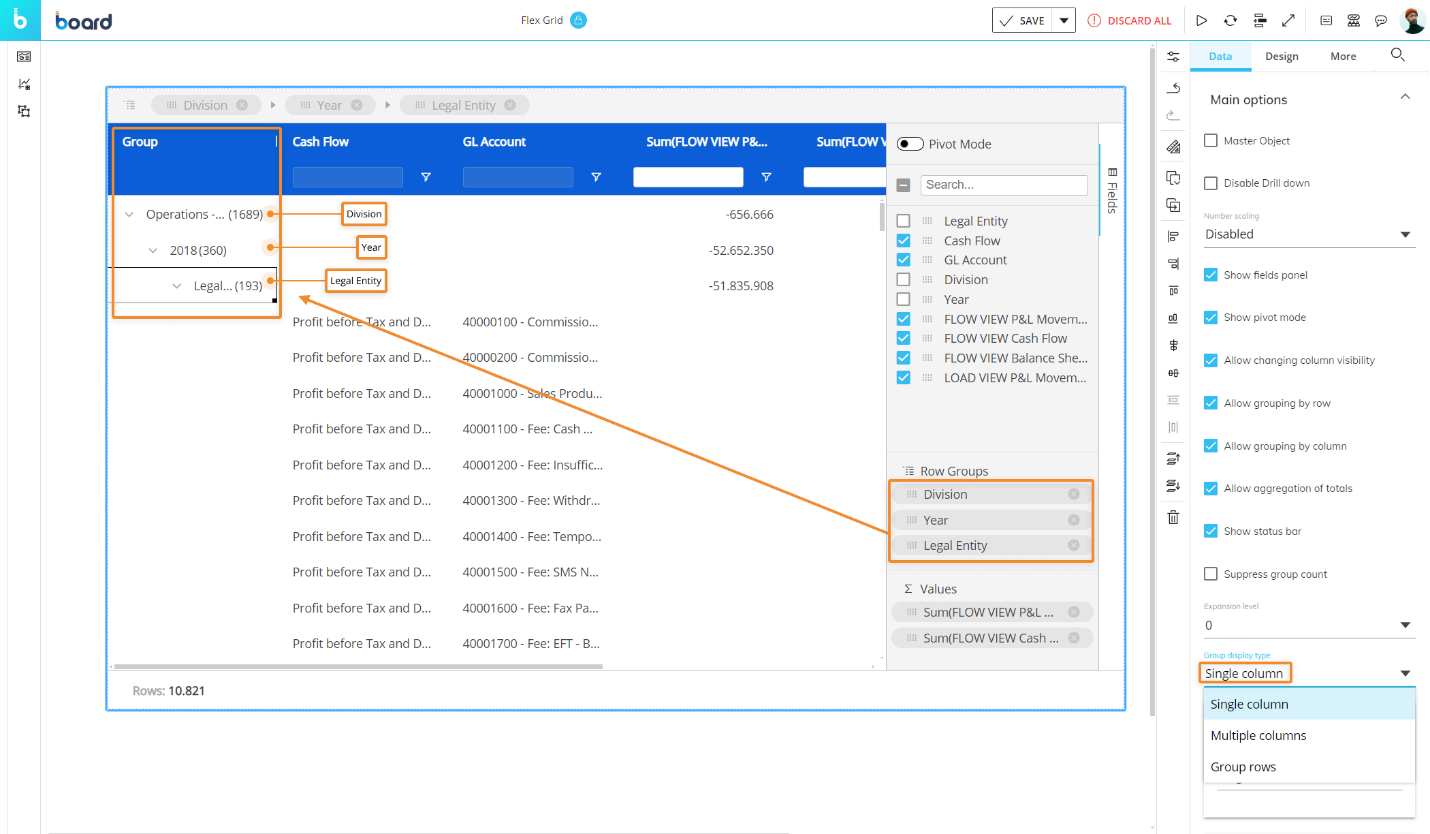
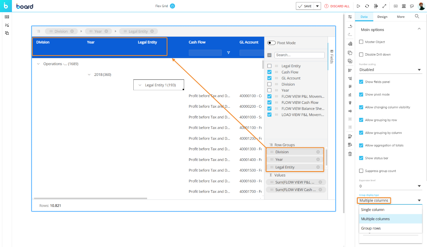
Group display type. Displays the row groups either in a single column (default), multiple columns (for 2 or more), or only as row groups without any headers or columns:
Single column (default). A single group column is added to the grid which displays all row groups.
Multiple. Separate group columns will be added to the grid for each column used to group the rows by.
Groups row. Removes Group headers and displays the grouping fields only in rows, similar to a Data View (only available in flat mode).

Sorting modification. Enables or disables the end user's ability to sort. If enabled, choose "Single" or "Multiple":
Single. Restricts the end user to only one field sort at a time. Sorting another field will automatically remove the last one.

Multiple. Allows the end user to sort multiple columns at a time. The numbers indicating which is the first (1), second (2), third (3), and so on.

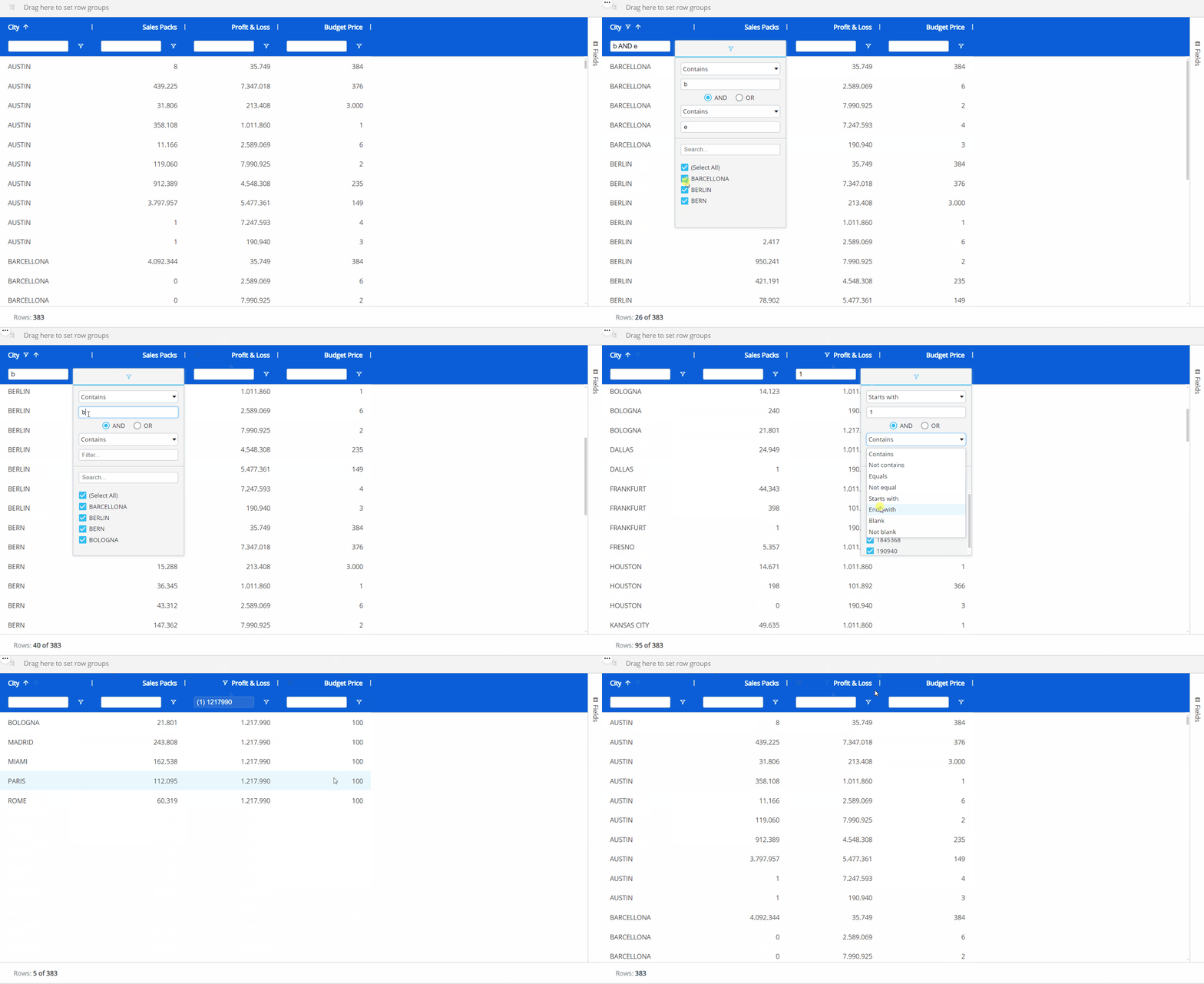
Filtering modification. Enables or disables the end user's ability to filter. If enabled, you can choose between "Single" or "Multiple", where single offers 1 filter per column and multiple offers 2 types of filters per column.
Single. Restricts the user's ability to apply only 1 filter per column.
Text field or Time Entity. A single filter on a text field or Time Entity offers a text field search box from the filter menu.
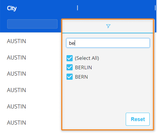
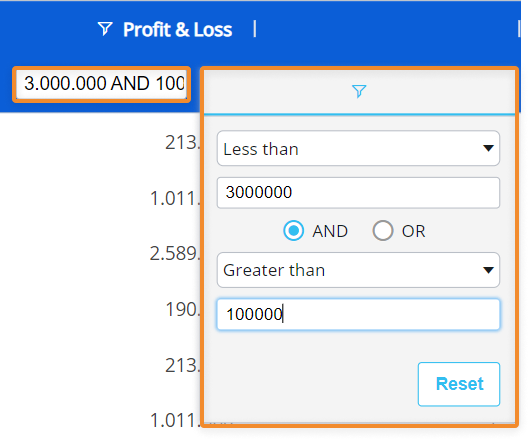
Numeric field. A single filter on a field with numeric data offers dropdown filter options combined with numeric field boxes with the possibility to use AND/OR conditions. The search box in the column header is also available for filtering directly from it.
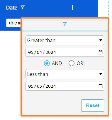
Date field. A single filter on a date field allows you to filter by dates with dropdown menus of filter options combined with a calendar with the possibility to use AND/OR conditions.
Multiple. Allows the user to apply multiple separate filters per column at a time. You can use multiple filters for each column, which unlocks a more advanced way to filter.
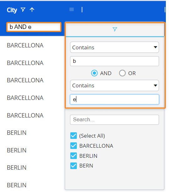
Text field or Time Entity. When multiple filtering is configured, a text field or Time Entity column allows for an additional filter option to what is offered in a single filtering configuration: dropdown filter options combined with text fieldboxes with the possibility to use AND/OR conditions. The checkbox filters, which are the only option for a single filter on a text field, now will show results of the additional filter above them. In addition, the search box in the column header becomes available for direct filtering from it.
In the example below, the user can search for words that contain both the letters "b" and "e" resulting in BARCELONA, BERLIN, and BERN instead of only BERLIN and BERN like in the single filter example.
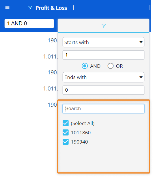
Numeric field. When multiple filtering is allowed, a field that contains numeric data allows for an additional filtering option to what is offered in a single filtering configuration: checkbox fields that reflect the of the results from the above filter. In addition, you can also search through the results using the search box above the checkboxes.
Date field. When multiple filtering is allowed, a Date field allows for an additional filtering option to what is offered in a single filtering configuration: checkbox fields that reflect the of the results from the above filter. In addition, you can also search through the results using the search box above the checkboxes.
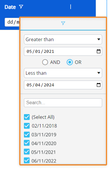
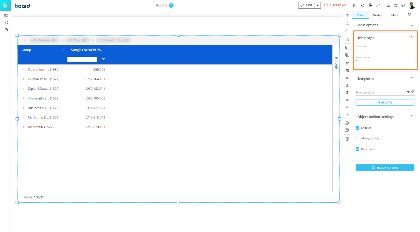
Table Style. Customize the table style with the ability to freeze rows and/or columns, similar to Excel.
Frozen rows. Customize frozen rows. Enter the number of rows you would like to freeze.
Frozen columns. Customize frozen columns. Enter the number of columns you would like to freeze.
You can also customize color formatting. To learn more, refer to the Flex Grid custom color formatting documentation.
Interacting with a Flex Grid in Design Mode
Flex Grid is a unique Object in that most of its configuration is done by interacting within the Flex Grid itself. Customizing a Flex Grid to have a specific saved configuration for an end user in Play mode is covered in the following paragraphs, while formatting the Object settings, options, and colors are covered in the next article: Formatting a Flex Grid article.
The "Fields" panel & Pivot Mode
The panel labeled "Fields", displayed vertically on the right side of the Flex Grid, is a powerful tool specific to the Flex Grid that gives Planners the ability to pivot and display data in different ways, depending on the configuration of the developer. Beyond the capabilities of grouping and setting fields by Row within the Flex Grid, the Fields panel allows you to group fields by Column using the "Pivot Mode" feature, giving you even more flexibility and freedom to configure your dataset.
Interacting with the Flex Grid is done both by the Developer and Planners:
Makers configure the default dimensions, grouping, sorting, and filtering for the Planners.
End users self-pivot data for their own conclusions.
End users can interact with the Flex Grid in the same way as a Developer only if the configuration allows for it. Below, it is described how a Developer configures the Flex Grid, however, any Planner can also use the same the logic.
You can configure the Flex Grid in 2 ways:
Flat view. In flat view, you see all the fields selected which can be grouped by Row. All rows of the dataset are always part of flat view. Even if row groups are defined, you can expand all row groups to display the distinct rows of the dataset, chosen in the Axes area of the Layout Editor.
Click on the Fields panel to open it. Then drag and drop fields into Row Groups or Values areas or hide Blocks from the panel. You can also drag column headers to the top bar of the Flex Grid that says "Drag here to set row groups".Pivot Mode. In Pivot Mode, you only see aggregated data by Rows that are based on the group configuration in the Fields panel, and you also have the possibility to group By Column, which becomes available only when "Pivot Mode" is enabled. Enable the Pivot Mode toggle to configure the default Pivot Mode view.
Drag and drop fields as before, but now you can add Column groups under the "Column Labels" section that appears at the bottom of the panel.
The configuration made in the Flex Grid from Design mode can be saved as a default view for end users in Play mode by clicking "SAVE" in the Top menu.
To configure a default view, do the following:
For flat view, click on the "Fields" panel to open it. Then drag and drop elements into Row Groups, Values, or hide Blocks from the panel. Click "SAVE" to save the flat view configuration as the default view for Planners.
For Pivot Mode, click on the "Fields" panel to open it. Enable the Pivot Mode toggle to configure the default Pivot Mode view. Drag and drop fields by Row Groups, as in flat view, and Column groups under the "Column Labels" section that appears at the bottom of the panel. Click "SAVE" to save the Pivot Mode configuration as the default view for Planners.
In the "Fields" panel, the options available are the following:
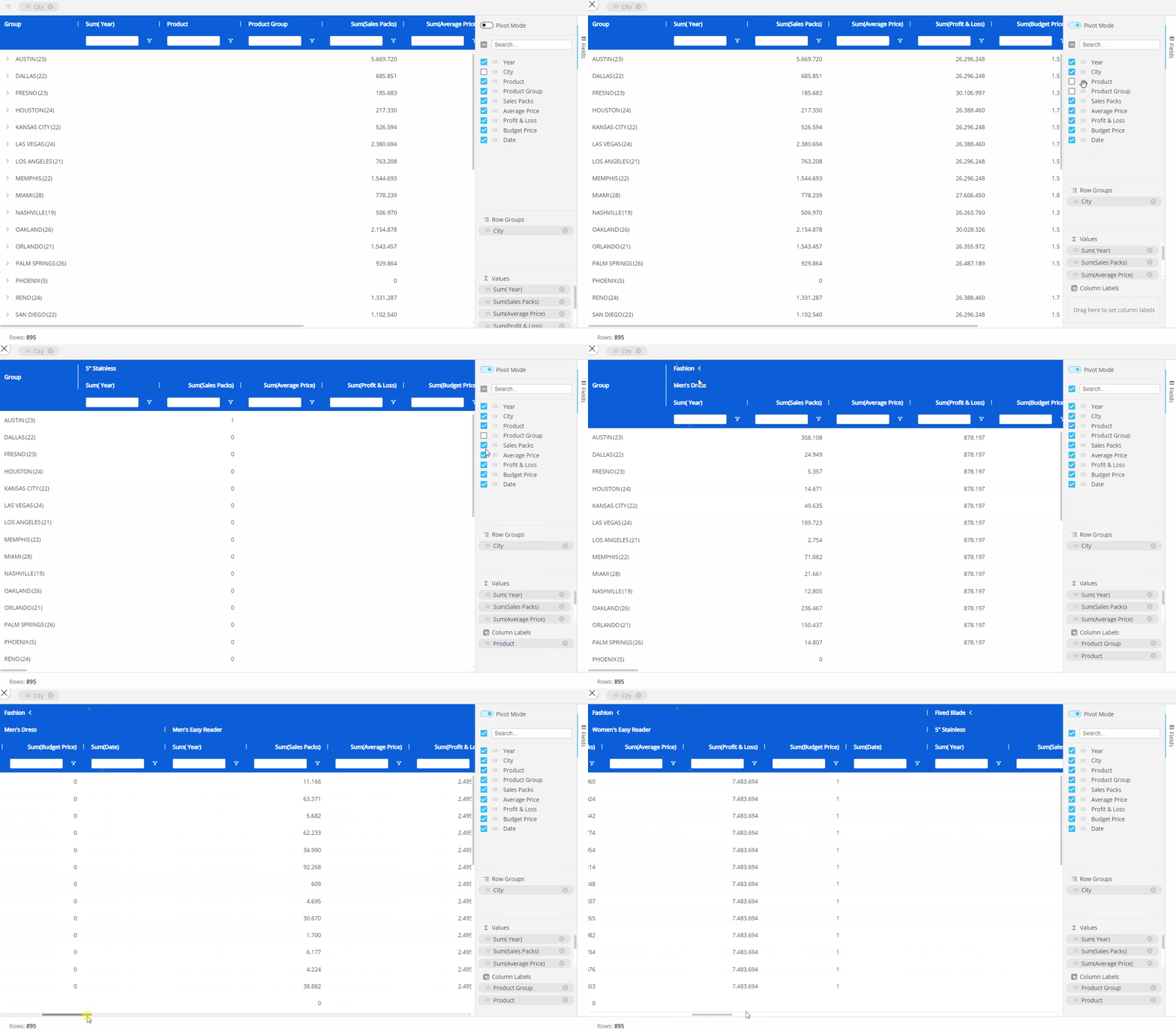
Pivot Mode. Enabling Pivot Mode allows you to customize the display of the Flex Grid in more detail. Upon enabling for the first time, all the default settings are cleared and the feature "Column Labels" appears. After configuring the Flex Grid in Pivot Mode, you can oscillate between the default flat view configuration and the Pivot Mode selections made by enabling or disabling the Pivot Mode toggle.
Column Labels. Enabling Pivot Mode will unlock the "Column Labels" feature. Drag and drop fields into the Column Labels area that you would like to group by column. For example, in the Flex Grid below, we breakdown the P&L data by Product group and Product, while by Row we have the City field. When you have multiple fields in the Column Labels area, you will also be able to expand and collapse column groups.
When a group of columns is collapsed, it will show the total value for that group.
Search. Use this search bar to find a field within the list below it (of only the fields configured in the Layout).
The checkbox that appears to the left of the search bar is used exclusively for the search results. The checkbox will select or deselect all the fields that are displayed under the search bar.
For example, if you search for "Sales" from a list of 10 fields, and 2 fields show up called "Gross Sales" and "Total Sales", you can select or deselect only these fields that displayed via the search function by selecting or deselecting the checkbox to the left of the search bar.Checkbox behavior. The checkbox is selected only when all the fields below the search bar are selected. If some are not, the checkbox will appear with a minus sign. If the checkbox is enabled with a checkmark, all field results via the search will be selected. If deselected when all fields are selected, all fields will become deselected.
If nothing is entered into the search bar, then all the fields are listed. The same behaviors as above apply when nothing has been searched
Fields. All fields configured in the Flex Grid will display under the search bar. You can rearrange the position of the fields in the Flex Grid by dragging and dropping a field in a different order. The first field in the list will display on the leftmost side of the Flex Grid columns, while the last will display on the rightmost side. You can also drag and drop these fields into the areas below: Row Groups, Values and Column Labels.
Row Groups. Drag and drop one or more fields you would like to configure the Flex Grid by row. By adding more than one, the row fields become grouped. The grouping behavior is determined by the position of the field in the "Row Groups" list. The first field in the list is the root group, the second is the first sub-group, the third is the next sub-group etc.
Values. Drag and drop fields here in order to aggregate the data on field groups. A new column appears in which it will display the aggregated value. The default aggregation is sum, but the aggregation can be changed via the "Value aggregation" menu access by the header options menu or directly in the Columns panel. From the Columns panel, click on the field under the Values section to display a dropdown menu where you can choose between average, count, first, last, max, min, and sum. Read more about aggregation values.
Read more about interacting with the "Fields" panel in Play Mode.
Interactions with a Flex Grid using the "Fields" panel can be exactly the same for an end user in Play mode, if the configuration allows it.
Grouping, sorting, & filtering a Flex Grid
Both Makers and end users can group fields of a Flex Grid via flat view or Pivot Mode directly from the Flex Grid Object.
The difference being that, in Pivot Mode, you can dimension the whole grid by rows and group columns, whereas in the flat view (with Pivot Mode disabled), you can only group the field by Row.
Grouping, sorting, and filtering a Flex Grid is done both by the Developer and Planner directly from the Object itself:
Makers configure the default dimensions, grouping, sorting, and filtering for the Planners.
End users self-pivot data for their own conclusions.
End users can interact with the Flex Grid in the same way as a Maker/Developer only if the configuration allows for it. Below, it is described how a Developer configures the Flex Grid, however, Planners can also use the same the logic.
Any field can be used to create a row group in a Flex Grid. Differently from a Data View, where only Entities can be set By Row, in Flex Grid, users can use any type of data, referred to as a "field", to create groups (text, values, dates, algorithms, etc.). A Flex Grid simply creates row groups based on the data available in that field.
When Developers group by Row, regardless of the view, they can configure how much, if at all, the group should expand by default for the Planners in Play Mode by using the Expression level setting in the Object Properties panel.
The grouping configuration made in the Flex Grid from Design mode can be saved by clicking "SAVE" as a default view for Planners in Play Mode.
Grouping in flat view
To group the full dataset by row in flat view:
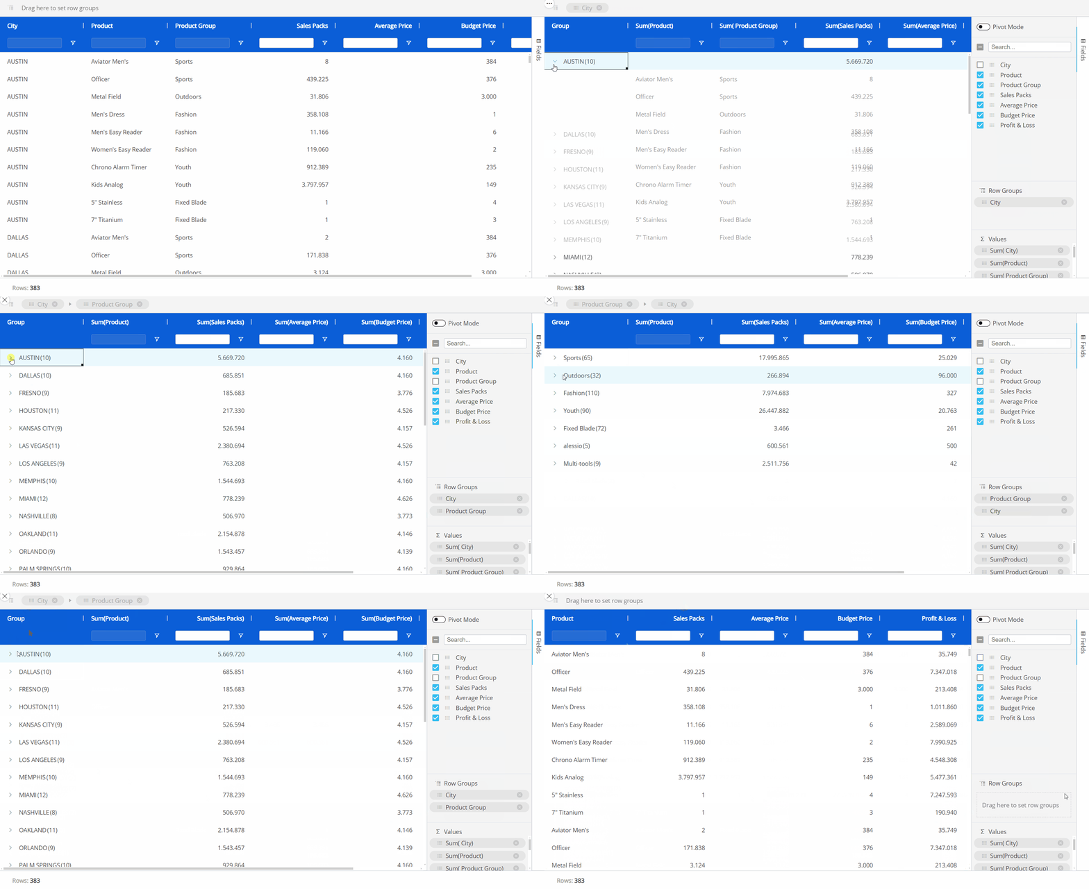
Drag and drop a column header of a field into the top grey bar that says "Drag here to set row groups". You can also group the flat dataset in a similar way by utilizing the Fields panel without enabling "Pivot Mode" and dragging and dropping fields into the "Row Groups" section. This will automatically set that field by row, grouping the others under it, as in the example below. You can change the hierarchy of the groups by dragging and dropping the elements in the order you want, the leftmost position being the most-nested.
Click "SAVE" to save the grouping for the Flex Grid in flat view as the default view for the end user in Play Mode.
The field to the leftmost position in the grid or in the Row Groups area at the top of the Flex Grid as well as the top position within the Fields panel under "Row Groups" and "Column Labels" is the most-nested Entity.
Grouping in Pivot Mode
To group a dataset using Pivot mode, access the "Fields" panel from the right side of the Flex Grid, and proceed as follows:
Enable the Pivot Mode toggle.
Dimension fields by Row by dragging and dropping fields into the "Row Groups" section. You must have at least one field dimensioned by Row Groups. You can change the hierarchy of the groups by dragging and dropping the elements in the order you want, the top position of the "Row Groups" section being the most-nested.
Group fields by Column by dragging and dropping the fields into the "Column Labels" section (which only appears once Pivot mode is enabled). You can change the hierarchy of the groups by dragging and dropping the Entities in the order you want, the top position of the "Column Labels" section being the most-nested. On the grid, you can expand and collapse the Column groups as you want.
Click "SAVE" to save the grouping configuration for the Flex Grid in Pivot Mode as the default view for the end user in Play Mode.
The different ways of grouping is shown below:
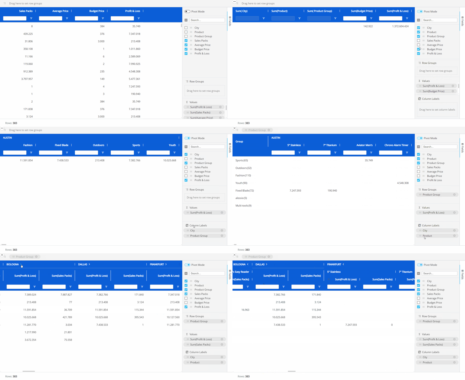
Grouping a Flex Grid can be exactly the same for Planners in Play Mode, if the configuration allows it.
Sorting and filtering a Flex Grid
There are 2 areas that contribute to sorting and filtering a Flex Grid in Design Mode:
In the Object Properties described above. The "Sorting modification" and "Filtering modification" settings which will allow the Developer as well as Planners to use the sort or filter features. Enabling "Sorting modification" and/or "Filtering modification" will also give you the option to allow single or multiple filtering and/or sorting, as described in the following paragraph: Multiple sorting & filtering.
Directly from the Flex Grid Object in which you can save the display configuration after sorting and filtering as a default view for Planners in Play Mode. Simply click "SAVE" in the Top menu once configured.
To sort directly from the Flex Grid Object:
Enable "Sorting modification" from the Object Properties panel.
Click on the field header you would like to sort from or click on the field under the "Row Groups" section in the Columns panel.
Arrows will indicate the order: up arrow for ascending, down arrow for descending, or no arrow for the default orderDevelopers click "SAVE" to save the sorting for the Planners to encounter in Play Mode when first entering the Screen.
To filter directly from the Flex Grid Object:
Enable "Filtering modification" from the Object Properties panel.
Filter. From the Flex Grid Object, there are 3 ways to filter: click on the filter icon, search in the textbox under a column header, or go to the column options menu and click on the filter icon from the window.
Read in more detail about the 3 ways to filter in the Interacting with a Flex Grid article, as it is the same for the Planners in Play Mode if the configuration allows it.Developers click "SAVE" to save the filtering for the Planners to encounter in Play Mode when first entering the Screen.
You can also configure whether Planners can filter and/or sort the Flex Grid in Play Mode, and if so, only a single filter/sort or multiple filters/sorts from the Object Properties panel.
Sorting and filtering a Flex Grid can be exactly the same for Planners in Play Mode if the configuration allows it.
Multiple sorting & multiple filtering
It is possible to sort and filter by multiple fields, if the configuration allows it. When multiple sorting and/or filtering is allowed, the first sort or filter applied is the first priority in the hierarchy, while the second and third sort or filter becomes the second and third priority, respectively.
Multiple sorting allows multiple columns to apply a sort, whereas a single sort only allows one column to apply a sort to the Flex Grid Object.
Multiple filtering allows multiple filtering per column, whereas a single filter only allows one filter per column.
Read more about how to configure multiple sorting and filtering and what the differences are to single sorting and filtering in the Formatting a Flex Grid article.
When sorting multiple fields, a number will appear next to the field header to indicate the priority order of the sort.
When filtering multiple fields, the textbox option under every field is available.
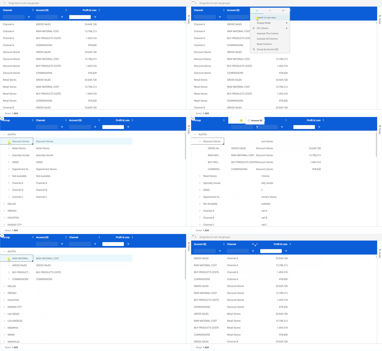
Tree view for Unbalanced Entities
Multiple Unbalanced Entities by row are supported by the Flex Grid Layout. The Flex Grid offers a tree view in order to visualize the unbalanced hierarchy in an improved way: Tree view enables the display of an Unbalanced Entity's hierarchy in a tree form, allowing users to interact with it by expanding and collapsing different nodes, as opposed to viewing the Entity in flat view.
The following information in regards to Unbalanced Entities in the Flex Grid should be noted:
You can add multiple Unbalanced Entities by row in a Flex Grid Layout.
The Unbalanced Entities do not need to be in the most-nested position.
Viewing the tree view of an Unbalanced Entity with the Flex Grid is done both by the Developer and the Planners:
Makers can dimension a Flex Grid by one or more Unbalanced Entities and save the Flex Grid in tree view for Planners in Play Mode.
End users self-pivot data for their own conclusions.
Both Planners and Developers can view Unbalanced Entities in tree view in the same way, Developers doing so in order to save the tree view as the default view for the Planners. Below, it is described how a Developer configures the Flex Grid, however, a Planner can also use the same the logic.
To see an Unbalanced Entity in tree view, you must be in flat view. Click on the hamburger icon in the top right corner of the Unbalanced Entity's column (the Column menu) and select "Switch to tree view". To exit the tree view, click on the hamburger icon in the top right corner and then select "Switch to flat view". Click "SAVE" in the top menu to save the tree view for Planners in Play Mode.
The tree view of the Unbalanced Entity will not retain any grouping.
In Play Mode, tree view is only available when the Flex Grid is in flat view and Pivot Mode is not enabled. When Pivot Mode is enabled, tree view is automatically disabled.
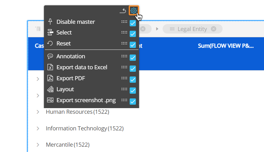
The contextual menu in Design mode
You can configure which options will be available in the contextual menu to Planners in Play Mode. To do so, double-click or Ctrl + click the Object and click the contextual menu icon ( ) in the top left corner, then expand it by clicking on the 3 vertical dots (
  ) . The configuration panel is accessible from the cog icon in the top right corner. Then, select or deselect the options. You can also reorder the options by dragging and dropping the option by its corresponding moveable icon (
  ).
).
Options can only be moved within their sections, determined by the line separating each section.
Interacting with a Flex Grid in Play Mode
The following interactions are used by the Planners in Play Mode.
Embedded Charts
Charts are viewed directly within the Flex Grid itself and configured on-the-fly. Embedded charts can help you visualize selected data from within the Flex Grid, however, can not be saved.
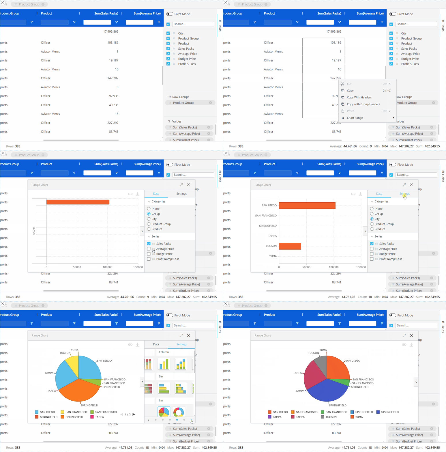
To view embedded charts, right click a value cell and click "Chart Range":
Chart Range. Based on the range selected within the Flex Grid and always available whether in Pivot mode or not. A chart popup window will appear where you can define the data settings in more detail under "Data" in the right panel, like "Categories", which are your fields, and the "Series", your Data Blocks, to configure the chart. You can also change the chart type and color palette under "Settings".
Then, click on the type of chart you'd like to display which are as follows:
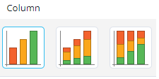
Column. Displays a vertical bar graph with the options of "Grouped", "Stacked", and "100% stacked", shown below respectively.
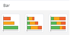
Bar. Displays a horizontal bar graph with the options of "Grouped", "Stacked", and "100% stacked", shown below respectively.
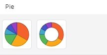
Pie. Displays a pie chart with the options of "Pie" or "Doughnut", shown below respectively.
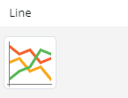
Line. Displays a line chart as shown below.
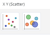
X Y (Scatter). Displays a scatter plot where data between 2 variables is displayed with a point or dot with the options of "Scatter" and "Bubble", shown below respectively.
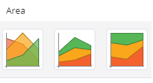
Area. Displays a line graph where the area below the line is filled in with color with the options of "Area", "Stacked", and "100% stacked", shown below respectively.
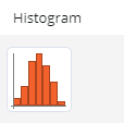
Histogram. Displays the frequency of numerical data with rectangles.
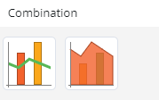
Combination. Displays the combination of two types of charts, either "Column & Line" or "Area & Column", shown below respectively.
To change the color palette or the type of the chart, simply scroll through the color options at the bottom of the window under "Settings" or select a new chart type as is done below.
When you are happy with the chart you have created, you can do a few things with this chart:
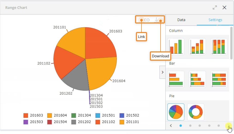
Download the chart as a .png by clicking on the download icon in the upper right corner of the chart area, as shown below.
Link or unlink the chart by clicking on the link icon, as shown below. This means, if data is updated upon a refresh, the data will also change and update the linked chart, whereas the data will not change in an unlinked chart.
Flex Grid contextual menu
You can access the contextual menu in the top left corner of the Flex Grid by hovering over the Object and clicking on the contextual menu icon ( ) which gives you the following options:
Layout
 . Access the Layout.
Export Excel
 . Exports the Flex Grid as an Excel file, as described in the next paragraph.
Export PDF
 . Exports the Flex Grid as a PDF file.
Export Screenshot .png
 . Takes a screenshot of the Flex Grid and saves it in .png format.

Exporting to Excel
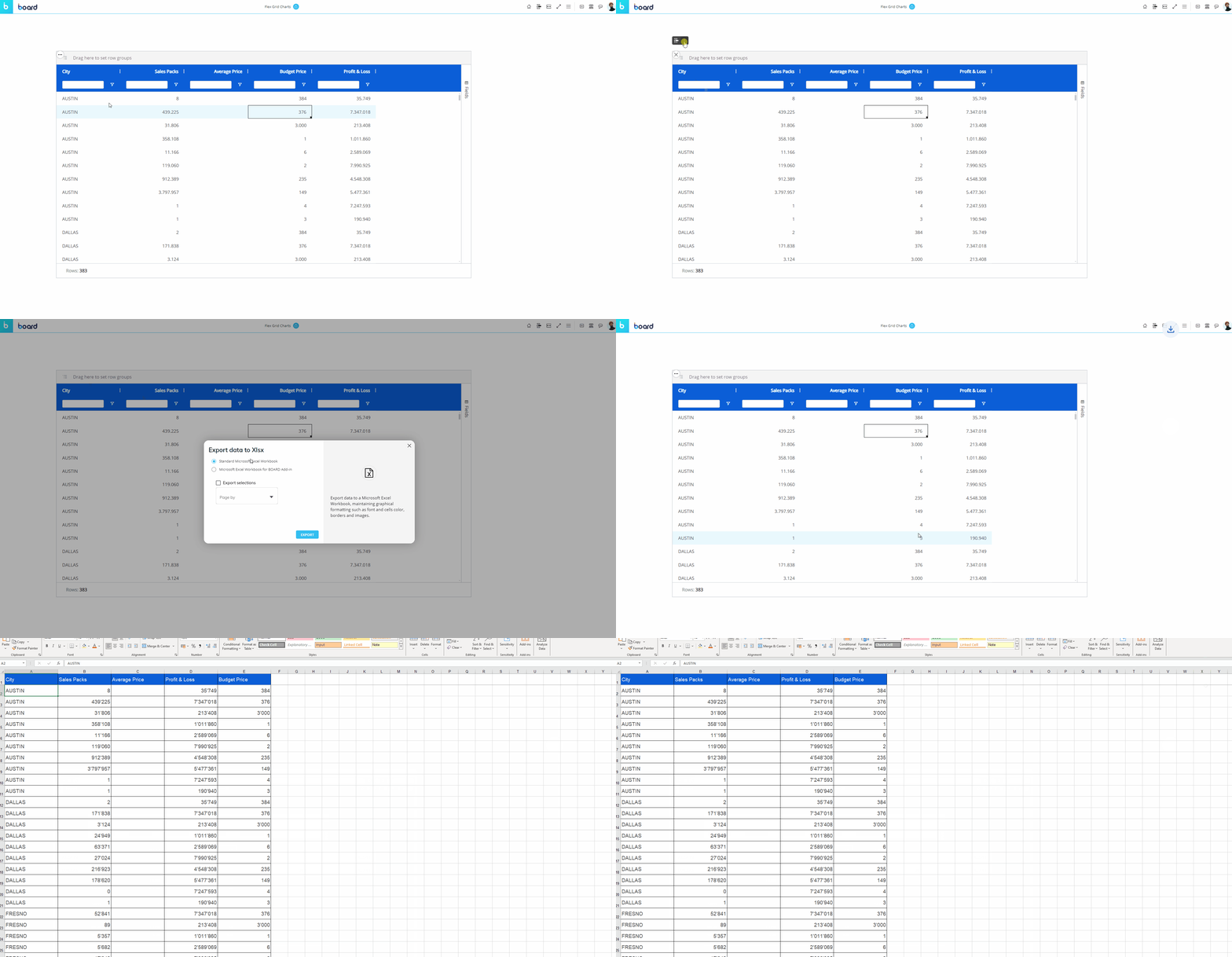
You can export the exact Layout of your Flex Grid configuration to an Excel worksheet directly from the Object.
To export a Flex Grid to Excel, go to the contextual menu and select "Export data to Excel" or the icon. You then have 2 options: Standard Microsoft Excel Workbook or for Board Add-in (only compatible with a user that has MS Add-in permission).
Color, border, font, template, and block formatting is not exported.
Flex Grid Column menu
Every column displayed in a Flex Grid has a menu for further options and capabilities.
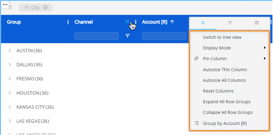
Hover over the column header and click on the hamburger menu icon ( ) to access the Column menu. There may be up to 3 subpages of menu options available: main options, filtering, and quick pivoting.
Main options. Customize Axes settings directly from the Flex Grid.
Switch to tree view/ Switch to flat mode. View an unbalanced Entity in tree view (only available for unbalanced Entities).
Display Mode. Choose or change the display mode of the Entities by Column. The following are available: Default, Code, Desc (description), and Code and description.
Pin Column. Pin the Entity column to the left or right of the Flex Grid so that it is frozen in the viewing area and always in view while scrolling through other columns.
Autosize This Column. The column width size is automatically changed to a size suitable to view the data within the Flex Grid Object.
Autosize All Columns. Every column width size is automatically changed to a size suitable to view the data within the Flex Grid Object.
Reset Columns. Resets columns to their default width.
Expand All Row Groups (flat view only). Expand all the row groups listed to the left side (if any) with one click. Each one can individually be expanded manual by clicking on each arrow next to the Group Entity's member.
This option is only available in flat view and when a row group exists.
Close All Row Groups (flat view only). Close all the row groups listed to the left side (if any) with one click. Each one can individually be collapsed manual by clicking on each arrow next to the Group Entity's member.
This option is only available in flat view and when a row group exists.
Group/Un-Group by/ Un-Group all. Group or ungroup the Flex Grid by the selected field or all fields. Also available by dragging and dropping the field into the top bar that says "Drag here to set row groups" and ungrouping by clicking the X next to the field's name placed in the top bar.
This option is only available when no column group exists.
Filtering. Gives you the same filtering options as in the field header. Select all the members you would like to filter this Entity by or type in a value you would like to filter the field by.
Quick pivoting. Shows the Entities set by Row with select boxes next to them. Select or deselect them to customize the display of the Flex Grid, however, for more customization, access the pivot tool located in the Fields panel on the right side of the Flex Grid.
Right-click options within the Flex Grid
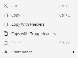
The Flex Grid right-click options are the same in both Design Mode and Play Mode. Right-click on any value cell or a selection of cells to reveal the following options:
Cut. Cut the selection of one or many cells.
Copy. Copy the selection of one or many cells.
Copy With Headers. Copy the selection of one or many cells with the headers included.
Copy with Group Headers. Copy the selection of one or many cells with the group headers included.
Paste. Paste the selection of one or many cells.
Chart Range. View embedded charts directly from the Object. Choose which type of chart you want to display alongside the value: Column, Bar, Pie, Line, X Y (Scatter), Area, Histogram, Combination. Read more about Flex Grid embedded charts.
Excel-like status bar component
At the bottom of the Flex Grid, a status bar gives you information about the selected cell or cells. If one or no cell is selected, it will display the number of Rows in the Flex Grid. If a group of cells are selected, it will display:
Rows. The number of Rows displayed in the Flex Grid.
Average. The average value of the selected cells.
Count. The number of cells selected.
Min. The minimum value within the cells.
Max. The maximum value within the cells.
Sum. The sum of the selected cells in total.
