Use the Flex Grid toolbar, Column menus, and right-click options to adjust how the grid appears and access supporting actions. You can resize or pin columns, change row and text display, copy data, use full-screen view, and export the Flex Grid in supported formats. Some options depend on the Flex Grid configuration set by the Developer.
The Flex Grid Object includes specific options and characteristics that differentiate it from a Data View Object. The subjects discussed regarding display and export options with a Flex Grid are as follows:
Read about how to organize data in a Flex Grid and analyze data in a Flex Grid.
Read about Range Charts (interaction only) and Docked Charts (savable).
Flex Grid Object toolbar and right-click
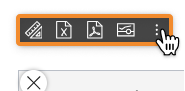
You can access the Object toolbar in the top left corner of the Flex Grid by hovering over the Object and clicking on the Object toolbar icon  , and you can right-click within the Flex Grid to access the following options if they are configured by the Developer:
Reset. Resets any selections made on the Flex Grid.
Only available when a Select in the Flex Grid has been made. Does not apply to Screen selects.
Drill down. If a Drill Down is configured, you can drill down via right click options.
Drills apart from drill down are disabled with vertical alignment.
When a drill down is created in vertical alignment, it overrides any existing drill in non-vertical alignment.
Drill anywhere. Configure a Drill Down. Read more about drill configuration in a Flex Grid Layout.
Drills apart from drill down are disabled with vertical alignment.
Select. Quickly add a selection to the Flex Grid of selected cells. This is separate from a Layout or Screen Select. The Flex Grid Select considers Layout and Screen Selects first.
Layout
 . Access the Layout.
Export data to Excel
 . Exports the Flex Grid as an Excel file, including for the Board M365 Excel Add-in. Read about the Export data to Excel in the next paragraph.
Exporting a Flex Grid in vertical alignment is not supported. The export will execute and render a Flex Grid in non-vertical alignment and without Data Entry formatting.
Export PDF
 . Exports the Flex Grid as a PDF file.
Exporting a Flex Grid in vertical alignment is not supported. The export will execute and render a Flex Grid in non-vertical alignment and without Data Entry formatting.
Export Screenshot .png
 . Takes a screenshot of the Flex Grid and saves it in .png format.
Exporting a Flex Grid in vertical alignment is not supported. The export will execute and render a Flex Grid in non-vertical alignment.
Clear All Filters. Clears all filters applied in a Flex Grid, but not in a Layout.
Applies only to filters made in the Flex Grid. Layout filters are kept.
Clear All Sorting. Clears all sorting applied in a Flex Grid.
Copy. Copy the selection of one or many cells.
Copy with headers. Copy the selection of one or many cells with the headers included.
Copy with group headers. Copy the selection of one or many cells with the group headers included.
Row Height.
Extra Narrow. Rows take up the least amount of space.
Narrow. Rows take up less space than Compact.
Compact (Default). Rows take up moderate space.
Large. Rows take up more space than the the Compact setting and less than the Extra Large setting.
Extra Large. Rows take up the most space.
Custom. You can customize the height with the below settings:
Rows. Enter the height value for rows in px.
Headers. Enter the height value for headers in px.
“Custom” gives you the freedom to adjust the size of the density within the range of 14-100px for both rows and headers. All other sizes are predefined.
The density setting of the row spacing does not adjust the font size. If you make the cell or heading row height too small or too large for the font size, you will have to adjust the density setting accordingly.
By design, exports of a Flex Grid to a Microsoft Excel Workbook for Board M365 exports the current row height from the Flex Grid as a manual row height in Excel. This applies when the Flex Grid is formatted with a row density (other than the default), such as "Extra Narrow", "Narrow", "Large", "Extra Large", or "Custom".
Because of this, actions that change a Table configuration do not reapply the configured Flex Grid row height to new or changed rows.
Rows that were exported from the original Flex Grid keep their custom height. Rows that appear later, for example after expanding row groups, use the standard Excel row height.
You can manually change row heights in Excel after the export. This behavior only affects how row heights are displayed in Excel.
Alignment. Customize the position and alignment of content within cells and Column headers.
Wrap Column Headers. Wraps column headers so that text is visible however wide or narrow the column is shifted.
Active by default. Applies only to Column Headers. Only available if enabled by Developer in the Flex Grid Property Panel. Can be enabled/disabled by Planner in Play Mode from the Flex Grid Toolbar.
Wrap Cell Content. Wraps values so that text is visible however wide or narrow the column is shifted.
Disabled by default. Only applies to text values. Enabled/disabled in Design mode Property panel and for the end user in the Toolbar.
Cell Content Alignment. Align the content in all cells to the:
Top
Middle
Bottom
Expand to full screen. Expands the view of the Flex Grid to full screen.
Full screen is only available in Play Mode. The full screen view cannot be used or saved in Design Mode. The full screen view can not be saved in MyView or Presentations. It is a temporary viewing mode only.
Full screen affects only the selected Flex Grid. Other Objects remain hidden while full screen is active. Export behavior or Excel row limits does not change when exporting from Flex Grid.
Range Chart. View embedded charts directly from the Object. Choose which type of chart you want to display alongside the value: Column, Bar, Pie, Line, X Y (Scatter), Area, Histogram, Combination. Read more about Flex Grid Range charts.
Docked Chart. View and save charts on a Flex Grid. Choose which type of chart you want to display. Read more about Flex Grid Docked charts.
Options can be removed by the Developer in Design Mode and may not be available in your Screen.
Export data to Excel
You can export the exact Layout of your Flex Grid configuration to an Excel worksheet directly from the Object with two options:
Standard Microsoft Workbook
Microsoft Excel Workbook for Board M365 (Add-in)
Color, border, font, template, and block formatting is not exported.
Exporting a Flex Grid in vertical alignment is not supported. The export will execute and render a Flex Grid in non-vertical alignment and without Data Entry formatting.
Standard Microsoft Excel Workbook
Export a Flex Grid to a standard Microsoft Excel workbook in the (.xlsx) format.
The Excel export options in the Flex Grid offer two distinct modes for tailored data exports: Flatten and Non-flatten.
Export to Excel popup options
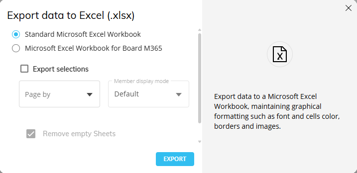
When exporting a Flex Grid to Excel, the following options are available on the “Export data to Excel (.xlsx)” popup window:
Export selections. Enable to include a Reference Tab which captures the active selections applied on the Screen at the time of export.
Page by. Creates a separate tab in the exported workbook for every Entity member (displayed by the Member display mode chosen) chosen in the configuration. Configure the export by choosing an Entity and a Member display mode from the dropdowns.
Member display mode. Choose the member display mode of the Entity chosen in the “Page by” dropdown.
Remove empty Sheets. When enabled, any empty sheets that would normally display in the report is removed to reduce excess pages.
This flag is enabled by default and can only be disabled when the “Page by” field is configured.
Export flatten. When enabled, exports raw datasets without grouping, ensuring a clean data structure for further analysis. Includes raw data while ignoring grouping and hidden columns.
Flatten
Enable “Export flatten” to export the Flex Grid in flatten mode: exports raw datasets without grouping, ensuring a clean data structure for further analysis. Includes raw data while ignoring grouping and hidden columns.
When using Flat Mode:
Exports the dataset without applying grouping or hierarchy structures.
Hidden columns are ignored in the output.
When using Pivot Mode:
Groups are exported into separate columns, preserving the hierarchical structure.
Items in Column Labels are preserved.
Totals are not included in the export, maintaining a clean dataset for external analysis.
Hidden columns are ignored in the output.
Non-flatten
When “Export flatten” is disabled, exports in a non-flatten format: retains grouping and hierarchy structures while reflecting the active selections.
Exports the dataset while maintaining the grouping structure displayed on screen also in the Excel sheet.
Retains all hierarchy and grouping details based on the current Flex Grid configuration.
Users can collapse and expand row groups also in the Excel sheet.
Group display type settings for Flex Grid to Excel export
Furthermore, the "Group display type" setting found in the Flex Grid Object’s Property Panel offers different ways to improve the functionality of the extracted report as follows:
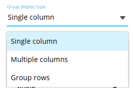
Single column (default):
In flatten mode: Exports raw data sets without grouping.
In non-flatten mode: Retains the grouping structure displayed on screen, with collapsible/expandable groups in the Excel sheet.
Multiple columns:
In flatten Mode: Exports flat, ungrouped datasets, excluding hidden columns and totals.
In non-flatten mode: Exports data with multi-column grouping preserved, matching the browser structure.
Group rows:
In flatten Mode: Ignores grouping and exports raw data without totals.
In non-flatten mode: Retains the row grouping hierarchy, matching the browser view in the Excel sheet.
The Flex Grid exported to Excel must not exceed 1 million rows. If it does, the following message will appear:

Grouping configured by row in a Flex Grid is converted to Excel groups functionality when exported to Excel. Tree view groups on Unbalanced Entities are converted to Excel groups functionality when exported to Excel.
Export to Board M365 Excel Add-in
Users can export a Flex Grid configuration from the Platform to a compatible Excel file to use in the new Board M365 Excel Add-in-enabled workbook. The export maintains graphical formatting, selections, grid-made filters and sorts, and grouping.
This feature improves user productivity by enabling seamless workflow in Excel by reducing manual, ungoverned exports and unifying the Flex Grid with Excel Add-in experiences to ensure consistent, governed access to Board data across both environments.
Read more about the compatible Flex Grid export for Board M365 Excel Add-in.
The following Flex Grid options are not supported in Board M365 Add-in:
Export Flatten is not available for exports specific to the Add-in.
Group Display Type is not supported.
Pinned Columns are not supported.
Expand configuration is not reflected in the export. All groups appear collapsed by default.
Unbalanced structures are not supported.
Reordering of columns or groups is not supported in the export
Drills
Docked Charts
Vertical Aligned Layout is disabled at the export
Pinned Columns
Flat view
Data Entry
By Column configured
Layout filters
The following Flex Grid Object Properties are ignored when exported:
Desaturate color alert
Show fields panel
Show Filters panel
Show Pivot Mode
Allow changing column visibility
Allow Grouping by row
Allow Grouping by column
Allow aggregation of totals
Remove aggregation label
Show status bar
Suppress group count
Enable click on URL
Allow Vertical Block Alignment
Expansion level
GroupDisplayType
Sorting modification
Filtering modification
Data entry options
Row Height
However, the configured Row Height that is visible in an export is replicated in an Excel worksheet but not carried over to new or changed rows. This can cause different row densities in a worksheet and can be manually changed in Excel.
Flex Grid Column menu
Every column displayed in a Flex Grid has a menu for further options and capabilities.
Hover over the column header and click on the hamburger menu icon  to access the Column menu. There may be up to 3 subpages of menu options available: main options, filtering, and quick pivoting.
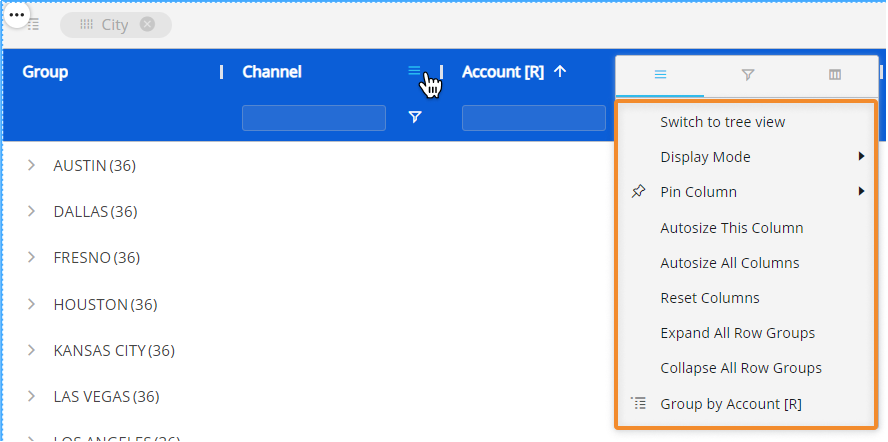
Main options. Customize Axes settings directly from the Flex Grid.
Switch to tree view/ Switch to flat mode. View an unbalanced Entity in tree view (only available for unbalanced Entities).
Display Mode. Choose or change the display mode of the Entities by Column. The following are available: Code, Desc (description), and Code and description.
Pin Column. Pin the Entity column to the left or right of the Flex Grid so that it is frozen in the viewing area and always in view while scrolling through other columns.
Autosize This Column. The column width size is automatically changed to a size suitable to view the data within the Flex Grid Object.
Autosize All Columns. Every column width size is automatically changed to a size suitable to view the data within the Flex Grid Object.
Reset Columns. Resets columns to their default width.
Expand All Row Groups (flat view only). Expand all the row groups listed to the left side (if any) with one click. Each one can individually be expanded manual by clicking on each arrow next to the Group Entity's member.
This option is only available in flat view and when a row group exists.
Collapse All Row Groups (flat view only). Close all the row groups listed to the left side (if any) with one click. Each one can individually be collapsed manual by clicking on each arrow next to the Group Entity's member.
This option is only available in flat view and when a row group exists.
Group/Un-Group by/ Un-Group all. Group or ungroup the Flex Grid by the selected field or all fields. Also available by dragging and dropping the field into the top bar that says "Drag here to set row groups" and ungrouping by clicking the X next to the field's name placed in the top bar.
This option is only available when no column group exists.
Reset Columns. Resets to the default view.
Cell Content Alignment.
Filtering. Gives you the same filtering options as in the field header. Select all the members you would like to filter this Entity by or type in a value you would like to filter the field by.
Quick pivoting. Shows the Entities set by Row with select boxes next to them. Select or deselect them to customize the display of the Flex Grid, however, for more customization, access the pivot tool located in the Fields panel on the right side of the Flex Grid.
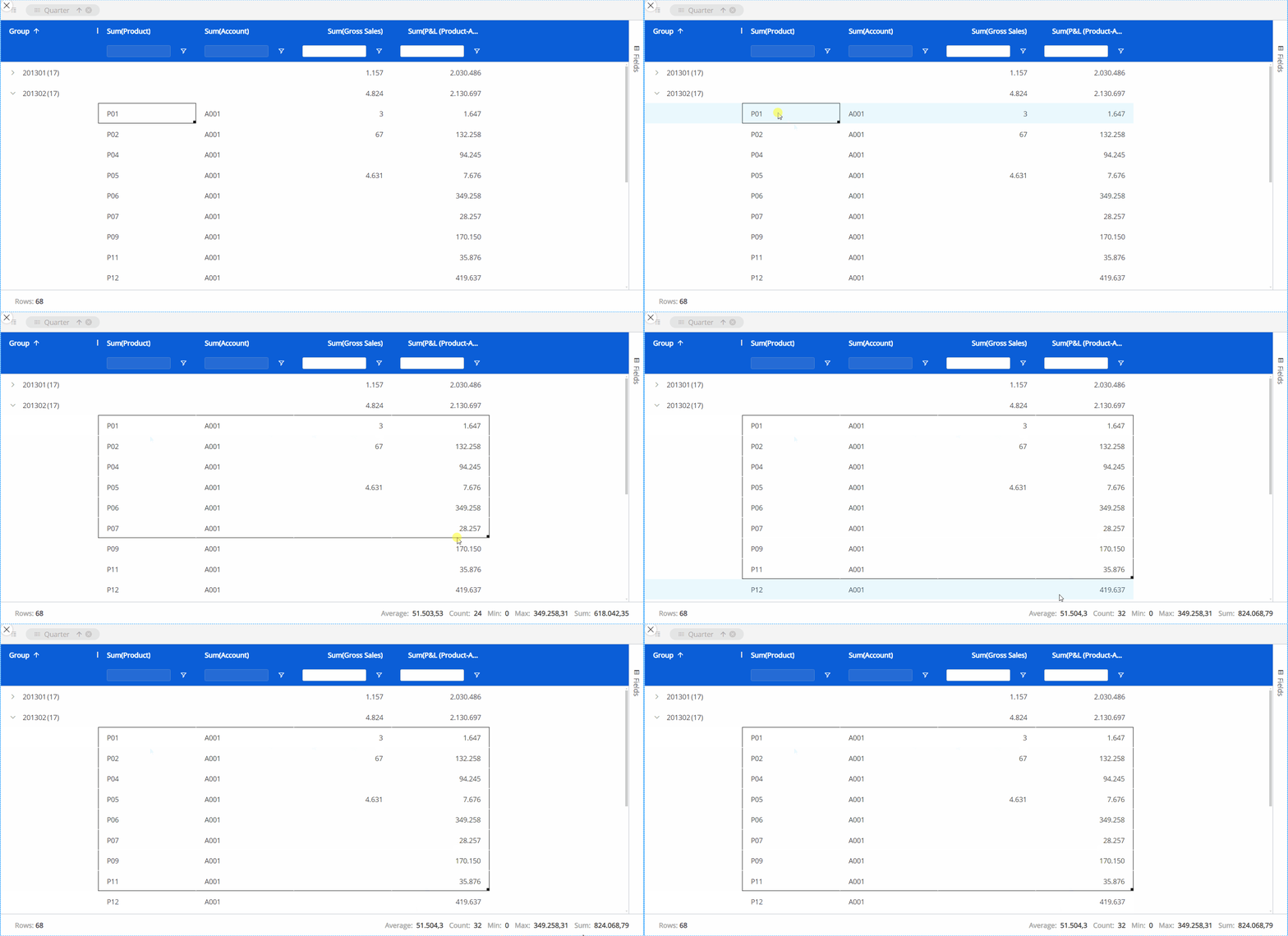
Excel-like status bar component
At the bottom of the Flex Grid, a status bar gives you information about the selected cell or cells. If one or no cell is selected, it will display the number of Rows in the Flex Grid. If a group of cells are selected, it will display:
Rows. The number of Rows displayed in the Flex Grid.
Average. The average value of the selected cells.
Count. The number of cells selected.
Min. The minimum value within the cells.
Max. The maximum value within the cells.
Sum. The sum of the selected cells in total.