The Flex Grid Object provides sophisticated data analysis for financial planners. After organizing data, Planners can effortlessly examine data from different perspectives with similar Data View features such as interactive selections, sorting, filters and drills. The available analysis options depend on the Flex Grid configuration and your permissions.
The subjects discussed regarding analyzing data in a Flex Grid are as follows:
Read about Range Charts (interaction only) and Docked Charts (savable).
Read about how to organize data in a Flex Grid and other display options.
Interactive Selection on rows and columns
The Flex Grid Object enables users to select an Entity by choosing specific rows and/or columns.
For example, in a Flex Grid that lists Countries in rows, users can click on one or multiple rows (i.e., Countries) and utilize them as selection criteria, prompting other Objects on the Screen to update accordingly.
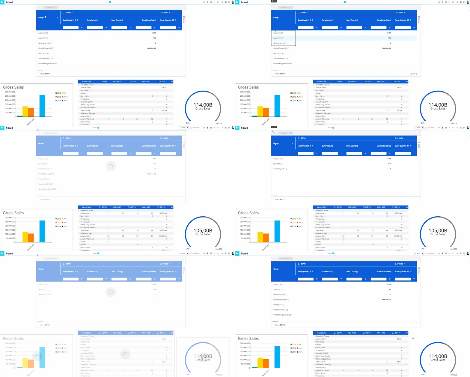
As you can see in the example above, once a selection is applied the other Objects on the Screen are refreshed to show data for the selected items only.
To reset the selection made on a Flex Grid Object, click the reset button  in the top left corner of the Flex Grid.
The selection can be made on the Entities set By Row and By Column. Read more about how the Select works.
Sort and Filter a Flex Grid in Play Mode
Sorting and filtering is not done in the Layout editor configuration as with a Data View, but within the Flex Grid itself, if the Developer's configuration allows it.
Sorting a Flex Grid
To sort directly from the Flex Grid Object, if the configuration allows it, click on a column header or drag and drop a field into the "Row Groups" section from the "Columns" panel that you would like to sort from. Arrows will indicate the order: up arrow for ascending, down arrow for descending, or no arrow for the default order.
Sort configurations remain when switching from vertical to non-vertical alignment and vice versa.
Filter a Flex Grid
There are 4 ways to filter a Flex Grid: from the filter icon under each column header, the column option menu within the filter subpage, the textbox underneath a column header (if available), and the “Filters” tab along the right side of the Flex Grid, each is described below in addition to the Filter Quick view and remove feature.
In "Pivot Mode", filters apply only to the least aggregated cells. Parent rows, Row Groups, and grand total rows are not recalculated, so displayed totals can include values that the filter removes from the visible detail.
Filter icon
From the filter icon in the Flex Grid column header, you can filter in a two-step process.
Click on the filter icon and then choose how you want to filter the field with the dropdown menu and add text/a value (if prompted) to combine with the filter command. The dropdown filter rule parameters include:
Contains
Not Contains
Equals
Not Equals
Starts with
Ends with
Blank
Not blank
By default, it filters using "Equals". If you want to, you can add a second filter in combination with "AND" or "OR" below.
All members that fit the filter rule display below and are all selected by default. You can choose to select/deselect member items to satisfy your preferences.
Filter from the column options menu
Another way to filter is from accessing the same filter menu as with the filter icon from within the column options menu. Click on the hamburger menu icon and click on the filter icon from the dialog box. If the text box is colored the same as the header background (or grayed out if the header background is white), then a small dialog window opens with the filter options to choose from and a search box. If the text box is white, you can type directly into the box in order to filter it according to what you type.
Filter using textbox
It is possible to filter from the textbox below each column header when the textbox is available (when it is white-filled or not grayed out).
To filter within the textbox below the column header, like "FLOW VIEW P&L" in the example below, simply type into the textbox and hit "Enter" on your keyboard or click outside of the textbox to run the search.
The column will filter according to the default setting, which is "Equal to" for integer Blocks when single filtering is configured and "Contains" for all other Blocks as well as all columns when multiple filtering is configured. To change the filter option from its default, click on the filter icon  and choose your parameters from the dropdown menus and using the AND/OR functions.
To filter without a textbox, like "Year" in the example below, click on the filter icon  and make a selection from the following options. You can also use the search bar to find what you are looking for.
To filter the columns that appear in the Flex Grid, you can deselect them from the Fields panel or access the menu from any one of the columns using the hamburger icon that appears in the top right corner. From the third tab with the Flex Grid icon  , a list of the columns appears where you can select or deselect the ones you want to view or hide.
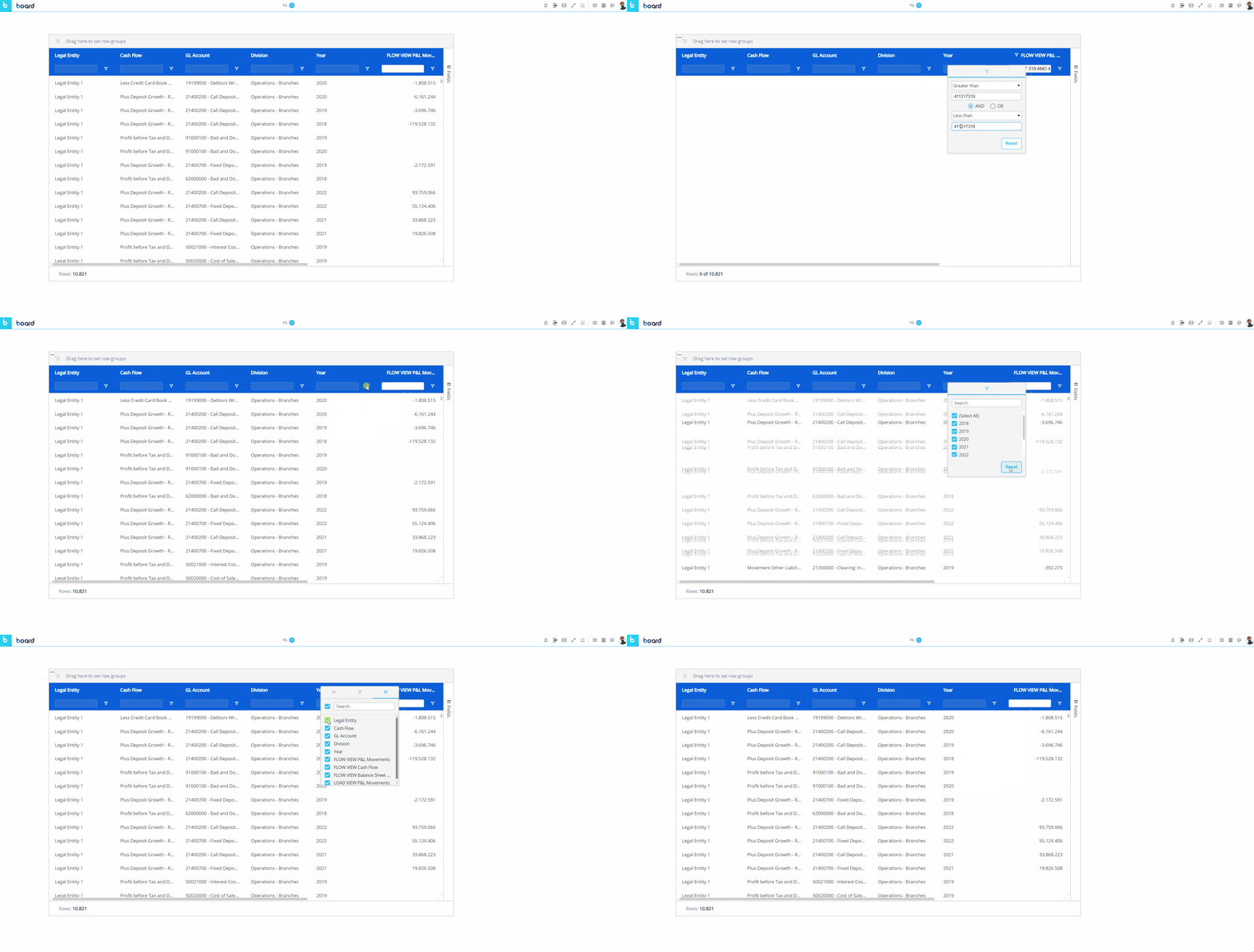
The textbox is only available to value fields when the filter configuration is set to "Single", or available to all fields when the filter configuration is set to "Multiple", allowing multiple filters at once.
"Filters" Tab
Along the right side of the Flex Grid with the "Fields" tab is the "Filters" tab. Click on it and the right-side panel opens where you can create filters for a Flex Grid. In addition to the filter icon in every column, the Filters tab contains every element name which you can open by clicking on the element, and the applicable filter options appear in the dropdown where you can reset filters or configure them.
Quick view and removal of filters
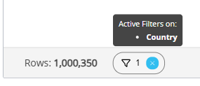
When you create a filter in the Flex Grid, it will appear on the bottom bar where you can view what filters are active and quickly reset them by clicking the “x”.
There are two actions you can do with quick view filters: view or remove the filter.
To view the active filter, hover over the element and the tooltip appears above it.
To remove the filter, click the “x” in blue.
In the example below, you can see that 1 filter is active on the Entity “Country”.
Multi-filtering & multi-sorting
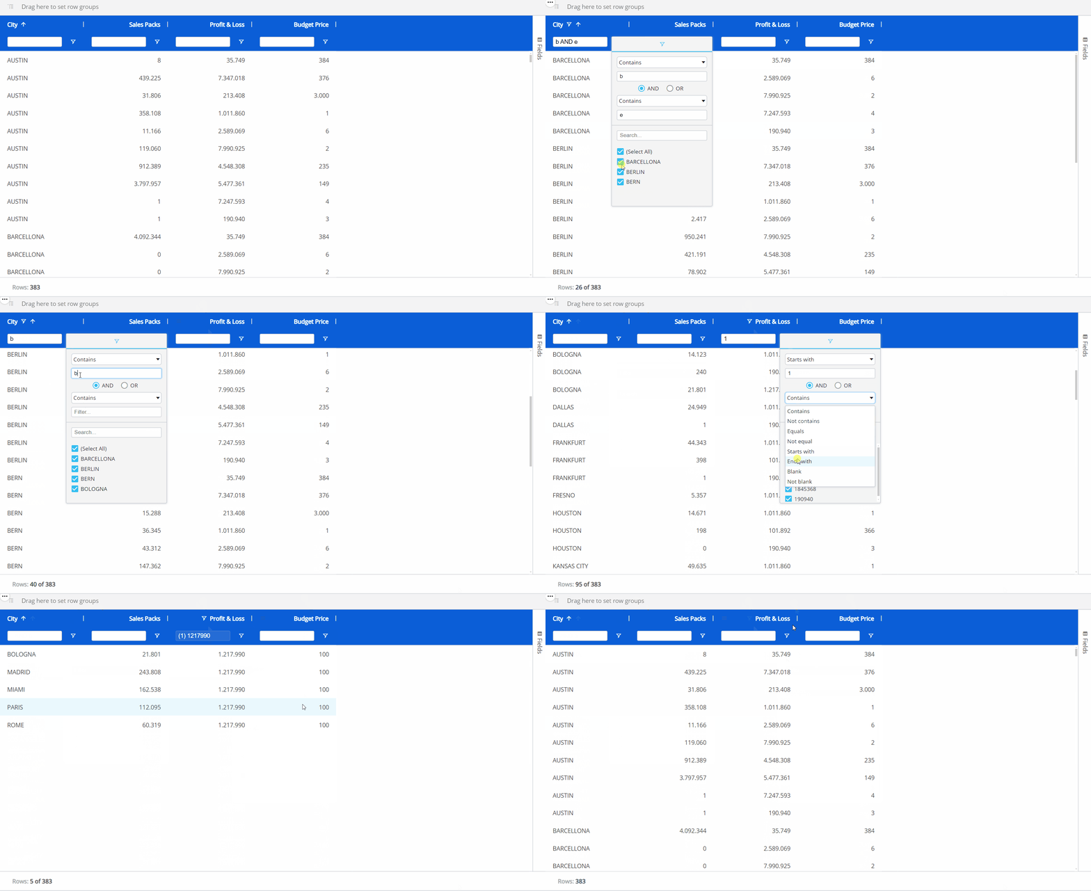
It is possible to sort and filter by multiple fields, if the configuration allows it. When multiple sorting and/or filtering is allowed, the first sort or filter applied is the first priority in the hierarchy, while the second and third sort or filter becomes the second and third priority, respectively.
Multiple sorting allows multiple columns to apply a sort, whereas a single sort only allows one column to apply a sort to the Flex Grid Object.
Multiple filtering allows multiple filtering per column, whereas a single filter only allows one filter per column.
When sorting multiple fields, a number will appear next to the field header to indicate the priority order of the sort.
When filtering multiple fields, the textbox option under every field is available.
Filters on Vertical Alignment
Filter configurations remain when switching between vertical and non-vertical alignment.
However, when filtering a specific value field, only that measure is filtered—not the others.
Vertical vs non-vertical filter logic:
In a non-vertical layout, filtering removes entire rows from the dataset.
In a vertical layout, those rows are represented as columns, so they remain visible, but the filter selection limits the data displayed within them.
Filters and sorting are supported only for numerical Blocks that do not have By Column configured. When By Column is configured, Board removes the filter and sort settings from the affected Blocks.
Master Object interaction
If the Flex Grid has been configured as a Master Object, clicking on a row header (i.e. the field members set by Row Groups) will update the data displayed by all other Objects on the Screen in order to show only the data relating to the clicked header. The Master Object result is similar to applying a Screen Selection.
By clicking on the "Disable master" icon  in the sliding toolbar, you can disable this option. Click on the "Enable master" icon
  to re-enable it.
Drill Down and Drill Anywhere
The Drill Down and Drill Anywhere features allow users to explore data in greater detail - users can interactively drill into specific entities and gain actionable insights directly from the grid, much like the Drill Anywhere functionality available in the Data View Object.
How to use the Drill Down and Drill Anywhere features in Flex Grid
Like in the Data View Object, the Drill Down and Drill Anywhere features allow you to see data that is in a different aggregation level than what is exposed in the Flex Grid table.
Drill Anywhere
When a drill is performed, by right-clicking a cell and then clicking “Drill anywhere” from the menu or by clicking on a cell and then on the Drill Anywhere icon from the Object toolbar  , a popup window displays.
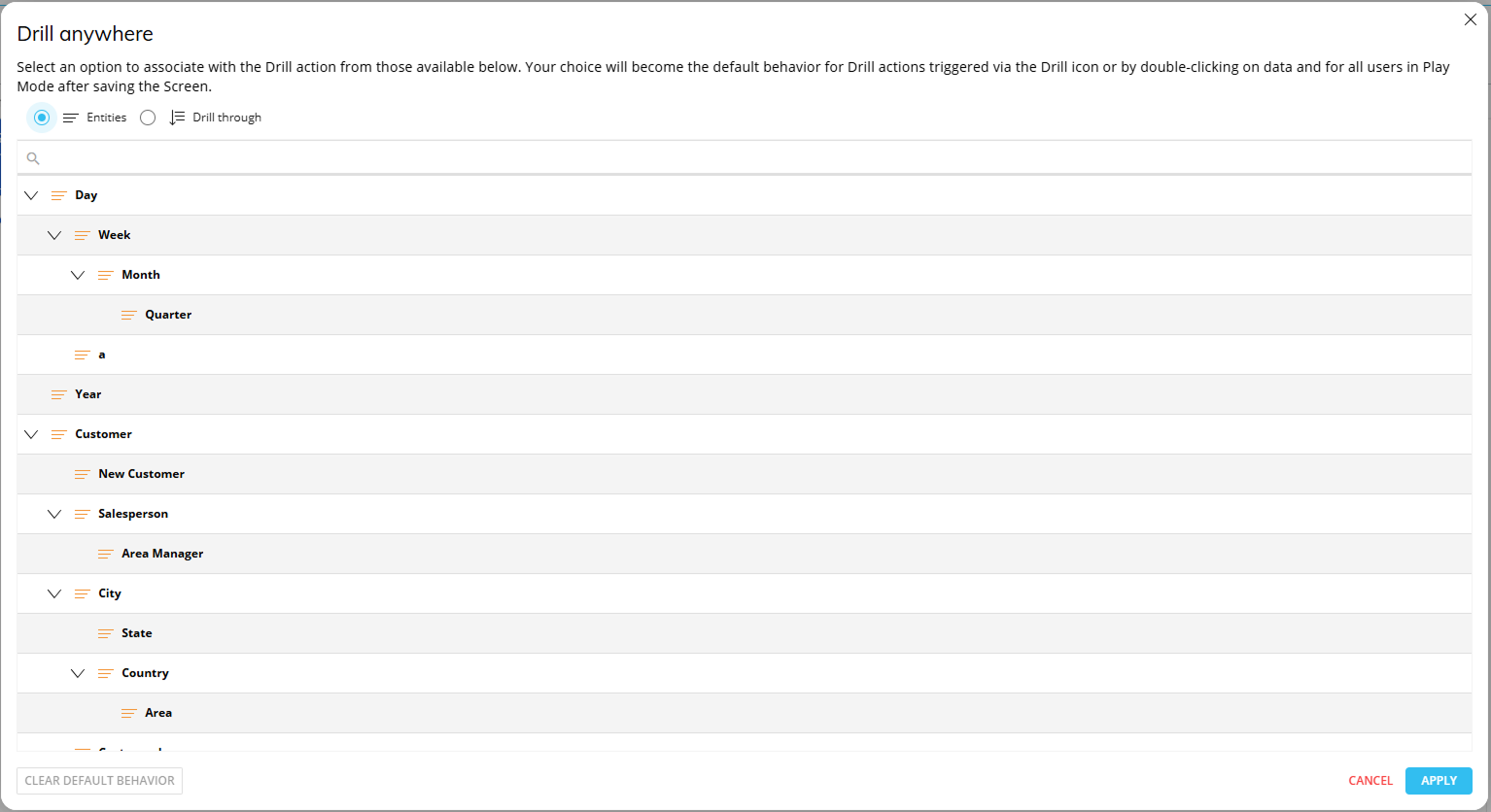
From this window, you can select the level of granularity you wish to see.
Drill Down
When a Drill Anywhere is configured, it is possible to access the Drill Down icon  from the Object toolbar or from the right click menu which lets you access the same level of granularity as configured in the Drill Anywhere functionality.
The drill Entity is displayed on rows and filters automatically applied based on the drilled number’s coordinates.
The resulting Layout retains the same structure and the pivoted fields by row/column, maintaining the same point of view of the original Flex Grid but focused on the drilled entity in axes with all configured blocks, just applying a selection on the drilled member.
In Unbalanced Hierarchies, Drill by level is implemented, ensuring consistency when exploring hierarchical data, regardless of its structure.
Drill-Procedures, Drill-to-Screen, and Drill Throughs are also available for the Flex Grid in non-vertical alignment only.
These drills are not supported with Vertical Block Alignment configured.
These drills are disabled when switching to vertical alignment if configured in non-vertical format.
Changes made in second-level Layout Drills are not saved.
When you drill down from a Block and then open a second drill level, changes made in the second-level drill result are not kept after you close and reopen the drill.
Changes are only saved in the first level drill down.
Drills made in vertical alignment will override any previous made drills when reverting back to non-vertical format.
Drill down with Vertical Alignment
Drill down on an Entity is supported on a vertically aligned Block. Drilling on an Entity in vertical alignment displays the Entity’s members within the Sum Values configured in the Values area. In the drill window, all KPIs are kept. Drills can be customized and saved by both Planners and Developers.
Drill-Procedures, Drill Throughs, and Drill-to-Screen are not compatible with Vertical Block Alignment and are ignored in vertical format.
Drills made in vertical alignment will override any previous made drills when reverting back to non-vertical format.