The Card Object provides the following interactive features:
Any changes made to a Card Object using the functions listed above will be lost if you leave the Screen or update it, except for Data Entry actions.
Interactive Selection on the Entity set By Row
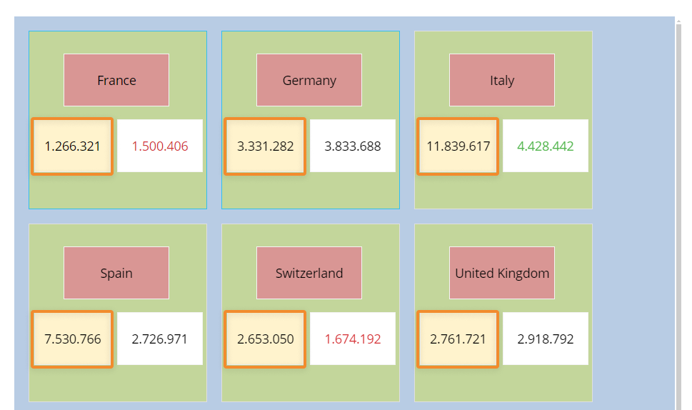
The Card Object allows the user to make a selection on the Entity set By Row by selecting one or more members of that Entity in card elements.
For example, on a Card with the "Countries" Entity set By Row, you can select one or more of its members (i.e. Countries) and then use them as selection criteria so that other Objects on the Screen are refreshed accordingly.
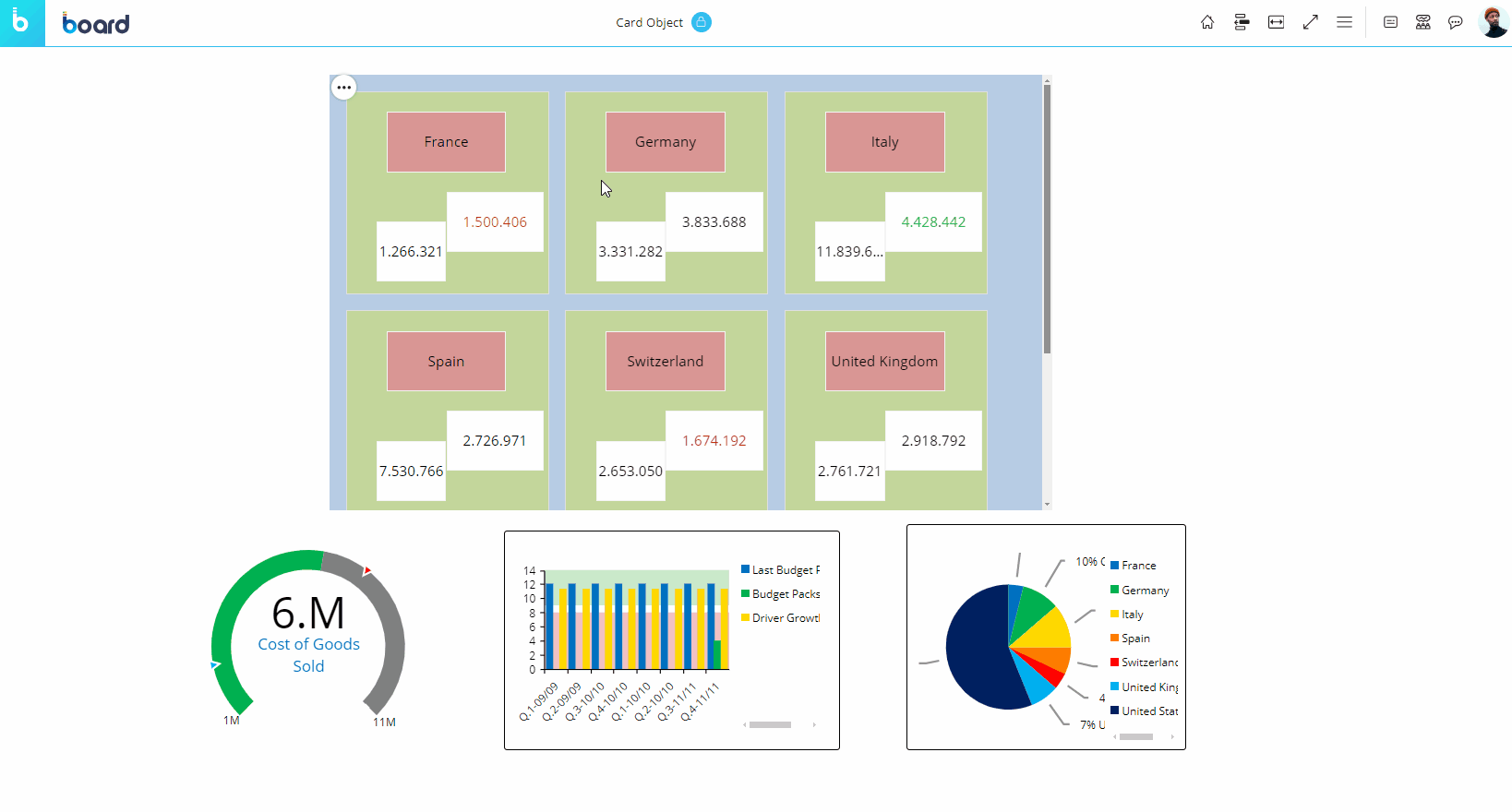
As you can see in the example above, once a selection is applied, the other Objects on the Screen are refreshed to show data for the selected items only. To select multiple cards, double click the first one over the Entity and then press the Shift key and click the next selections. When done, click the Selection icon in the Object toolbar.
To reset the selection made on the Card Object, click the reset button  in the top left corner of the Object area.
Master
If the Card has been configured as a Master Object, clicking on a member of the Entity set By Row will update the data displayed by all other Objects on the Screen in order to show only the data relating to the selected member. The Master Object result is similar to applying a Screen Selection.
By clicking on the "Disable master" icon  in the sliding toolbar, you can disable this option. Click on the "Enable master" icon
  to re-enable it.
Drill Anywhere
The Drill Anywhere button allows you to configure a default Drill down that will be available for all card elements.
To configure it, proceed as follows:
Select a card element and click on the Drill Anywhere icon
 in the sliding toolbar to open a window with the list of Entities you are allowed to drill down on.
Select the desired Entity and click "APPLY" or double click the Entity to save the Drill and to perform it. The configured drill data is always displayed in a Data View.
Once the drill is saved, it can be easily performed again by clicking on the Drill Down icon  .
.
The Drill Down configuration process can also be started by double clicking on the item you want to drill down on if a configuration is not set. The Drill Anywhere function is available also in Drill Down windows, so you can create your own drill-down paths at different levels of granularity.
Drill Down
Once you have configured a drill using the Drill Anywhere function, click the Drill Down button  to perform it on the selected item or double-click on it.
Drill-to-Screen
If a Drill-to-screen has been configured, the Drill Anywhere  and Drill Down icons
  will not be available.
In this case, double click on a card element or or on information displayed in it to follow the drill path from the Card Object to another Screen of the current Capsule.
Depending on the Drill-to-Screen configuration, the destination Screen will open with:
A selection based on the Entity member selected (or double-clicked) in the Card Object.
No inherited selection.
Drill-Procedure
If a Drill-Procedure has been configured, the Drill Anywhere  and Drill Down icons
  will not be available.
In this case, double click on a card element or or on information displayed in it to trigger the configured Procedure or choose from a list of available Procedures.
Depending on the Drill-to-Procedure configuration, the Procedure will run with:
A selection based on the Entity member selected or double-clicked in the Card Object.
No inherited selection.
Data Entry
The Card Object allows data entry of numeric data, dates, text and even files into Cubes.
See Data Entry on Cubes and Data Block settings for more details.
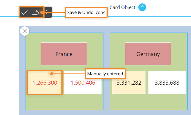
When Data Entry is enabled on a Cube, the background of the corresponding rectangle in card elements turns yellow (unless otherwise formatted), as in the following example:
To perform a Data Entry action, double-click on a cell to enter data (either by typing a value, by uploading a file or a picture, by picking a date from a date picker, and so on).
If Save/Undo mode is enabled on the Screen, after you have entered a value, click the save icon  at the top left of the Data View to actually save the value in the Cube. To do this, you can also press the F9 key on your keyboard.
The undo arrow icon allows to restore the last saved values (i.e. it discards all unsaved changes).
Unsaved values and totals that depend on those values are shown in red. When you click the save icon, their text color will change to match the text color of previously saved values, indicating that all changes have been saved in the target Cube.
When the Data Entry option is enabled in the Layout, after you have manually entered data in a cell, the contextual menu (sliding toolbar) in the top left corner of the Data View will automatically show the Save/Undo icons (if Save/Undo mode is enabled on the Screen) and the Lock/Unlock icons (see Lock and Spread for more details).
The Data Entry option is also available on Data Views in drill down windows. See Interacting with a Data View for more details
The Object toolbar
When you hover over the Data View, the Object toolbar icon  appears in the top left corner. Click on it to reveal the Object toolbar as a toolbar.
In addition to the icons mentioned above, the Object toolbar also includes the Layout icon  (unless otherwise configured). Clicking on that icon opens the Layout editor.
Click on the Comment icon  to displays any comment attached to the Object (if any). Depending on the comment configuration, the icon displayed can be a balloon icon, a question mark icon or an alert icon.